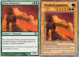
Blue player wins, thanks to City of Solitude
While I was writing this article, JP”Polluted” Meyer AIMed:”Game 1 to Upheaval / Shallow Grave when he can’t sac land to his Overgrown Estate in response to my Upheaval ’cause he has City of Solitude out..”
This was Round 1 of The Mana Drain Invitational, and JP was playing the Type I Psychatog build he’s been tuning against Dan Rosenheck a.k.a. Cooberp’s trademark Enchantress. Bad Player Meyer does it again…
By the way, apologies about the late posting of last week’s article (by one week, no less). We had technical problems converting the file into HTML. I’m more annoyed than you are, and Chinese work ethic has pushed me to keep deadlines even at the height of Manila typhoons, floods and power problems. Hopefully, it won’t happen again.
This week’s headline”The Death of Art,” by the way, was borrowed from the last mission of Mafia, a most entertaining game. For more on the new card layout, check out our forum thread dedicated to Chris Flaaten and his”black belt in Paint Shop.”
Much ado about nothing?
I signed Dustin Christman‘s “Not to change the look of Magic: The Gathering cards” petition, which reads:
“To: Wizards of the Coast
“This is for all the veteran Magic: The gathering players, Wizards of the Coast is changing the look of the cards to a more”futuristic” look. From what I have read on most message boards, people are enraged with the new design, as am I. This is ridiculous, and uncalled for. As the saying goes ‘If it isn’t broke, don’t fix it’.”
It’s not the Gettysburg Address, but it captures a lot of people’s feelings nicely – mine included.
Why?
Chris Flaaten from Norway e-mailed me why with his Paint Shop demonstration:
In case you’ve been hiding in the cave this past week, here are the relevant links:
- Sideboard Online: No Face Change
- Josh Bennett on Sideboard Online: Unveiling Eighth Edition
- MagictheGathering.com: Card Face Redesign FAQ
- Ray Moore on Brainburst.com: Interview – Mark Rosewater
- Star City Forums: The New Look of Magic Cards
- Star City Forums Poll: What do you think of The New Look?
- Star City Forums Poll: How do you view changing the card layout?
And for good measure, here’s one of an entire page of Misetings New Look articles:
- Eviscerator86 on Misetings.com: “The new designs will grow on you,” says Mark”Bling-Bling” Rosewater
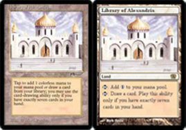
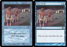
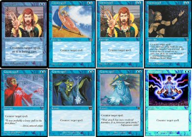
Once you’ve played for several years, opening your card binder is like a trip down memory lane. Take something as simple and vanilla as Counterspell:
I still remember passing around my Mirror Universe for its Foglio art.
I still remember voicing that Richard Kane-Ferguson is my favorite artist of all time.
I still remember trading for the”good” Elvish Ranger alternate art, back in days when you were concerned about how your commons looked. Heck, I still remember the triumphant feeling of finally getting all four versions of Hymn to Tourach.
I still remember walking over to the little card store outside my high school to pick up newly released Mirage starter boxes for the new land art..
And I still remember the announcement about a Philippine landmark getting a spot on one of the APAC land Mountains.
Yes, I remember and treasure how the cards looked years back, from the bleached Revised look and the original white mana and tap symbols, to the original translucent packing that let you peek at the rare if you could slide it up with your fingernails.
A lot of people care about how these cards lovingly stored away in binders and boxes look-myself included.
And a lot of people are going to start wondering how those new white cards are going to look with their Army of Allah and Beta Balance – myself included.
The New Designs Will Grow On You
Going over Sideboard Online and MagictheGathering.com, this is the short version of The New Look:
Key information has to be better emphasized and made more readable. Richard Garfield was especially particular about the power/toughness on creatures.
More space has to be devoted to the card art.
Artifacts need to be more easily distinguished from land.
Basic land have to be more clearly marked as, well, basic land. Once upon a time, you were one of those guys asking if Land Tax could fetch Tundras.
The color and texture of the backgrounds needs to be enhanced.
Magic’s foil cards need to look better, because they’re less attractive compared to other games’ foils.
Now, these make a lot of sense. Except for the part about foils, no one would disagree.
The New Look is not as bad as some people are making it out to be – even if I don’t like it myself.
For example, a lot of people practically shouted on various forums,”Who can’t read the card names?” and”Who can’t find the power/toughness?”
Then I read this post by Naught Jennifer on the Wizards boards:
“The subject of changing the text is actually a very big one. I have partial astigmatism. My right eye sees fine, but my left eye has a hard time making out details. Because of my right eye being fine, though, I haven’t bothered with getting glasses. For perspective, using my left eye, I need to be about a foot away from the card for the card name to be somewhat legible, and it’s still fuzzy. With the new format (I even tested with printouts), the name is legible from as much as two feet.”
Can’t argue with that.
But no one minds more readable card names. Just try reading the names and artists’ names on Beta cards, for example. (I have an Alpha and a Fourth Edition Hypnotic Specter on my desktop right now. Big difference.)
The problem is that when all these little, sensible changes came together, we got nicer little trees, but lost the entire forest. They just came up with a look that makes Magic: the Gathering look like a sci-fi game like BattleTech or Star Wars, and completely destroyed the fantasy ambience. For example, they wanted to make the card names easier to read, but they did it by slapping overdecorated boxes behind them that gave Eighth Edition its online nickname,”MagicXP.”
Let’s take another look at Chris Flaaten’s handiwork:
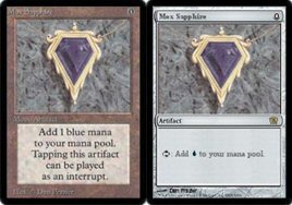
The”new” Mox doesn’t look so bad – until you realize you’re staring at Urza’s Tricorder, Legendary Artifact. In Fit in Window view.
As Bruce Richard wrote on the Star City Forums:
“I began playing with an image of myself as a wizard, standing in my long robes, searching through my ancient tome of spells for just the right spell to cast at the right time. Now, I will picture myself as a nerd with a pocket protector, doing a search on my Palm Pilot for the right coding to produce an effect.”
Another anonymous visitor wrote:
“Suddenly, these cards are not spells. They are fancy pieces of computer-generated cardboard that happen to interact with each other.”
Me, I think it’s the equivalent of celebrating the hundredth anniversary of The Fellowship of the Ring by rewriting it Tom Clancy-style.
It just looks wrong.
And aside from the futuristic feel, I dislike the Windows look because it seems to take attention away from the art. Having edited layouts for campus newspapers and magazines, I got the idea that a good design plays up a single dominant element to first catch the eye, then guide it around the page. In this case, you’d think they wanted to emphasize the now enlarged art.
But they also wanted to emphasize power/toughness, so they put it in a box. They wanted to emphasize the card type, so they put it in a box. They wanted to emphasize the card name so they put it in yet another box with yet more of those awful rounded corners. They even wanted to emphasize the artist’s name, for crying out loud, so they added that tiny graphic.
Have you ever seen your proverbial nerd study with a highlighter and turn his textbooks into coloring books? When he does it so badly that you just want to ask him to highlight what he thinks isn’t important?
All this emphasis cancels itself out, and the cluttered look just distracts you from the art.
(And in fairness, a couple of graphic designers voiced professional objections on the Star City Forum.)
Of course, the Palm Pilot look does give the foil finish a lot more elements to make shiny. I’m sure the handful of store owners out there who play with all-foil decks are breaking out the champagne right now.
Maybe the rest of us ordinary mortals who work for a living can ask Chris to put the new art back into the old layout?
There are a lot of wild theories out there. The most popular: Magic is being made to look more like Yu-gi-oh in another for the ten to thirteen year-old age bracket for the Pokemon fiasco. Take this predicted evolution, courtesy of Yawgatog from Misetings.com:
The other conspiracy theory holds that Eighth Edition is just the first step to making Magic an online-only game. Me, I just hope they get the online petition and remember that this is a fantasy game. All I know is that the Phyrexian Colossus sample can pass for a Mech card.
Right before typing this paragraph, I stuck my hand into a pile of cards and held up my Beta Timetwister and Demonic Tutor. The eerie color finish and the awkwardly-placed card text look unpolished compared to today’s better laid out cards… But they’re a lot more capable of making me feel like Raistlin Majere for a few seconds than any of those Magic XP cards.
If The New Look does everything but give you that musty spellbook feel, maybe Magic wasn’t broke after all..
Of course, since Wizards also owns D&D now, who am I to say that Raistlin never used a Palm Pilot?
If I Were Mark Rosewater For A Day…
The classic look worked great for ten years, but no one resists change just for the sake of resisting it. I remember going to the Invasion Prerelease hoping to open a split card. I did, and I’ll never forget how my kid brother stared at it for a long time when I came home.
Change is good.
Thing is, you can’t make changes just for the sake of making them, either. Some forum visitors are saying that the negative reaction – overreaction? – is normal.
You griped about Urza-era rules simplification..
You griped about the loss of interrupts..
You griped about the last Extended rotation.
Yet you’re all still playing – and griping about The New Look.
True… But those are some very specific, very objective complaints being voiced, and I wouldn’t dismiss them with a simple,”They’ll grow on you in a year.”
If it’s really time to give Magic a new paint job, maybe there are other ways of doing things.
And maybe some of them have been voiced long before The New Look was unveiled.
1. Focus On The Art, But Keep It Simple
This is a fantasy game, so you can’t have a cluttered, techy look. But you don’t need that to play up the art.
Take a look at the amazing wolf head Hymn to Tourach art, for example – a clear favorite of old school black players. It just captures the effect so wonderfully that you stop to look at how that wolf head pops out of the midnight fog.
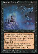
Imagine this little piece, for example, allowed to bleed to the right and left, all the way to the card’s border. Then, instead of sharp lines on the top and bottom, what if you just let it feather, blur or fade into the background?
That would probably play up the art, and better capture that spellbook or scrying glass feel.
Think about the same effect framing the mysterious rays of Cursed Scroll, or the violent fringes of any explosion depicted in a red card. Wouldn’t that be a lot better than Fit in Window view?
Another idea might be to enlarge the art by simply letting it take up all the space on the card and provide its own background. They something like this for Unglued land, and players of all stripes still swear by Unglued land to this day.
2. Emphasize The Art By Having Different Layouts For Different Permanent Types
If you want to make comparisons to the look of other card games, there’s a lot more to talk about than foils. My kid brother used to collect BattleTech, and I loved how the layout really framed Mech cards with more than an ordinary-looking box look. Trying a Star Wars board was a different feel, too, with the distinct card layout for the equivalents of land.
If you want to emphasize power/toughness and card type, why not go all the way and make different layouts? Magic has a lot of card types, but it would be easy enough to make four: Land, Creature, Non-creature permanent, and Non-permanent spell.
At the very least, you could have special layouts for land and creatures – because everyone separates them into implied zones when they drop them onto the table anyway, with the library and graveyard making a third implied division.
Especially in Limited, the game revolves around creatures, so you want a layout that makes them larger-than-life, and makes them practically jump up from the table to bare their fangs and claws at your opponent. You can change the dimensions of the original paintings and let the creatures stretch their legs all the way to the bottom of the card, then change the shape of the text box and leave it in the lower right corner. Maybe orient the art a little more to the left, to compensate.
For land, you could do even more and do away with the background altogether, since land art are like backgrounds already. Text boxes could float somewhere at the bottom or the lower left corner, and basic land could have nothing more than a plain disc with the mana symbol and land type.
We can draw inspiration from existing Token cards and Unglued land. Looking at Unglued, you can see how fresh it can be to break out of the boxy look-instead of turning it into the XP look. If you’re a mage in a multiverse, the very shape of the card elements should let you feel that borderless sojourn through cloud, mist and smoke.
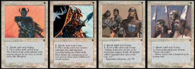
3. Bring Back Alternate Art
If a player who began very late (say, Odyssey) asked me what he missed from ’95 or ’96, I wouldn’t answer”Interrupts” or the Mirror Universe kill. Not even Mark Rosewater favorite Black-Lotus-and-Plague-Rat deck.
Alternate art.
That, I think, defined the look of some of the older sets. Heck, alternate art made Fallen Empires a very memorable set for me.
Remember that Magic is also a collectible game. I remember making a lot of trades with a high school friend where we called each other up and read Fallen Empires flavor text to each other and traded for what we didn’t have yet. We were that picky about commons, so imagine how much fun that was.
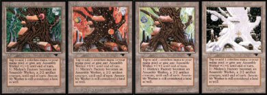
I have to say that even after all these years, the Foglios still hold the throne for creativity with alternate art, as immortalized in the four seasons of Mishra’s Factory from Antiquities:
If you were once one of the kids who tried to get all twelve Urza Lands reprinted in Chronicles, then you sympathize with me.
I don’t know why they discontinued alternate art. Maybe they didn’t wanted to scrimp on the artists. Since Wizards itself announced how Magic is played in so many countries, maybe they now have the volume to justify alternate art for commons again.
Think of how perfect alternate art common creatures would have been for Onslaught block. If you think your new Soldier or Cleric deck brings a fresh look to your gaming table, take a look at this obscure grunt from Fallen Empires:
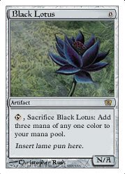
4. Stop The Puns… Please!
Enough said.
“Puns” encapsulates the collective annoyance of old-school players with”new” (meaning post-Legends or something) flavor. Check out this Eighth Edition Black Lotus spoof from a Dutch TheManaDrain.com regular:
I remember reading through proposed flavor changes in Duelist around Mirage. The old design teams planned to write flavor text using specific”voices,” from Ertai’s swagger to Gerrard’s melodrama. I think that marked the point when the flavor went downhill for me.
In my scrub days, I enjoyed just flipping through cards in a box and reading through the literary flavor text, back in the days when Magic had no unifying storyline yet. They make very old cards that survive to this day like The Abyss all the more memorable.
Here are a few oldies:
…There was no trace! Of aught on that illumined face…-Samuel Coleridge,”Phantom” (Hypnotic Specter, Beta)
“O! it is excellent / To have a giant’s strength, but it is tyrannous / To use it like a giant.” -William Shakespeare, Measure for Measure (Giant Strength, Legends)
“The bird of wonder dies, the maiden phoenix, / Her ashes new-create another heir / As great in admiration as herself.” -William Shakespeare, King Henry the Eighth (Firestorm Phoenix, Legends)
In fairness, I think Wizard got the message, and reemphasized”real world flavor text” all the way to its Eighth Edition poll.
A simple step further, though, would be to let a few of the famous quotes slip into the less story-specific cards of expansions sets, instead of limiting them to main set reprints. I think they add a crucial bit of dignified intellect to a game we’d like to think caters to intellectual people.
I don’t know if a Yu-gi-oh layout will grab potential young players. But I do know that Shakespeare and the Qu’ran in my old cards grabbed me.
5. Better Storyline
I am a confessed Gerrard-hater, and I’ll even proclaim how Master of Arms got the single most pathetic Sixth Edition rules change. Unfortunately, Kamahl isn’t racking up points with me, either.
A storyline is what ties together all the aesthetic elements of a collectible card game and, frankly, I think that’s Magic’s weakest point vis-Ã -vis its competition-not how its foils look. Art, card layout and flavor take on new beauty once you can place them in a fantasy universe you can vividly visualize.
Compare playing Magic to Star Wars, Star Trek and BattleTech, and it’s still a far cry from how you identify with your Anakin or Victor Steiner-Davion card. Sure, those are big franchises – but Legend of the Five Rings is still the best in the storyline department, and Bayushi Kachiko did very well on her own. (And just compare Bayushi Kachiko’s performance to Sisay…)
Legend of the Five Rings didn’t cut corners with the story – so much so that it had tournaments whose outcome could affect the storyline and future expansions. Heck, I don’t play L5R, but I collect L5R novels because I want to follow the story.
If Magic has grown so big, then maybe we can spend some money on the storyline in addition to the artists. Wizards owns D&D now, so it can’t say it has no experience in that department.
The only Magic novel from the newer series I actually liked was The Brother’s War, and I really hate spending money on Magic novels.. If Wizards commissioned special Tenth Anniversary hardcovers by R.A. Salvatore, Michael Stackpole or Robert Jordan, though, I’d even promote them in this column.
Closing Note
While I was outlining my thoughts, I e-mailed Randy Buehler, Aaron Forsythe and Mark Rosewater, hoping to get a little more inside information about the layout change. They didn’t reply, but I did ask what kind of marketing research they did – did they use any focus groups aside from R&D? – and why they never ran proposed draft layouts on MagictheGathering.com. After all, aren’t they trying to tells us how much they value our opinion with all their polls, down to whether Yoda could cream Gandalf in basketball?
Opinions posted online aren’t very reliable, not even the present forum outrage, so as a Management degree holder, I’m really interested in how they did their product testing.
Maybe they could share this with us before they roll out MagicXP (since it doesn’t look like there’s any stopping them).
Then again, maybe there’s truth to Star City Forum regular BeatStyk’s theory:”I think they learned after the outrage about the pricing on Magic Online, it’s easier to ask for forgiveness than to ask for permission.”
No, seriously, you can admire the transparency and customer participation Wizards has been trying to build, all the way to how Aaron Forsythe champions corporate integrity as the reason why they won’t reprint Ancestral Recall anytime soon.
It’s just sad that the transparency broke down in such an emotional issue as this one… they even unveiled it to the Pro Tour players first instead of the young fans.
Oscar Tan
rakso on #BDChat on EFNet
University of the Philippines, College of Law
Forum Administrator, Star City Games
Featured Writer, Star City Games
Author of the Control Player’s Bible
Maintainer, Beyond Dominia (R.I.P.)
Proud member of the Casual Player’s Alliance
P.S. – I hope you enjoyed this non-strategy discussion. It was nice talking about something lighter, and I put in some extra time doing my own Photoshop work on this one. Thanks again to Chris Flaaten for providing a wonderful starting point for the article, and to the MTGNews Ultimate Spoiler Generator for a lot of the art I used. And, my apologies if the article took a while to load, but I thought you couldn’t talk about art without showing some of it.