Oath of the Gatewatch lands at an interesting time for Magic: The Gathering. Oath of the Gatewatch (or OGW, as I’ll call it from now on) is the first “small” set of the new two-sets-per-block system, it’s the debut of the colorless mana symbol, and it’s also the wrap of the “origin story” for the planeswalker crew we’ll be seeing a lot of for years to come.
OGW also was the most-spoiled (i.e. not officially previewed, but spoiled-spoiled) set since New Phyrexia. In contrast to how Wizards publicly handled the New Phyrexia “Godbook” leak, the Wizards response was less “calm, collected corporate” and more personal, almost lashing out in its ferocity. Wizards wanted to reveal the colorless mana symbol in its own way, on its own time, and it didn’t get the chance.
But the full set is revealed, with the blessing of Wizards, and that means it’s time to buy some cards. It’s also time for all the players and pundits to form their opinions and broadcast them to their circles, however small or wide. I’m no exception.
Instead of going over the tournament implications of various cards, though, I’ll be looking through them for flavor highs and lows, whether that’s killer art, groaner flavor text, or even a small design touch that truly “makes” a card. I won’t cover every item — sometimes there’s just not much to say — but if it catches my eye, I’m tapping the keys.
Before going over specific cards, I’d like to cover two other points: the colorless mana symbol and the “story cards” of OGW.
The Colorless Mana Symbol
Here’s my short take: the colorless mana symbol is, by a fair distance, one of the top accomplishments of Wizards graphic design in years. It was a high-stakes project — not so high-stakes as, for example, brainstorming how to tell humans 10,000 years in the future that a repository for nuclear waste is “not a place of honor,” but significant in context.
Think about all the ideas packed into the concept of colorless mana. There’s power, of course, but also a certain indefinability. It can’t be put toward specific purposes; it can pay for the one generic mana of Grizzly Bears, for instance, but not the green. Colorless mana is “something yet nothing,” but also its converse, “nothing yet something.”
How does the colorless mana symbol get those ideas across? It’s monochrome, all black and light gray, with the pale platinum color on the Wastes basic lands sharply different from the bold black outline in mana costs and text boxes. The diamond shape with a void in the middle is instantly recognizable — it actually reminded me of the Red Crystal, an international humanitarian emblem — and that void, in the context of Magic, reflects the idea of “something yet nothing,” a container with naught inside its walls.
But there’s one significant difference between the shape of the Red Crystal and the colorless mana symbol: the sides of the colorless mana symbol curve inward, just enough to be visible on the small symbols in text boxes, more obviously on the Wastes cards.
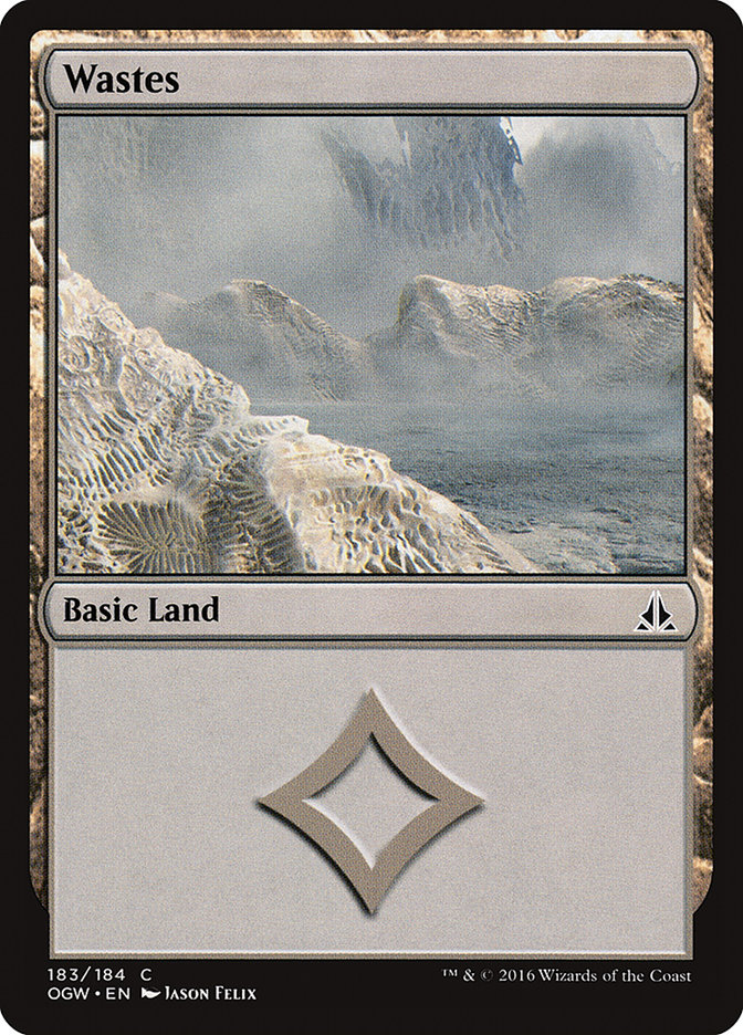
This curve makes the colorless mana symbol more welcoming than a straight-sided version would be and ties it into the more obviously curved mana symbols for white, blue, black, red, and green. Especially within the context of the Wastes cards, the curve matters. Beneath all the corruption and Ulamog’s draining-dry or Kozilek’s thing for bismuth, there’s power still in that land.
And where there’s power, there’s the potential for life to rise again.
The Story Cards
As with Battle for Zendikar, there are several “story cards” outlining key moments of the OGW story. While these “story cards” can be misleading (as Aligned Hedron Network proved to be, showing a moment of seeming success before Ob Nixilis ruined everything), Wizards has been rather vocal about OGW ending on a positive note — and after all the “downer” and ambiguous endings of the last few years (the back-to-back downer notes of Rise of the Eldrazi and New Phyrexia, the did-anything-really-improve weirdness of Theros and Dragons of Tarkir), frankly we’re due for a happy finish.
Of course, that happy finish as far as Zendikar’s concerned may have dire consequences for the rest of the Multiverse, but whatever, let’s party!
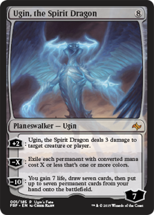
Meanwhile, Ugin’s muttering, “Why did you, why would you…”
Key storytelling cards of OGW:
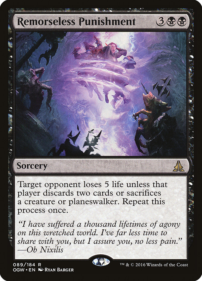
Remorseless Punishment – Ob Nixilis hits his enrage timer and goes wrecking ball on our heroes. Described in “Retaliation of Ob Nixilis.”
Kozilek’s Return – Exactly what it says on the tin.
Devour in Flames – Chandra Nalaar has had quite enough of Ob Nixilis, thank you very much.
Call the Gatewatch – The four planeswalkers face down Ulamog and Kozilek. In a roundabout way, this feels like a rejoinder to an idea I and some others have had over the years: that planeswalkers are, by default, sociopaths who are enabled by planeswalking to do whatever they wanted and to New Phyrexia with the consequences. Gideon, the paladin with the high charisma score, has convinced Jace Beleren to come around to Gideon’s views instead.
Comparative Analysis – Having decided to stick it out on Zendikar, Jace goes into research mode.
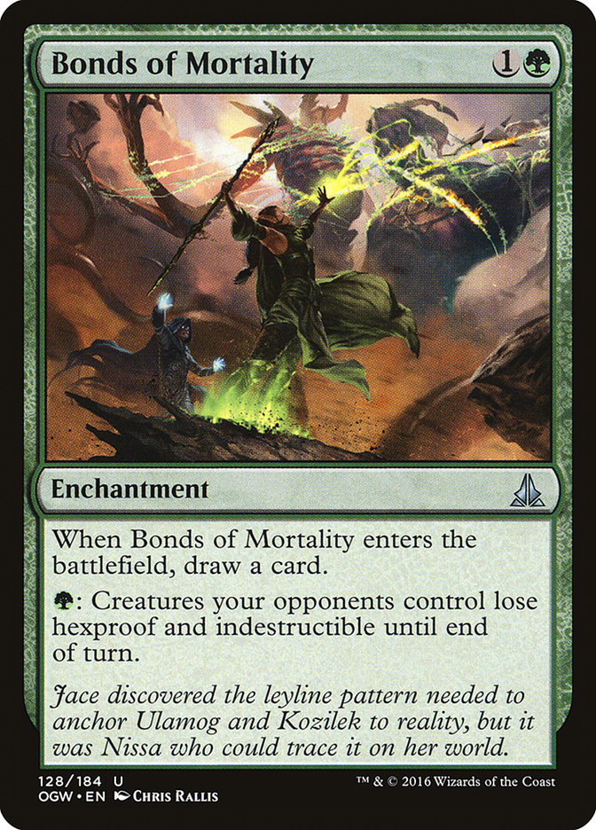
Bonds of Mortality – Jace solves the puzzle, but Nissa actually puts the pieces together.
Unity of Purpose – It falls to Jace to give a nice rallying speech to the troops, and he promptly goes “WWGS?” (What Would Gideon Say?) on us.
Lead by Example – Gideon and Nissa start smashing Eldrazi.
Cinder Hellion – Chandra has some interesting battle tactics.
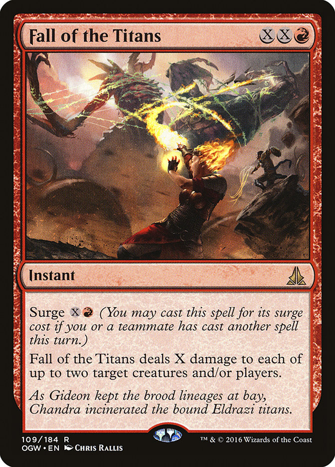
Fall of the Titans – Chandra does what she does best. So does Gideon.
Zendikar Resurgent – After the defeat of the two Eldrazi titans, the magical happy Disney flowers come out.
The four Oaths – I’ve put them here because I think the Gatewatch truly forms at the end, after the immediate Eldrazi threat to Zendikar vanishes.
Those are the main story cards. Putting them aside, it’s time to look at the highlights and regrettable moments in OGW.
Colorless – Nonartifact, Nondevoid

That’s a lot of header to say “the colorless Eldrazi,” but so be it!
Eldrazi Mimic – Kozilek and his brood tend to have short, cryptic flavor texts. This flavor text doesn’t quite work as well as a few others because it’s so non-specific and the phrase “consistently inconsistent” shows up elsewhere in culture. (Frankly, it sounds like the “perfectly imcomplete” line from Jessie J’s “Masterpiece.”)
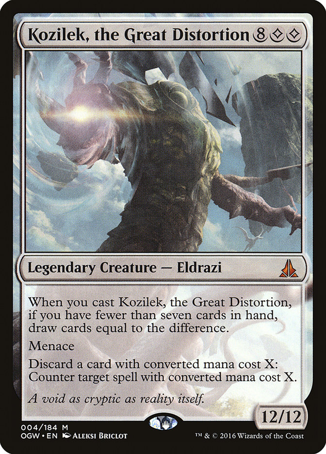
Kozilek, the Great Distortion – Mike Linnemann’s already said most of what I would say about Big Papa Kozilek. The short version: this probably wasn’t the original art made for Kozilek’s card and instead was a swap-in late in the game.
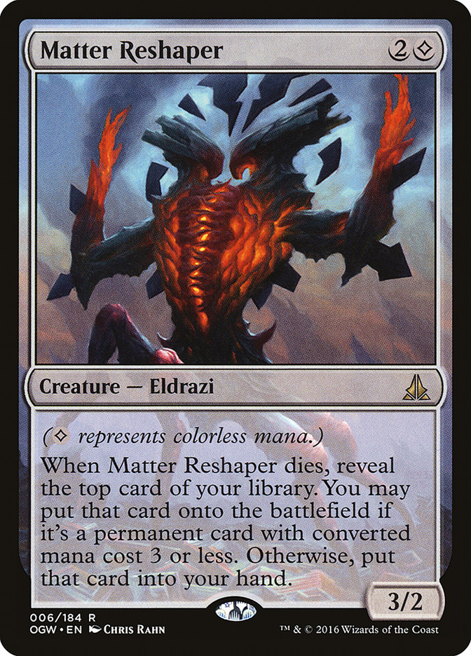
Matter Reshaper – Chris Rahn was on his art game for this illustration. In his hands the unnatural colors of Kozilek’s brood come alive, and the weird symmetrical shapes lie in that tricky space between meaning and non-meaning. It reminds me of the double-headed eagle found in European heraldry, except with the heads turned in rather than out.
White
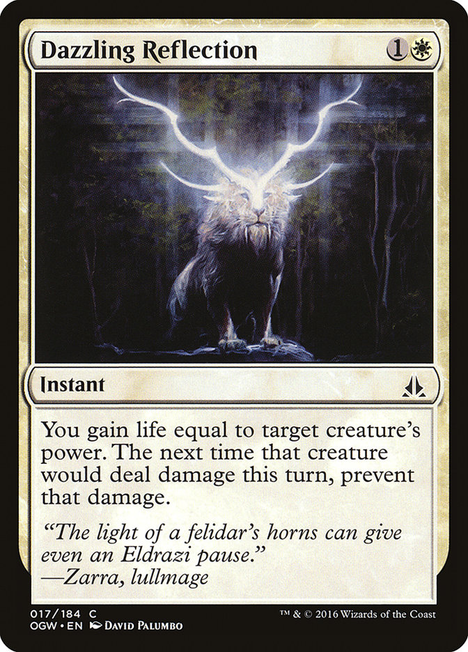
Dazzling Reflection – Knowing artist Dave Palumbo, this piece started as an oil painting and had digital effects on top of it. Either way it would’ve made an awesome prog metal album cover.
General Tazri – Usually Chris Rahn is awesome and I can count on him to elevate even humble cards like Arashin Cleric or Qasali Pridemage, but on this legendary creature I’m a little underwhelmed. The environment is too big for there to be proper focus on the general, there’s a weird overlap between her shoulder and a rock behind her, and the background doesn’t feel all that finished.
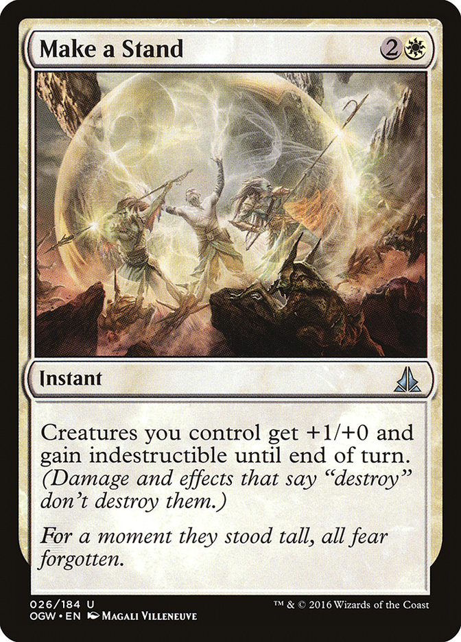
Make a Stand – The real shiver is when you realize that this bubble can’t, won’t last. But for an instant, there is glory.
Ondu War Cleric – This technically isn’t Ben Maier’s first illustration for Magic, but since his debut was the Intro Pack alternate art for Defiant Bloodlord, calling this his “regular set” debut (alongside Stoneforge Masterwork) is fair. As for debuts, Defiant Bloodlord shows off his talents better than this piece. The pose is super-awkward, especially with the one sword arm behind the head. Overlapping visual elements everywhere.
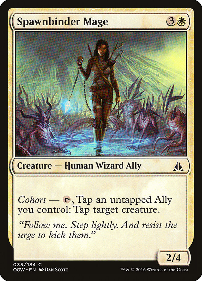
Spawnbinder Mage – A rare humorous moment on Zendikar, not quite gallows humor but its kissing cousin.
Stone Haven Outfitter – For me, everything on this card comes together. The striking figure of the bald kor, the simple yet true flavor text — it’s a great big Vorthos “yes” from me.
Blue
Blinding Drone – Artist Lake Hurwitz slays it again, lending this common Eldrazi an otherworldly stained-glass elegance to go with the creep factor. Almost certainly the art influenced the flavor text in Ayli’s voice.
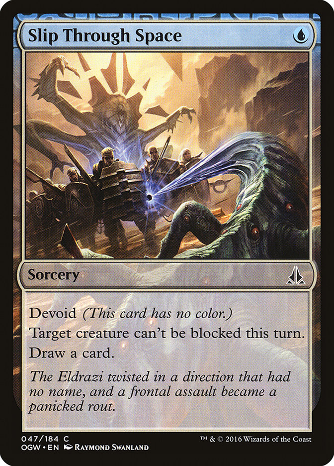
Slip Through Space – I love this flavor text and its twisty words that tell a tale of disaster.
Thought Harvester – The flavor text doesn’t really require knowledge of what gomazoa are — the name alone sounds creepy — but they’re jellyfish. Of the Zendikari sky. Freaky, huh?
Cyclone Sire – “Sire” is an oddly masculine term to use in this context, especially when Wizards generally tries for gender-neutral language when possible.
Gift of Tusks – This flavor text made me think about what it could possibly mean. Then I got it — “Elephants never forget” — and I regretted getting it.
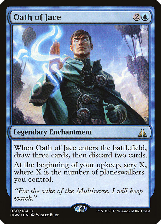
Oath of Jace – Visually, this and the other Oaths confuse me. What’s the enchantment? The sigil glowing on the palm? Because that’s not the first thing I see in the art. The first thing I see is Jace.
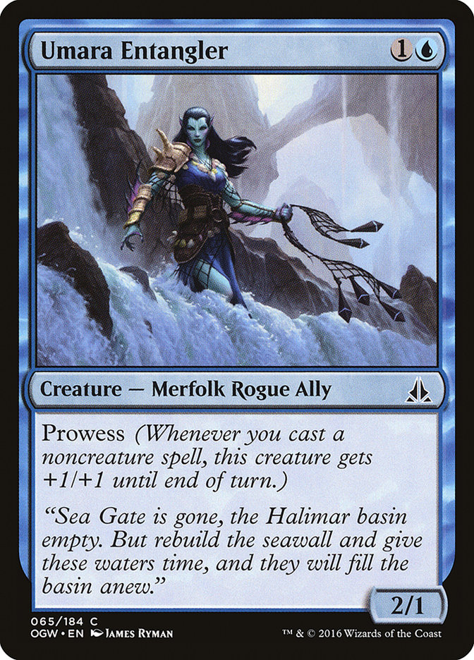
Umara Entangler – Four lines of flavor text is a luxury, and the writer made the most of it, telling a bit of story about the Halimar Basin…and how it could be restored.
Black


Havoc Sower, Inverter of Truth, Kozilek’s Shrieker, Kozilek’s Translator – All four of these cards have “Eldrazi are weird” one-liners, a form that perhaps was overused in the end. Of these four, only Kozilek’s Shrieker sticks with me in a good way. Listen to the sound, listen to the sound…
Witness the End – For all the terrible grandeur of the Eldrazi titans, it’s the small figure, almost invisible within the landscape, that is the emotional focal point of the art. Chills.
Null Caller – Kalastria Healer says hello and once again complains about not getting any respect.
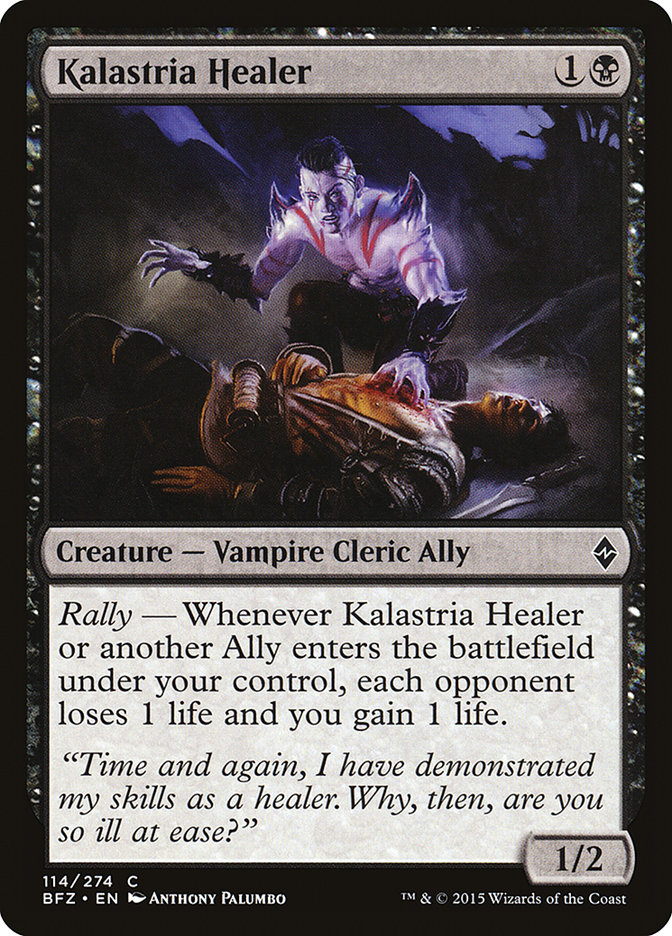
“Are you serious? I was just in the last set…”
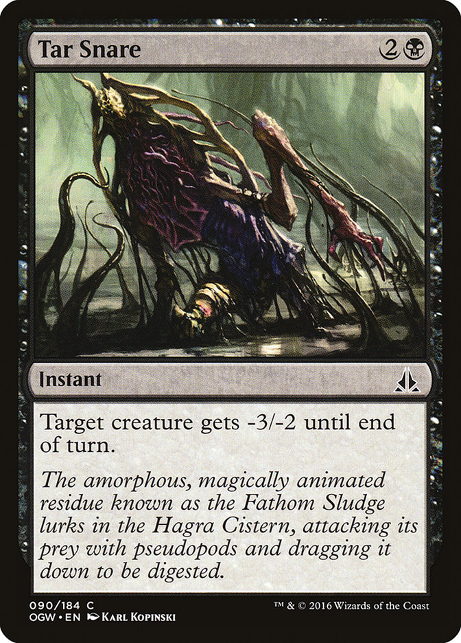
Tar Snare – Sometimes long flavor text enriches understanding of the game’s world. Sometimes it gets bogged down in adjectives and overly Latinate words. This is one of the latter cases.
Red

Consuming Sinkhole – One of those cards that’s “so wrong, it’s right.” The bizarre combination of a sinkhole — a land phenomenon! — stuck in a clear blue sky is a surreal match for the rules text that either exiles a creature land or goes right to the opponent’s face for no discernible reason.
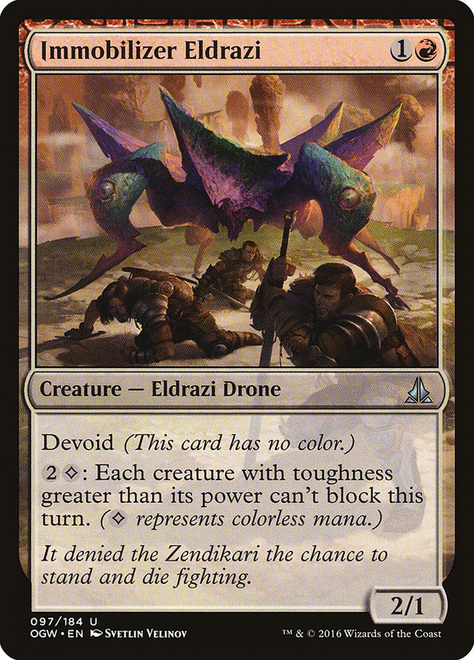
Immobilizer Eldrazi – The flavor text may not be a one-liner, but it’s still a terrific punch to the gut.
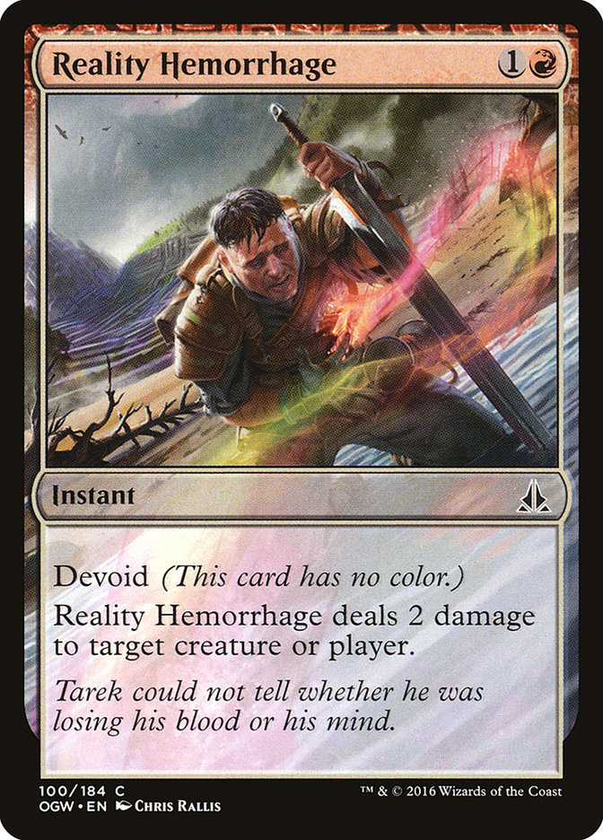
Reality Hemorrhage – Why not both, Tarek? It might as well be both. You’re not getting up from that.
Chandra, Flamecaller – The art holds a weird contradiction. We know from other “story” cards that Chandra’s one of the heroes of the set … and yet here, surrounded by Kozilek’s bismuth, she and her grin seem positively devilish! Nobody tell Tibalt. He’d get jealous.
Cinder Hellion – This is the Magic art debut of California illustrator Jason Kang, along with Loam Larva and Saddleback Lagac, and it’s a testament to his polish that he slips into the Magic “look” so effortlessly. Interestingly enough, as an artist he worked on Hearthstone before Magic!
Expedite – I see the name, and in my head, I hear postal clerks. Sorry, I can’t help it.
Goblin Freerunner – Dear flavor text writer: if you’re going to rip off the line about “old bold pilots,” have the dignity to do it wholesale and don’t try to hide it with the word “ambitious.”
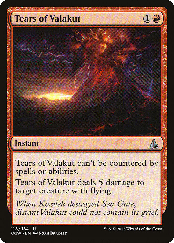
Tears of Valakut – Between the name, the Noah Bradley illustration, and the elegant flavor text, this uncommon feels more epic than most of the rares and several mythics in the set.
Green


Ruin in Their Wake – A pretty awesome illustration that nonetheless fails an important criterion: how is it relevant to the game action of fetching up a basic land? This art feels more like land destruction than land tutoring.
Harvester Troll – This is the first Greg Staples artwork seen in Battle for Zendikar block and it doesn’t quite match the aesthetic of its peers. I suspect the illustration was pulled from the “unused” files.
Nissa’s Judgment – It’s only fitting that this card, like its namesake in the long-departed Magic novels, isn’t good.
Pulse of Murasa – I wish this flavor text, which plainly was written as a chant, had been broken up into its lines — as printed, the chant takes up four lines anyway — and had more punctuation added. Something on the order of:
“Little flower, twirl and bloom.
Arise from this, your rocky tomb.
Little warrior, slash and brawl.
Be born again to free us all.”
Vines of the Recluse – It’s saying something about the peculiarities of Magic’s vocabulary that this card assumes its audience knows “recluse” means “spider” in context, not “hermit.”
Gold, Artifact, and Land
Ayli, Eternal Pilgrim – While I’m sad there won’t be as many awesome Cynthia Sheppard paintings in Magic now that she’s an art director for the game, she hasn’t lost her touch, as this gorgeous painting of the legendary cleric Ayli shows.
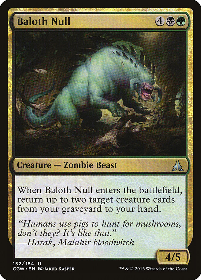
Baloth Null – The comparison to
Relentless Hunter – Big family, huh? This is either a nice, subtle insight into Zendikari kinship structures or careless hyperbole. I’d like to think it’s the former.
Weapons Trainer – The name is a bit dull, but not every name sparkles. The flavor text containing “weapon” and “training,” though? That repetition between name and flavor doesn’t make any written part of the flavor come off well.
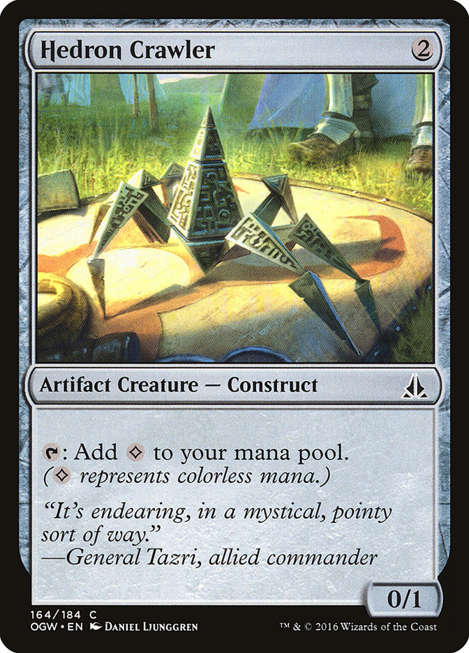
Hedron Crawler – General Tazri is absolutely correct. For a pointy artifact creature, it’s totes adorbs.
Stoneforge Masterwork – Ben Maier’s better debut card, a simple and clean set of armor he didn’t feel the need to over-complicate. I can respect an illustration that just gets the job done.
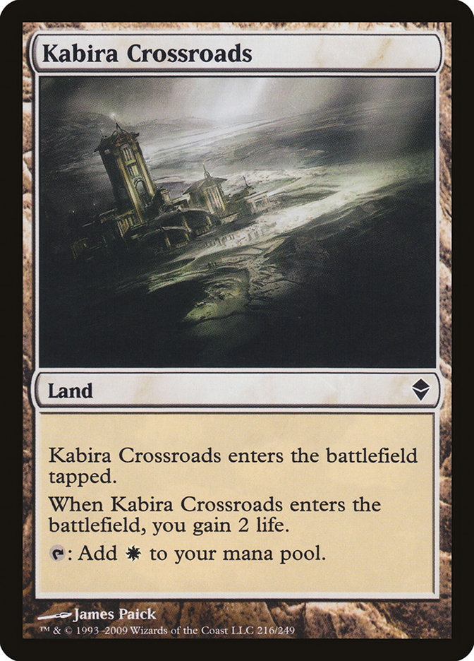
Corrupted Crossroads – As I saw mentioned by Cary Thomas Barkett (aka Vronos), this card is a callback to Kabira Crossroads from the original Zendikar set.
The enters-the-battlefield-tapped lands – As Blake Rasmussen pointed out when he previewed this cycle, some of the names chosen back in Invasion simply weren’t appropriate for other settings, particularly Shivan Oasis and Urborg Volcano. On the other hand, I’m unconvinced that “Meandering River” is an improvement on “Coastal Tower,” and “Submerged Boneyard” is far wordier than the simple-and-clean “Salt Marsh.”
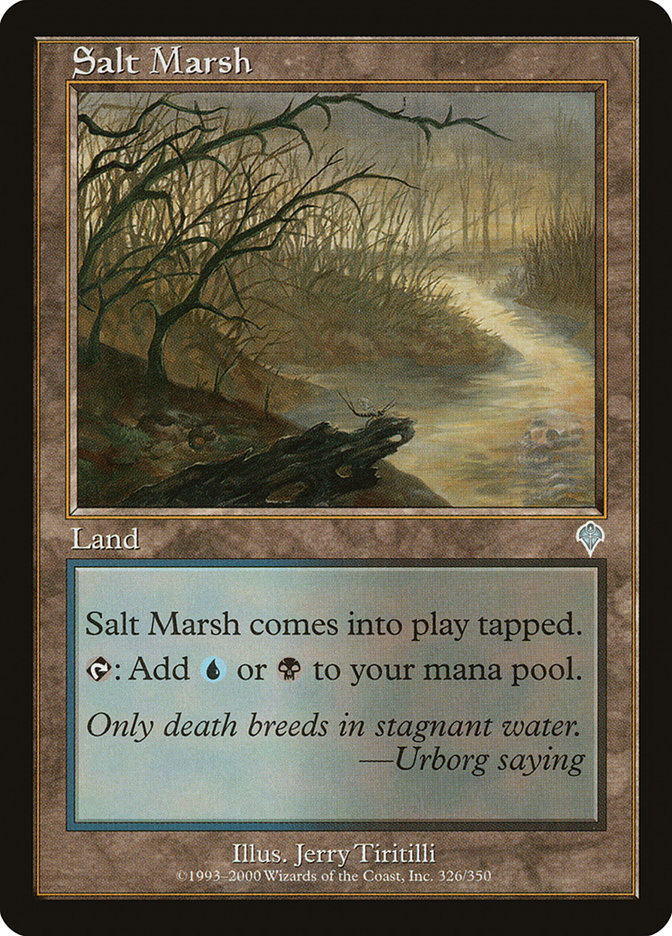
“Shh… sh-sh-sh. You did nothing wrong, Salt Marsh. I promise.”
Wastes – In the absence of a future reprint (and I fully expect one by Commander 2017), full-art versions of Wastes will be more common than their “regular” versions, which won’t appear in booster packs. It’ll be fascinating to see how prices change on the two types in the future.
That’s my flavor review for Oath of the Gatewatch. Now it’s your turn. What’s your favorite flavor in the set, and what could’ve been improved? The Facebook comment section is yours!