I’ve had a fair bit of time on my hands lately and I haven’t had a ton of interest in Constructed Magic. You could ascribe that to any of a number of reasons, though the result remains the same. I’m still deeply enamored with the game; I just don’t currently have the fire for 60-card formats. In times like these I turn my focus to my one true Magic love: Cube Draft. The Vintage Cube on Magic Online (MTGO) did a fine job of scratching that itch in July, though as the sun has set on the digital queues I’ve shifted my energy to tinkering with my own designs.
I’ve been interested in Cube Draft for over ten years now, and over the past five years I’ve spent some serious time refining my approach to designing Cubes. There was a time when Cube Draft mostly just meant drafting from a selection of the most powerful cards in Magic’s history, and the regular MTGO offerings largely follow this trend. These play experiences are enjoyable, but if you’re willing to invest some time designing your own draft environment, Cube can go much deeper and be much more rewarding than that.
There’s a fair amount of literature on Cube design scattered around the internet, though I’ve found most Cube content to be either incredibly broad or incredibly focused. What I want to offer is a resource for players that takes you from the general notion of wanting to design a Cube and helps to narrow your focus to cultivating your own Cube environment. For this purpose I’m going to offer a lot of broad-strokes advice and contextualize things as we go using my Grixis Cube that had a brief run on MTGO to give an example of my methodology in action.
A lot of introductory Cube articles suggest selecting a Cube size as one of your first steps, but I disagree pretty strongly on that point. I believe Cube size is a highly nuanced topic that warrants its own article entirely. The only thing you need to be aware of relating to Cube size before you start designing a Cube is that you need at least enough cards for the number of players you intend to play with to participate. That’s generally going to be about 45 cards per player, so for most groups that’s going to mean at least 360 cards for an eight-player booster draft.
Forming a Vision
Where I would actually recommend starting is with a broad vision for what you want the experience of drafting your Cube to be. Establish the style of Cube you want to build and come up with an elevator pitch for what you’re building. This could be based on a particular play style, a particular plane or block, your favorite format – really, anything you enjoy about Magic.
This vision should consist of two parts, technical and aesthetic. Your technical vision establishes the play experience that you aim to deliver, and your aesthetic vision provides parameters for card inclusion or exclusion that are independent of gameplay. Let’s break that down using the Grixis Cube as an example.
Technical Vision
The technical vision for Grixis Cube is to generate games that feel like playing highly interactive Legacy matchups. I wanted a lot of stack-based interaction, powerful combo decks, and aggressive decks that were pushed enough to force the other decks to execute their gameplans quickly.
This outlines a few potential archetypes for the Cube to support, but the important thing to hammer home in your technical vision is the general power level for your Cube. I originally considered a powered Grixis Cube, but my desire for interactive games was at odds with including the most powerful cards ever printed.
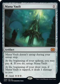
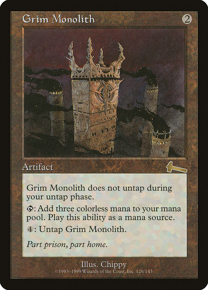
My target ended up being that players could do the most powerful things that could realistically be interacted with. I like to say that the ceiling for a card I would consider in terms of absolute power level lies between Grim Monolith and Mana Vault. Grim Monolith is incredibly powerful, but there are a lot of cheap artifact destruction effects like Abrade that keep it in check and plenty of two-mana counterspells come online even when you’re on the draw against it, whereas Mana Vault can often lead to casting a five-drop on Turn 2 and winning easily.
That’s a very specific line for power level and it’s not necessary to go quite that deep. What you will want to do is answer the question of what you want games to be about. Do you want a lot of planeswalkers or none? Do you want an environment without creatures? Maybe one without sweepers? How do you want to play Magic? Would you rather games were swingy or would you prefer a more narrow power-band?
Cube is where you get to highlight your favorite parts of the game and exclude the parts you’re less interested in. Start broad here and keep this vision in mind as you consider how you want to represent the colors of Magic and what archetypes you want to support.
Aesthetic Vision
Personally, when I design Cubes aesthetics take a backseat to gameplay, but that’s not true for everybody, and even though it is true for me, I still think it’s important to identify a Cube’s aesthetics.
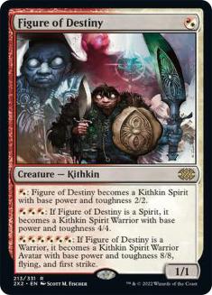
Aesthetics in this context means parameters for card inclusion or exclusion based on factors external to gameplay. For the Grixis Cube the aesthetic vision is that green and white mana aren’t required to cast any of the cards. I play loosely with aesthetics and include hybrid mana and some permanents that can generate mana of any color in my Grixis Cube, though a person who was more of an aesthetic purist might choose to exclude Figure of Destiny and Coalition Relic.
Format-driven legality also falls into the category of aesthetic concerns. I mentioned earlier that I include Grim Monolith but exclude Mana Vault in Grixis Cube, but that doesn’t mean that it’s a Legacy Cube. A handful of cards that are banned in Legacy such as Wheel of Fortune and Timetwister are included in the Cube. Power level is muddier than that. Constructed format legality and abstract power level in terms of Cube design are generally correlated, but not an exact match.
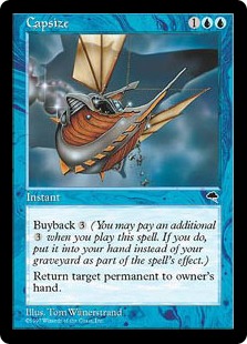
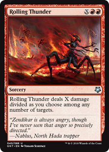
Similarly, Pauper, Peasant, and any other Cube designation involving rarities are all aesthetic categories. The power level of cards across rarities varies wildly, and there’s quite a range of things you can do to impact gameplay within these confines. My first Cube was a Pauper Cube with a technical vision of being the most powerful environment featuring only commons that valued including cards like Capsize and Rolling Thunder over ensuring that all five colors were balanced for power level.
A great example of a Cube that is driven more aesthetically than technically is my friend Calvin’s Ravnica Cube. The rule for inclusion is that all the cards must either be from a Ravnica block set or printed with art or flavor text that takes place on Ravnica in a supplementary product. Further, War of the Spark cards are excluded because the set involved characters from all around the multiverse and the set didn’t feel very Ravnican. It’s a real Vorthos masterpiece.
Another aesthetic concern is whether you’ll want to abide by the singleton rule. Most Cubes only feature one copy of a given card, and I personally find that balancing an environment becomes more difficult when you stray from this rule. I also believe that doing so is generally a detriment to replayability. I don’t consider duplicates to be a non-starter, though all of my Cube writing is going to be based on a heavy preference for singleton environments.
Themes and Color Identity
Now we’re ready to talk about what archetypes you want to support and what you want each color to do. I’d start with a short list of the most important things that you want and allow your design to evolve organically from there. If you try to jam too many ideas into the same environment you won’t necessarily be able to support them all.
In my experience you want to start small here and then focus on defining more archetypes once you’ve actually made a list of cards. One major upside of this approach is that it’s easier to change your Cube to support additional archetypes by cutting generic and redundant stuff than it is to cut archetypes. It’s also a much better draft experience for your friends if multiple players end up in a well-supported archetype than it is for somebody to attempt to draft something that isn’t realistically possible.
I love Storm as a Cube archetype, so that was one of the first things I committed to including in Grixis Cube. Reanimator and artifacts-matter themes were the other big ones, and beyond that I just wanted aggro and control.
There’s a lot less substance there than you might have guessed; like I keep saying, you want to start broad and get more specific as you go along. Storm eats a lot of card slots and it’s easier to take a list of generic beatdown and control cards and provide those strategies with a more specific identity later than it is to try to make a bunch of specific things work all at once. Part of this is that if the gameplay experience is unbalanced in your early runs, it’s easier to assess that the Cube has too many counterspells or burn spells than it is to do something like trim X tokens-matter cards and Y tribal cards to add Z spells-matter cards.
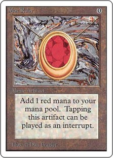
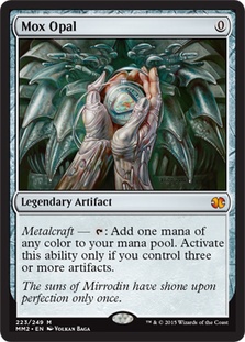
A more subtle point is that Cubes tend to have macro-archetypes and micro-archetypes. Artifacts-matter is one of the macro-archetypes of Grixis Cube and a ton of slots are committed to making sure your cards that care about artifacts work consistently. Mox Opal and Metalworker need a lot of support to work. Every two-mana rock that could reasonably be put in the Cube was.
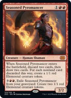
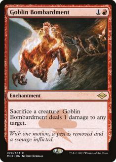
An example of a micro-archetype in the Grixis Cube would be the small tokens theme. Really it’s just a handful of cards that get better when you control a lot of creatures. Seasoned Pyromancer and Chandra, Acolyte of Flame are pretty good cards on rate, but you’ll value them more highly if you have Goblin Bombardment.
The artifact-matters theme was implemented in a heavy-handed fashion to allow a lot of flexibility. The tokens theme was just the addition of a couple of cards that play well with the good aggressive and midrange cards that happen to make tokens. Focus on your desired macro-themes to start, and then flesh out some micro-themes that can easily be slotted into your environment.
Another common example of a Cube micro-archetype that you’ll find in many of the MTGO Cubes is Splinter Twin combo. The combo pieces take a small number of slots and are fairly disjointed from the rest of the decks that they end up in. The macro-archetype for supporting Twin tends to be facilitating good blue control decks and from there you can pretty easily add the Twin combo cards or eschew them from your list as you see fit.
Color identity in terms of Cube design is a bit rigid given that color pie breaks aren’t super-common in Magic, but defining what you want the colors in your Cube to do is still an important step. My Grixis Cube list involves every color supporting control, aggro, and combo, though every color is somewhat skewed towards a specific thing. Red is the best aggressive color, black is the best combo color, and blue is the best controlling color.
A very minor color pie consideration worth pointing out is that I kept land destruction out of black despite it being heavily featured in red. Sinkhole was a card that I considered, but it just didn’t play to black’s strengths and Rakdos decks that curved Sinkhole into Molten Rain struck me as less likely than Sinkhole rotting in sideboards. Even in very powerful environments, you still want to make sure your colors have coherent identities. Curving Thoughtseize into Sinkhole is just kind of nonsense.
Those specific decisions aren’t fairly minor, but there are directions you could go that help make your Cube a more unique experience. For example, one of my Cubes leaves white without sweepers like Wrath of God and forces it to be a more aggressive color while also not including any red cards that are generically good in beatdown decks. An extreme example of playing with color identity is Simonot Timothée’s Twisted Color Pie Cube that had a run on MTGO a few years back.
Pick a few macro-archetypes; decide how aggressive, controlling or combo-centered you want your colors to be; and decide on any unique directions you want to take any of the colors. Once you’ve done all that, it’s time to start compiling a list!
Making the List
When it comes time to actually start adding cards I strongly recommend using either CubeTutor or Cube Cobra. These websites automatically sort your Cube by color and card type and make it really easy to analyze your list as you go.
When I built the Grixis Cube I took the incredibly inefficient route of doing a Gatherer search for every nongreen, nonwhite card ever printed, and I’ve gotta say I do not recommend that at all and I have no idea how I had that much time on my hands. I do think that, when you start making your list, it’s best to come up with a long list of potential cards and then to cut that list down to a playable Cube, but there are definitely better ways to do this than giving every Magic card ever printed a yes or a no.
You’ll very likely have an idea of some cards that you know you want to include, and it makes sense to list those to start. From there there are some tools you can use to track down inspiration and to efficiently search for cards that fit your themes.
Something that I spend a good amount of time doing is just looking at other people’s Cubes. There are tons of user-submitted Cubes on CubeTutor, and odds are somebody has built a Cube similar to the one you have in mind. If I search the word Grixis on CubeTutor I find a bunch of Grixis Cubes, and looking over those gives you tons of examples of cards that people deliberately put into a Cube along with the other cards they included to support playing with those cards. It also definitely doesn’t hurt to just familiarize yourself with the regularly recurring MTGO Cubes so you have an idea of which cards are commonly considered Cube staples.
These types of searches of play environments are far more fruitful than just looking at individual cards. I maintain a Cube that is heavily graveyard-centric that was fleshed out largely just from looking at every card in blocks that featured a lot of graveyard mechanics. It takes some time to go through every card in Innistrad and Odyssey block, but considerably less time than going over every card ever printed.
The other tool I use for narrowing searches is EDHREC. EDHREC is a Commander-focused website that allows you to search for cards that are commonly played in Commander decks with other cards. This search can be for a legendary creature as a Commander, or just as a card in decks. Let’s say that I want to support an aggressive spells-matter theme. I could go to EDHREC and search for Sprite Dragon and then go through a list of cards that other people are playing with Sprite Dragon in a singleton Constructed environment.
EDHREC is very good for searching for cards to play with legendary creatures, though some of the results are a little weird when you’re just searching for cards in the 99. Even still, most of the information is good and it addresses a bit of a blind spot for me when it comes to Magic knowledge. I tend to not know cards that have only been released in Commander products, and those cards tend to come up often when you search on EDHREC. Aminatou’s Augury is one of my favorite cards in Grixis Cube as a card that plays really well in Storm-style decks by being a very powerful spell to Ritual out and I never would have heard of it if not for EDHREC searches.
This part of the process takes a good amount of time, and if you’re like me ideas will come to you periodically at bedtime or as shower thoughts. The goal for this phase is to come up with a long list of all of the cards you’re considering and then to trim it down to your desired size. Then all that’s left to do is get the cards together. Personally I edit my Cubes with some regularity and have something of an affinity for heavily played cards, and I can say that I was very satisfied with a recent purchase of a handful of cards for a new Cube I’m building from SCG’s Heavily Played Singles Sale. They didn’t even tell me to say that.
To recap, the process of designing a Cube is to take a broad idea that excites you, to define your vision for how to turn that idea into a Cube, to come up with themes that you want to support in your Cube, to gather a list of cards, and then to narrow that down into the actual list you want to draft.
That’s the broad-strokes version anyway. I hope that this introduction to Cube design is useful for prospective Cube designers, and I can’t wait to get into more involved Cube topics. I have a short list of topics that I intend to take a deep dive into in the coming weeks, and I would love to know what questions about Cube design you have. Feel free to tag me on Twitter (@RyanOverdrive) with any such queries!

