Last week, John Dale Beety explored the idea of Commander as “camp” on Hipsters of the Coast, paralleling Susan Sontag’s 1964 essay Notes on “Camp.” This week, Donny Caltrider uses some of those same principles laid out by Sontag, and illuminated by Beety, to inspire art-related camp in your next Commander game and enhance your experience.
Hello folks, and thanks for joining me for the premiere edition of this brand-new collaboration column, where StarCityGames.com’s own John Dale Beety and I explore interesting and art-adjacent topics in an effort to look at Magic: The Gathering in new and exciting ways.
This joint effort kicked off last week on my home site of Hipsters of the Coast, where John Dale published his Notes on Commander as “Camp.” It’s one of the most interesting pieces of Magic writing I’ve read in quite some time; still, when he asked me to collaborate on this particular topic, I wasn’t sure exactly what I could add.
Choosing Art, Choosing Fun
I read his article a half-dozen times before I had an epiphany of sorts, remembering my own Choosing Commander Art series, and how that process changed my experience with the format. For me, that exercise of choosing specific art or building around certain basic lands or printings is at the core of campiness in Commander. Based on this inspiration, I’d like to take some of the Sontag quotes that Beety has referenced and use them as a recipe to show how Magic art can inspire flavor and fun within the Commander format and ultimately add a little more camp to your next Commander game through aesthetic card selection.
Choosing specific art when building your deck isn’t necessary to play the game, but Commander is one arena that allows a player to fully customize their decks, and in turn their play experience. One can make something truly unique, an extension of oneself, that is visually distinctive and one of a kind. And whether you realize it or not, it’s full of camp.
The Art of the Matter
“Camp is esoteric – something of a private code, a badge of identity even, among small urban cliques.” – Susan Sontag, Notes on “Camp” (Introduction)
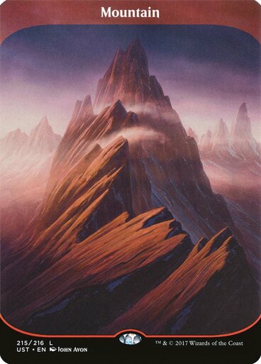
Choosing which artwork you’re going to play on a card-by-card basis is a part of all Magic, not just Commander. Even the most dedicated competitive player, somebody who might normally have no preference for choosing artworks, has, at some point, picked specific basic lands because they liked one over another, such as the Unstable basic lands. In a game full of visual cues, it simply can’t be helped. Magic would not be the same game without the art that appears on the card, and that art has helped ensure its longevity these last 30 years.
Choices, Choices
“One must distinguish between naive and deliberate Camp. Pure Camp is always naive.” – Susan Sontag, Notes on “Camp” (Note 18)
There has never been a time in the history of Magic that has given players such choices in their card selection. From Project Booster Fun to the ongoing crush of Secret Lair offerings to the alternate frames and styles found within the main set expansions, there is literally something for everyone. And if you want the traditional, tried and true frame, be it the now “retro” frame or the Modern frame that began during Eighth Edition, those options are still here too. This plethora of printings can be overwhelming, but it no doubt allows for great diversity in choices, even amongst Commander decks that seek to do the same thing with the same cards.
Variations on a Theme
“Objects, being objects, don’t change when they are singled out by the Camp vision. Persons, however, respond to their audiences.” – Susan Sontag, Notes on “Camp” (Note 21)
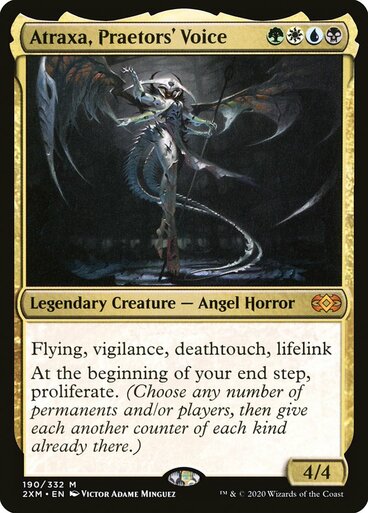
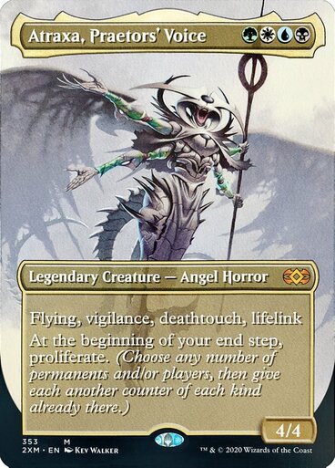
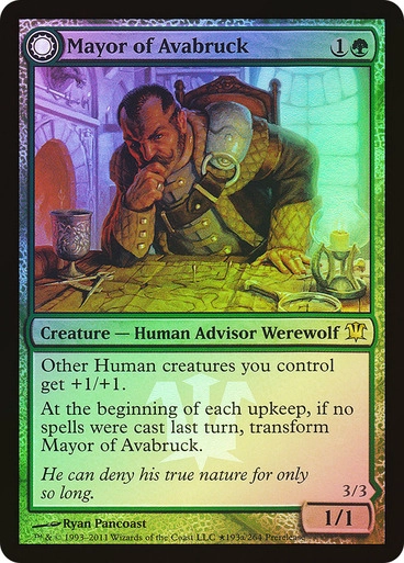
Let’s say you want to play the super-popular general Atraxa, Praetors’ Voice. You could build a dark and gritty version using the original foil by Victor Adame Minguez alongside the eerily beautiful New Phyrexia basic lands. Or, if you want something lighter, look at her second artwork by Kev Walker. This opens up an entirely new aesthetic avenue, coming in a regular and full-art frame that is classic Magic. It lets this contemporary Commander feel like those kitchen table games you remember as a kid.
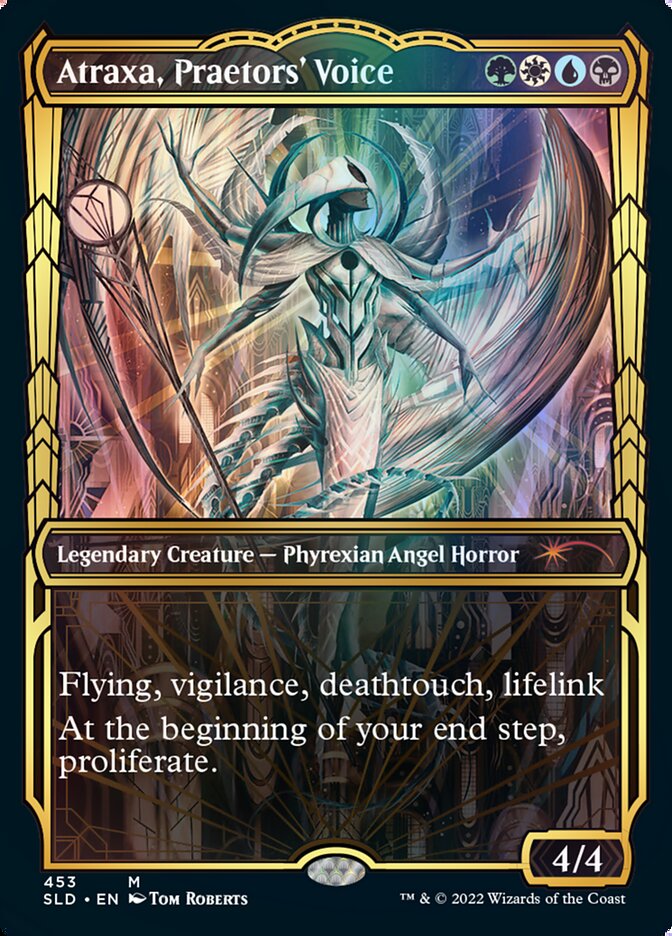
And, as I was writing we got yet another version, and with her newest printing, you can go full Gilded bling. I’m talking foil basics, Etched Foil and Golden Age Frames, the works, all the way to the special fancy dice and counters you get to proliferate. Yes, these artworks and printings are two-dimensional, but you as a player can make them anything you want to be. Be classic, be traditional, or be super-extra. The choice is yours (and none of them are wrong!).
Making Memories
“We are better able to enjoy a fantasy as fantasy when it is not our own. This is why so many of the objects prized by Camp taste are old-fashioned, out-of-date…” – Susan Sontag, Notes on “Camp” (Notes 30-31)
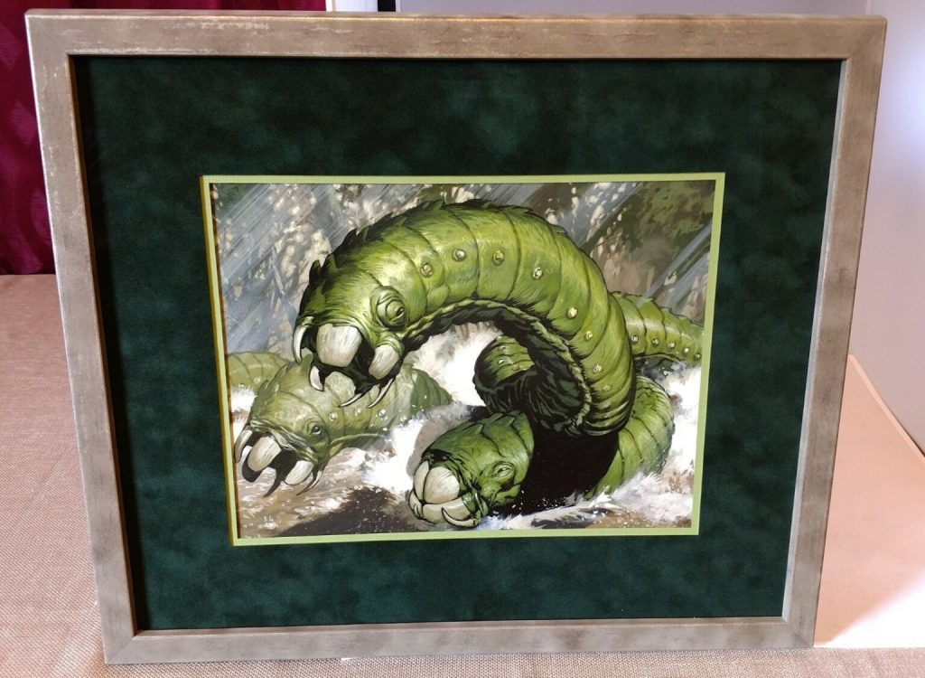
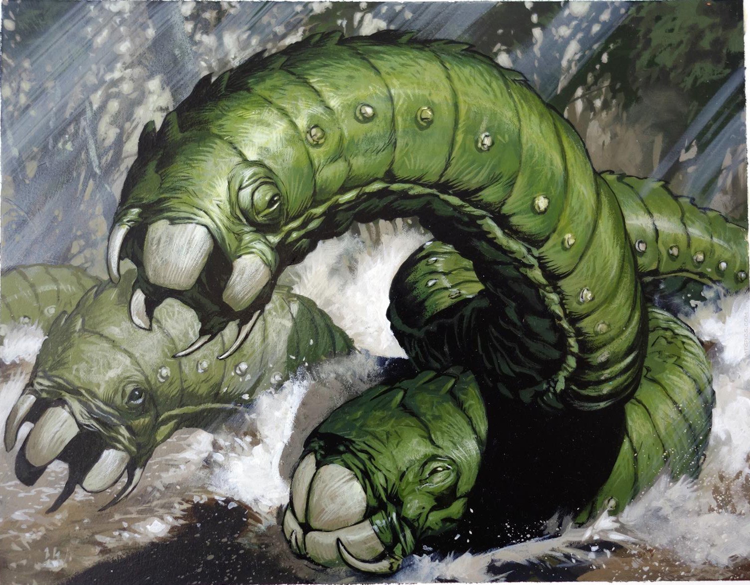
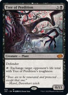
This customization and personal optimization often means not playing the best cards, but rather cards you just like, or have particular meaning to you. Crush of Wurms goes into several of my green decks, not because it’s the best choice, but because the painting hangs on my wall at home, and it holds a special place in my nostalgic memory as a kid player and my larger art collecting journey. Tree of Perdition stays in my Grenzo deck because one time (and only one time) I dropped an opponent to thirteen life, only to have someone else alley-oop them out of the game at instant speed with a card I can’t even remember. It was years ago and it’s still hilarious.
Moments You Can’t Believe
“It’s embarrassing to be solemn and treatise-like about Camp.” – Susan Sontag, Notes on “Camp” (Introduction)
Stories like these, centered around choices of artwork and pet cards, persist beyond the heat of battle. Most of my Commander games involve me telling stories about my cards as I play them, just as I have through this article: where they came from, who painted them, and why they’ve been included. I literally cannot shut up about art, and for me Commander is as much about the conversation as it is about the competition.
Years ago at IX, a convention for the sorts of artists who illustrate Magic, I played a game (not Commander, but Vintage Artist Constructed) with artist Ryan Pancoast on a local stream, while other Magic artists like Rob Alexander stopped by to tell stories about their MTG careers Playing an artist’s cards against that artist who is also playing his cards while talking about them: it’s one of the most surreal moments in my twenty years with the game, and just one of the stories I take with me to Commander tables even today.
Serious Whimsy
“The whole point of Camp is to dethrone the serious.” – Susan Sontag, Notes on “Camp” (Note 41)
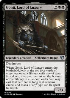
So the next time you’re ready to start brewing a Commander deck, let your mind wander. Make an entirely Heavily Played deck, like DJ’s Gonti Deck that Sam from Rhystic Studies told us all about. Build a deck made entirely of Artist Proofs. Try to get all the cards signed, or all the lands signed. Pick out a set of basic lands and build from there, matching card choice and artwork to the environment, as Magic did when it first started. These seemingly simply (or even silly) constraints add a bit of flavor and fun to the process, and if you’ve never done it this way before, I guarantee it will change how you play your games too.
“What [Camp] does is to offer for art (and life) a different – a supplementary – set of standards.” – Susan Sontag, Notes on “Camp” (Note 34)
This interaction between art and life is at the core of Commander, at least for me, and maybe for you too. Your Commander, the legendary leader who pilots your strategy and often steers your deck to victory, becomes a part of you as a player. It could be as a pet deck, or a playmat, or it could even hang in your home.
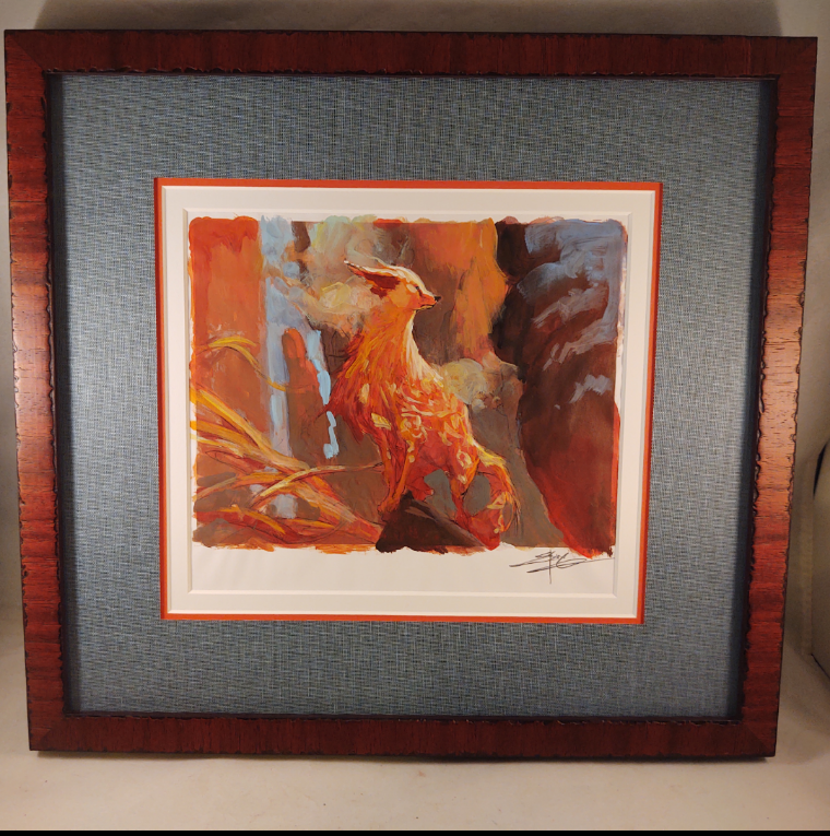
Imagine sitting in front of a painting or print of your Commander while you’re playing, their illustrative gaze looking down and willing your deck to victory. That sounds cheesy, but no more so than the idea of taking on the role of a Planeswalker and casting spells, which is how many of us started playing. That’s Camp, both then and now, and again, it’s what this is all about.
Fantastic Extravagance
“The hallmark of Camp is the spirit of extravagance.” – Susan Sontag, Notes on “Camp” (Note 25)
Whether it’s original artwork of your Commander, Artist Proofs with sketches, foiled-out fanciness, or just supreme Aesthetic Consultation, there is perhaps no better vehicle in all of Magic to flex extravagance. It’s where your favorite cards live outside your collection, just waiting for a chance to see play during your four-player pod at the next CommandFest. It’s an opportunity to talk about your experiences with the game, often with other people who also care more about the journey than the destination of reducing your opponent to zero.
“Camp taste is, above all, a mode of enjoyment, of appreciation – not judgment.” – Susan Sontag, Notes on “Camp” (Note 55)
Commander is camp because Commander can be whatever you want it to be. It provides players with limitless choices in every aspect of the format, from play style to deck construction and every facet in between. It’s completely customizable, non-optimizable, and, when you want it to be, totally art- and flavor-centric. Choosing your specific artworks means choosing your own adventure, drawing from all your past joys with Magic and setting the stage for every future joy.
You can tell the story of tomorrow with the art of today and years gone by. That, my friends, is incredibly powerful. That, my friends, is Commander as Camp.
“Camp is a tender feeling.” – Susan Sontag, Notes on “Camp” (Note 56)
John Dale and I will see you next quarter with another pair of articles, this time looking at the relationships between Great Cards and Underappreciated Art, and the reverse, of Great Art on Underappreciated Cards. Stay tuned, and thanks for reading.