I tend to find that the land art on basic lands is of a higher quality than that on the other cards. Maybe WotC allows artists to really push the pretty on their land art, or perhaps it’s the lesser impact of the style guide. I don’t know why, but the art on the basic lands tends to include the top pieces of art in each set, no matter what plane our artists are on.
Today I want to select my top four pieces of art from each basic land type. If I were making a core set in the future and I wanted to reprint four lands that I felt truly represented each color, these are the ones I’d pick. I do have some issues with how some of the lands are portrayed, and we’ll examine that more closely in the individual sections.
My basic grudge with a lot of basic land art is that it does not portray the philosophy of that color in the art. Think about it for a moment. This is a place that is massively connected with the mystic energy called mana. Any place so infused would physically demonstrate the philosophy of color. Therefore, I want that philosophy permeating the art. There is a mystical connection between the mana and the land and what happens there, and I need that psychology of each color to show in its lands. I understand if a certain plane interferes with that, because a place such as Ravnica or Lorwyn demands a different sort of art. However, in general, I’m looking for certain things from the art. We’ll discuss those now.
Forest
Forests are already virtually perfect. Green believes in the strength and power of nature unfettered and unruled. When I look at a Forest, I want to see nothing but nature. I don’t even want to see any signs of civilization, but if I do, I want it to be in such a way that it blends into the world seamlessly. Any image of a proper green Forest should be unadulterated nature right in your face. Since the vast majority of Forests already do this, selecting four pictures as my ideal vision of green is actually pretty easy. All I have to do is select the four prettiest, most breathtaking Forest pictures I can find. Here they are:
Forest (#244, Avacyn Restored), Eytan Zana
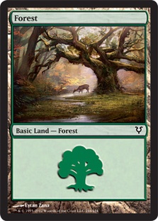
I wanted one piece of art for my four Forests that is virtually idyllic, and this seemed like a really attractive piece for that. Sure, it’s a recent card, but it also shows a landscape untainted by "civilization."
Forest (#248, Shards of Alara), Zoltan Boros & Gabor Szikszai
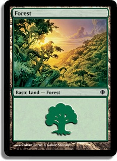
This is my pulled back picture. I wanted one piece of art in my four Forests that shows the grandeur of the landscape, and this beautifully does the job quite well.
Forest (#349, Odyssey), Jerry Tiritilli
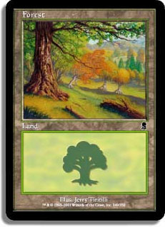
I wanted one Forest picture where we have a view of woods lit up by the nice sun, and since that’s a common image among Forests, I found one I thought was very lovely.
Forest (#247, Magic 2012 Core Set), Volkan Baga
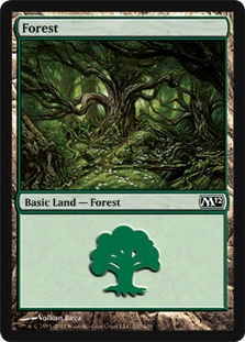
For the final Forest, I wanted art that shows where a Wurm or Baloth could come crashing down around you from the dark reaches of virgin woods, pristine and primal. The darker art here really services the concept of hesitation that any thinking person should have going into the heart of the woods.
Island
I have more issues with blue basic lands than any other by far. Consider blue. Blue is the color of artifice, magic, and twisting and warping nature. Green wants to live with nature, red wants to survive nature, black wants to decay nature, and white wants to harness nature. Blue doesn’t want any of that; it wants to truly conquer nature. Maybe it takes an animal and crossbreeds it with an extraplanar creature. Perhaps it gathers a plant and magically grafts new fruit or skin to it. Even a rock can be improved with a wash in a batch of artificial salts that makes the rock shiner and harder. To blue, nature is merely an ingredient in the recipe of improvement.
I’m puzzled by the vast majority of Island pictures that show nothing but nature and nature’s wrath. I don’t want some pristine image of a beach scene that could be from Bermuda. What I want to see is wizards conquering or ignoring nature altogether. A great example of this is the art from the legendary land, Minamo, School at Water’s Edge. When you look, you see a wizard’s structure at the edge and floating over a waterfall. The 2009 Planechase card for Minamo demonstrates this even better. Here is nature, in all of her fury, and she cannot touch the blue structure.
I want to see a basic land where a blue mage’s structure is standing nonplussed in the midst of a hurricane or tidal wave. I want to witness a tower on an island with magical beams of light pulling rocks from the ground around it into a protective cocoon. I want to observe an artificer’s workshop that has a long automated assembly line, pulling ingredients from the island and ending with making Golems. These are the perfect images for Islands, and we don’t have them. Instead, I’m just choosing those that are the closest while still looking good. I have to collect art from very specific planes in order to find what I need.
Island (#293, Champions of Kamigawa), Martina Pilcerova
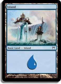
After talking about how great the Minamo area looked, it’s no surprise that I would choose one as the perfect art for blue lands. I feel this one best expresses blue’s disdain for the forces of nature and its subsequent conquering thereof.
Island (#294, Mirrodin), John Avon
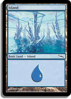
I considered many examples of this area of Mirrodin and ultimately decided on this one. I like showing off an Island that is not even a little bit natural. This is blue at its extreme, just completely artificial.
Island (#237a, Zendikar), Vincent Proce
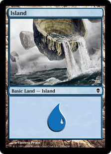
One of the reasons I picked out this land is because it looks unnatural and yet is quite natural. Islands and landforms don’t come this way, and this is how blue’s magic has "enhanced" or perverted the natural order of things. It’s a great way to demonstrate the philosophy of the color in a way different to the previous two pieces.
Island (#168, New Phyrexia), Jung Park
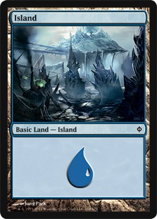
Ultimately my final spot came down to this one or the Shards one that has the sky and clouds divided and ordered. I like the freakish aspects of this picture, so in it went. Phyrexia, Mirrodin, and Alara have similar concepts of perfection by changing the flesh, so adding some pictures from those places made sense to me. You can tell something very freaky is happening here. There are boils on the land and some sort of latticework above where science can run amok. It’s a very blue landscape.
Mountain
After Islands, Mountains are probably what least show what I want as well. What is the difference between green and red, Forest and Mountains? Both should have stark images of nature, but where green is often inviting and warm, red is harder and colder. I want my Mountains to be savage, heartless, raw, and desperate. I want them to show life harshly. People living in Magic’s version of Mountains are Bandits, Goblins, Barbarians, and Orcs. I want a Mountain to demonstrate the impact that living there has on a people. I want to see people just surviving. Here are those lands that I consider the best at showing off red’s philosophy in a pretty manner.
Mountain (#245a, Zendikar), Vincent Proce
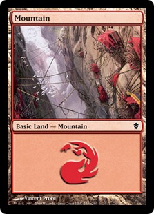
Zendikar may not be a plane that makes sense for most basic land types, but I really adore this picture for a generic view of what red truly is. Here you have people living on the side of a ravine and coming up with ways to survive. It’s a perfect way of displaying the survival attitude of people living in this desolate area.
Mountain (#344, Onslaught), Sam Wood
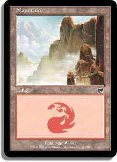
This commonly reprinted land is another great way of showing the sheer desolation of the place. In this case, you can see the bridge and walkway to the right. They look so small against the sheer cliffs. They also look very precarious.
Mountain (#345, Onslaught), David Day
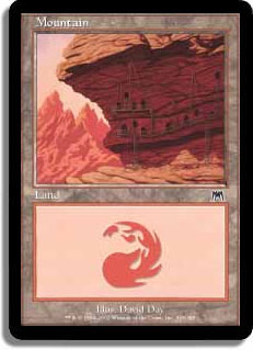
This is supposed to be showing the Goblin burrows in the mountain and where they live. Much like the first piece above, it demonstrates the mass difficulties of living at altitude. There is no advanced construction like the castles of white or the towers of blue, but instead you see a people bending to the world around them so they don’t break.
Mountain (#240, Magic 2010 Core Set), Karl Kopinski
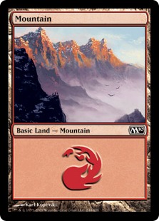
For my last Mountain art, I’m going with another frequently reprinted land that shows three small travelers on the middle of the left side of the card. You feel a perfect sense of the tininess of their lives both physically and spiritually in this place. There are several other good choices, such as Cliff Childs’ piece from M12 and M13 and more I considered. But I think this really shows off what people face to live here.
Plains
At first, white and blue seem like they should be very similar in what they demand from the world around them. After all, both seek to dominate nature, right? Well, not so fast. First of all, blue dominates nature with magic and technology and in small numbers. White has whole communities harnessing nature. White still uses nature. It ploughs fields and grows grain to make bread to eat. It’s still using nature as nature.
White takes a wild horse and domesticates it into a steed. Blue takes that horse and gives it two sets of artificial wings in the front and back. I want to see Plains in white that demonstrate this philosophical difference. I want to see a shepherd with a flock of animals or folks at the plow. This is where people are working together to farm, to grow, and to build communities. Here are the four basic land Plains that I feel best represent this philosophy as well as look pretty.
Plains (Euro Set Red: Netherlands), Eric Peterson
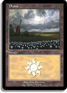
Despite this art being of a real world setting, it’s one of the best pictures showing man using nature—in this case, via a windmill. I wish the flowers in the foreground were another color because there’s already too much white in the piece, but you have a nice scene here with people beginning to harness what is around them.
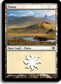
Plains (#288, Champions of Kamigawa), Greg Staples
Most of the Plains art that shows people shows them in the distance. This gives you a city or village in the distance as well, and I’m not a super fan of the cracked landscape around it. However, it’s one of the few pieces that truly shows an entire community surviving and growing in a flat landscape.
Plains (#288, Ravnica), Christopher Moeller
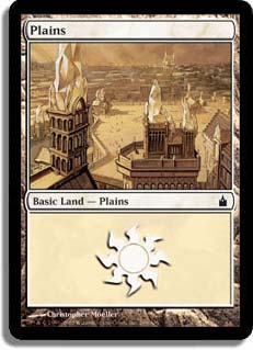
I’m not a fan of the Ravnica art in general in core sets or other places, but this picture is different. White is often the color of both communities and cities. This shows a big city, but it doesn’t have that odd Ravnica look to it that that keeps it solely on that plane. As a picture away from its friends, it just looks like a city.
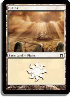
Plains (#231, Shards of Alara), Michael Komarck
This recent card has been heavily reprinted since its introduction due to how pretty it is. It also shows off white quite well, with the castle in the background representing the presence of both people and social order.
Swamp
Our final basic land is the Swamp. I feel like black shares some philosophical roots with blue—nature is to be used to further one’s power. Where blue builds nature up and tinkers with it, black decays life into its constituent parts and then uses that to trigger its magic. Death fuels its spells, and the detritus of that can be reanimated as a very willing servant.
Your wild horse is captured, slain in some eldritch ritual that gives black more power, and then reanimated as a steed for an undead Knight. I want to see my Swamps decaying and rotting. Perhaps there are old buildings, bodies, or trees being quickly destroyed by the vile corruption of a Swamp infused with black mana. Here are the four images that I feel best represent the idea of the land in Magic-dom.
Swamp (#239 in Magic 2010 Core Set), Alex Horley-Orlandelli
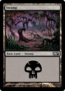
I think this is a very foreboding piece of art. Then when you add the skeleton in the foreground, you can tell who won that battle. This is a perfect example of black overwhelming a piece of art as well as demonstrating the concept of the color. Black wins because, in the end, everything dies.
Swamp (#241 in Magic 2013 Core Set), Jung Park
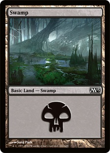
Despite being in the newest set, I really like this art for several reasons. The palette is very pleasing to me and shows off some nice greens and blues. And yet, it’s bleak. This is one of the best pictures of a Swamp conquering trees. You have great trees in the background that were once so giant, with the birds in front showing their size. These monsters must have once been great bastions of a forest, and now black is everywhere. Black is the land type that spreads and moves, like a sickness. This really demonstrates that.
Swamp (B, Portal Second Age), Susan Van Camp
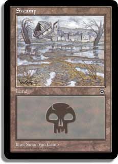
I think this is one of the best examples of a Swamp taking over a building or ruin. Here you have an obviously wealthy estate that has been destroyed, not by rampaging beasts, scars of war, dragon fire, or mystic energy. Oh no, this estate has been defeated simply by the corrupting influence of black.
Swamp (#293, Time Spiral), Richard Wright
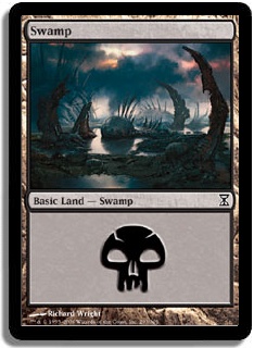
Our final Swamp shows the sheer desolation of black. Those things coming out of the ground are either pincers of some fell beast or the corruption of what was once green and alive into something very much not. You have a sense of true essence of black in this piece. It’s a perfect complement to the other three Swamps.
Today we’ve looked at twenty pieces of art from all five colors. We also talked about how I feel the lands should look in general. I want the philosophies of the colors witnessed in the basic land art itself. Basic lands are very pretty, but they should be more than just a painting of a landscape. They should capture the essence of why an Island or Plains or Mountain reflects the philosophy of that color so much that it can be harnessed for mana. I hope that you enjoyed today’s article!
Until later,
Abe Sargent