Several things have happened since the last installment of Magic Art Matters, which featured the Judgment sorcery, Burning Wish. First off, I have stepped up my exercise routine, improved my diet, and cut out my late night snack habit of Ranchero-flavored Doritos I am still drinking the Diet Dr. Pepper, so I guess I am a little hyped-up on the caffeine from that – and my sudden weaning off of Doritos has sent me into some kind of”… what the hell happened to my MSG fix?” withdrawal.
Some side affects of these changes have manifested themselves in the form of a heightened state of awareness and a newfound abundance of energy.
Well, everyone knows that there is nothing worse than wasting awareness and abundant energy – check that, sitting around watching American Idol and eating Ranchero Doritos is probably worse – so I have challenged myself to some new endeavors.
The first thing was easy; I coined a new Magic phrase – that’s right, look at the title.* It will take a little while to catch on, but soon enough players everywhere will be referring to the new block as” ‘Slaught”, which is pronounced just like it looks, or phonetically – slot. Just you watch. It is what everyone will be saying, and you heard it here first. I’d be really excited and self-congratulatory if this had been the first thing I had invented that later caught on nation-wide, but it isn’t the first** such discovery of mine.
The second thing I want to do with this energy is commit myself to writing a new article each day on the general subject of Onslaught art. Starting with today’s article, I intend to write an article a day and continue, indefinitely, until: [1] I run out of energy (read – I start eating Doritos again) [2] I run out of ideas, or [3] the pre-release, whichever comes first. Yeah, I know the pre-release is coming up pretty fast, but man, writing is hard. Have you ever tried it? It is really, really hard; especially when trying to write every day. To appear to be fresh and creative sometimes you have to make stuff up, or plagiarize, or lift someone else’s idea for a writing format.
As an aside, I don’t think plagiarization with respect to art reviews is an option for me; I haven’t really seen a lot of writers clamoring for the coveted spot of most well known online Magic Art Critic.
As I was saying, writing is really, really hard… No, really. I already feel like I am running dry of ideas for this approach.
Dang, this is hard.
I sense a word-count-enhancing, stream-of-consciousness meandering coming on… Yep, there it is right on the tip of my tongue, ready to be committed to paper, or disk, or screen, or whatever it is that something gets committed to when writing using a computer. Ah…one of life’s perplexing questions.
Before I start the article in earnest, there are just a couple of disclaimers, or warnings, to get out of the way. Since I will be writing every day, this will be sort a diary, and some non-‘Magic art’ topics may creep in here quietly. That, plus due to the stress of writing every day, there may be some wild mood swings. I have been kind of moody about Magic art lately, you know, what with all the compositional errors and distorted perspective found in the drawings; so moody, in fact, that you shouldn’t be surprised at anything that may come up. The swings might even be so pendulous that you may find them disturbing.*** It has been so bad lately that I have been thinking about throwing in the towel on art critiques and taking up haiku…
Or maybe not.
Now bear with me over the next few paragraphs, and brace yourself for an abrupt change in tone as I actually address a fine piece of Onslaught art.
Heh… I said fine piece! Heh.
It is time to get all somber-like; to hell with continuity and coherence – after all, I am writing every day. What do you expect, Hemingway, or Dostoyevsky? Gimme a break.
I must switch tone, you see, because the discussion of art is a very somber matter: It must be conducted with the utmost of consideration for the fundamental aesthetics, as well as out of respect for the efforts of the artist. It must be this way because that is the way it has always been done for online Magic Art critiques…
Wait a minute! I’m inventing the form as I go! I can do it any way I want!
Well, since I have been somewhat somber in previous installments of Magic Art Matters, that is what I am used to – so shall I continue, at least for today – plus, I am running out energy tonight. In fact, where is that last bag of Doritos that I hid? Maybe I can find my VCR copy of the American Idol finale. That would be sweet; Doritos, Kelly, Justin, and MSG!
Don’t worry – I’ll finish what I started, at least tonight. There will be plenty of time for TV later… Plus, there is a new season of Survivor. Thank goodness for the VCR!
Once again the subject of this critique is provided by the very informative and entertaining Wizards website, in the Arcana installment that featured Snapping Thragg.
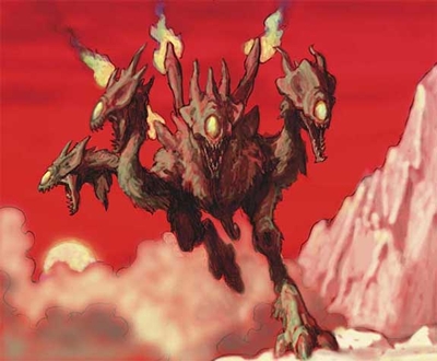
I chose to address this piece first because I find it very refreshing in is execution; its primary strength is in its loose and casual approach. It is interesting as a change of pace from many recent paintings that are more tightly drawn and correspondingly, more self-conscious. A perfect example of a very tightly drawn, self-conscious painting is Shade’s Form. While Shade’s Form is an ostensibly nice painting, I find it to be somewhat forced. No changes were made by the artist after the draft was approved, and the final line quality is so rigidly drawn it ends up being somewhat uninteresting.
That is not the case at all with the Snapping Thragg. The draft form, which can be seen at the above link to the Wizards site, is wonderfully loose and dynamic. The commentary provided with the picture even points this out, and rightfully so; however I would disagree slightly with the use of the word”rough.” It is too easy to misconstrue this with a negative meaning. A better word is loose. A loose, fluid line like this is highly desirable and contributes greatly to the beautiful line quality that is evident in the final artwork.
The looseness of the draft translated well into the final – but in this case, the artist worked the painting effectively to give it a life of its own. While it is clearly based on the draft, it is not overly constrained by it, as is evident in the minor refinements that are seen when comparing the two.
Compositionally, the artist has done a good job. The angular mountain on the right, contrasted with the fluffy dust clouds on the left form nice V-shape which plays host to the character nicely.
A nice subtlety in this pair of features it the contrast between the angular mountain and the fluffy dust clouds. This is a very simple, effective background that was easy for the artist to execute. I say this because he did not even have to change his color palette – the same colors are used in both parts. The only thing that needed to be changed is the airbrushing technique.
This shows a very nice economy of effort. Why work harder than you have to accomplish an effect; especially when a thoughtful, simple technique is more than adequate? Another example of economy is the treatment of the trailing leg, on the left side. Notice that it is simply drawn as a blocky shape, and it has a uniform color and darkness. No more effort than is necessary is expended. Object details within a shadowed area are necessarily going to be somewhat obscured, and the artist’s sensitivity to that fact is a nice touch.
Another nice touch in the composition is the placement of the sun: It is immaculately placed! Notice how exquisitely is occupies the negative space above the dust cloud, and below the left-most Thragg neck and head. Any change in size, and it is too big or too small. Any change in placement at all, and it throws off the balance completely. Beautiful! If only Mark Zug would have gotten the message that placement of the sun is important as a compositional feature in his painting for Genesis. **** I will not discuss it here, but with just a few very important compositional changes that piece could have been taken from mediocre to fantastic. I was considering playing with it in Photoshop to demonstrate what I mean… But hey, now I am on a tight schedule – lotsa writing to do. Maybe I’ll do a Photoshop makeover sometime later.
As for depth, it has been conveyed very nicely: There is just a hint of the ground in the foreground, but it is just enough to be effective. Thank you Ian, for showing us that all-important foot. Now we know how the creature is attached to the ground. Furthermore, it serves double duty as the requisite”foreground object of interest.” Weight is properly conveyed. Also, the question is answered – where did the cloud come from? Yes, that is right, it is being stirred up as this thing runs through a dusty valley.
Mark Zug, are you listening? Please show the feet on Genesis – by not doing so, too many questions are left unanswered.
As long as we are talking about running, notice one more superbly crafted aspect of the Thragg. See how it is tilted to the left, and how the cloud seems to be being kicked up to the left side. These two things reveal something important – the Thragg is running in an arc – the fact that it is leaning, together with the direction of the cloud tells us so. Is this more interesting than on straight-on front view, with no lean? I think it much more interesting. Props to Ian for being thoughtful in the execution of this painting. We have to live with this card for a long time, so it is good that a nice looking, dynamic card such as this is, made it to the final product.
All aspects of the artist’s treatment contribute to a creature that appears to have a convincing volume. This is most apparent in the various heads of the Thragg. Essentially, the same”type” of head is drawn from different perspectives, and they are all consistent. By this I mean that if you superimposed appropriately-sized parallelograms, shown in perspective, over each of these heads they would confirm the proper execution of perspective. Each head is correctly drawn to the extent that they project outwards from the canvas, or remains in the plane of the canvas as is the case for the leftmost head. It is not in perspective since it resides in-plane with respect to the canvas. Other contributors to the volume are shadows on the underside of the main body, and neck/heads of the Thragg.
To wrap up my comments here, I will say that there are many fantastic negative spaces within this painting. Any shape that is formed by the intersection of the Thragg, the dust cloud, and/or the mountain, with the red sky in the background is exquisite. This is an example of a painting where much of the success is derived by what it not drawn – namely, the red sky shapes – rather than that which is explicitly drawn. If you can’t tell, I really like this painting.
My only issue with this painting, and it is a little awkward to bring up… But what is that thing hanging down from the underside of the Thragg? It is rather bizarre, but nonetheless it does serve a useful purpose in defining some of those exquisite, red, negative spaces that were mentioned previously.
I am not going to come right out and say it… But doesn’t it seem somewhat reminiscent of something phallic? I am going to stop right there because that is the end of my expertise on the subject. Perhaps there is someone else within the StarCity stable of writers with more experience exploring phallic imagery within Magic art. That is where I would respectfully defer to the editor for assignment to a different writer, if such a writer exists.
That’s all for now; I am exhausted. Like I said, writing is really, really hard…really.
Michael Jay LaRue
Engineer Legend
[email protected]
* – Not to worry; this choice of a column name is only temporary. I will go back to Magic Art Matters after this Onslaught thing blows over. You mark my words though. This block is destined to be known as the ‘Slaught Block.
** – As a youngster in Maryland I was fond of Popsicles from the Ice Cream truck that visited the neighborhood every day in the summer. Of course, the paper always stuck, frozen to the sides of the product, and I found that very frustrating. I discovered/invented a simple three-part solution: [1] carefully open one end of the wrapper, [2] gently blow warm air into the open end – this should provide enough warmth and air pressure to release the paper from the Popsicle, [3] grasp the wooden stick and carefully pull it out of the wrapper. Works like a charm, first time and every time. Mind you, nobody showed me how to do this. I invented it. To my amazement many years later, when I moved to Los Angeles to take my first engineering job right out of college, I saw someone use my procedure to free a Popsicle. How incredible; what an influence a little guy could have, to create a procedure that both crossed the nation and withstood the test of time! Let that be a lesson not to underestimate the value of a good idea. And remember this little story next time you eat a Popsicle!
*** – While the mood swings might seem wild and disturbing, do not worry. I will not do anything that would disturb you as much as if you had, say… Out of curiosity, followed any one of a number of”interesting” links found on The Ferrett personal site. I promise you, it will never get that bad. I would sooner deface my signed, foil, Masticore, than willfully subject you to anything that disturbing. By the way, I may or may not own a signed, foil, Masticore – but if I did not, I would want one, and I would not ever do anything bad to it. In fact, it doesn’t even have to be signed for me to not want to deface it. Yeah, that’s it, that’s the ticket; a foil Masticore. That would make life great! Well, greater than it already is; life is great!
**** – Just as an exercise, and to see if you are paying attention, how about working on an assignment? As we say goodbye to Judgment, which featured many Centaurs, take a look at these two cards – Genesis, and Leaf Dancer, which both feature Centaurs. I’d be interested to hear how you think these two compare in terms of the aesthetic rules of art that have been the subject of all Magic Art Matters articles. Compare composition, negative space, movement and dynamics, line quality, and depth, and anything else that occurs to you. If you are like me, you will find one vastly superior to the other. Let me know what you think.