
It’s funny how words can change meanings with time. Long ago, a “masterpiece” was a work submitted by an individual hoping to become a master craftsperson in a guild. (This tradition arguably has lasted longest in the field of fine art, where Academies with a capital “A” still exist and the reception piece remains a standard among some of them.)


Magic card titles include nineteen “Apprentices” and dozens of “Masters,” yet no journeymen.
Nowadays, of course, that meaning is all but obsolete. A “masterpiece” is now a creative triumph, a great work. Magic: The Gathering has in the past borrowed masterpieces of writing for flavor text and commissioned illustrations from great artists such as Donato Giancola.
Masterpieces have been referenced in flavor text…
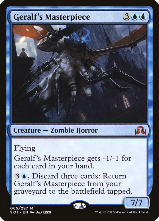
…and even in card names, with slight variation…
…but their most prominent use in the context of Magic is the Masterpiece Series of premium cards.

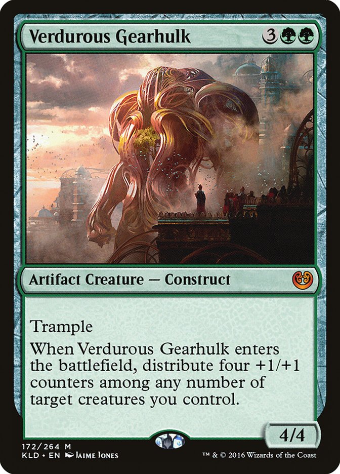
Today I’ll take a look at the Masterpiece Series, what’s already been printed and what I think of the Amonkhet Invocations.
Zendikar Expeditions: “Prototype“
While they aren’t officially part of the Masterpiece Series, the Zendikar Expeditions from Battle for Zendikar and Oath of the Gatewatch (and their intensely positive reception) were the prototypes for the future Masterpiece Series. Much as Jane Austen’s early short novel-in-letters Lady Susan hinted at her later literary output, the Zendikar Expeditions showed what was possible…and showed Wizards of the Coast the money.
The first slate of Zendikar Expeditions was revealed on 17 September 2015, and it’s striking just how much carried over from the Expeditions to the Kaladesh Inventions. While the full-ish art didn’t make the leap (I’ve written in the past on why extended art is so often associated with lands in particular), the plane-specific border area and the sense of a “heightened” take on a pre-existing or simultaneously printed card sure did.
The Zendikar Expeditions met with immediate success, according to Mark Rosewater, and not just in terms of social media buzz:
“So when we stood back and analyzed what Zendikar Expeditions had done, we realized that it made Standard more accessible, it got players access to older cards, and it provided alternatives for deck building. It wasn’t a total solution for every challenge, but it helped address all of them. This, of course, led us to ask, ‘Is this something we should be doing more often?’
We had a lot of meetings where we discussed all of the ramifications of turning Zendikar Expeditions into an ongoing promotion. We talked pros and cons and benefits and detriments and everything we could think of. In the end, we decided that it made sense, and the Masterpiece Series was born.”
And why wouldn’t Wizards of the Coast want to continue a promotion that increased sales of a set? After all, the “made Standard more accessible” line refers to how more packs being opened put more cards in players’ hands.
While there wasn’t enough turnaround time to make Zendikar Expeditions-like cards for Shadows over Innistrad and Eldritch Moon, the newly named Masterpiece Series was ready for Kaladesh block.
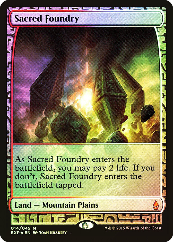
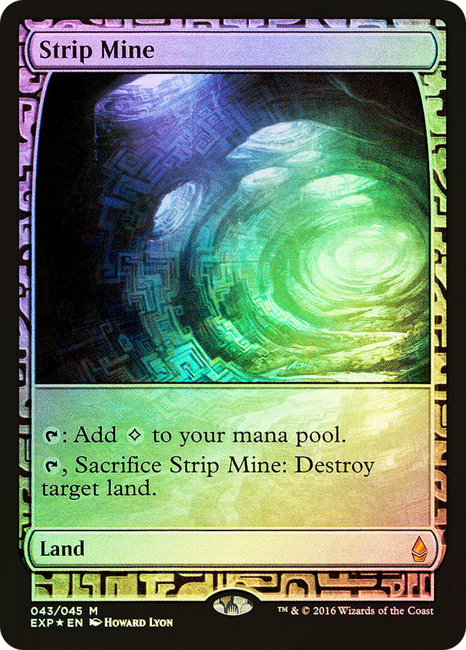
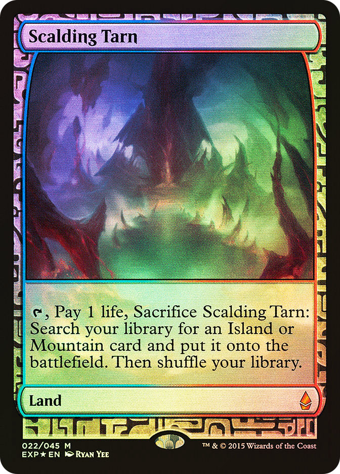
Kaladesh Inventions: “Masterpiece“
It’s pretty astounding, looking back, just how much the Kaladesh Inventions got right.
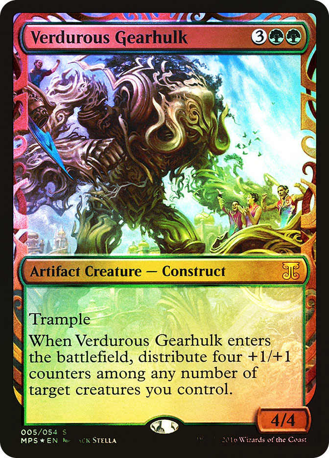
A handful of flashy new cards joined dozens of in-demand classics, all artifacts to go with the Kaladesh Inventions theme.

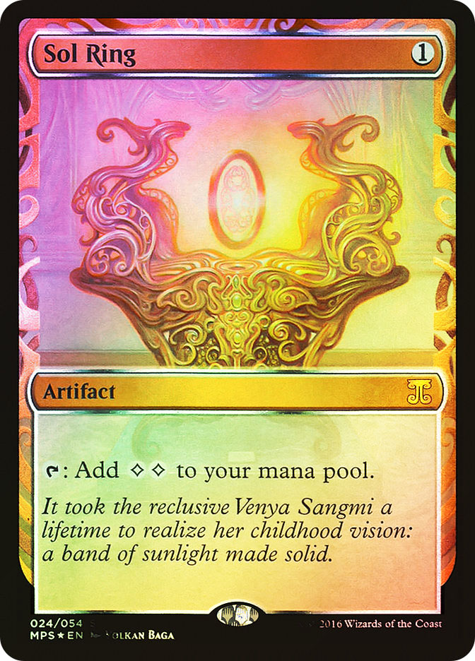
The card frames reflected the swirling metal aesthetic of the Kaladesh setting, and there were even multiple variants on the card frames! Note, on the two images above, the shape descending from the left side of the card name box, and how Lotus Petal’s shape flows smoothly into the edge while Sol Ring’s has a noticeable “spike” there.

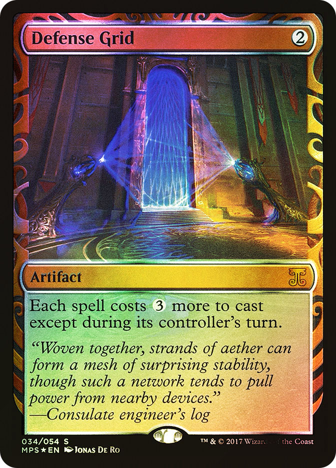
A number of the cards even have flavor text, furthering the sense of immersion. While Crucible of Worlds from Kaladesh has the feel of a placard put next to a display at the Inventors’ Fair, Defense Grid from Aether Revolt reflects how the world has descended into open hostilities.
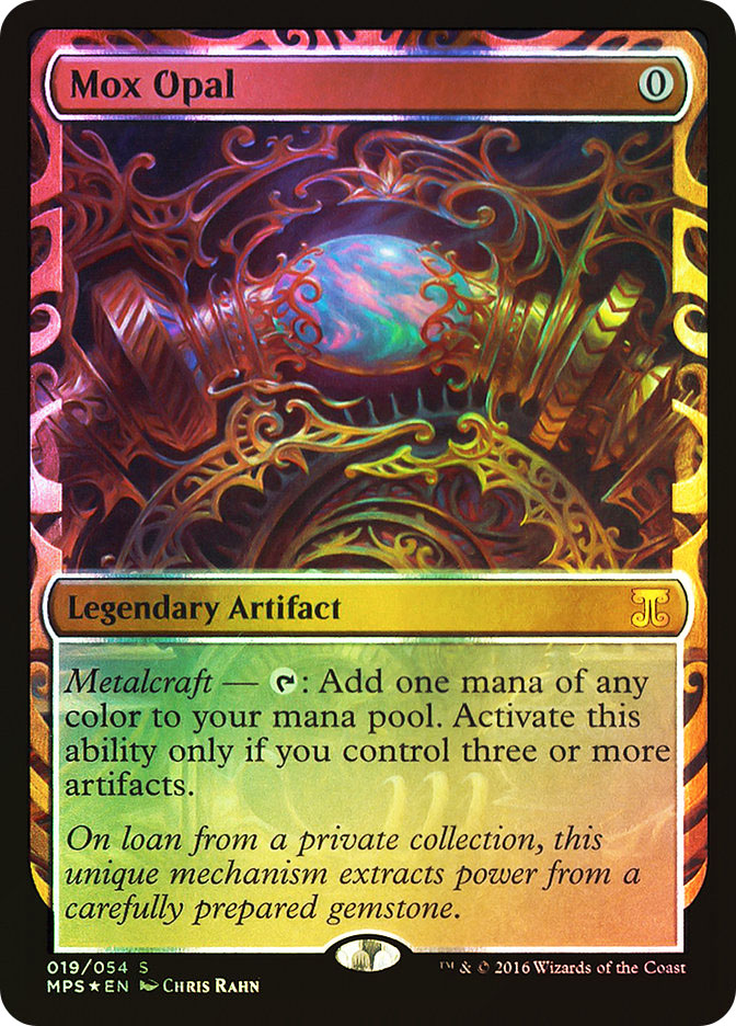
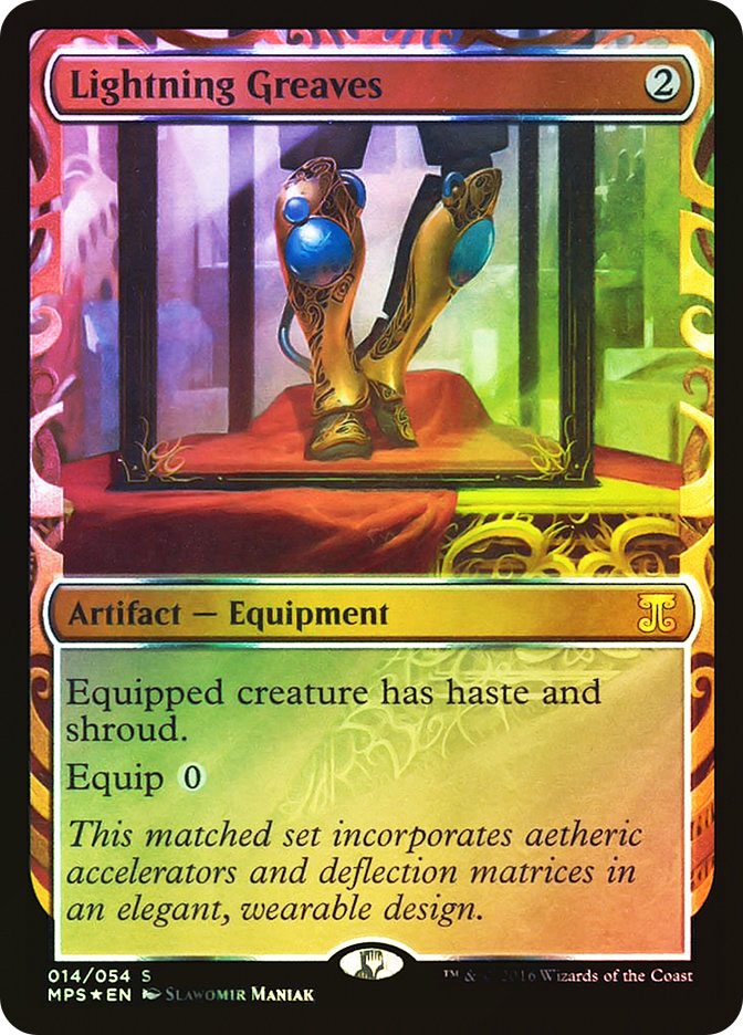
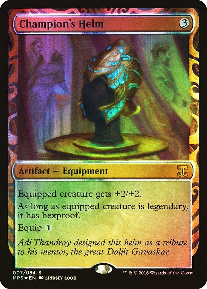
Most of all, the Kaladesh Inventions just feel luxurious! From the intricate setting of the Mox Opal to the plush red cloth beneath the Lightning Greaves and the “gallery” impression given by Champion’s Helm, the art is on point.
All this, without for a moment sacrificing clarity. All the templating is up-to-date; information is where players expect it to be. Everything’s wonderfully readable.
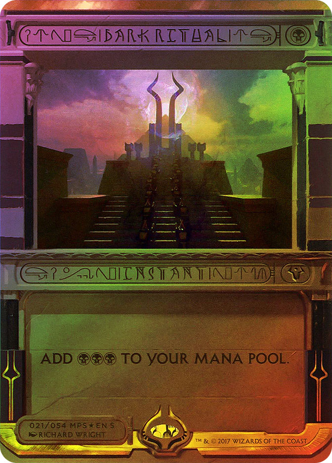
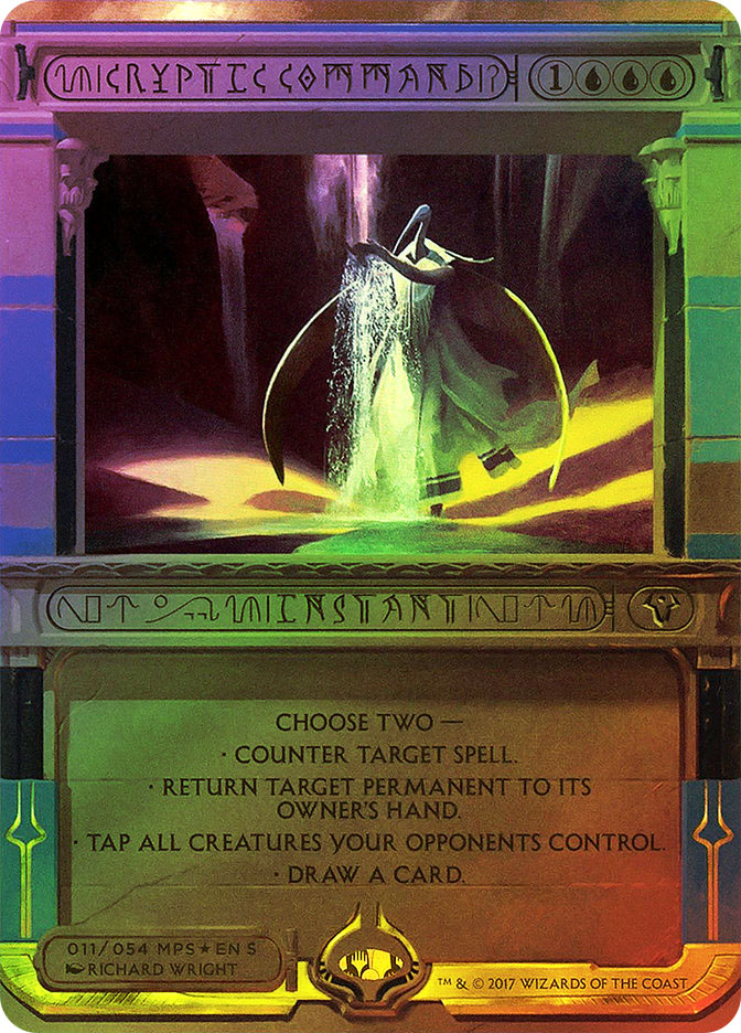
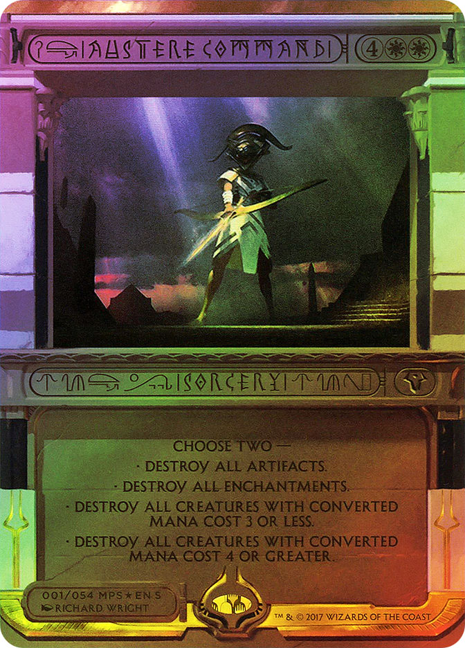
With the emphasis I put on “wonderfully readable” just then, you might have a good guess what I think of the Amonkhet Invocations…
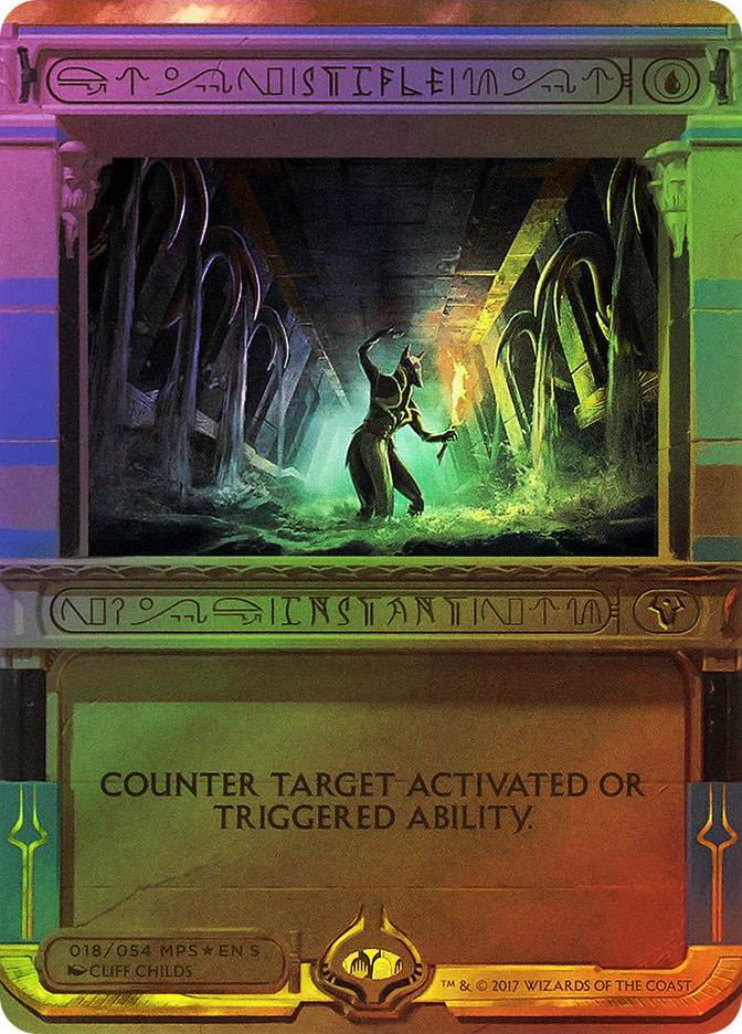
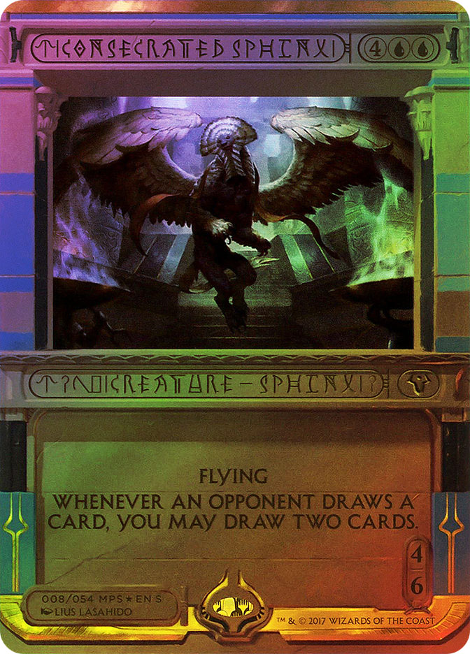
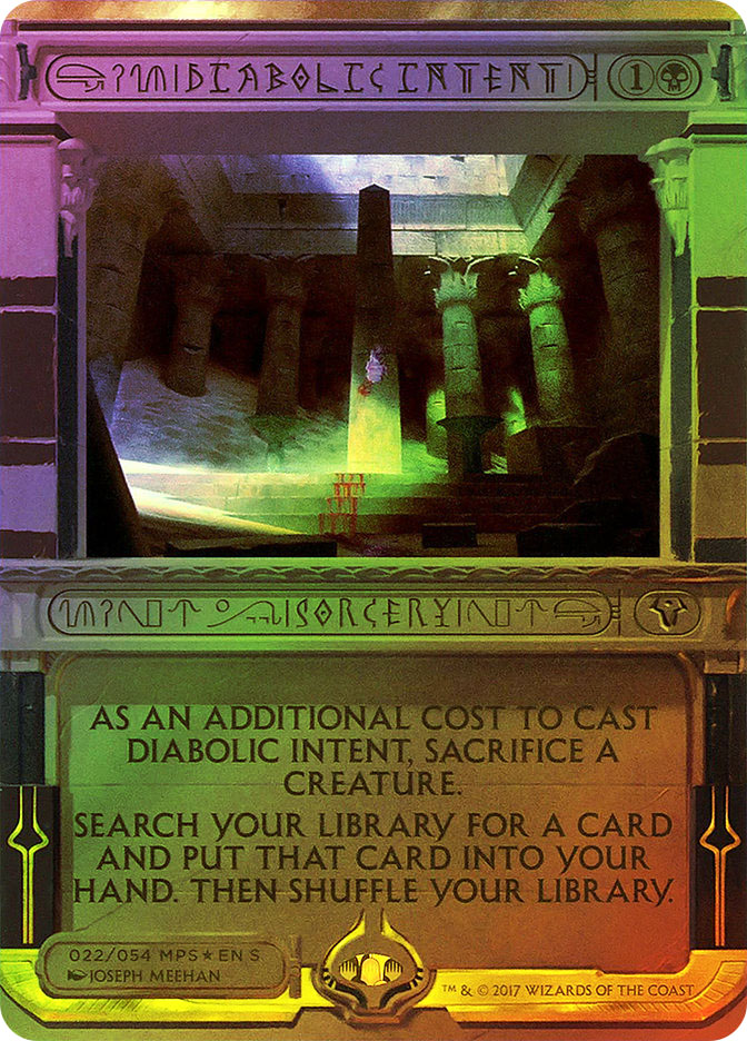
Amonkhet Invocations: “Trainwreck“
…and you’d be right.
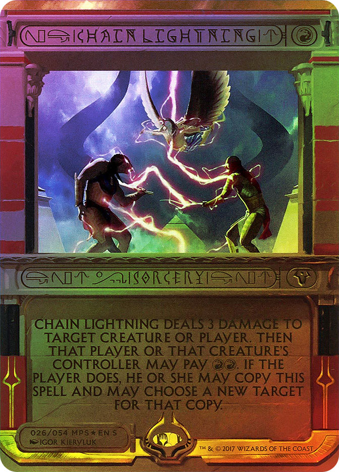
Don’t get me wrong; there’s actually a lot I like about the Amonkhet Invocations, and not just the theme of “the divine,” a necessary shift to get away from the limiting and ultimately self-exhausting restriction of the Masterpiece Series to one card type at a time.
Start with the outer parts of the frame: the gleaming gilt-like top, the borderless sides like an extension alter, the color indicators at the sides and behind the Bolas-horn bidents (blue for Counterspell and black for Diabolic Intent), and the recurrence of golden touches at the bottom with the Bolas horns around the counterfeit-prevention hologram sticker. Collectively, these changes look absolutely stunning. They’re rule-breaking in the best way (as in, they’ll force Magic to redefine the characteristics of an Authorized Game Card for tournament use).
A lot of the small touches are evocative as well. The flipping of the power and toughness oval from horizontal to vertical, evoking a cartouche, may not be the most historically accurate (cartouches set off royal names in their original usage), but it sure is resonant. The oval shape is echoed twice at the top of the card as well, where the shape surrounding the mana cost expands as necessary and shrinks the accompanying title oval as a consequence.
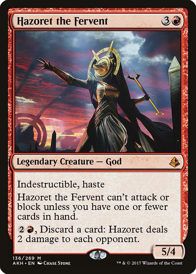
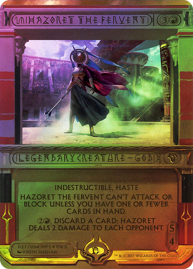
Other changes work or don’t work, depending on the card. The larger text box and consequent shrinking of the art on the Amonkhet Invocations, for instance, decreases any visceral impact the art can have, making it seem like it’s at a remove. Compare the regular and Invocation printings of the first revealed God of Amonkhet, Hazoret the Fervent. Which image looks more awe-inspiring to you?
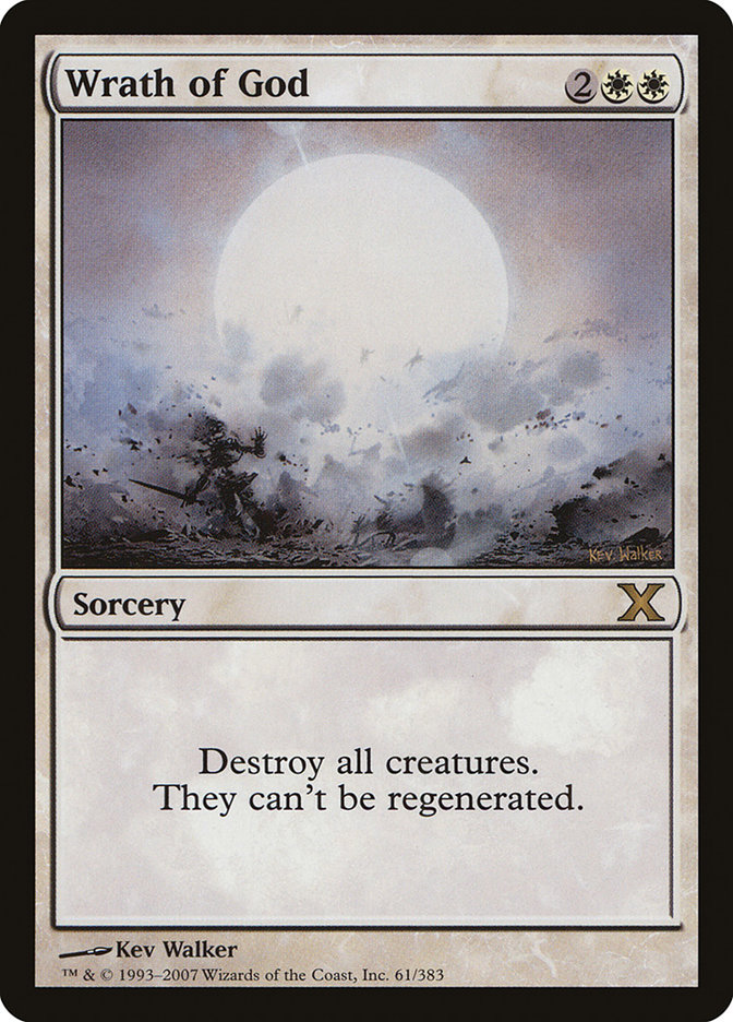
Then there’s the choice to center the text in the text boxes, a stylistic choice I’ve traced (in the Modern-card-frame era, at least) to the jump between 9th Edition and 10th Edition on certain cards with minimal text that has maximum impact.

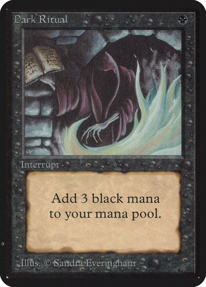
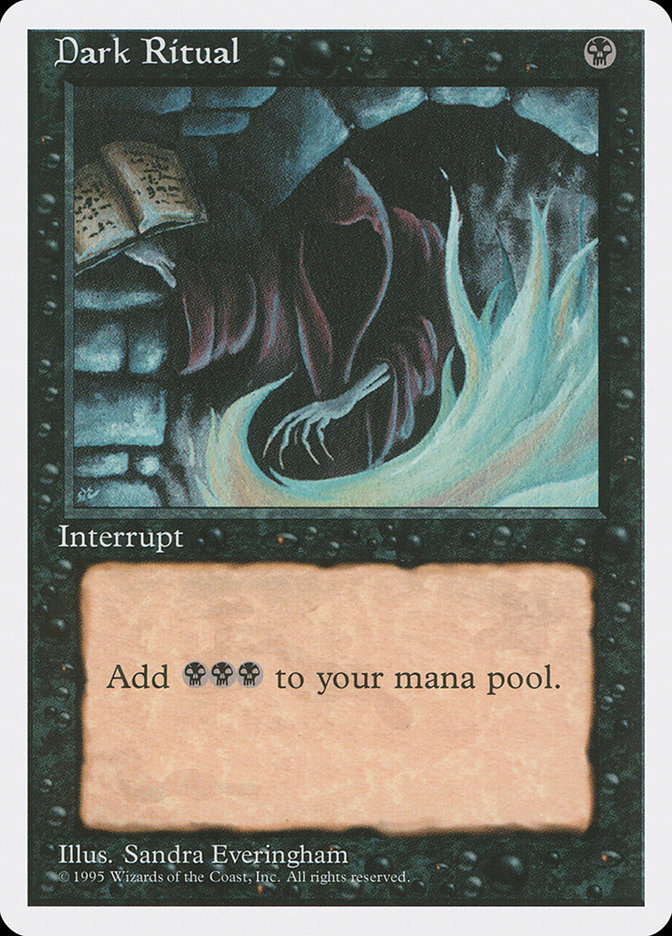
When that centered card text is short, it shows that, while the early Magic card design had its limitations, sometimes it just looks right, as on Dark Ritual.
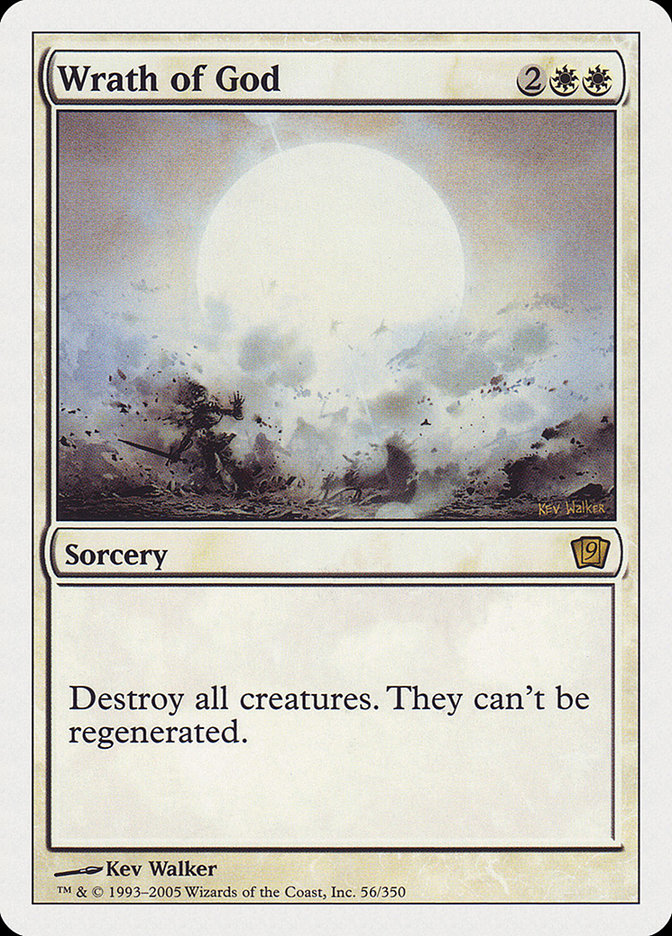
On modal cards like Austere Command, however, those bouncing bullet points just look goofy.
And then we come to the stylistic choices made for the Amonkhet Invocations card names and type lines.
Okay, Wizards of the Coast. Those names. Those type lines.
What the heck happened?
For reference, I’m a copy editor. I read and polish in the neighborhood of 10,000 words a work-day to put authors in their best light and give readers the best experience possible.
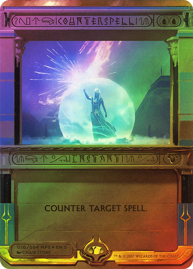
I literally cannot read the card names and type lines on the Amonkhet Invocations.
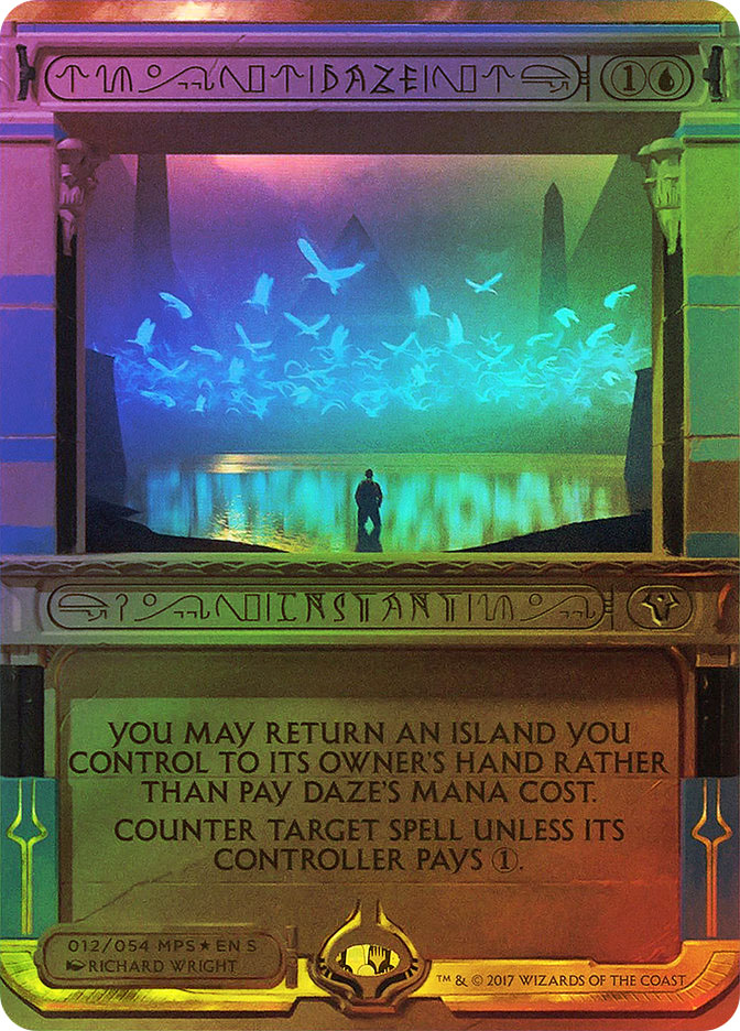
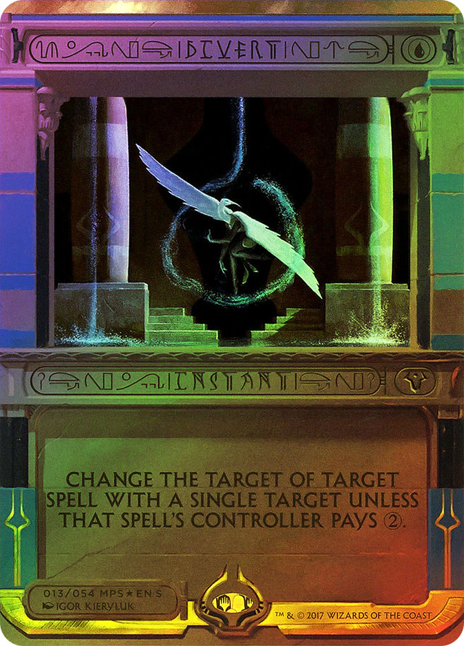
They just don’t process for me. Try as I might, I cannot force the words “Daze” or “Divert” or “Instant” to appear on the cards above.
Between the bizarre font and the even more bizarre choice to throw other symbols into the name and type spaces, I have to wonder, was Wizards of the Coast trying to make those areas unreadable or merely succeeding?
@mckenna_tim @MishrasFotoshop Goal was that it didn’t look like English on first read. It appears that we succeeded.
— Aaron Forsythe (@mtgaaron) March 29, 2017
Oh. Well, then.
I can think of a few possibilities for how this decision went all the way through to print. Not one is particularly flattering.
Possibility 1: Nobody stopped to ask what effect these junked-up name and type areas could have on individuals with dyslexia or whose brains otherwise work differently from those present at Wizards of the Coast. Neither did they do the research or consult people who might be affected.
Possibility 2: At least one person did stop to ask, but then was influenced by corporate culture not to speak up or rock the boat too much.
Possibility 3: At least one person brought it up as an issue but then was overruled.

This isn’t like the not-a-regular-Magic-language Prerelease cards of long ago or the “Phyrexian” Judge foil Elesh Norn, Grand Cenobite. All of those had extremely limited distributions, at one set of events or to a select group of people. Both, crucially, used the same card art as regular versions. They weren’t meant to be played by people who weren’t already familiar with the card (at the time, Prerelease cards weren’t part of the card pool).
This is “If I open one of these in an English-language booster pack or encounter it in a tournament, I need to look it up or have a judge explain to me exactly what this card does, because even if I know the card is Diabolic Intent from the name-check in the ugly-as-sin-but-still-readable-font text box, I haven’t memorized whether it’s an instant or a sorcery.”
This is messed up. And until I can get all the Amonkhet Invocations memorized (with more to come when Hour of Devastation drops), I’ll need outside sources to connect an Amonkhet Invocation to its name.
Seriously, Wizards. You have your own typeface. Use it next time.
Because if I open an Amonkhet Invocation, I’m buylisting that flawed Masterpiece the first chance I get.