I will always be a fan of unconventional art in Magic. I am a huge supporter of Secret Lairs, alternate art treatments, and the like… but I don’t love them all. Shocking, I know, but it’s true that there are just some rough-looking Lairs and alt-arts in the game.
That’s not to say the art is bad. Not at all! Art is subjective, and I can always find at least one thing to like in art I may not adore. No, I’m talking about the cards that are practically illegible. You’d be surprised at just how many there are, especially within the past few years or so. Please give a round of applause to my editor for being able to transcribe what these cards do, because even with my glasses on, I’m struggling to parse out my tiny, tiny list.
Grist, the Hunger Tide
Grist is one of the coolest planeswalker cards to ever be made. Everything about this card screams horror. A swarm of bugs converging upon and animating a skeleton is just about the most terrifying thing I can think of. The moment I saw this card, I was obsessed. When I heard it was getting a Lair treatment, I was thrilled…until I saw the actual Lair.

The art is very busy. Like, incredibly busy. The colors clash and blend into the noisy background, while the thick bubbly letters do the same. The art itself is stunning. In fact, it reminds me of John Carpenter’s The Thing. When each aspect is put together, however, you start to lose the terror and instead have no idea where your eyes should focus. In fact, while writing this, I just now noticed the man fleeing in terror in the right corner of the art. I bet you didn’t notice it either, huh?
Arwen, Mortal Queen
I love that this art, much like many of the cards in The Lord of the Rings Holiday Release, looks like a Grateful Dead poster. The fluidity of the art and text give it a strong 60s concert poster vibe that I just adore.
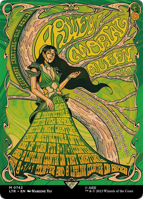
That being said, wow, this is hard to read. The type line is curved up on the left, the power and toughness have been moved to the middle of the card, and the casting cost is shrouded by the wooden frame. I almost didn’t even see the 1 in the cost either. The font choice for her text box (or lack thereof) is also a bit of a nightmare. It’s curvy and squished, which makes it seem like one big blob. Her enters-the-battlefield text is almost unreadable, and the only line I can make out on the card besides her name is the last two lines of text (confidently, that is). It’s such a shame, because I adore the art style.
Tevesh Szat, Doom of Fools
Planeswalkers receiving massive art overhauls seems like a fun idea in theory, but Tevesh Szat, Doom of Fools is a wonderful example of how hard it is to translate.
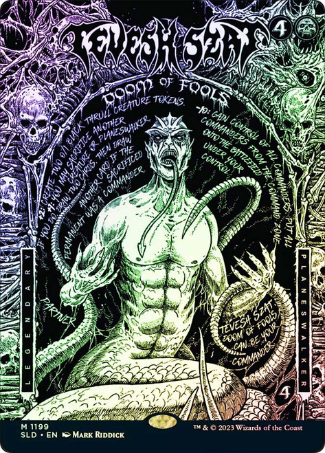
While some might disagree, I actually think the art has zero impact on the issue. In fact, it’s the text. Planeswalkers are organized card designs, and once you get rid of those rows, the free-floating text becomes hard to find. When looking at this Secret Lair, it took me a few moments to realize that this was a planeswalker and not a creature because of how the loyalty abilities look. The numbers next to these abilities, while bolded, are blobby and hard to parse out. Good luck locating the word ‘partner’ on the card as well. While I can see the direction they were going for, it just didn’t quite meet the mark.
Amonkhet Invocations
This one kind of breaks my heart, because I absolutely adore the Amonkhet Invocations frames. I love how statuesque they look, but the choice of font is a bit brutal. I can totally see what they were going for, but they blend in heavily with the hieroglyphs that frame the card name. The Locust God, Thoughtseize, Boil, Containment Priest, there are so many.

In fact, we saw a return to the use of this frame in the Multiverse Legends sheet! However, there was a bit of an overcorrection with this. The font, while a bit swirly and confusing, was incredibly flavorful and was instead swapped for the typical Magic font. Of course, it made the card 10x more legible, but it made a flavor sacrifice that had me feeling conflicted. I really hope for us to see a middle ground between these two in the future.
DJ Scarab God
Yo, whaddup? It’s DJ Scarab Goooooood!

In all honesty, I adore this art style. In fact, I wish the other Amonkhet Gods got a similar treatment, but alas, we must live without a completed cycle. What makes this card so difficult to read is the layering of the colors. The art itself is rather minimal compared to some of the others on this list. However, the white text on top of the neon green hands makes the text box almost impossible to read. Maybe the font has something to do with it, maybe not, but I find myself rereading the first line of text because my eyes start to unfocus. While this may be one of the most legible cards on the list, it still is a bit rough.
Any Old-Border Planeswalker
I said it once before, and I’ll say it again: planeswalkers are almost impossible to translate in Lairs and alternate art treatments. This time it’s a bit different, though. The old-border planeswalkers have gorgeous art, clean borders, and legible text. So what makes them have a spot on my list?

Well, I give up reading the text box about two sentences in. I know that it’s supposed to mimic the old days of Magic where text boxes were incredibly specific and detailed, but wow, these guys are exhausting to read. Some of the archaic word choices also lead to some slight confusion. And I feel like, right around here, y’all would also reference the full-text Secret Lair lands, but they aren’t on this list because you aren’t required to read the text box to understand the card. You look at the name and instantly know it is a basic land. The same cannot be said for these planeswalkers, which require you to constantly pay attention to their abilities. Too much reading.
Textless Cards
Okay, okay, okay, okay, so I know this feels like a cop-out, but hear me out. Some of the old (and new) textless promos are an absolute nightmare to read… simply because there is nothing to read! Omnath, Locus of Creation; Cryptic Command; Thalia and The Gitrog Monster; Dark Confidant; Moonshaker Cavalry. There are tons!

These cards aren’t exactly easy to memorize. Back in the day, there used to be textless promos for cards easy to memorize, like Mana Tithe, Hinder, Harmonize, Damnation, Doom Blade, and more! What happened to days of simplified lines of text? While I love seeing the return of these textless promos, I find it a bit saddening to see that each of the cards chosen has at least one paragraph of text on it.
Sauron, the Dark Lord
First thing’s first: this art is absolutely sick. There is no question about it. If you disagree, you are absolutely wrong. The art is gorgeous and colorful, and is easy to pinpoint on this card.

What makes it rough is that it suffers from The Walking Dead “Don’t Dead Open Inside”-style text. In English, we are used to reading from left to right; however, this card is formatted in three separate columns, going up and down. Initially I read the first line as, “Whenever ward – sacrifice whenever”. That is obviously not correct, and yeah, I eventually got it, but at first sight, it was a bit confusing.
Another issue I have with this piece is the fact that the casting cost has been scattered to cover each of the card’s four corners. It’s definitely not egregious (and is definitely better than Arwen), but I find it to be a bit annoying that it is so spread out. Also notice how the card is named “Sauron, the Dark Lord”, and yet the word “the” is missing on this printing. Maybe I’m just nitpicking, but it lacks consistency.
Dance of the Dead
Illegible cards don’t always have to stem from crowded art or weirdly formatted borders. Sometimes they stem from old cards with over-explanatory text.
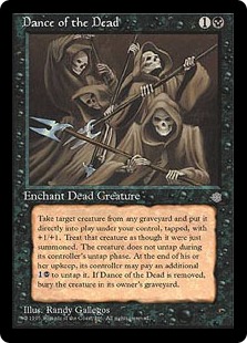
Whenever I think of cards that make me stumble, Dance of the Dead always comes to mind. This bad boy has eleven lines of text, each more confusing than the last. And I know what you’re gonna say. ‘Chase, it’s so old it’s probably been errata’ed to be simpler.’ Sad to say this is not the case. The original printing of the card has eight lines of text running together in an insane paragraph. The errata gives it a cool crisp eleven. If you’re ever looking for a nifty gag gift for your Reanimator friend, Dance of the Dead is a great one to snag. Just make sure you give them some time to digest it.
The One Ring
And finally we have The One Ring. Again, I love this art. Everything that Justine Jones does is drop-dead gorgeous. What I find to be an issue is, you guessed it, the text box.
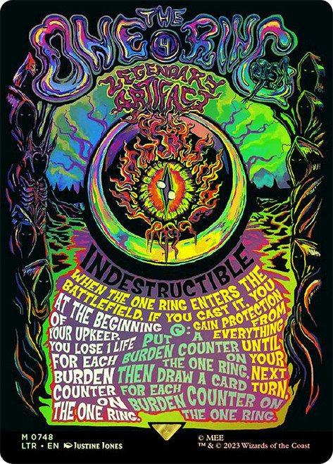
Remember when you were in school, and you were writing words big on a poster board, only to find out you ran out of room, so you had to squish the words together to make them all fit? Yeah, that’s what this card is to me. I also find there to be a disconnect between the font used for card name/type and the text box. The difference is a bit jarring. Obviously, making the whole card have the same font as the title would be impossible to read, but it would look a lot cooler than the Canva vibes it’s currently giving me. At least the art is sick, though.
Growing Pains
I am overjoyed that we are seeing more and more unconventional forms of art pop up in Magic. I love the wacky styles, bright colors, and pop culture references. What I don’t love is not being able to understand what I’m seeing. I don’t want this to seem as though I’m solely being negative. On the contrary, I think these frogs are necessary. I consider them to be growing pains in something somewhat relatively new. If we don’t talk about what we don’t like, how can anything be corrected? All we have to do is wait and see what the future holds. Happy brewing, deckbuilders!