Hello folks, and welcome back to my final article of the year here on Star City Games, and the fourth in my collaborative series with your own John Dale Beety. Today I’d like to continue showing a little more than meets the eye when it comes to Magic: The Gathering artwork. No, we won’t be looking at the new Transformers cards, but rather the Showcase Schematics of the Retro Artifacts series in the recently released The Brothers’ War expansion.
In total, 63 artifacts were reprinted in the retro frame, and those same 63 were reimagined as schematics under the art direction of Sarah Wassell. Of these, 39 artists returned to reimagine their original illustration (whether original to the card or a now-aged reprint), and 24 schematics were done by a new artist not responsible for the first (or any past) iteration. Serialization notwithstanding, the resulting collection of artwork is an absolute innovation in the showcase series for the game, and a sprawling conglomeration of styles holding all matters of secrets. Our quest today is to expound upon some of those things you can’t quite see at card size, and I think you may be surprised what’s hidden in plain sight within the cards in front of you.
Secret Supplies: Titus Lunter and Chris Rahn
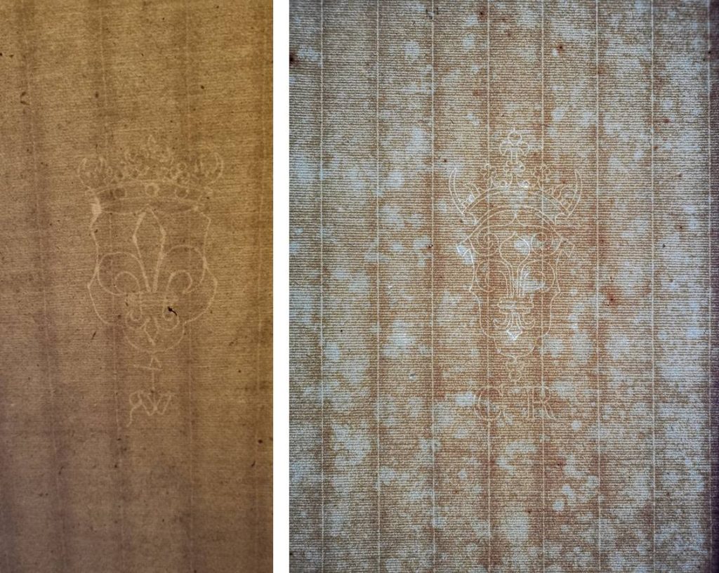
I’ll begin our exploration with the intersection point between me and my collaborative partner. If you’ve read John Dale Beety’s piece over on Hipsters of the Coast today (and if you haven’t, do that once you’re done here), then you know two of these schematics are much “older” than they appear. Artists Titus Lunter and Chris Rahn, in order to flourish that ancient feeling, both chose to work on paper hundreds of years old.
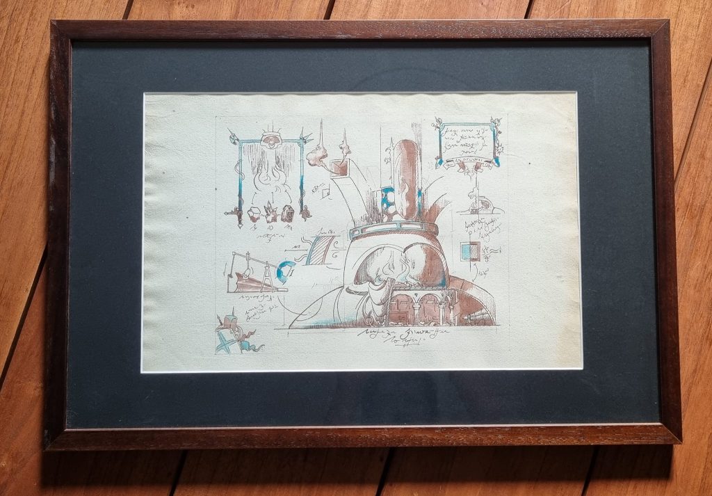
Lunter used paper made and watermarked by Wendelin Riehel, dating from the early 17th century, and the very same paper that Rembrandt used during the Dutch Golden Age. Rahn chose 18th-century English paper manufactured by Clement Taylor in or around Kent, England in the last quarter of the 1700s.
Additionally, each artist worked with particular ink to further the flavor, with Lunter choosing Scribo ink, a contemporary Italian brand made in the 17th-century manner, and Rahn cracking out his dip pen to work as closely as one might have two centuries ago.
It’s one thing to create an image as if it was made during a different time. To actually bring that piece to life with material and manner is a different task entirely, and a very special component of this overall showcase set.
Secret Script: Lars Grant-West and Chuck Lukacs
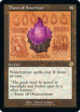
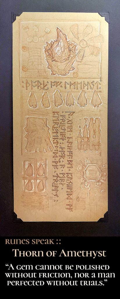
We now know there is more than meets the eye when it comes to material, but what about within the works themselves? During my time studying this set, I came across two especially fine examples of script present in the schematics. Up first is Chuck Lukacs’s recreation of his Thorn of Amethyst.
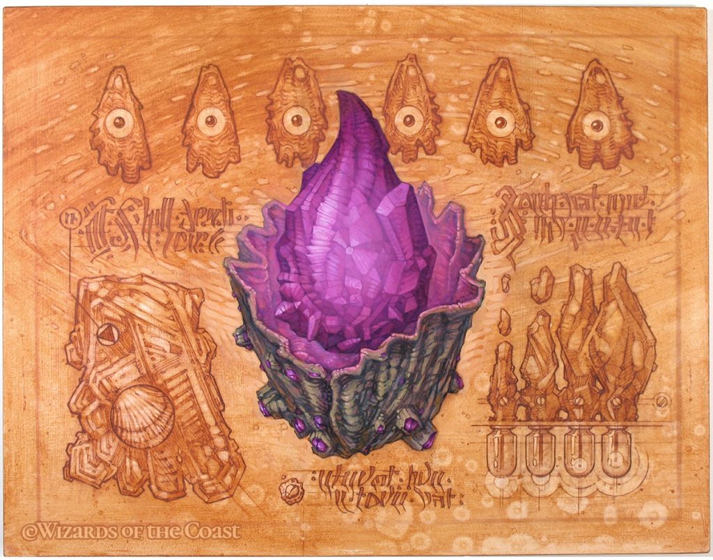
The runes present to the left, right and below the artifact are not just nonsense, but in fact spell out the great quote by the ancient Roman philosopher Lucius Annaeus Seneca the Younger, oft known just as Seneca. It says:
“A gem cannot be polished without friction, nor a man perfected without trials.”
How do we know this? Well, Chuck told us of course, but only deep within the auction listing for the preliminary sketches surrounding this work, inside one of the photos:
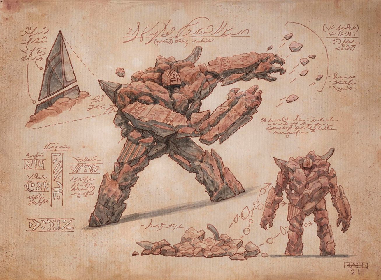
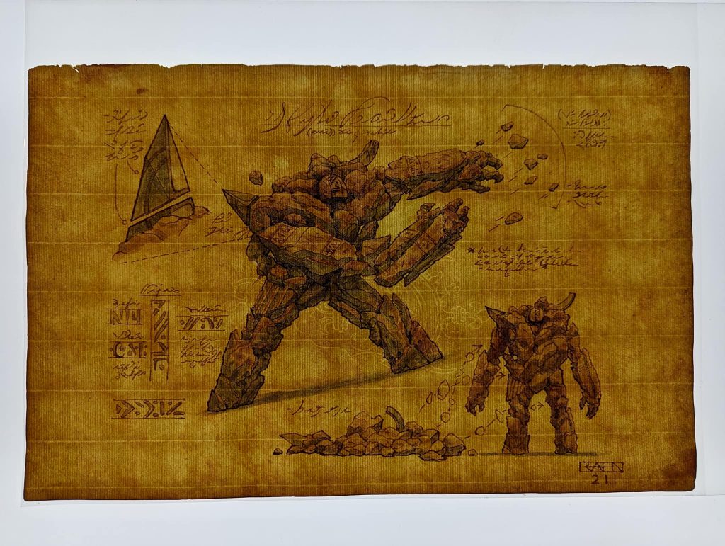
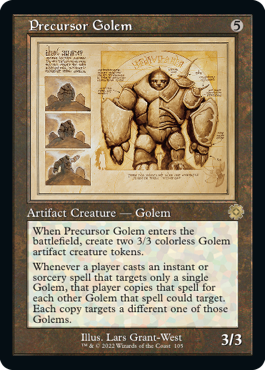
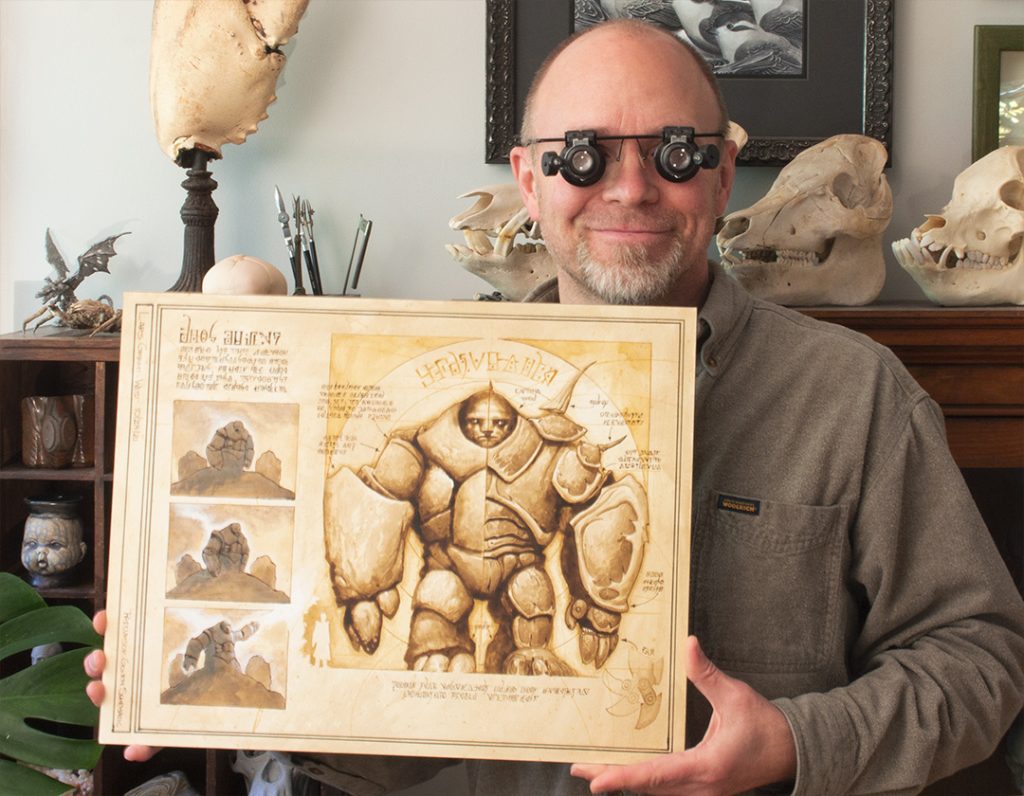
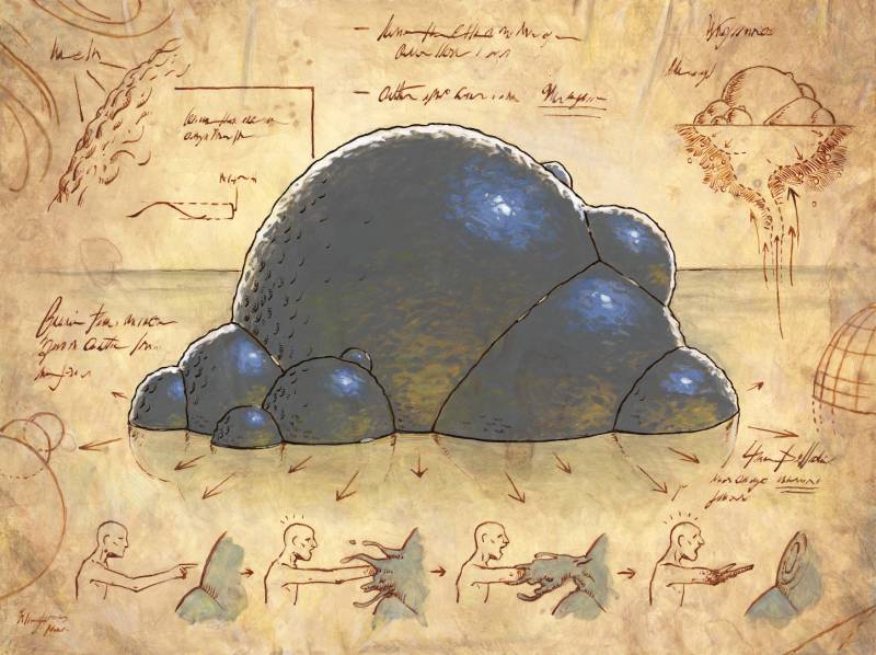
Conversely, we can look at Lars Grant-West’s Precursor Golem, a reimagined version of the original Scars of Mirrodin card by Chippy, that has considerable writing in the margin to mimic design notes, almost as if a field guide.
Lars made a fun little four-minute video, and you can watch this Golem come to life, along with all that brilliant script.
The text begins at 2:48, and as you can see, he wrote it bottom to top and left to right. Why? Because Lars is a lefty, and he’d smudge it otherwise. And what does it say? Absolutely nothing! He made it up entirely!
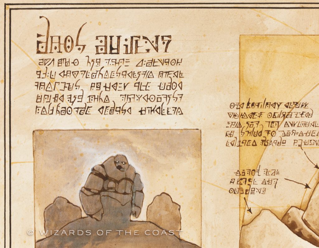
When you look closely, you realize that in this case, the words say nothing at all! And yet you still got that feeling, didn’t you?
You didn’t think this entire article would be serious, did you? It’s like you don’t know me at all. Anyway, I digress, back to the pictures!
Returns: Steven Belledin
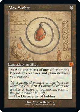
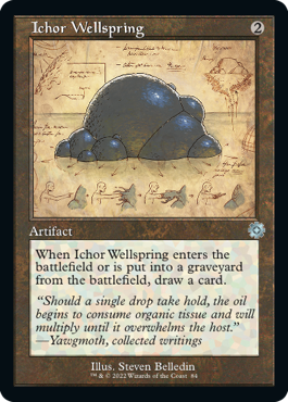
As I mentioned at the beginning, many of these schematics have the same artists that did the original artworks for the card. Steven Belledin was one of those folks, and he had the chance to look into the recent past, towards his 2017 Mox Amber, and then into the Wayback Machine all the way to 2010 with Ichor Wellspring.
I’m not going to go into too much detail because Steven has already done that, in his regular contribution to Muddy Colors, where you can read right from him how these two pieces came to be. It’s like a Behind the Brush every single time he posts, and frankly I’d like to see more players get their eyes on these artwork peelbacks by one of the best in the game today.
Before I move on though, I’ll give you a short TL;DR: Steve did sneak his name into both pieces. I’m not going to tell you where, but see if you can find them before you read his full write-up. They’re in there, I promise.
Reimaginings: Ben Hill
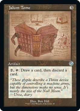
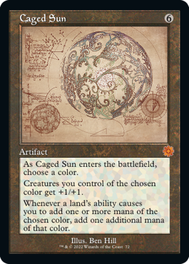
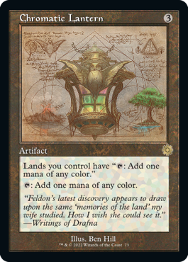
And again flipping the narrative, for as many folks who were tapped to revisit their old works, there were almost that many for which the original artist was not available, and thus the task of reimagining passed to another. Chief among these folks is fairly new Magic artist Ben Hill, who had four cards in this series. I had a chance to talk to him about these works via email, and get some insight into how he tackled the challenge.
Perhaps the biggest challenge for Hill was that Art Director Sarah Wassell wanted these to appear as if created by four different inventors, as their original cards were from four different artists. That meant four different approaches, and four different thinking caps. It also meant that because these artifacts were from quite some time ago, Wizards of the Coast (WotC) didn’t have the best resolution for reference images. Ben mentioned for Jalum Tome, he actually found the original painting online, and zoomed in to try to pick up some of the detail needed.
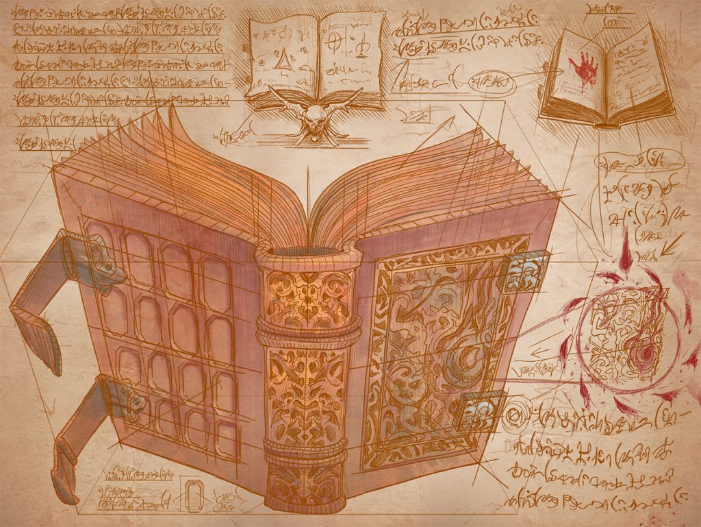
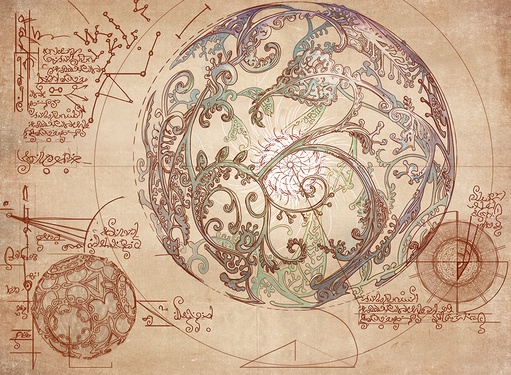
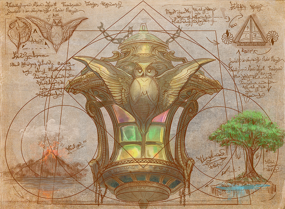
He drew inspiration from the Voynich manuscript, an illustrated codex of the 15th century filled with all matters of symbology, astrology, fictitious plants, and other diagrams. Profusely illustrated and filled with an otherwise unknown writing system, the meaning of its contents largely remain a mystery to this day. (As an aside, the manuscript, now held by Yale University, can now be viewed in its entirety).
The manuscript found in each work is written to mimic its design, just as found in the Voynich, whether the spirals and flourishes present in Caged Sun, repeated in script:
Or the block font, symbolic of the strong geometry and architectural designs of Chromatic Lantern:
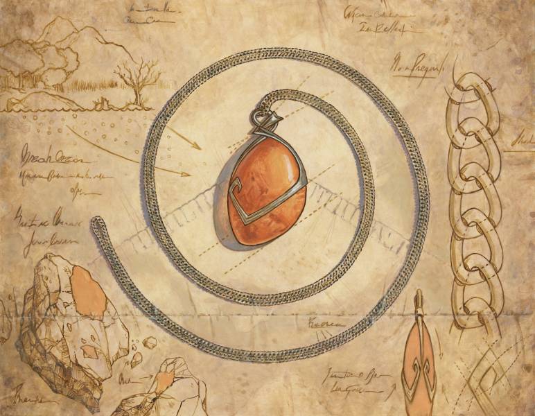
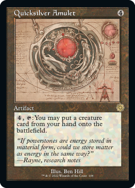
He also brought a particular narrative to Quicksilver Amulet, placing it firmly in the Brothers’ War era of Dominaria while at the same time keeping it true to its Da Vinci-esque roots. He explains below:
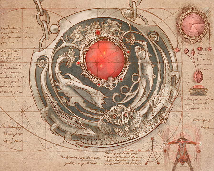
“Quicksilver Amulet has a few story elements that I was quite proud of; a lot of things that don’t really come out in card size but are there in the art. I quite liked the placement of the five smaller gems to resemble how a spellcaster would hold or wear this amulet to best channel their magic. Another hidden design is the faded pattern pressed into the parchment, based on the Fallaji Empire design motifs, as well as the sorcerer’s clothing demonstrating how to use the stone. And I used a golden ratio spiral out of the center gem in the design, which is always fun to do.”
Ben Hill was able to breathe life into these four pieces as no one else could, all distinct, all unique, and each a triumph in its own right. It’s an amazing little group of stylistic diversity, and cannot go unnoticed.
Secrets Revealed
There is so much to see within the art of these tiny pieces of cardboard. I’ve talked about only ten from hundreds of cards in this one set, a fraction of the thousands (yes, thousands) of new artworks to join the game this year. I implore you to continue to look closely, to follow artists, to ask questions, and most importantly, to enjoy the artwork that makes Magic: The Gathering special, and the best game in the world.
Before I sign off for 2022, I’d just like to say a quick thanks to my partner in crime John Dale for inviting me along on this ride; we’ve had a lot of fun this year traveling down the rabbit hole of our collective experience, and I hope you’ve all enjoyed it as well.
I’m not yet sure what 2023 will bring, but I hope to see you back here next quarter. Remember you can always find me over on Hipsters of the Coast, and as always, stay tuned, and thanks for reading.