A while back, I wrote about the one thing that defines Magic art more than anything else: the 2″ x 1.5″ box that all of that precious artwork has to fit in. We call it “The Little Box,” and it’s a crazy, specialized format that artists have been trying to break for years… And, largely, failed.

The problem is that artists put a lot of time and effort into cards that just don’t work. They spend hours putting in details that just don’t pan out; speaking as someone who’s drawn a few cards himself, it’s more than a little frustrating to see your fine detail turned into a smudgy quarter-inch streak of color. (In fact, “wasted artwork” was the very reason we created Magic Arcana and the Wallpaper section — we hate to see people’s efforts going to waste!)
We can — and have — tried to teach new Magic artists the rules for creating good artwork to optimize the Box, with mixed results. But when you think about everything that the Little Box requires, it’s pretty strenuous:
- Only one prominent figure (so no pairs of people)
- Low-contrast artwork (because areas of high color tend to blur together when held at arm’s length)
- No complex compositions, period (because the art is so small)
And even then, a lot of cards aren’t as successful as they should be. I’m not going to name names, because every artist has a different take on what “success” is, but I know a lot of artists haven’t been happy with the things we’ve had to do to their cards to make them pop for this game we all know and love.
That distresses me, because I like to have happy artists. And one day, I was discussing this issue with Mark Rosewater, who’s usually a good man to bounce ideas off of… And he asked me the question that totally changed the way we thought about art.
“You know,” he said, scratching his chin, “Newspaper comic strips are facing the same problem. There was a time when you had rich, dense art like Little Nemo in Slumberland, but that was when you had a lot of space to work with. Thanks to shrinking ad revenues, comic strips have shrunk to smaller boxes than even Magic has to offer.”
“So how’s that a solution?” I asked.
“They solve it by going for a more iconic look,” Rosewater said, and the light went on in my brain. We’d been approaching this backwards; we’d been developing full-sized art and trying to shrink it down for a ludicrously-cramped space! Why didn’t we tell artists to create the art at the actual size, moving away from the hyper-detailed fantasy look we’d gone for and towards a much bolder feel? (After all, as much as I hate to reference rival card games, the iconized artwork of Yu-Gi-Oh and Vs. hasn’t hurt their look.)
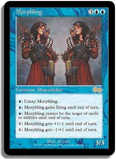
I can see you’re getting a little confused here, so let’s take a look at a card that everyone knows: Morphling. (“But Morphling’s not a new card,” you say. “Nobody knows it.” Well, they will after it’s reprinted as the new Clan Chief of the Simic. Whoops — did I just say that?)
Now, let’s take a look at this artwork, which is about as good as Magic artwork gets… And you still can’t see that much of it. Both of them have a checkered sash that almost fades into oblivion. They have different facial expressions, which does not come across when squeezed into the Black Hole Of Calcutta-like confines of The Little Box. And yes, one has a tail — a critical detail that just doesn’t come across in that tiny, tiny space.
But once we treat the new Magic art as if it were intended to be bold and iconized, we have this!
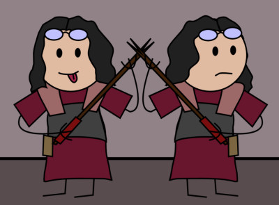
Look at the clean, bold art style! You can pick that card out from across a room, baby. And the critical detail that the Morphling on the left is different is obvious from the clever touch of the stuck-out tongue. (Not to toot my own horn here, but I did draw it, so show me some love.)
Another advantage to this is that we can start getting some of the comic artists to draw for us. Next week, I’ll show you some truly stunning artwork from Scott Adams, creator of Dilbert, and Stephan Pastis, the man behind Pearls Before Swine.
But when we started iconizing the new Magic artwork, we realized it was time for a revision of the card look itself. Those bold, clear artworks just didn’t fit on the old, muddied frame we’d stuck them in… And so we redesigned the card face.
Yes, we did a reboot only a few years ago — but we’ve done a lot of studies since then that shows that new players are still hella-confused by Magic itself. They don’t know what a Converted Mana Cost is, and really it’s nowhere to be found on the card. That’s bad design. Likewise, since we’re keying so many effects off of cards lately, people have been confused by what color something should be. And lastly, though we’ve tried very hard to give reminder text when appropriate, there’s still a vast leap from the Basic sets to the Expert sets that throw an awful lot of players into confusion… And they wander away from the game.
And so, let me introduce to you the new card face of Magic!
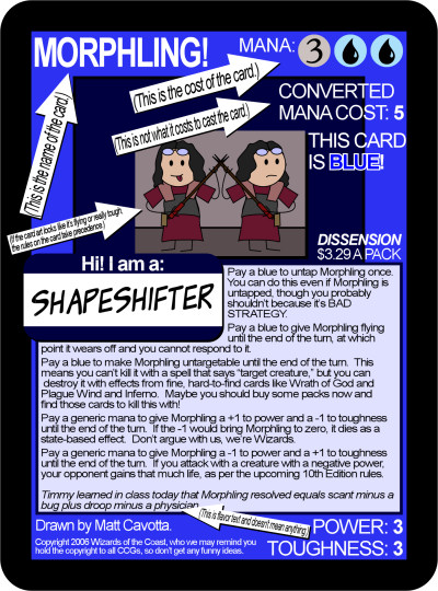
Now, many of you will complain because this isn’t the card face you’ve grown to know and love over the past few years, but Magic is about transition… And sometimes, we have to discard ideas that aren’t working. This much cleaner design introduces the new player to the basic mechanics of Morphling, and erases all possible confusion on pretty much every level that players have had. We’ve done tests on retarded twelve-year-old children, and they could follow the rules of Magic without question… So it’s not going to be a problem for anyone else.
Note the rules text changes, as well. We not only tell you what the card does, but our Judge database allows us to find the most commonly-asked questions and anticipate what sorts of rules questions may come up. This new policy of “The Card Is The Judge” is something that John Carter will go into more detail on tomorrow.
“But Matt,” you say. “The artwork isn’t any bigger; in fact, it’s smaller!” Which leads me, inexorably, to the next surprise:
This card is actual size.
Now, again, many people will be upset by the new 6″x9″ cards, but the time has come to admit that Richard Garfield was a visionary in many ways — but blindly aping baseball cards for inspiration wasn’t one of them. For years, we’ve been trying to squeeze a boatload of mechanics, rules tips, flavor, and just plain fun into a miniscule space. Magic’s a complicated game, and the small card size just doesn’t work.
We thought about all the bonuses that came from larger card sizes:
- Increased usability
- Decreases cheating at tournaments (try one-hand shuffling this!)
- Increases visibility, so if you’re playing Magic people will know it from across a room — enabling you to find fellow players more quickly!
- Enables vision-impaired players to play
- Obese children can hold them without getting paper cuts
- Binder sales will increase
Really, there are very few downsides except for the obvious — backwards compatibility. But being forced to keep the same card design for years had stifled Magic (the misprint on the back of the original printing has been painstakingly reprinted for years, for example)… And even though it’s time we shook things up a bit, we didn’t want to leave everyone in the lurch.
Thus, our new plans to reprint every card in Magic.
Oh, you’ll need to re-purchase them to play at tournaments, but in these days of buying the DVD for the Fellowship of the Ring and then buying the Special Edition at Christmas, is that really too much to ask? Starting with the release of Dissension, we’ll be re-releasing one old set each month until, in April of 2010, we’re all caught up.
Now, there is one other issue — namely, that people have paid a lot for their Moxes and don’t want to see them reprinted. (Though if you’ve seen the new, iconic Black Lotus, you’d change your mind toot sweet!) And we agree that Vintage players should be able to keep their value, which is why we won’t be reprinting them. To keep it fair, however, we’ll be announcing the banning of several hundred cards in Vintage.
But more on that next week. For now, just think about all the cool things that Magic will be bringing to your doorstep… And enjoy!