It seems like only yesterday that I was high-fiving all in sight upon learning of my acceptance into this talent search. Now we’re at the end, the top
four.
Getting to this stage has been a long process, spanning what seems like an eternity. Every time one of my articles goes up, I spend the following three
days refreshing the forums/Twitter, gathering feedback. I then wait for two days or so for the voting period to elapse until it’s time to spam ‘F5′ on
the forum screen again in anticipation of the results article, which is visible there prior to its being live on the front page. It’s exhausting!
Worrying, hoping, stressing about my next article and the epic-ness that it must be to catapult me into the next round. It wasn’t always this way. No,
I never planned on making it this far…I don’t put decklists in my articles!
The first batch of articles I put out were not very stress-inducing in comparison to the last three or so, that is. People kept dropping out of my
division, resulting in me defaulting my way up the ladder. It was like being Inspector Gadget, just sort of bumbling my way through until the bad guy
was accidentally apprehended. I was just grateful to still be in the contest at that point. Then something clicked. Despite having always been a gamer,
I’m generally not all that competitive, but for whatever reason, I ceased being content with my mere presence on the site and began to truly believe I
could go all the way. Cue the stress. With my chronic procrastination in tow, I would attempt to take this thing down…after just one more game, okay?
I’d like to start off my top-four article with my own work before we take a trip around the globe admiring what the best of the best have to offer. In
no particular order, here are my top-four alters I’ve had the pleasure of working on:
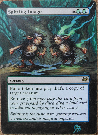
I’ve chosen this one because it’s the best I’ve ever color matched a card. It didn’t take me too long to complete the Spitting Image, as it has a
fairly straightforward border to match, but I really like the way that it turned out.
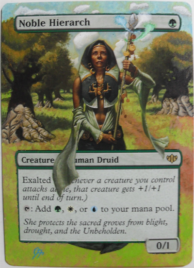
This Noble Hierarch is still probably my favorite alter I’ve done. For whatever reason, I was just excited throughout the whole process. Even when I
was having difficulties with the clouds (which I’m not entirely happy with), I was still inspired. I spent a very long time extending the cloak into
the borders and really like how that turned out. The matching in the foliage also turned out really well. The Spitting Image, Noble Hierarch, and the Tooth and Nail I showed back in
November have all been reacquired to use as display pieces for my binder. I may end up selling them down the road though.
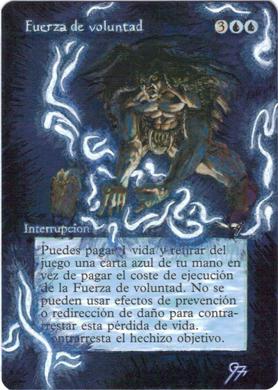
Everyone seems to like this Force of Will I did a while back, though I can point out a bunch of things I’d change if I had another crack at it. The
fact that it’s a blue card, yet the art is mainly fire, has always annoyed me a little (sorry, Terese!). I’ve always wanted to see a Force be blue, and
what’s more blue than Jace? I just took out all the fire, added blue highlights all over the place, and used the Jace glowy spell idea.
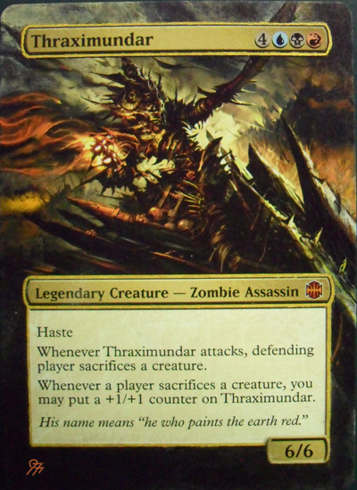
This Thraximundar was done for one of my local players as his Commander. I did this guy pretty early on, but it turned out very well. I only have a few
things I’d like to fix, but for the most part, it’s one of my best as far as matching goes, especially with the fiery stuff on the left-hand side.
While browsing through the massive e-tome that the MTGS altered art forum has become, you’ll encounter a plethora of different artists, each with their
own unique set of skills and abilities. Artists that share their work repeatedly throughout the history of our altering ‘bible’ tend to stand out a
little more than the rest though. Evidently, practice does make perfect. So when it came to choosing my top four alterers from the community, frequency
was definitely a factor. All four have different styles, varying backgrounds, and are scattered around the globe. Thankfully, they all share the love
of alterations.
Let’s begin with Sandreline. I displayed a few pieces of her work in my last article, and everyone seemed to respond very well to her incredible Misty
Rainforest alter. Sandreline lives in France, outside Lyon, and has been altering for about a year and a half. Surprisingly, she’s had no formal
artistic training, yet her work is comparable to that of professional artists. Considering she’s a full-time dental assistant, it’s amazing that she
finds time to churn out the alters as quickly as she does. Here are Sandreline’s personal top four alters:
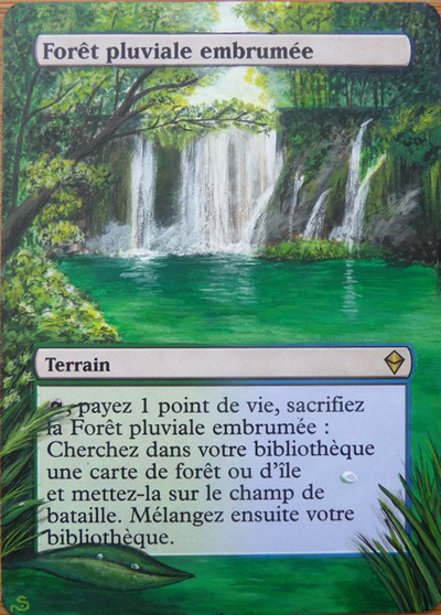
I had a commission from a Croatian player; he wanted me to paint a landscape of his country. As I was looking at galleries with Croatian
landscapes, I came across this picture,
and I said, “Wow, just wow, this is so amazing. I have to paint it!!!”
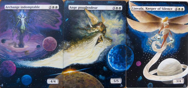
The space design was a friend’s idea. At the beginning, it was for the Baneslayer Angel only. As she was in the sky on the original artwork, he
told me it would be cool to draw some planets. That’s how it started! The panorama is for a guy who collects angels: for the moment we made three
cards, but there will be other angels.
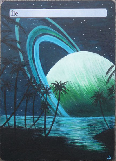
This is a continuation of what I love to paint; landscape, planets, night…
I don’t know who did the original artwork though.
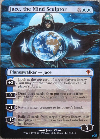
Jace was a commission for a guy who wanted me to do some “night” artworks. The Earth is symbolic, you know: Jace rules the world of Magic!
 🙂
Sandreline’s alters will most definitely be woven into future articles, as I frequently draw inspiration from her work. In my alter this week, I’ve
used her version as a ‘goal’ for my paint job to aspire to. That, and many of her other alters can be viewed at her website.
Jumping from France halfway around the world to the Philippines, the next artist in my top four is Poxy14. If you’ve been reading this series for a
while, you’ll also recognize him as Earl, with whom I did a full article spotlight a couple months back. For the sake of brevity, his more in-depth
back-story can be found in that article.
I finally managed to get him to pick some favorites, though he insisted on four ‘sets’ as opposed to four singles:
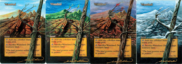
One of my earliest commissions came from Jester and this I dubbed “The mother of all my seasonal alters.” This line-up was bundled with some power
cards (Lotus, Baghdad’s, Grim Tutor). This playset gave me the confidence to alter big money cards since I had just started altering during the
time (2009).
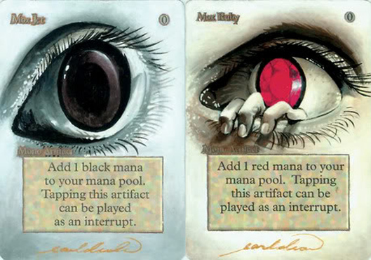
Altering “power” cards are very challenging tasks indeed, but these guys put me on the map of card altering. Dragzz created such a cool concept for
these, having them retain the original art on a new look, full-art alter; all I had to do was render them well. I think we did a great job on these
cards.
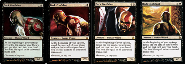
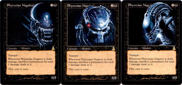
Bio’s series started the “concept alter” lineups for me. It took a while for me to finish this lineup, since I was just finding new techniques and
learning to put very tiny elaborate figures on the picture box of the card. I love how well I made the anatomy and colors of the chosen subject for
these cards.
Incredible stuff, as always. To see Poxy’s complete gallery (warning: can be glued to screen for hours!) head over to his photobucket.
Back to Europe we go, this time visiting Germany. Sandreline’s neighbor to the Northeast is one of the most respected altering artists on the MTGS
forums. Malte, or more commonly known as BigUp, has been one of the most active contributors to the community over the last two years, and his work
with foils is unparalleled. Having focused entirely on artistry throughout his education and now currently working as an art director; BigUp is one of
the most skilled alterers out there. He was eager to share his work for this article, though it was painful filtering down to just these four pieces:
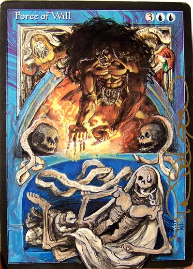
I made this one to play in my cube. A friend took it to a GP and stood in line for three hours to get it signed by Terese Nielsen. Thanks,
Matthias!
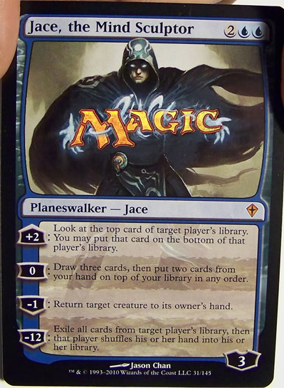
This is a regular Jace with a foil Magic Logo. It only took about 30 minutes to complete. I used a foil layer from the Divine vs. Demonic box and a
little paint.
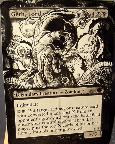
I did this one for a contest at MTGS. An homage to Andy Brase, my favorite comic artist.
I love painting black and white.
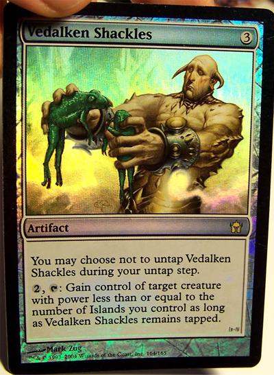
Me like Frogs.
If you ever have the pleasure of meeting BigUp, all of these and many more can be found in his cube! His photobucket is great viewing, as there are a bunch of different foil alters,
which you won’t find in too many other people’s galleries.
Lastly, I’d like to shed some light on America’s own Eric Klug. Eric has been altering cards as long as anyone, having started almost three years ago.
Currently, he’s making a living altering Magic cards, of which I am extremely jealous. A background in the arts certainly helps, having achieved a BFA
from the Corcoran College of Art & Design in Washington, D.C.
I’ve been following Klug’s work for a while now, and his alters have certainly jumped up a few notches this past year. When asked about his personal
favorites, these are the four he sent me:
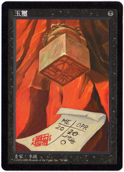
This was one of the first, more expensive cards I did after I started off altering. It’s an original idea, and I was extremely happy with the way
it turned out. The mark of the seal on the paper turned out to be a nice touch. It’s exactly as it should look minus my signature I incorporated.
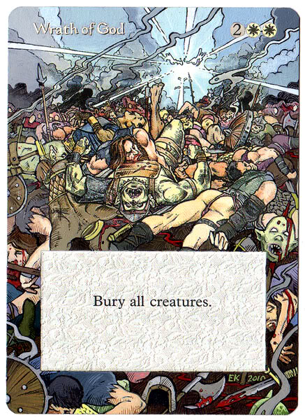
Quinton Hoover’s art is pretty popular among Magic players, and I’m no exception. I had this Wrath sitting in my binder for the longest time until
I finally worked up the nerve to do an extension on it. It took me three days to complete, mostly because I had to rest my eyes after completing a
square inch or so.
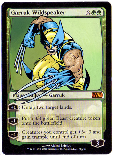
Superheroes is kind of my shtick at the moment. It started with a Thor Koth of the Hammer and snowballed from there. Wolverine was always my
favorite when I was a kid. This one just went real easy from start to finish. It’s one of the few alters I have yet to sell as I’m not quite ready
to see it go. Â
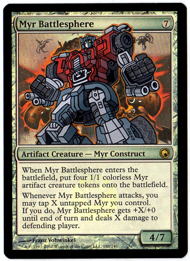
Transformers are just so fun to draw and paint. That tiny detail all over their design is a lot of what draws me to altering in the first place. I
like how Optimus pops on this foil Battlesphere. I didn’t really try to hide the Myrs behind him; they just ended up fitting. A nice, happy
accident!
Recently, Klug’s been on a comic/superhero painting spree, and the result is unbelievable. Be sure to stop by his photobucket to peruse the awesomeness!
On to this week’s alter!
The other half of Noah’s commissions, Primeval Titan, was vastly more enjoyable to work on than its frozen cousin. I also came to the realization this
past month that I really enjoy working with greens. Not quite to the level of Nagle’s love for the fatties, but it’s getting there. It may have
something to do with the number of different shades of green paint I own, making it easier to weave the perfect color. Maybe I’ve just completed enough
green cards to grant a certain familiarity with the process. Who knows?
Starting with a nice deep green base layer (multiple thin layers, really) we get the jungle giant underway.
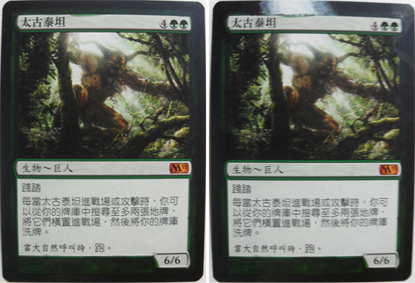
I then began laying down some white layers at the top where the sunlight originates. It’s hard to tell, but in the upper right side, I’ve mixed up some
green with black and started planning where my branch extensions are going to go.
Taking a stock lighter green, I started mapping out where I wanted things to go, while at the same time, taking some browns to draw where the branches
will be soon. Turned out the green I chose was god-awful, and I wasn’t happy with the placement of branches and such.
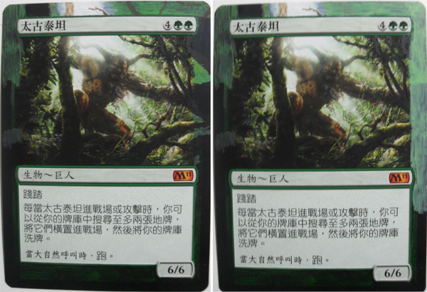
I found a lighter green that would make a better base color and went over all the top and right areas again to get rid of the things I wasn’t a fan of.
It’s better to make a change earlier in the alter while the paint is still relatively thin on the card than to try to undo your mistake later on as I
had to do with the Frost Titan.
I then jumped into some branches and the rock in the bottom right. Technically, I should have been working on the foliage that’s farther back in the
picture, but I wanted to get a feel for the branch locations early on. If I had done all the foliage first and then put on a deep brown/black mixture
on top for branches and not been happy with it, I’d have a lot more work to do to fix it. This way, I can build the foliage overlapping a little bit
and then shore up the branches later on.
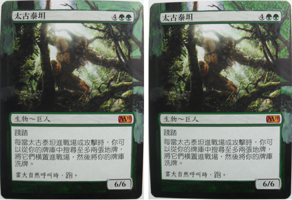
The next part was to rough in the foliage at the top of the right tree and adding some darker greens to be built on in the nooks and crannies down the
right-hand side. The rock started coming together pretty nicely here as well.
While the photo quality is lacking a little on this picture, I wanted to show the stages of the foliage, and it serves that purpose. With that deep
green in the last step now having been layered with some lighter green, we can start getting some depth. The top sunlight has also been expanded here
to come in to the trees a little more. The rock is almost finished in the first image, needing only highlights.
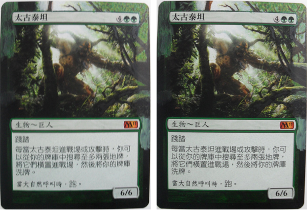
A much better photo shows the highlights on the rock very well now. I also spent some time detailing the light effects on the larger two low branches.
The light has been worked into the right-hand foliage, as I found it looked too dark; then we put some visible branch tips in the canopy.
Adding more dark green to the canopy ended up looking a little odd here, and I wanted to rewind a little. I figured I may be able to mix some yellows
in with a green to downplay that dark green a little later, so I carried on. The top left treetops have been worked on a little here as well.
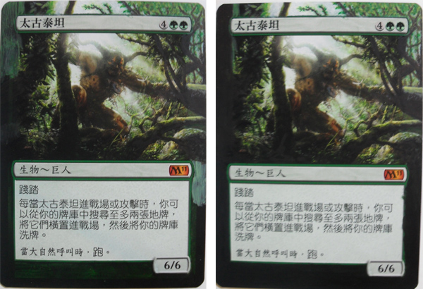
With the right side of the picture put on the back burner, I wanted to shore up the areas I hadn’t given any love to yet. I started playing with the
upper left tree and its orientation and also darkened in the lower half of the card to hide the green by the M11 symbol and the frame that was still
visible through the green base coat. If you look closely, you can also see where I’ve worked my black in with the original tree in the middle of the
card.
I got a little carried away in the next two steps and neglected to take a few relevant pictures. The first shot shows where I went with that left-side
tree, including the highlights that I spent some time on. They still look a little hard and fine in this picture but are softened a little in the final
version.
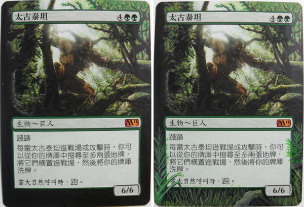
Being happy with almost all the foliage and branches, I moved to the bottom of the card, which seemed to need something. A lot of the time, I can leave
the bottom portion of the card black and just blend it up to the image, but it truly depends on the original art’s orientation. Needless to say, I
added some grass, ferns, and a rock.
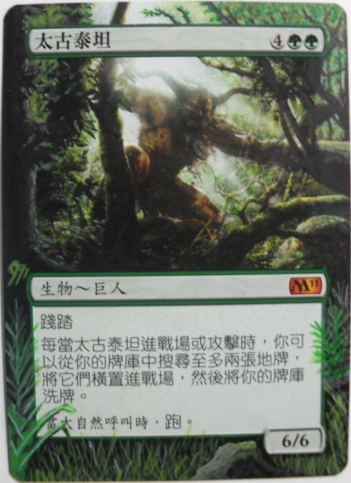
Add the signature and clean up rough borders, and we have a completed Primeval Titan!
Considering this is my last article as a talent search contestant, I’d like to do a few quick shout-outs.
First and foremost, I have to thank you guys for reading, voting, and commenting in the forums. Without an audience, I wouldn’t be writing, and I truly
do welcome any ideas, thoughts, and criticisms on my work be it past, present, or future. It’s been an amazing journey; I’ve learned a lot about
writing, painting, and most importantly myself, and I have you thank for this.
Next, I’d have to give props to my pal Sean Peconi. Without your continual support in both the encouraging and nagging forms, I wouldn’t have gone as
far as I have in this contest. I know, bro-mance much…but seriously, good friends are hard to find. The types that will push you to be better are few
and far between. So a heartfelt ‘thank you,’ homie.
Thanks to my family and close friends. I know that my extracurricular availability has dwindled since I undertook this project, and I appreciate
everyone’s support. My wife, Tiffany, usually just sees the back of my head after 9 pm, when I have my headphones on and brush in hand. I love you and
thanks for taking on more than your share so that I have the time to finish my articles and alters. Also, a big shout out to my co-worker Barb who has
been an immense source of encouragement in both this contest and in life in general.
To close out my top four thank yous, I must mention all those who placed their trust in me with their cardboard. Prem Sonegra, Noah Whinston, Matt
Urban, and many others who have requested commissions from me during the last year have all been great to deal with, especially considering some of the
delays they’ve had to endure for various reasons.
If you enjoy seeing something a little different than decklists and tourney reports, keep me around, and we’ll continue to explore the artistic side of
our beloved game for the next year!
I welcome any questions, comments, commissions, angry rants pertaining to the level of suck that you feel I display, or suggestions. Don’t be shy!
Twitter: @jerfroggatt
E-mail: jfroggatt at persona dot ca
MTGSalvation: Kyrian
Facebook: Jeremy Froggatt
Cheers,
Jeremy Froggatt
