Any flavor review of Magic 2014 has to start with the new Slivers.
The elephant-sized Elephant Guide in the room.
Before I get to my thoughts on said new Slivers, here’s the necessary disclaimer: I have contributed creative text to Magic: The Gathering card sets (not Magic 2014). For sets where I have advance knowledge of the contents, I am ineligible to play in Prereleases; when I have knowledge of the full set, I will not play in tournaments or distribute decklists to anyone until after Magic Game Day.
Sliverlicious 2.0
So, new Slivers.
/me takes a deep breath.
I’m more positive on them than I thought I’d be.
Am I completely happy? No. I have memories of what Slivers were, and the change is tough to accept. With Slivers it’s harder than for, say, Goblins because they’re Magic unique and they don’t show up that often. There’s a definite impulse to be protective of them, to resist radical alterations. The last time we saw Slivers labeled Slivers was in Time Spiral block, when every player who had seen them before was primed to be nostalgic (and those just entering the game were primed to be…confused).
I’m of two minds about this one.
It can be difficult to break out of one’s own experiences and ideas, but in thinking about the players who have come into the game at different times and the Magic environments they have encountered, it’s plain to me that many current enthusiasts have never played with Slivers to any great extent. Before Magic 2014, the last Slivers (with Sliver on the type line—Changelings can go fly a Journeyer’s Kite) printed were Virulent Sliver and its buddies in May 2007. Before that, it was Scourge with Sliver Overlord in May 2003.
The great "acquisition" push by Wizards of the Coast dates to early 2008, and Duels of the Planeswalkers was not released until June 2009. Any players who came in on that first Duels wave were introduced to the tail end of Alara block and Zendikar; those who were part of the initial acquisition push found themselves in Lorwyn (aka Tweeland) or Shadowmoor.
Slivers never were that prominent in Time Spiral/Lorwyn Standard (Faeries were more in force) and haven’t been a force in Modern at all, with only the Time Spiral Slivers to choose from. I started with Odyssey and encountered Slivers in their second act during Onslaught block; I could appreciate the first generation of Slivers in my own way but not in the same way as someone who played them through Limited and Standard. Even Time Spiral’s Slivers are part of a dusty past for many in the active lifeblood of the game—much the same way that old-school "lords" such as Elvish Champion, which buffs all Elves on the battlefield, gave way to more selective lords like Elvish Archdruid that reduce the complexity of the board state in mirror matches.


One core set and a huge philosophical divide apart.
In changing the Slivers’ visual forms at the same time as the mechanics, Wizards took a "rip the Band-Aid off" approach, which I find understandable insofar as it’s a clean break from the past. The Slivers of Shandalar are to the Slivers of Rath as New Phyrexia is to old Phyrexia: the core is the same, but the details and the visual output are far different.
On a strictly personal level, I don’t like how the new Slivers look, and I can’t speak for how they play. (Professionally, had I done creative work on Magic 2014, I would have treated them with the same high standard I would give to any card regardless of my individual distaste for the New Phyrexian visual aesthetic.) On the other hand, these Slivers aren’t for me. They’re for the newer players: the ones who walked into Lorwyn and thought all of Magic’s elves have horns, the ones who never knew a Mirrodin unscarred, those for whom the Return to Ravnica was the first time.
As always, business considerations will rule. If the focus groups and financial results come in and the new Slivers are hurting the bottom line, they’ll be gone ASAP. If they prove as popular as Ravnica, particularly with those prized newer players, then of course they’ll come back. In the meantime, the new Slivers are, and whatever your first impressions were, I ask that you give them a fair shake.
And now…the rest of the story.
New Artists of Magic 2014
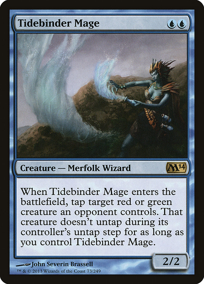
John Severin Brassell actually made his debut in Dragon’s Maze with Wind Drake, but I totally whiffed on giving him his due then, so here’s a belated celebration. His Tidebinder Mage might end up being a Constructed staple, but I’m not sold on the art itself; it looks more like a spell than a creature with the way the mage is shunted off to the right and his mermagic is taking center stage. Of course, that could be a case of repurposed art, as I suspect happened with Elite Arcanist. I’d like to see more before I render a verdict.
Jonas De Ro – This Belgian-born concept artist, now living in London, has done some jaw-dropping environment work. One of two illustrators to debut with a full cycle of basic lands, he has a pretty good thematic link with all his pieces except maybe the Forest; this suggests to me that he was illustrating a certain plane. (Maybe.) The Forest and Swamp suggest that he could bring versatility to future landscapes. Seeing his urban work on his website, it seems a pity to me that he couldn’t have had a hand with Ravnica’s spires…
Andreas Rocha – Portuguese polyglot and illustrator with his own cycle of basic lands. This Lisbon-based digital artist has two main "modes" in his works, sun-drenched and foggy, but there’s enough versatility that I have strong hopes for his future with the game. It does help that I’m partial to landscapes…
James Zapata debuts in Magic 2014 with Elite Arcanist and Galerider Sliver. The Arcanist doesn’t show what he’s capable of doing and looks like repurposed Jace Beleren artwork. The Galerider Sliver, on the other hand, is the weirdest of all the new Slivers, itself an accomplishment, and is one of the few I like to look at, so well done.
Cards That Caught My Eye
I’m taking these in order on the official Wizards Card Image Gallery. Not every card got my attention; some are straight reprints, while others just didn’t grab me one way or the other.
White
Ajani’s Chosen – How do we know they’re Ajani’s Chosen? They have white fur patches simulating the scar over Ajani’s eye. This is clear only in large images; at first I thought all the Chosen themselves were one-eyed, as if they’d half-blinded themselves. I’m curious to get a copy in hand and see how the image looks at that size. One question on the flavor text though: why do they want their united roar to level mountains? Aren’t there, like, sleeping gargantuans on Naya-Alara and stuff?
Angelic Accord, Archangel of Thune – I like both pieces of artwork for depicting angels feminine yet well armored, benevolent and businesslike, avoiding the unfortunate "stripper angel" trope.
Banisher Priest – The name is a trifle pedestrian, but everything else, from the art to the abilities to the simple-yet-direct flavor text, makes my inner Vorthos happy.
Celestial Flare – A new card and a great piece of flavor text, with one catch: the Flare can force a player to sacrifice a blocking creature, not just an attacker, so there’s a mismatch with Jura’s line about aggression. Perhaps a late development tweak?
Dawnstrike Paladin – Crushing darkness beneath her charger’s hooves, or beneath her body when she falls off the back of said charger, which it looks like she’s about to do. That horse position, that sword…I’m glad she looks good now because eyeballing the physics it’s not going to end well.
Devout Invocation – David Palumbo is now on my list of "go-to" painters for Magic. If he does a piece, I probably like it, and Devout Incantation is no exception. The humbly dressed human says more with his eyes than many Magic cards manage to convey with whole illustrations.
Fiendslayer Paladin – When will they learn? No capes! (Is that even a cape? I’m not sure if some of those pieces of cloth are even attached to anything…)
Hive Stirrings – This art makes more sense upside down. Not much, but enough.
Imposing Sovereign – Making me wish for a creature type "Monarch" since I wrote this. We have "Advisor," but the Sovereign is merely a Human? Such an insult to royalty!
Pay No Heed – A Shakespeare quote, and from a play that hasn’t been done before. Booyah! As I wrote this, I had several people email or IM me, "Did you see Pay No Heed?" I must have a reputation or something…
Sentinel Sliver – As an exercise, I sometimes look at Magic cards for sets I didn’t handle and try to come up with different names for them. Had I been dealt this card, I would’ve submitted "Janus Sliver," after the Roman god of transitions. "Sentinel Sliver" gets the vigilance mechanic across better though. As for flavor text, if I get one at the Prerelease, I might sharpie "on your side of the battlefield" into the flavor text to be cheeky.
Solemn Offering – The "temple signs" gimmick is still funny, but this might be the end of the course. I’d like to see a new take in the flavor text on the next printing.
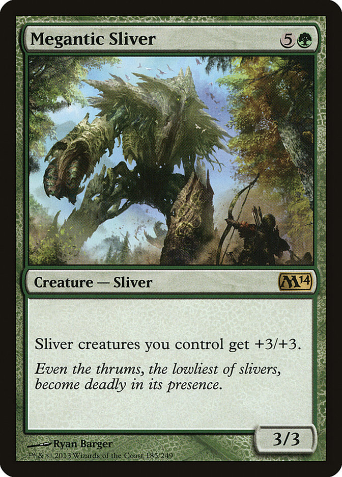
Steelform Sliver – The Sliver in the art is supposed to look ugly, a blight and violation on the pristine landscape where it crouches. It succeeds too well for my taste.
Blue
Clone – The first "pfft!" flavor text I’ve seen so far. I approve.
Colossal Whale – "Two ships in a storm, but where’s the whale…oh. Oh. Wow." Sneaky-good art.
Dismiss into Dream – Sam Wolfe Connelly is moving into the Rebecca Guay spot on the Magic illustrators’ roster: singular and polarizing in style, impossible to ignore. I’m a fan of Connelly’s, and this 21st-century Lascaux update fascinates me.
Glimpse the Future – Serious thumbs down on the cheesecake art with its peekaboo portals. Come on, Wizards. You’re better than that.
Opportunity – Now, this is better. I’m a fan of the mysterious smile, and the suggestion of a bare shoulder is more effective than putting all and sundry on display.
Spell Blast – Putting this art and Tidebinder Mage side-by-side illustrates my point above. Which looks more like a creature and which the spell?

Wall of Frost – After three editions of the goatherd’s praise, I like the switch to the paladin for the flavor text.
Zephyr Charge – New card, decent art. I’m such a sucker for real-world flavor text that my love for the Sun Tzu quote should be no surprise. There’s actually a longstanding cycle that this card completes: Portal Three Kingdoms had one card each quoting Sun Tzu in white, black, red, and green. This makes blue (and from the same Giles translation, no less).
Black
Artificer’s Hex – Dack Fayden, what’s up! I have no idea under what circumstances this card would see play, but I like its resonance all around. It really tells a story.
Blood Bairn – Uh oh, we’re on creepy vampire child alert. Reminds me of Babette from Skyrim.
Bogbrew Witch / Festering Newt / Bubbling Cauldron – Put me on record as a fan of the concept. The "of Empires" cycle never really took off, but I’d be tempted to draft this group if a Witch fell to me.
Dark Prophecy – … And somewhere in the Multiverse, Tibalt, the Fiend-Blooded mutters "copycat" and sweeps his bangs off to one side.
Deathgaze Cockatrice – A workmanlike name, but the art is effective and the flavor text is suitably chilling. I approve.
Liturgy of Blood – Sometimes the theme of "villains aligned with the color black are long-winded jerks" gets old, but this one gets the nod from me. Art is by Zack Stella, who made his debut in Modern Masters.
Minotaur Abomination / Undead Minotaur – "See, we necromancers, we’re just like you. Some of us take pride in our work, and some of us are lazy slackers."
Rise of the Dark Realms – A sort of "Queen Liliana" pose, frankly one of the more tasteful illustrated versions of her to see print. I’m most intrigued by her facial expression; there’s something behind that sense of triumph that I can’t place.
Shadowborn Apostle / Shadowborn Demon – Another obvious or baked-in combo, the first card offering an alternate to Relentless Rats in that style of deck. Aren’t you glad Slaughter Games is in the Standard metagame?
Tenacious Dead – The name might be begging for a certain obvious joke, but the flavor text offers more subtle humor and the art is suitably ghastly. On the whole, a success.
Vampire Warlord – Simple name, simply effective one-liner flavor text.
Red
Academy Raider – This has the feel of a top-down card, which I like.
Act of Treason – While it’s too long to fit properly into the three lines of flavor text accorded to core set versions of Act of Treason, there’s one particularly apt real-world quote I’d love to see on this card someday, perhaps a promo version: "Treason doth never prosper: what’s the reason? Why, if it prosper, none dare call it treason." – Sir John Harington
Awaken the Ancient – Having written creative text for Wizards, I’ve become much more sympathetic to names and quotes that don’t inspire me. Sometimes the words just don’t come, sometimes the card doesn’t offer that spark, and sometimes the best you can do is a takeoff on Yakov Smirnoff‘s "In Soviet Russia…" jokes. Even so, the flavor text on this one disappoints me. I can see the punch line from a kilometer away. Even something like "The horizon rose to greet me today." – Lithomancer Dale would be preferable to me just because the inversion isn’t telegraphed.
Barrage of Expendables – Trevor Claxton’s art gives the foregrounded goblin just the right expression of freaky glee. My Vorthos is happy.
Chandra, Pyromaster – The full art here is just gorgeous. Also worth noting: Ms. Nelson refers to the illustration as "Chandra, Flamebringer." A clue to the production name, perhaps? (Reminder: I have done work for Wizards of the Coast but had no advance knowledge of this set.)
Dragon Egg – Sometimes worldbuilding details can sound off, but this one strikes my inner storyteller just right. Getting the concept down in two lines is quite the accomplishment.
Goblin Diplomats – Call it a 2013 update of the theme that brought us Goblin Ski Patrol and Goblin Artisans. Something for the old-timers.
Lava Axe – 1. Read flavor text. 2. Search on StarCityGames.com for "Cinder Hatchet." 3. Find no such card. 4. Frown at punning text that has no payoff at the end.
Ogre Battledriver – The flavor text spurs more of a chuckle than a guffaw, but I’m ok with that.
Pitchburn Devils – Here’s a flavor text where the punch line just doesn’t work for me. Goblins are known for being ingenious yet not terribly higher thinking, so my mind circled back to them rather than sheep. Fixing the issue—if it can be classified as an "issue"—is another matter, and no fix readily comes to mind.
Scourge of Valkas – Cool art, but I’d like it better on a 6/6 base. The sense of scale between the knight-on-steed (I figure a 2/2 minimum) and the dragon is way past two-to-one.
Seismic Stomp / Volcanic Geyser – "Ryda, geomancer" is trying to get into "Jaya Ballard, task mage" territory but has yet to find her (his? eir?) voice. It’s interesting that I assumed Ryda was a woman at first. Why did I do that? The Jaya analog? The "a" ending? On Seismic Stomp the character doing the stomp appears male; on Volcanic Geyser the figure appears female. Now I’m curious whether the creator of this geomancer thought of the character as male, female, or something beyond that binary.
Young Pyromancer – I still haven’t sorted out exactly how I feel about the art, but Cynthia Sheppard’s illustration is compelling and visually distinct at a minimum, so it did its job.
Green
Briarpack Alpha – The flavor text shows a side of Garruk that isn’t much on display.
Elvish Mystic – "Good news, everyone! Now new players don’t have to figure out how to pronounce "Llanowar" anymore!"
Enlarge – This art is begging to be turned into a meme. Also note the interplay between this and Diminish. (Kitties for the win!)
Giant Growth – There’s a definite trend between Planar Cleansing, Cancel, Doom Blade, Shock, and now Giant Growth of having a single simple card in each color with no flavor text at all.
Hunt the Weak – I LOLed.
Into the Wilds – Veronique Meignaud sighting! All her other debuts were in Magic 2010 and Zendikar block. I’m guessing this is an illustration for a card that was deleted from that block and later was repurposed as "slush art."
Kalonian Hydra / Kalonian Tusker – Our only previous glimpse of Kalonia was with Magic 2010’s Kalonian Behemoth. Two short flavor texts are decently effective.
Predatory Sliver – Oh, that flavor text. I see what you did there, Wizards. We all see what you did there.
Sporemound – Good for a chuckle, at least on the flavor text. The name—workmanlike. Lots of workmanlike names this time around. That’s not necessarily a bad thing, but it feels like a higher concentration than usual.
Voracious Wurm – This art raises an interesting question: at what scale to picture a creature that starts at a base 2/2 but can scale to huge with something as small as a Sacred Nectar beforehand? This illustration looks to be about a 6/6. I’m not saying there’s one right answer, but the question itself interests me.
Artifacts and Lands
Forge[/author]“]Darksteel [author name="Forge"]Forge[/author] / Darksteel Ingot – A sad juxtaposition of New Phyrexian arrogance and the Mirrodin that Koth has lost.
Guardian of the Ages – New Ryan Pancoast art (I can’t get enough Pancoast) and effective short flavor text? I’ll sign on for this.
Millstone – Art more literal than previous iterations, which may or may not be a good thing. At least the look is good, and the flavor text reinforces the idea.
Ring of Three Wishes – I like the effect newer artist Mark Winters produced here. The art’s simple, but that’s not a bad thing to me.
Staff of the [Whatever] Magus – Can a cycle be too obvious? This one is riding the line. I like the adaptation of the mana symbols as staff-toppers, but the names and flavor texts have so much sameness that they feel cookie-cutter. It doesn’t help, of course, that the visual spoiler puts them all in a row.
Strionic Resonator – Noah Bradley art alert! This is a funky little illustration, even if the name veers a little "techno" for my fantasy tastes.
Vial of Poison – Simple spooky art and a sharp one-liner for flavor text with a name that doesn’t need to do anything else. This card is a top-down Vorthos win.
Encroaching Wastes – Dust Bowl’s worse cousin, but I like the name and the art. The flavor text is the semi-obligatory mention of planeswalkers as a Big Deal, but hey, it’s part of the marketing. I can deal.
Forest et al. – In addition to the new cycles from Jonas De Ro and Andreas Rocha, most of the usual landscape suspects are represented: John Avon, Volkan Baga, Noah Bradley, and so on. I’m happy to see Steven Belledin’s Forest get another run for purely selfish reasons.
So Much More to See…
Phew! There’s a lot to talk about with Magic 2014. I’m approaching 3500 words and in some ways I feel as if I’ve barely scratched the surface of the set. As I have more time, the art in particular will unfold itself to me; I freely admit that as a Vorthos I’m more attuned to words than art, but I’m pretty sure I hit most of the key points.
Now it’s time for you to join in. What new cards, art, and flavor do you like or not like? Did I miss a surefire Spectrum selectee among the illustrations? Do you want to see more real-world flavor text? (Say yes.) The Facebook comments are below. I’d love to see your thoughts.
As always, thanks for reading.
— JDB
@jdbeety on Twitter