So it was Emrakul after all.
The big mystery of what was behind the madness in Shadows over Innistrad had the simplest possible solution. Nahiri, the Harbinger was hanging around and wreaking havoc. Nahiri was one of the three planeswalkers who sealed away the Eldrazi long ago. Nahiri wanted to make Innistrad and Sorin suffer the way Zendikar and she had.
Any source of madness but Emrakul would require a great deal of contrivance. Would Nahiri really go to the trouble of finding the New Phyrexians or Marit Lage when she already knows the Eldrazi exist — and how to bait one to a world, having done so to Zendikar? Occam’s razor says no.
To be sure, this simple and logical solution disappointed numerous folks. A handful of them were wrapped up in their own theories, piling speculations upon facts upon speculations, and were disappointed when it all came crashing down like the Tacoma Narrows Bridge.
Others had Eldrazi fatigue. We’d just finished off Ulamog and Kozilek in the same block, and now it’s the third Eldrazi Titan in the very next setting, within less than a year, a body horror invasion of the Gothic horror setting of Innistrad.
Like New Phyrexia, this grosses me out and not in a good way.
But Emrakul is what he have, and even I must admit that the payoff for the Hanweir Chronicle was spectacular. So instead of lingering on the disgusting side of Eldritch Moon, I’d like to dedicate this flavor review to the better side of the set: artwork, names, and flavor text that make me think and feel.
I’ll also mention some clunkers, because there were some and it wouldn’t be honest for me to omit them, but in a set as grim as this, I’d rather focus on the good than the bad.
Let’s do this!
Art – The Hits
This Christopher Moeller art stands out, in part, because it’s so blatantly un-Magical. It’s an elderly woman sitting on a tumbledown building’s front porch, pouring herself some tea. No tentacles. No threats. No horror. In the context of the set, the lady and the butterfly stand out, rather than most of the Eldrazi.
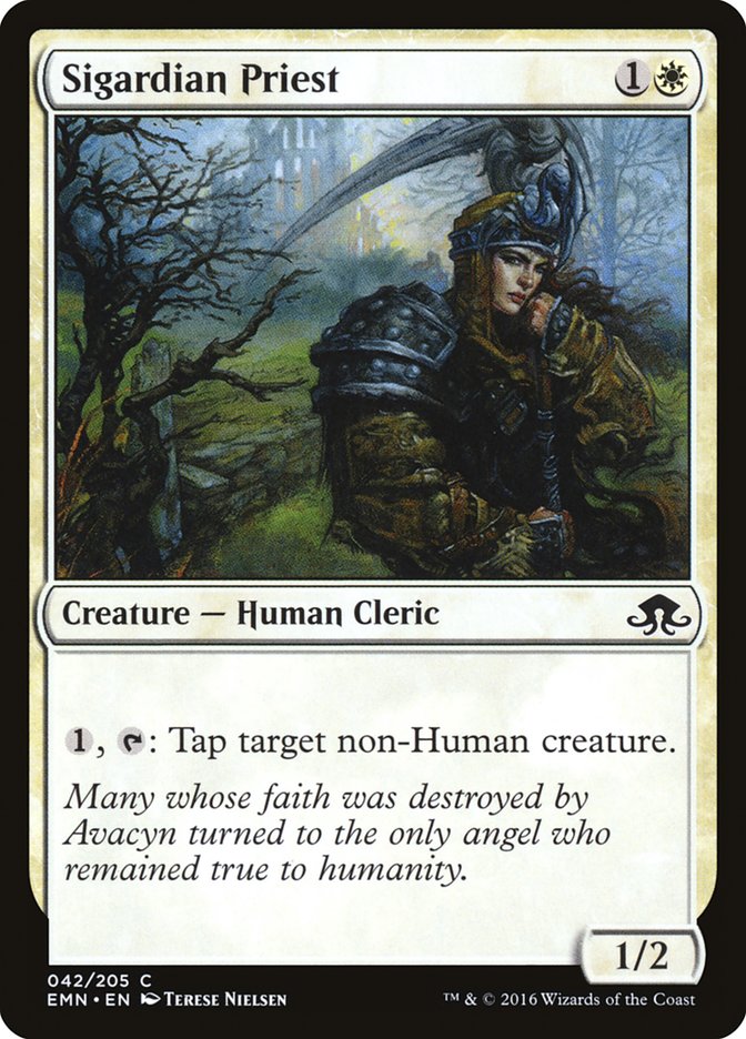
Terese Nielsen is back in regular Magic sets where she belongs. That is all.
The perspective on this piece likely came from the art director: “Show the creature lurking beneath the dock.” The execution, though, was all Daarken, and those tentacles poking up to introduce themselves to their victim have the strength of anticipation on their side.
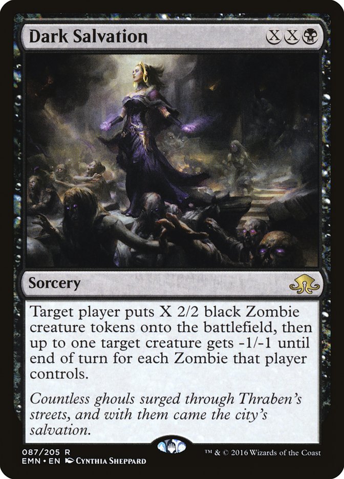
Cynthia Sheppard’s work seldom appears in sets anymore, as she’s become an art director for Wizards of the Coast rather than being a freelancer for them. On the other hand, when she does make art for the game, it’s often high-impact, and this gorgeously grim work — which notably doesn’t rely on Liliana being Liliana for its impact — is no exception.
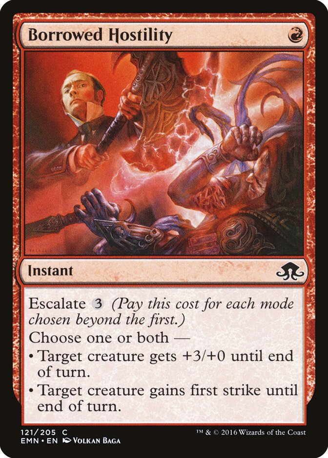
The three-card common “Borrowed” cycle (no blue or green, interestingly) has illustrations by Volkan Baga. Of the three, all are executed well, but Borrowed Hostility really made an impression. The dignified figure in the upper left dropping the axe on the cultist and tentacles is Lovecraftian in the best way.
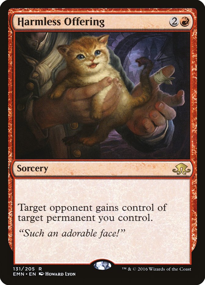
You knew it had to be in here.
At first glance nothing seems wrong; it’s a tiny orange kitten. Its blue eyes are bright and shining, its mouth is open in a smile with a cute pink tongue poking out…wait, is that blood?
And then you see all the other signs: the back paw turning into a claw, the fanged mouth on the tip of the tail, the giver’s bandaged thumb. The subtle horror is one big reason why this piece already has been recognized for its greatness. It’s well worth visiting illustrator Howard Lyon’s blog for more details.
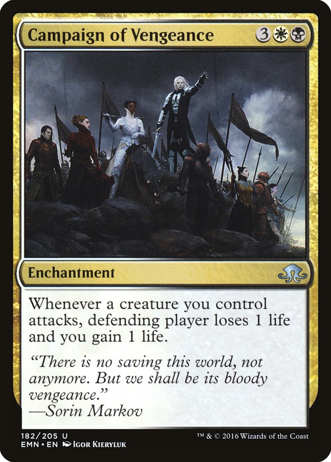
Like Dark Salvation, Campaign of Vengeance is notable for having a planeswalker as a secondary focal point. Sure, Sorin Markov’s in the picture, and he’s the one standing on the rock. The eye doesn’t go to him first, though, but the silver armor of the Vampire astride the horse, her face a rich brown against the black and gray backdrop behind her. The Innistrad setting has us used to seeing super-pale Vampires, but the Humans of the plane always were more diverse than that, and the regal Vampire on Campaign of Vengeance shows the Vampires are too.
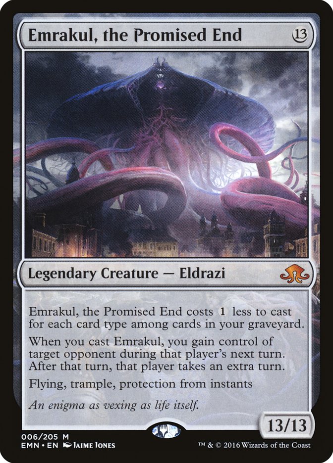
While other Eldrazi, even the biggest ones, can sometimes feel small in their grotesquerie, there’s no such feeling when Big Mama Emrakul is in the plane. Forget scale birds. Those are scale trees and buildings. And there’s also a bizarre elegance to the purple tentacles of doom.
As I said above, Terese Nielsen is back where she belongs. Ditto for John Avon. A hearty “welcome back” for two of the older-school masters of Magic illustration.
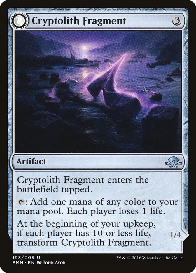
It’s an artifact illustration…with a landscape inside it. This little jewel with its “two scenes in one” reminds me of one of Ryan Pancoast’s earliest illustrations, the underrated Convincing Mirage.
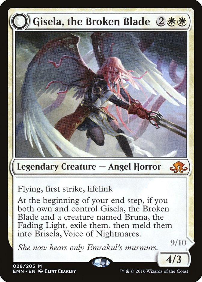
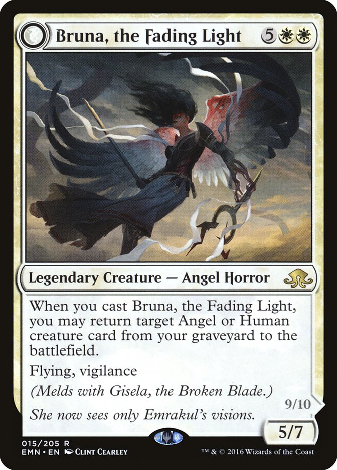
This card pair grosses me out on the back. It’s also a disgusting masterpiece. Clint Cearley wanted to create an effect in the viewer, and by Avacyn he nailed it.
Art – The Misses
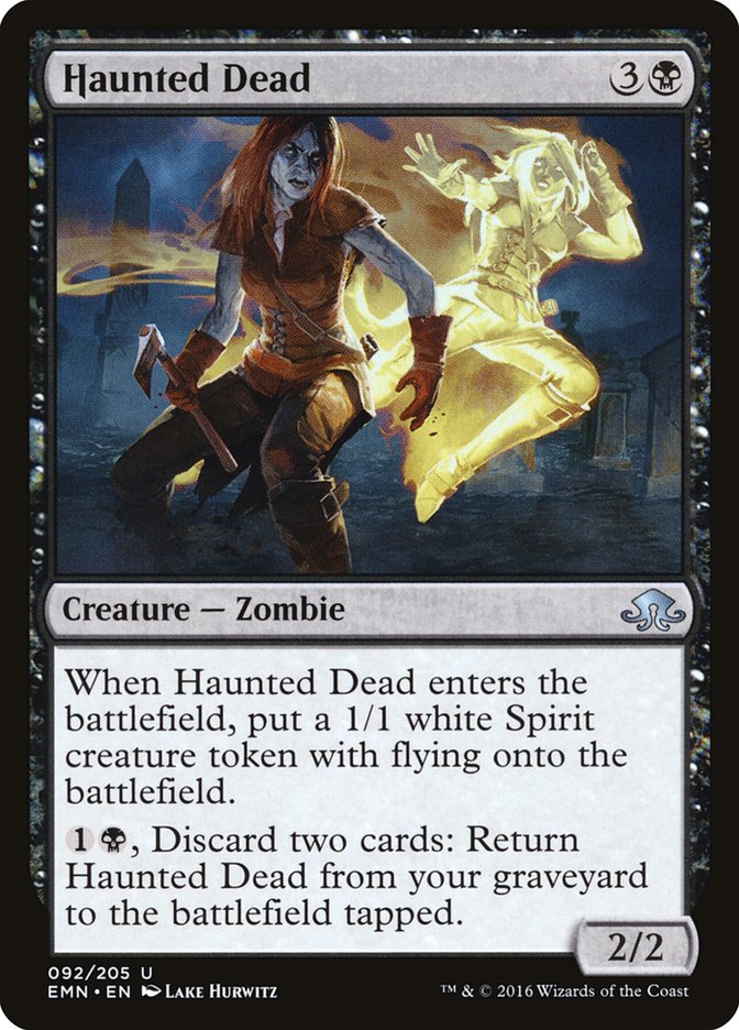
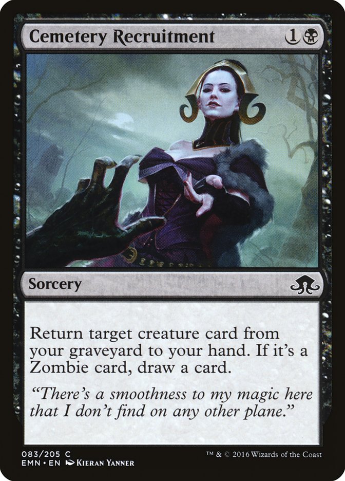
This art is striking without a doubt, visually distinct from the rest of the set with its vivid reds and oranges and yellows set against the deep colors of graveyard and sky. But where is the light coming from? Neither the moon nor a light source from behind would account for the patterns I see. And what’s with all the tangents, the places where the Zombie in front and the Spirit behind do not overlap but only touch? I’m glad the artist took a chance here rather than turning out something boring, but ultimately this one doesn’t make sense to me.
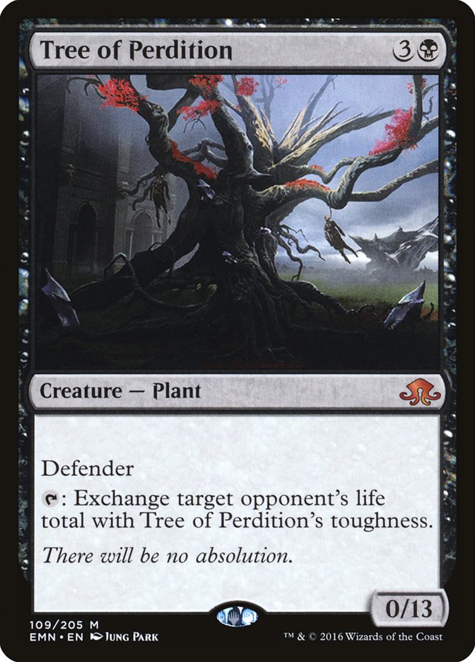
This isn’t a matter of the artist’s performance but taste in art direction. Magic has shown implements of execution and pre-execution scenes for a long time; Eye for an Eye is an example, as is Public Execution. Similarly, Magic hasn’t been afraid to show execution victims back from the dead, as with Strangleroot Geist and Drakestown Forgotten. But Martyred Rusalka gave me visceral disgust when I was still a college student, and Tree of Perdition now gives it to me even more strongly. In the context of the United States and the shameful parts of its history, showing a body hanging from a tree is playing with visual fire. The callback to Tree of Redemption isn’t enough to justify it.
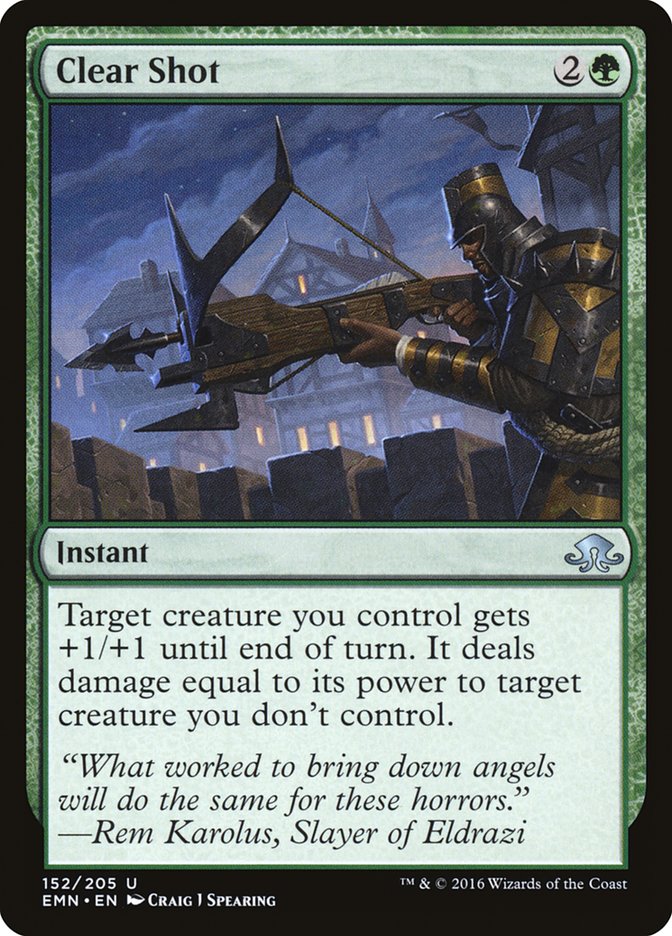
Again I don’t blame the artist; this looks like a last-second art swap. The art for Clear Shot with its figure to the right and gigantic crossbow suggests either a creature or an Equipment card, not an instant. Yet there’s only the tiniest suggestion of action, far above in the sky. Puzzling.
This really wasn’t Kieran Yanner’s set.
Names – The Hits
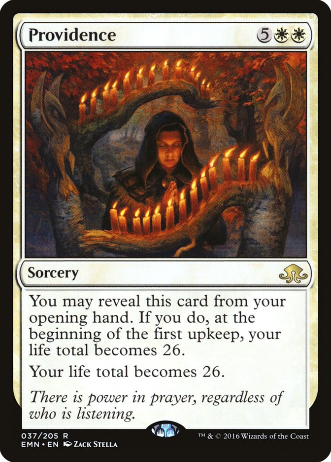
Layers upon layers of real-world resonances! With a slightly old-fashioned feel to it, “Providence” with a capital P refers to divine intervention in the world, which the card certainly offers. Yet there’s an additional layer related to horror: H. P. Lovecraft was born in Providence, Rhode Island and lived most of his life there.
“Coax” is the perfect word here. Nahiri can’t order Emrakul to show up, “you must obey” and all that. The cryptoliths and cultists are more of a “hey, Emrakul, you like eating planes and here’s a nice one with unusual mana, so why not?”
Yes, you just saw this as an art miss. That name, though! “Perdition” is tremendously flavorful, bringing to mind the Christian concept of hell as well as the graphic novel and film Road to Perdition. There’s also a specific phrase in several theologies, “son of Perdition,” with a strong echo in the Tree. Given how deeply religious themes are imbedded in the Innistrad setting, it’s no surprise that words with such connotations (including Providence above) would land in a set like Eldritch Moon.
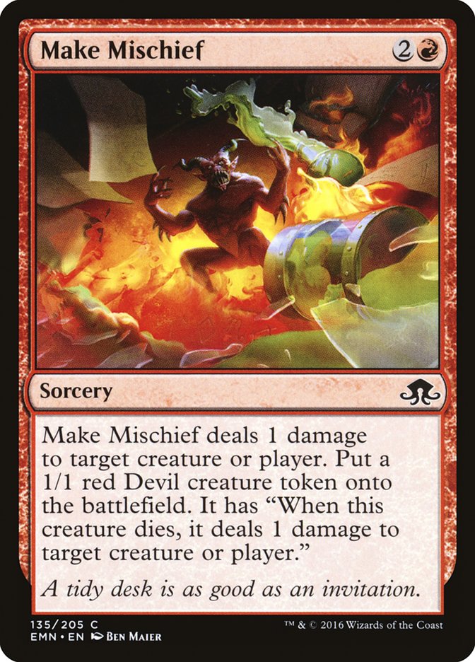
Whoever named this one had tongue planted firmly in cheek. From the inside, mind you. Not the outside. That would be creepy and gross and Emrakul-influenced.
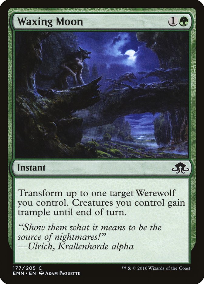
After Full Moon’s Rise in the original Innistrad block, it’s nice to see another astronomical term make its way into Eldritch Moon. Sure, we already had Wax // Wane back in Invasion block, but this is more specific to the all-influencing silver moon on Innistrad.
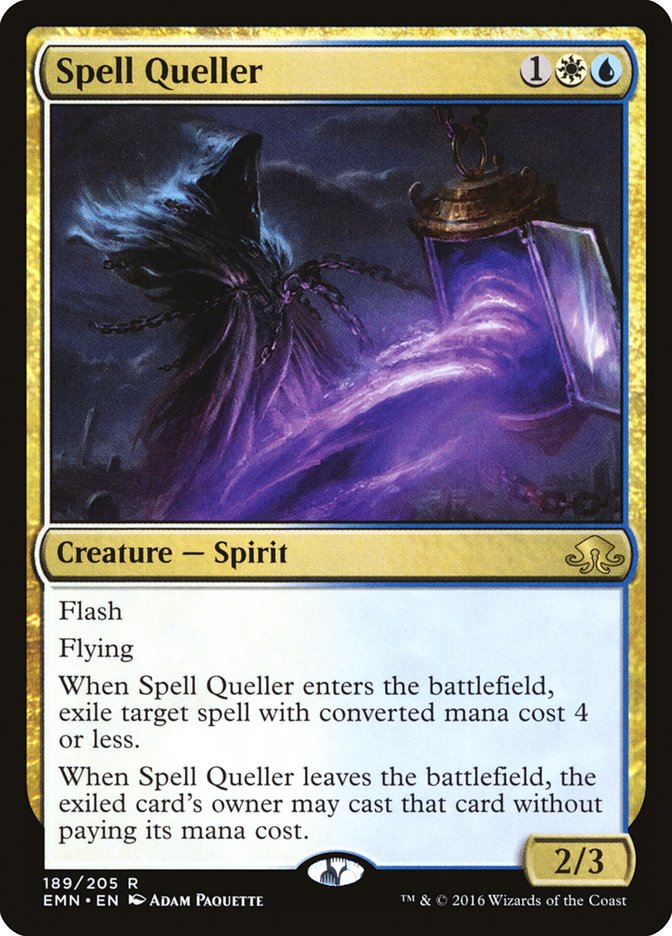
There’s something I love about a card name with a word starting with Q that doesn’t feel forced. I’m also a fan of the internal rhyme of “Spell Queller,” though I must confess I’ll probably call this card “Quello Kitty” about three-fourths of the time.
Names – The Misses
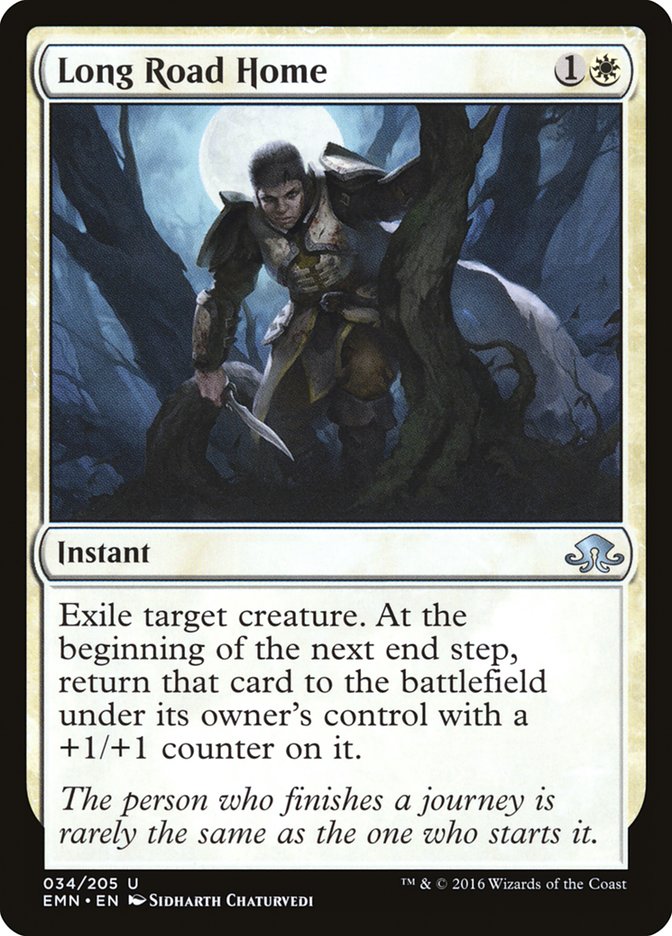
The idea is flavorful, to be sure, but “Long Road Home” and the card type “instant” seem to be rather at odds, no?
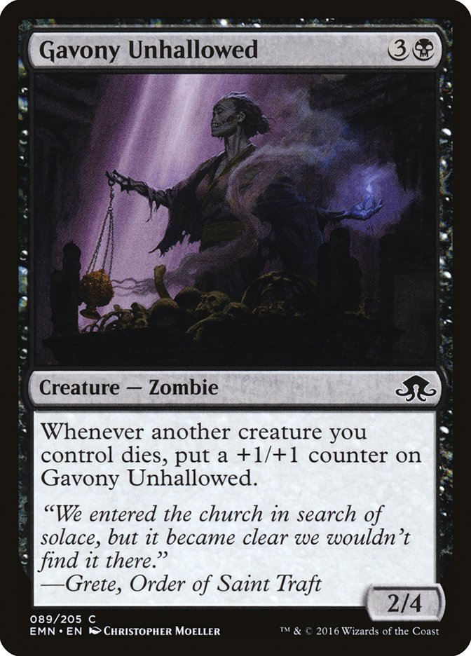
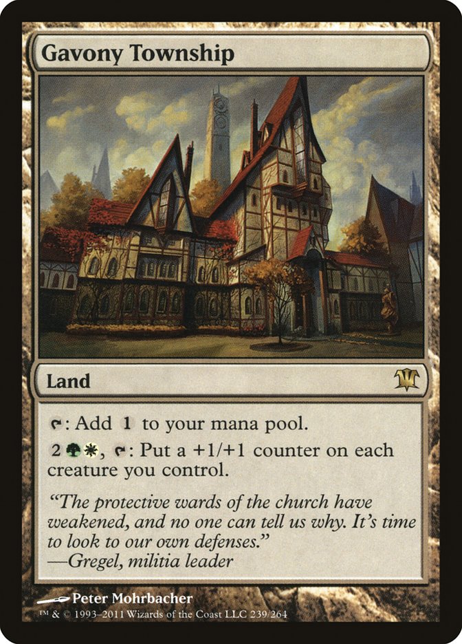
There’s one big problem with this name: it sounds like a legendary land rather than a creature. Sure, there’s Mikaeus, the Unhallowed to argue for a “creature” interpretation for “Unhallowed,” and Gavony Ironwright does exist, but “Gavony” still points in a different direction:
It’s far easier for me to read “Unhallowed” as an adjective rather than a verb, and Gavony as a noun than an adjective, hence my confusion.
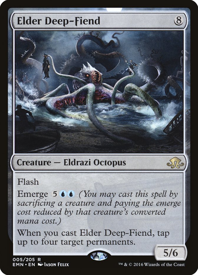
It will always and forever be “Elder Deep-Fried,” which is how I and umpteen hundred people read it the first time, but this Eldrazi Octopus is something even the Texas State Fair wouldn’t touch.
Flavor Text – The Hits
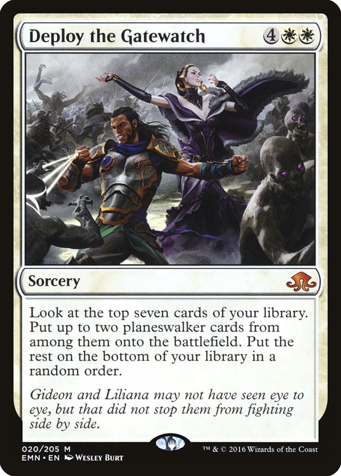
In the recent era of telling brief story points on cards, this is one of the strongest, showing not only the conflict but the cooperation between Gideon and Liliana with pleasing parallelism.
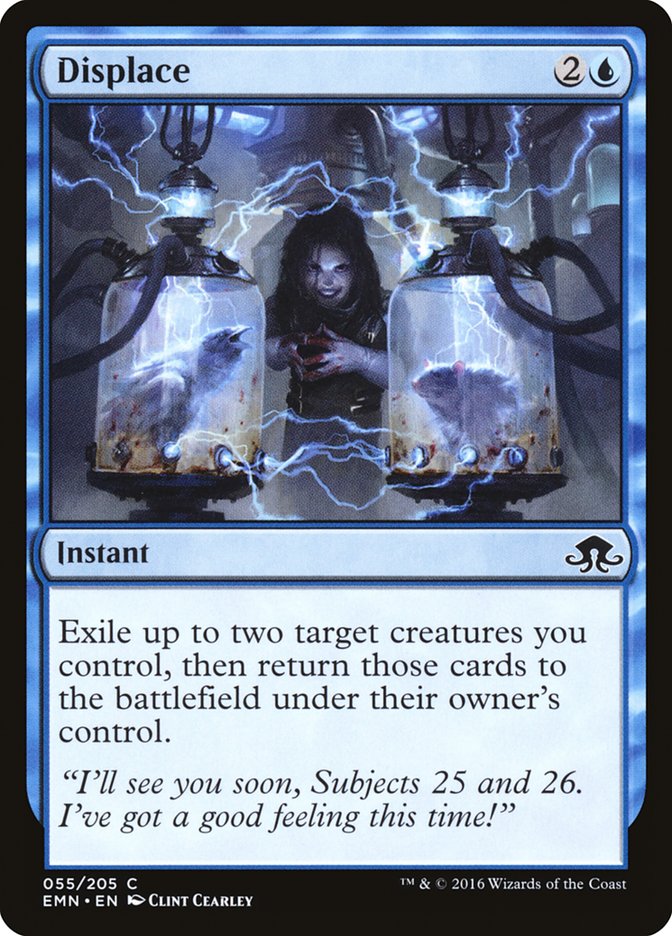
A short-but-sweet two-liner that puts the humor in mad science.
While I’m not completely sold on the echo with “salvation” in the card name, the twisted juxtaposition of the unhallowed Zombies and the city’s rescue is striking and rings true.
One of the shortest, simplest, and yet most powerful callbacks to an original Innistrad card, in this case Tree of Redemption.
It is indeed an adorable-worable face. It’s also yet another part in the seamless misdirection that hides Kitty’s sinister side until it sneaks up on you.
When flavor text writers are given just one line to work with — only 40 characters, give or take, less than a third of a Tweet — the results can be bland as heck or note-perfect. This is one of the latter.
This is the voice of Nissa that I’ve been missing in a lot of her stories. To her, connection with life and the land is all, so putting her on a plane where she fears reaching out and using her mana bonds leaves her estranged and disoriented.
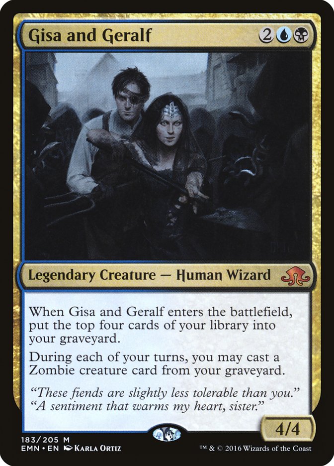
Aww, I guess they really do care for each other. Even if their bickering wrecks entire neighborhoods with Zombie wars.
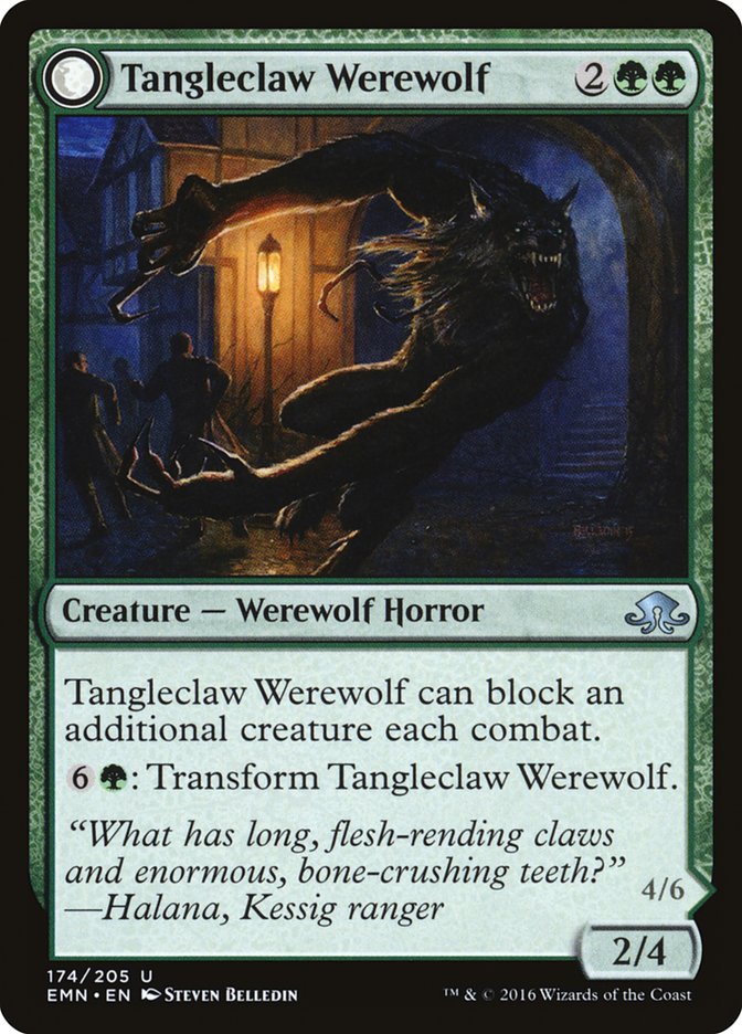
This double-face card’s anti-joke is actually pretty funny, albeit in a twisted way.
Flavor Text – The Misses
The character Geralf is still a teenager, his prodigious stitcher gifts notwithstanding. His natural voice is going to be arrogant, stuck-up, a little Holden Caulfield, and, yes, a bit pretentious. There’s a difference between showing that artistically and genuinely getting on my nerves, though. This one crosses the line.
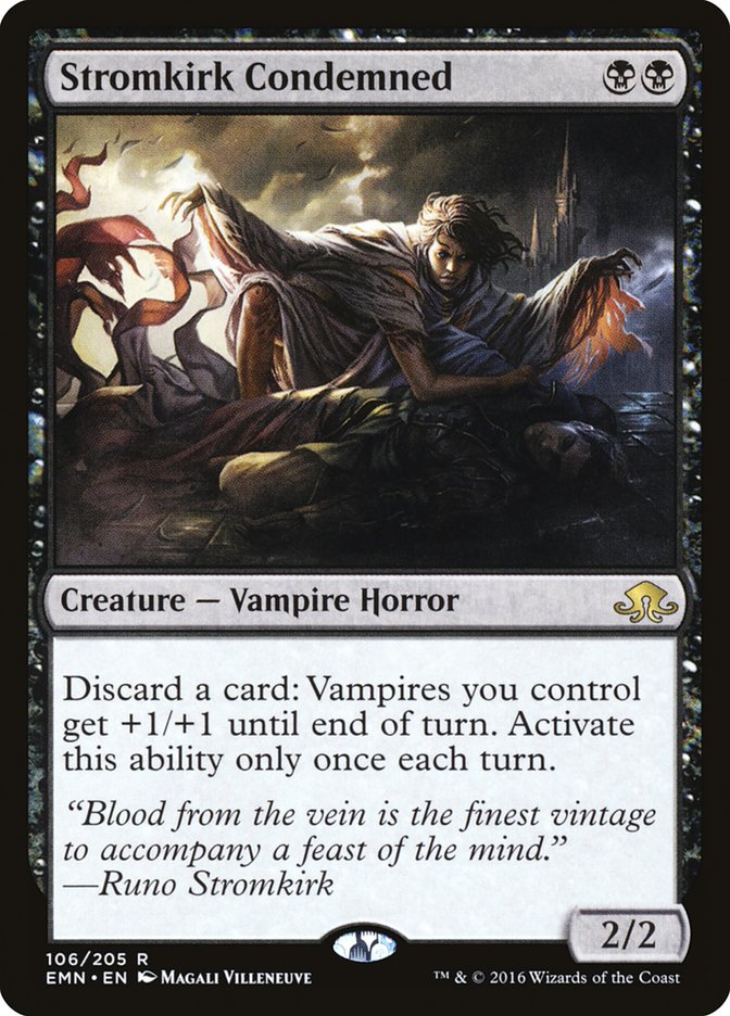
This one’s so close to being awesome, it hurts. On an earlier card, Markov Patrician, there’s a reference to “wine of the vein” as a euonym for “blood.” On Stromkirk Condemned, just replace the first two words, “Blood from,” with “Wine of,” and it’s a flawless match for the “vintage” reference later. As is, though, I have to call it a miss.
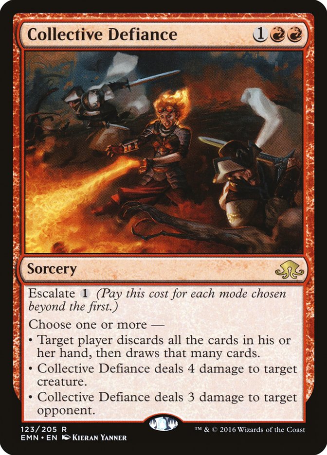
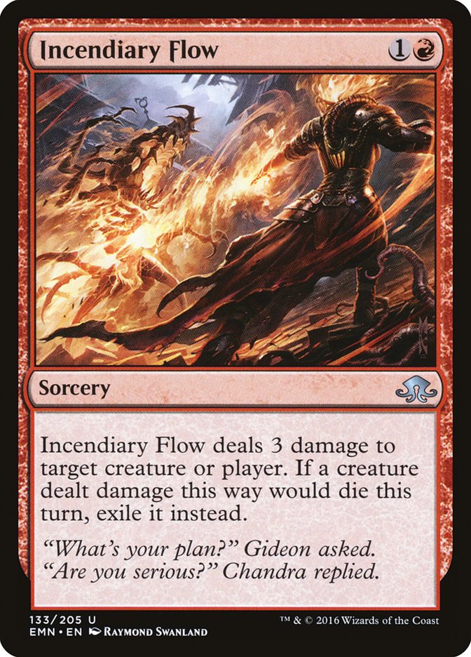
This looks like it was taken verbatim from an upcoming Magic fiction. If so, it could have used some tweaking. Chandra’s snarky reply deserves to stand alone, as in this potential rewrite:
“What’s my plan? Are you serious?”
— Chandra
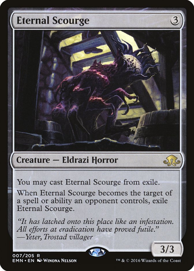
This heavily Latinate flavor text with a bunch of lexical curlicues in just a couple of lines might make sense for a cleric. Even a village doctor or a cathar, I could buy. But just an ordinary villager? It’s not a match for their generally simpler (that’s not to say inferior, but merely plainer) speech.
Most Resonant Overall
Yes, I called this an art miss, and I stand by that. On the other hand, it really made me feel, even if that feeling was anger, and the name and flavor text are spot-on.
#2: Dark Salvation
Everything about this card flowed from a single, powerful idea: the irony of the necromancer Liliana being the salvation of Innistrad’s holiest city. The twistedly beautiful art, the grim name, and the wicked flavor text make for an almost-unstoppable combination.
What could stop a legion of Zombies? A single cute marmalade kitten.
The tiny Emrakul-twisted kitten. The ironic name. “Such an adorable face!” It’s the complete package. No wonder foil preorders are sold out on StarCityGames.com as I write this!
Those are my nominations for the most flavorful cards of Eldritch Moon. What are your picks?


