Welcome to Art Fight: Part Red! If you weren’t here a couple weeks ago, here is the
first installment,
which covers white, blue, and black cards
in the cube. I wanted to just mention something about this series — it would’ve been much more difficult if
StarCityGames.com didn’t have an exhaustive list of each card version over on the sales portion of the site. Gatherer doesn’t list promo cards, and
most other sources only have incomplete lists. This would also have been a lot more difficult without the mouse-over images. So, thanks!
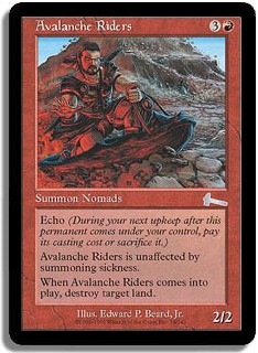
I hate to start out with a card that has the same art on both versions, but this is a promo and deserves a mention.
Besides, Darwin Kastle seems like a pretty nice guy (I watched a match he played against my husband (!) Justin a few weeks ago), and it’s not like
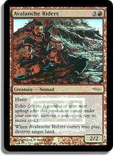
I’d hope for his invitational art to get replaced. Anyway, Avalanche Riders is one of my favorite red cube cards, and I’m really
glad that they have this sweet new border FNM version.
The extended art promo is one of my most wanted cube cards — it’s proven pretty hard to find. I think this
is a really good example of a cool direction Wizards could take their promo cards, while still appealing to people who don’t like foils. An
added benefit is that you can play your promo cards alongside regular versions without worrying about them being marked. Extended art cards are basically
perfect for the cube, because they look awesome but are more new-player-friendly than textless cards.

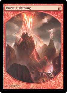
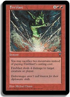
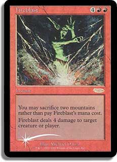
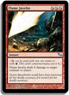
So jealous of all you textless-card-using people! The textless version is more generic-burn-spell looking, but
it’s so pretty. Jung Park is becoming one of my favorite Magic artists. I actually don’t think Burst Lightning is the best candidate for a
textless card, though — I find the pay five to do four a little unintuitive, anyway.
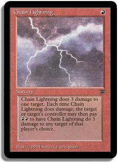
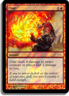
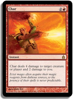
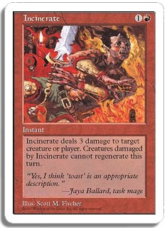
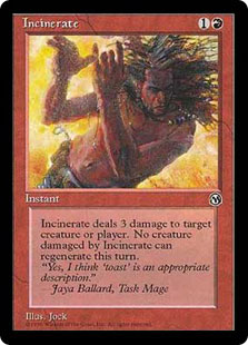
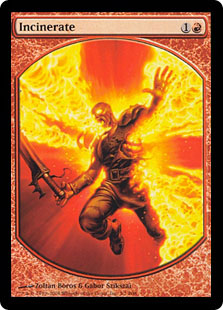
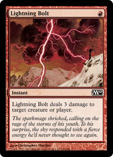
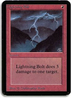
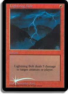
[card name="Chain Lightning"]Chain Lightning[/card] Promo
Well, I’m definitely a sucker for the new border + foil combo. The updated wording is pretty nice too, and I like
the Lightning Bolt art tie-in. Win-win-win!
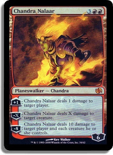
I can’t get over how awesome the Lorwyn art is. It’s beautiful, and Aleksi Briclot does a great job of
making Chandra attractive without being all about the T&A. Which is kind of a different topic, but suffice it to say that I think this art is a good
example of how to be slightly fan-service-y without decreasing the believability of the character. Kev Walker’s version is an okay way to get a
foil Chandra, I guess, but I think it lacks the really finished-looking quality of the original. As for the manga version, well, it is what it is.
It’ll be cool to see the whole card, though.
I actually have one of the Anniversary promos (and the dude’s hair is clearly sweet), but Adam Rex’s
original art is too good not to use. By the way, the flavor text on the promo is ludicrous.
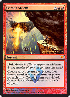
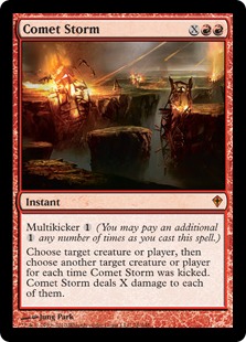
I like the Release promo here — I love that the Kor are really prominent. I feel like you could pick this out as
being from Zendikar block, which is pretty cool since the effect itself isn’t incredibly unique. This is also an example of a really well done
foiling process that complements the art and makes the unique aspect — the comet bits — stand out more. With that said, the original art
(feels funny saying that since everyone had the Prerelease version first) is also good — Jung Park doesn’t seem to get it wrong, ever.
Oh man, this is why I love doing these. I hadn’t even seen the Portal II art before, and it’s pretty
awesome. Art on red cards tends to blur together — lots of fire and dudes or ladies producing fire. Sometimes a different dude or lady being engulfed
by fire. I like this one, because you couldn’t possibly mistake it for being any other card. The alpha art is good for the same reason, and
that’s the one I’m using now. Might have to reconsider, though.
Not too much to say about the versions here — classic foil vs. not — but I do really like the art on this
card. I love that it conveys the fact that this is a red spell without actually using the color in the art. I don’t think that every piece of art
should be like this, but it’s a nice change of pace and allows the focus to be on something else — the sparks flying, or the poor
little dude getting hit.Â
I like the Shadowmoor art. It’s pretty and not just “this is a burn spell!” And on occasion, the
converted mana cost reminder has been relevant in my cube.
Kind of funny that with five printings, we’re still sitting at one piece of art and one flavor text as well,
although Sisay gets identified in the Planechase and Jace vs. Chandra versions. I don’t mind the art at all, and it definitely gets the “good
aim” part across. I just think such an iconic card could get something a little flashier.
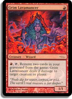
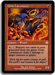
It’s so hard to fight the pull of the Judge promo! In this case, why bother — the Judge promo art is
obviously riffing on the original, but does a better job of framing the Lavamancer himself. Counterpoint: the Torment Wizard is clearly way grimmer. Decisions,
decisions… but I’m on the side of the promo here.
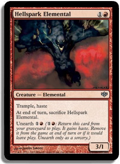
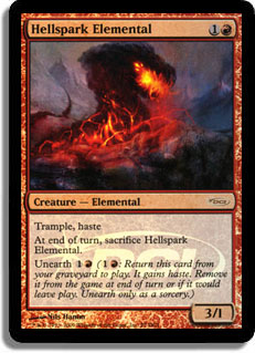
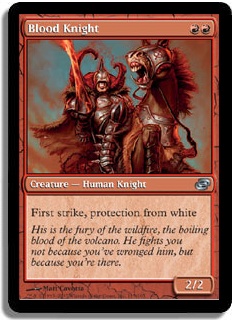
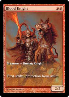
Don’t get me wrong, there’s nothing wrong with Justin Sweet’s Hellspark, but I love the dreamy
background on the WPN foil. Doesn’t it look kind of Jund-like, though?
Well, that’s lots of choices. I’m running the Mirage version, but I also like the Jace vs. Chandra art
— it’s striking, and the colors are pretty. I think the Mirage art is the most distinctive — kind of a Greek vase feel. Maybe a foil
version, Wizards?
I just wanted to point out the wacky choice of reminder texts on the Destiny version. As with most Planechase reprints,
the colors look great — that’s the version I’m using.
For purists, the Judge foil is probably the pick, since you get the classic art and a rare card. I’m actually
breaking my own rule and running the textless player rewards version in my cube, since I have one, and it’s really beautiful, and both new players
and returning players are familiar with the text. It’s hard to go wrong here, though.
The FNM art is nice enough, but I’m a sucker for these really clean, blank backgrounds — the Kev Walker, if
you will. Perfect for the cube, as this type of art looks amazing foiled.
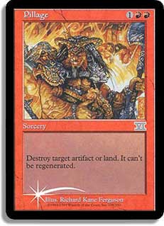
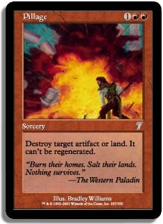
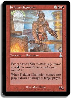
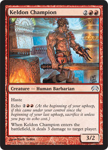
Hmm. Neither piece of art particularly blows me away. Richard Kane Ferguson does what he does, and the smirky guy in
front does look like Pillaging is more than a day job to him. It has kind of a dream-sequence feel to it, like maybe he’s actually just a dorky
would-be Pillager. The Seventh Edition art is simple in a way that I like, but I’m not really sure what the role of the man is. It looks like
that’s the art in the Fire and Lightning deck, and I imagine that’s what I’ll be using in my cube shortly.
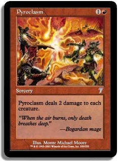
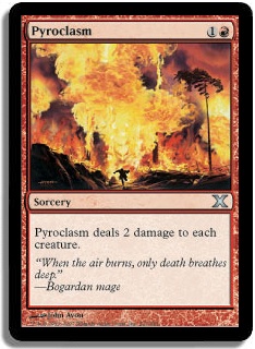
Let’s see. The 10
th
Edition art is fine (that’s what I use), 7
th
is really busy, and
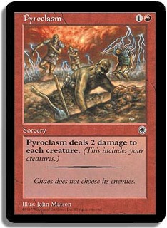
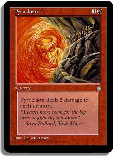
Ice Age is… strange. I’m really unclear about what’s happening there. Did Jaya conjure up a Pyroclasm with a face? Seems like it.
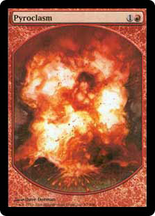
The Portal I Pyroclasm is also pretty bizarre — that guy doesn’t look very two-toughness to me, so why is he digging a grave? The textless
version is pretty, although it could just as easily be Incendiary Command. Anyway, presumably there is something for everyone here.
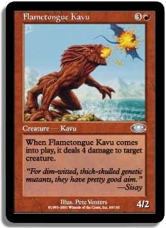
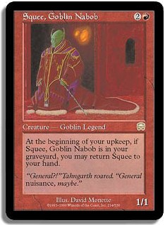
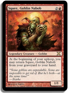
Christopher Mueller’s art is such a clear winner here. Not only does it read well, but it’s adorable without
seeming too jokey. I love the expression on the face of the little guy in the catapult. “Okayyyyyyy…”
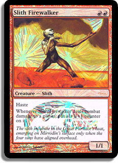
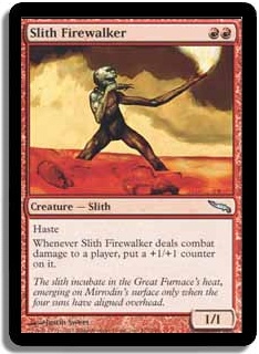
Oh, sunburst foiling. What a bummer on a card with such clean, distinctive art. No reason not to foil out the Mirrodin
version, though — I imagine it looks great with the light-colored blank background.
The Tenth Edition art is so beautiful, and what a cool coat. And probably the best representation of Goblin ears in any
piece of Magic art. I’m such a big fan!
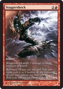
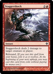
I wish this art was less cheesecake, but Swanland is pretty freaking good. This is another example of just how nice the
extended art cards look, even when not foiled.
I also love the use of sparks or lightning rather than actual fire — it’s pretty and less expected.
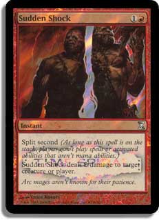
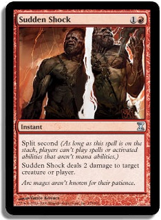
Hmm. Not the most optimal foiling technique, is it? It’s stuff like this that makes me happy I got into Magic in
this golden age of rare Release promos with alternate art.
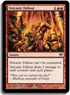
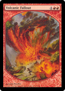
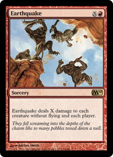
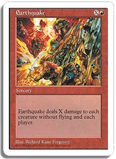
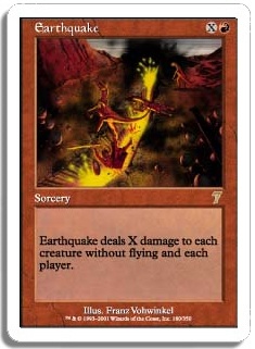
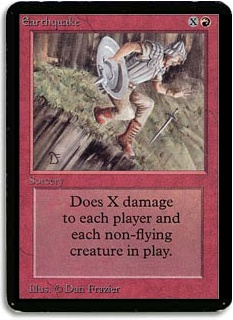
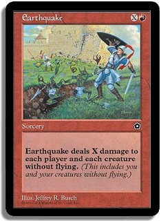
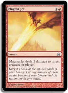
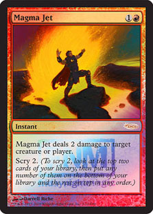
I like the art on the textless version, but I like that the original is faithful to the name of a card —
it’s another I think you could match to the name. The textless version clearly involves a volcano, but there’s also some lava and a possible
earthquake — it’s less clear that the falling ash is what’s doing the damage.
Thanks for reading! I look forward to hearing what you think in the comments, or say hi on
Twitter.