It’s flavor review time! Actually, wait, hold on . . .
It’s giant disclaimer time!
I contributed names and flavor text to Born of the Gods. Due to my advance knowledge, I was ineligible to play in any Prerelease events and am prohibited from participating in DCI tournaments until after the end of Born of the Gods Game Day weekend, which is March 1-2.
I contributed the following names and flavor text to Born of the Gods and so cannot possibly be objective about them. I will include subjective NDA-safe tidbits about these items where appropriate.
Name Only
Asphyxiate
Skyreaping
Xenagos, God of Revels
Flavor Text Only
Ephara’s Radiance
Excoriate
Spirit of the Labyrinth
Vanguard of Brimaz
Kraken of the Straits
Drown in Sorrow
Eye Gouge
Fate Unraveler
Gild
Nyxborn Eidolon
Bolt of Keranos
Fearsome Temper
Karametra’s Favor
Satyr Wayfinder
Gorgon’s Head
Both Name & Flavor Text

My two new favorite cards.
All right, enough disclaiming. Here are the cards that caught my eye.
White
Acolyte’s Reward – A suitably dramatic image of Iroas, the Theran god of victory. I still haven’t figured out why Iroas, whose color combination is red-white, would take the form of a centaur, a species rooted in green. Ah well. Some mysteries may never be solved.
Akroan Phalanx – As Garrett Baumgartner wrote in his Daily MTG article "The Secrets of Creation," cards change all the time during the name-and-flavor process. When my fellow writers and I were tangling with the card that became Akroan Phalanx, it had so much rules text that we had only one line of flavor text, about 40 characters. (And you thought composing a 140-character Tweet was tough.) I don’t know when the card changed to this much shorter version, but one of my one-line flavor text submissions stuck.
Akroan Skyguard – I don’t think the "bare-chested gent" quotient has ever been so high for Magic as in these first two sets of Theros block. It only makes sense because Greek classical art considered the (athletic, male) nude body an aesthetic ideal, and any Magic artist who did her or his homework would’ve been looking at lots of sculptures. More on this later.
Archetype of Courage – This flavor text feels overstuffed. Replacing "It has been my experience" with "I’ve learned" not only makes for less of a mouthful, it also sounds (to me at least) truer to Elspeth’s voice.
Dawn to Dusk – I’m a fan of this artwork. It’s metaphorical without being fully abstract and could stand on its own outside any Magic context.
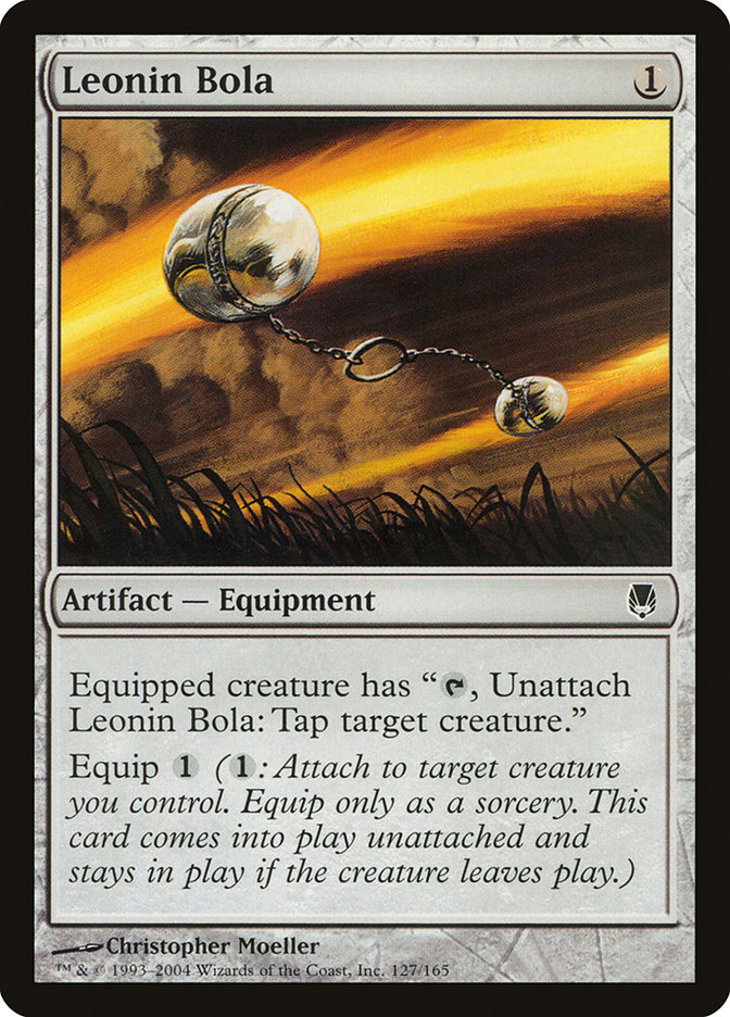
Elite Skirmisher – There’s a cute callback in the flavor text. One of the earliest pieces of Equipment way back in the Darksteel set was Leonin Bola.
Excoriate – A name I wish I’d submitted. Flavor text often is tweaked before it sees print. In my original submission, Heliod (the sun god) was named while Erebos was called "the underworld god." I like the change. It puts more emphasis on Heliod’s role and how he’s smacking down the demon.
Fated Retribution – Illustrating "utter obliteration" is a tricky business. Kev Walker’s Wrath of God became an icon, but this Jonas De Ro piece wound up looking like a landscape rather than a sweeper effect, at least at card size. In this Magic Arcana the destruction is more obvious.
Ghostblade Eidolon – The eidolons, spirits created when mortals escape the underworld and their bodies become returned, have a blurry and out-of-phase appearance. This is deliberate, but the effect is hit and miss in practice. Eidolon of Countless Battles turned out fine, but Ghostblade Eidolon looks "smudgy" rather than out of phase.
Glimpse the Sun God – When I saw this card’s flavor text as an entry in the database, I thought to myself, "Stop the competition. It’s over." I still gave this card my best, but I was right.
Hero of Iroas – In the immortal words of Edward Cullen, "Doesn’t he own a shirt?"
Mortal’s Ardor – Probably the most 300of any art in the set.
Nyxborn Shieldmate – The art director knocked it out of the park with the concept of a warrior stepping out of a mosaic, and Eric Deschamps delivered the goods. Heck yes.
Plea for Guidance – Terese Nielsen may be one of the oldest-school artists still working for Magic, but her compositions are almost always beautiful and recognizably "her" while still carving out a space within the current look and feel of the game.
Spirit of the Labyrinth – This is actually one of my flavor text acceptances I like least. The concept is good, but the "students | learn | study | lesson" sequence is just too much. I could’ve made this stronger.
Sunbond – Gorgeous Noah Bradley art and flavor text that makes me wish I’d written it. The flavor on this card really came together. Too bad the card itself likely won’t ever see Constructed play.
Vanguard of Brimaz – A case of the Wizards creative team bailing me out from a bad word choice. My original submission ended with "devotion" rather than "allegiance," which would’ve been a bad conflict with the devotion mechanic.
Blue
Chorus of the Tides – "Lady Gaga? Is that you?"
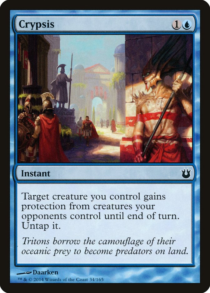
Crypsis – When I first saw this card in the database, my mind jumped to "something something camouflage," so I hopped on the Wikipedia article for camouflage. Right in the first sentence was a word I’d never seen before: "crypsis." Another Wikipedia hop later and I had a submission. It’s Greek-derived, and it appeals to the vocabulary geek while being pronounceable at first glance. I’m glad this name made it. Wizards added a word to my flavor text to take it from good to awesome.
Divination – As Mike McArtor mentioned in his "Born of the Gods Prerelease Primer," he contributed the flavor text for Divination. Grats, dude. May it always be your word-baby.
Eternity Snare – I like the art better than the Drew Tucker original from Time Spiral, but a really cool idea—a mortal trapped in a constellation, pinned by stars—doesn’t quite reach full "whoa."
Fated Infatuation – A takeoff on the Narcissus myth, except this time the beautiful image in the water is not merely a reflection. I enjoy this Winona Nelson illustration.
Floodtide Serpent – I’m a fan of Steven Belledin, and I enjoy the mix of a waterlogged city and the massive culprit in the background. The flavor text is a reminder that while the gods of Theros can grant boons as often as not (or more often!) they’re gigantic immortal pains in the neck.
Kraken of the Straits – I could make an argument for this art being a throwback to Magic’s early days or else some simple polychromatic Greek art. It still looks out of place in the set.
Mindreaver – This art really creeps me out. From the expression on the Mindreaver’s face to that of the victim’s, I don’t particularly care for it.
Perplexing Chimera – This name has to be an in-joke about the card mechanic, right?
Sphinx’s Disciple – New artist debut! This time it’s Ryan Alexander Lee. His bio talks about contributing "works" to Magic, so there’s likely more where this one came from. (Also, magnificent flowing lower-body robes and no shirt.)
Sudden Storm – I saw this one in sketch form and was impressed. An interesting illustration of minotaurs drowning beneath a dreary sky, though not really one to put over the couch.
Vortex Elemental – The more Jack Wang art I see in Magic, the more impressed I am . . . and the more frustrated I get that I can’t track him down online at all.
Whelming Wave – Yes, "whelming" is a legit word. No, that doesn’t stop the name from feeling too clever by half to me.
Black
Archetype of Finality – I may not have the formal art training of some other Magic critics, but I know what I like and how a piece hits me. Chris Rahn’s illustration has a sinister mix of stars and snakes to send a shudder down spines worldwide.
Bile Blight – Pretty sure that’s an arrow that had been loosed in the left foreground. Just saying, flavor text. Just saying.
Black Oak of Odunos – Often the most flavorful cards are Limited fodder rather than Constructed staples. The grim mystery of the name, the chilling art, the understated horrific flavor text I wish I’d written—it all comes together on this card.
Drown in Sorrow – I can’t lie. I’m glad my flavor text got paired with some Noah Bradley art. My original submission began "The whip of Erebos" without the "sad truth" part. The added words put the character of Perisophia (also seen in Fate Unraveler below) in the light Wizards wanted, and that’s plenty fine by me.
Eye Gouge – Because Mutavault. That practical application aside, this is one of my favorite top-down designs in the set. In the original myth of Odysseus and the cyclops Polyphemus, the implement of gouging was a great sharpened beam or wooden stake rather than a javelin, but Theros is taking inspiration from the myths, not copying them.
Fate Unraveler – The flavor text I wrote for this card isn’t one of my favorites because I mixed metaphors badly: "life you’ve built" versus "single loose thread." The original preview of this card on Rebellion.es was in Spanish, and the game’s translator changed "built" to "woven," which I consider an improvement.
Forlorn Pseudamma – This concept wigged me out more than any other. The returned from the underworld basically repeat their actions mechanically and without the aid of memory. Dead soldiers know they must fight but cannot tell friend from foe among the living. Dead mothers know they have children and must find and take care of them, which leads to kidnapping and zombification of innocents. I can’t imagine how much stronger my reaction would have been if I were a father.

Gild – When cards change in development, sometimes flavor text has to be scrapped entirely. Other times it can be trimmed. My original submission needed three lines, but Wizards did a great job of keeping my first sentence largely intact and adapting the second. Cheers!
Nyxborn Eidolon – I suspect I wouldn’t like a larger image of Nyxborn Eidolon, but it looks right at card size. Nils Hamm can be polarizing as a Magic artist, but he usually gets the job done.
Sanguimancy – Some clever placement of figures in this composition. Clearly the dude standing in the pool of blood is bleeding out from his arms, but showing those cuts would be unacceptable; Magic has a large teen audience, and slashed wrists or close to them are a serious no-no.
Weight of the Underworld – Good luck shrugging this one off, Atlas.
Red
Akroan Conscriptor – "Hello ladies. Look at your man. Now back to me. Now back at your man . . . and you can’t because I took him to get maimed or killed in a war of aggression. I have an orb."
Cyclops of One-Eyed Pass – This passage from The Theriad dovetails nicely with Eye Gouge above. Whether or not that’s coincidence, I can’t say. I’d have to ask Creative.
Fall of the Hammer – To me, this card will always be "Drop the Hammer." Too punny to work as a card name, but so it goes.
Fearsome Temper – Perhaps the most radical reworking of any of my accepted submissions, though the core concept of "god of creation and destruction being creatively destructive" remains. The repetition of the word "god" within the new flavor text feels a bit awkward to me, but I’m not sure my original version was better.
Forgestoker Dragon – Fierce art. I’m not as enamored of the flavor text or at least the last bit. The favorable interpretation is that the "as that would be little help" part was supposed to be understatement in the British vein.
Impetuous Sunchaser – Icarus in a muscle cuirass. I love the little detail of the paper wings just starting to catch fire.
Pharagax Giant – It’s tricky illustrating cards that can change in power and toughness. That said, Pharagax Giant "looks" too big for even a 5/5 with the "scale humans" at his feet. Compare Ryan Pancoast’s 7/7 from Magic 2014 called Guardian of the Ages.


Reckless Reveler – Mike Sass has one of the most interesting hop, skip, and jump illustration histories in all of Magic: never more than two works per set, often with years between them. His other illustration in Born of the Gods is Aerie Worshippers.
Satyr Nyx-Smith – By satyr standards, this dude is positively ripped. Then again, he is the satyr equivalent of a blacksmith, so it makes sense.
Scouring Sands – Another flavor text I wish I’d written. It’s evocative and an elegant fit with the name and illustration.
Searing Blood – I wasn’t the first to come up with the line about this art looking like it’s bleeding fondue, but I’ll happily use it. Also cheesy? The flavor text. That said, several people have told me they love the pun on Searing Blood. So it goes.
Stormcaller of Keranos – Could someone please tell me what’s going on with the background figure in the art? It’s not a reflection, and its proportions are all whopperjawed.
Green
Aspect of Hydra – The default art for green "pump spells" is showing a small creature at supersize. This is a cool alternative all around with the folds of the woman’s dress forming hydra heads.
Culling Mark – The word "Mark" in card names seesaws between sorceries such as Mark of Mutiny and Auras such as Mark of Eviction. I wonder when Wizards will settle on a convention.


Hunter’s Prowess – In real life, anyone who tries this warrior’s attack will get wrecked. (The gap between "looks cool" and "actually works" is why kung fu gets the films and Brazilian jiu-jitsu gets its high representation in mixed martial arts.) Luckily for her, this is Magic.
Mischief and Mayhem – Wizards accepted and paid for a name and flavor text I submitted for this card but chose not to use them. In both cases I think they made the right call to switch them. The "Mischief and Mayhem" formulation carries on the convention of "X and Y" for spells that have (up to) two targets, such as Stomp and Howl or Tooth and Nail. My original flavor text had a Xenagos quote, but it was better suited to his psychology in Theros (disillusioned plotting satyr) than in Born of the Gods ("I’m a god and what are you going to do about it?") These things happen.

Nessian Demolok – Another case of "how big is this thing supposed to be?" With the scale humans (more clearly visible in the large art on Daarken’s site), the Demolok looks to be a 6/6 in the image.
Peregrination – In its ordinary sense, "peregrination" simply means "travel on foot." In the context of Theros, when male Setessan youths get too old and start upsetting the women and children balance, they’re sent out to find their way in the world, and that process is called peregrination.
Raised by Wolves – Others have mentioned that this is a place where the Roman influence is bleeding over into the Greek-inspired Theros (it’s a takeoff of Romulus and Remus). Me? I’m so amused by the idea of a kitty-person growing up in a wolf pack that I don’t mind.
Setessan Oathsworn – Setessa has a limited number of adult males (see Reap What Is Sown below), but the choice of a male satyr here seems odd. After all, there are female satyrs in Theros, as seen on Destructive Revelry.
Snake of the Golden Grove – One of those odd paintings that makes me go "oh no" and laugh at the same time. This isn’t a tempting snake; it’s a plain old "gobble up the little elk" snake.
Multicolor, Artifact, & Land
Chromanticore – Add me to the many who wish this card were legendary for Commander purposes. I get that there’s only so much space on the type line, but darn.
Karametra, God of Harvests – Unlike Ephara, God of the Polis, Karametra’s art loses the plot at card size. Karametra’s figure is just too small. Wallpaper size, on the other hand, and the details come out.
Kiora, the Crashing Wave – For a reminder of why she’s not "Kiora Atua" anymore, read this post by Doug Beyer. (Short version: "Atua" are divinities in Maori mythology, and that’s too close to real-world belief for Magic to want to use.)
Mogis, God of Slaughter – Am I the only one who saw this and thought of Ordos, malevolent deity of the yaungol in World of Warcraft? *crickets+*Yeah, that’s what I thought. Moving on.
Reap What Is Sown – Shirtless field hand alert! It wouldn’t surprise me if there were a bit of checking out going on; note that the two women are looking in roughly the same direction. Setessa doesn’t have a sizable adult male population, so harvest time might be the best chance to, shall we say, survey the field.
Gorgon’s Head – My favorite flavor text that I wrote for the set. The "last words" flavor text genre is sadly underrepresented in Magic, and I couldn’t resist giving Polydectes, the evil king of Greek myth who was turned to stone by a glimpse of the gorgon’s head Perseus brought to his court, a "too dumb to live" makeover.
Pillar of War – A clever enough name. At least it didn’t get called a "caryatid column."
Springleaf Drum – Those who were excited about a Springleaf Drum reprint so they could get away from the bizarre Lorwyn art likely are disappointed in this art unless they also happen to be fans of satyrs in weird poses. This is a bit of an eyebrow raiser for me.
Temple of Enlightenment – As with Temple of Abandon in Theros, Temple of Enlightenment continues the trend of land art with human figures prominent, a former taboo. Is this a new direction for Magic art?
Temple of Plenty – I want a print of this Noah Bradley art. Unfortunately it isn’t up on his prints site yet (there are some nudes on said print site, hence no link) so I’ll have to wait.
Contest Time
One of the cool parts of contributing names and flavor to a Magic set is that Wizards sends each writer a courtesy foil copy of each card where her or his work appears. Because my name was accepted for Xenagos, God of Revels, I will receive a foil copy of that card. Same with Akroan Phalanx, Crypsis, and all the other cards I listed at the top of the article.
I’ve made my list of people to receive contributor copies. Out of twenty cards, I have nineteen earmarked for someone (even if that "someone" is myself).
The twentieth card? It will go to one of my readers.
It’s not just an "enter and win" thing though. I’ll make you work a bit for it.
Here are the rules:
1) Tweet to me @jdbeety with the name of the one card from the twenty above that I’ve earmarked for this contest.
2) Just one guess/entry per person.
3) On February 7 (sometime, so don’t try to time this) I’ll choose at random an entry that named the correct card. If it’s your entry, you win, and we’ll be in touch by direct message on Twitter to get the address and other good stuff arranged.
4) U.S. residents only please. I can try to make international shipping work, but that’s way more complicated than domestic.
Since a one-in-twenty guess is asking a bit much of contest entrants, here are a few hints to help you narrow down the field and zero in on the giveaway card.
I’m sending my mom four of the cards. She doesn’t like ugly or scary pictures.
I’m keeping four of the cards for myself, three of which are particularly meaningful to me and one of which is worth some money.
Myke Cole is receiving three of the cards in a prearranged writer-swag-for-writer-swag deal. He games but is not (so far as I know) a Magic player. On one card of the three, I contributed the name but not the flavor text (if there is any).
I’m sending eight of the cards to a range of acquaintances from co-workers to Magic writers. The co-workers are getting cards that are easy for non-Magic players to understand. The Death and Taxes player is getting a card suited to his taste.
That leaves one card for the contest. A final hint: I didn’t critique my contribution to the giveaway card in the article above.
Good luck, have fun, and don’t forget to send me your entry on Twitter.
— JDB
@jdbeety on Twitter