Hello everybody, and boy do I have a treat for you. Today marks the culmination of over a year’s worth of work, planning, rework, replanning, designs, and redesigns. We’ve hired new employees whose entire job it is to get this off the ground, and now it is finally ready to show to the world.
StarCityGames.com is proud to present: http://beta.starcitygames.com !
As many of you know, redesigning a site as massive as StarCityGames.com takes a lot of time, effort, and collaboration. The entire company has worked, in some capacity or another, in making this redesign a success.
Today’s unveiling is but a small part of our entire strategy. Because parts of the site will not be overhauled at the same time, I feel it’s important to be very clear about where we are and where we’re going. We’ll be revisiting this roadmap as we continue development. Note: This is subject to change. They’re called estimates for a reason 🙂
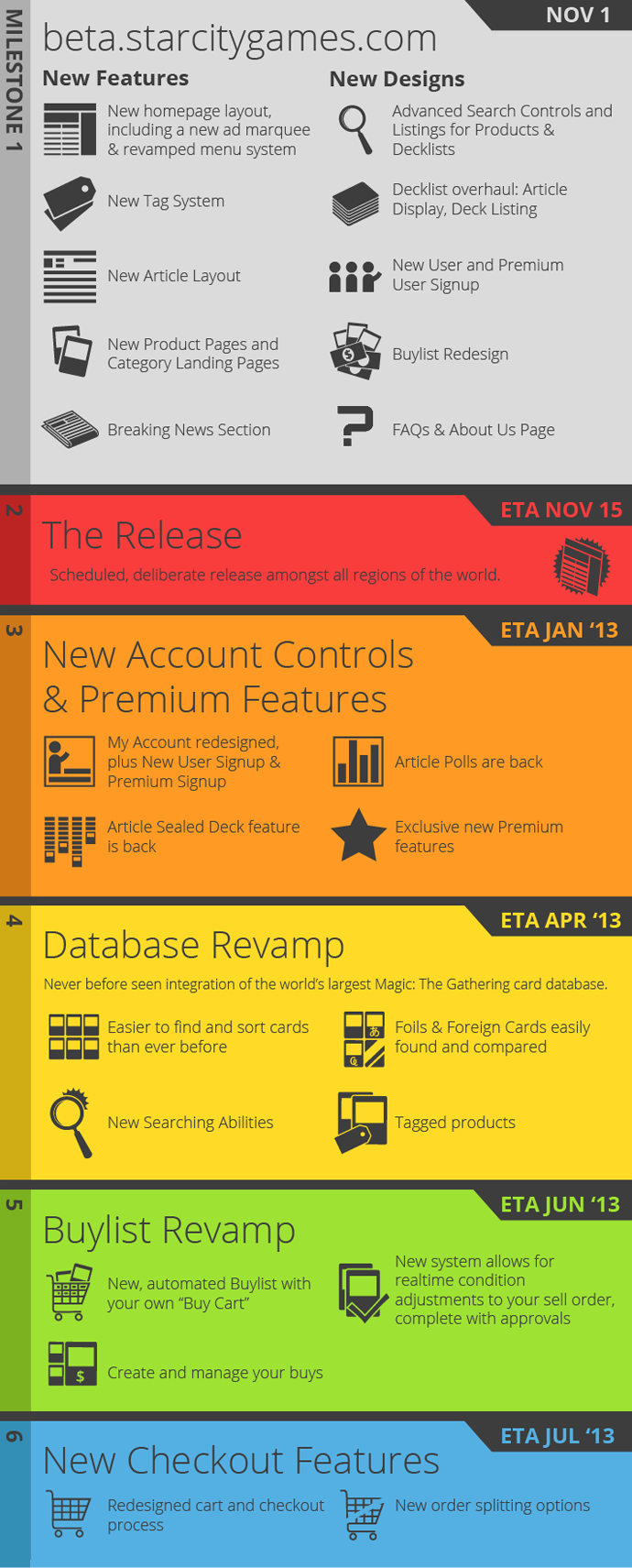
As you can see, we have a long way to go. Instead of waiting until mid-2013 to unveil our big revamp, we wanted to give you access to the all the latest upgrades.
The new site is 100% live and ready for your feedback! Yes, you can login, purchase products, and view articles to your heart’s content.
Go, explore, have fun, and then come on back, and we’ll talk a little bit about how this design came to be. I’ll then showcase some awesome new features and how they all work.
How We Got Here
So it’s been a long road for the redesign. This project has been underway since around November of 2011. We went through meetings, goals, and projections. By early this year, we had a redesign that looked like this:
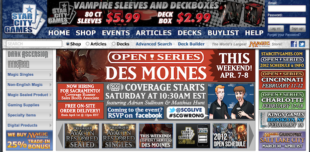
As you can see, quite a lot of color, shading, moving parts, and textures.
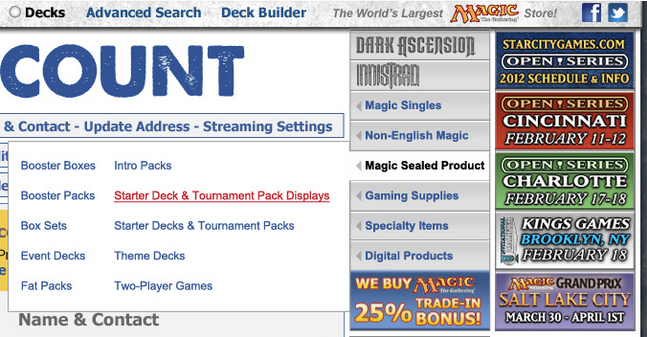
But while we were generally pleased with this, the real awkwardness came when you navigated away from the homepage. This caused the menu to the move to the right of the screen, which is a user interface no-no:
So at that point we had to go back to the drawing board. We needed to redesign the menu and, while we were at it, make our events far easier to grok:
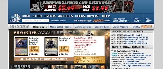
This was an additional step towards a cleaner design. Everyone was excited about the new layout, but as time went on, the graphic designers decided to keep going with the clean look. The following was unveiled internally in mid-July and changed the course of the redesign from that point:
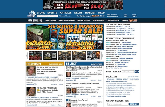
And the clouds opened, and there was much rejoicing. With fewer textures, less shading, and overall less stuff, we were well on our way towards something that would allow our content and events to share the focus with our sales and promotions.
The beta site you see today is the final evolution of that initial breakthrough. With a redesigned marquee, sidebar, tweaked menus, and layout, we are confident you’ll get more out of StarCityGames.com than ever before.
New Features
Feature #1 – Tags
Tags are something we are very excited about. Tags are an evolution of grouping like objects on the web, and we are embracing them wholeheartedly.
You can now search for #Standard, #Legacy, and #Limited to find articles that pertain to just those subjects. Looking for free content? Hit up #Select. Looking for #Premium? Go nuts. Your favorite author such as #BrianKibler? It’s all there. You will also be able to check out what articles relate to our upcoming events. (Note: Not all—or even most—of our articles have been properly tagged. This will occur as the weeks and months roll on.)
Take a look at our new Tag Search feature (which is replacing Article Search) that allows you to find things by keywords, tags, or any combination there in.
Feature #2 – News
If you haven’t seen it yet, we’re posting #News items! This is our ability to talk about the latest happenings in the Magic community that aren’t necessarily articles. We’re excited to have an outlet to discuss things as they occur, instantly and easily.
Feature #3 – Category Landing Pages
It’s one thing to see a list of Multiplayer products, but it’s another to see them nicely laid out for your perusal. These easy-to-navigate pages allow you to peruse our catalogue like never before. Like the Multiplayer Expansions landing page? Check out the Card Sets or Rarities! All of these landing pages are available from the menu at the top of the site.
Feature #4 – New Article Pages!
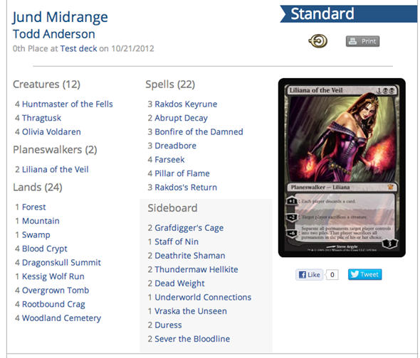
If you’re perusing articles you’re going to be pleasantly surprised—our articles now look better than ever! For example, the new decklist layout is quite the looker:
And Much, Much More!
The features I’ve highlighted today are just the starting point to a huge variety of changes we have made to StarCityGames.com. As I’ve personally found over the past year, just when you think you’ve got it all covered…you find another facet that was forgotten.
We know things aren’t perfect.
As I noted above, there will be parts of the site that aren’t as optimal as possible. We here at SCG hope that you will help us find those bugs by reporting them to [email protected] and checking the SCG Bugs Google Doc to see what we’re currently aware of and working on.
What Happens Now?
Up next we’re working on Milestone #2 – The Release. The beta site as you see it is still very much in flux—work is still progressing each day to continue the improvements we’ve been working on for almost a year now. As the time comes for release, I’ll have another article here explaining how the beta and subsequent release went and how we’re getting to Milestone #3 in providing some amazing (and hush-hush) upgrades to Premium, our New Account Controls, and more.
All I know, the biggest project I’ve ever been involved in is finally making its way to the world, and we all hope you are as excited as we are. Viva la StarCityGames.com!
Marketing and Technology Dept. Manager
