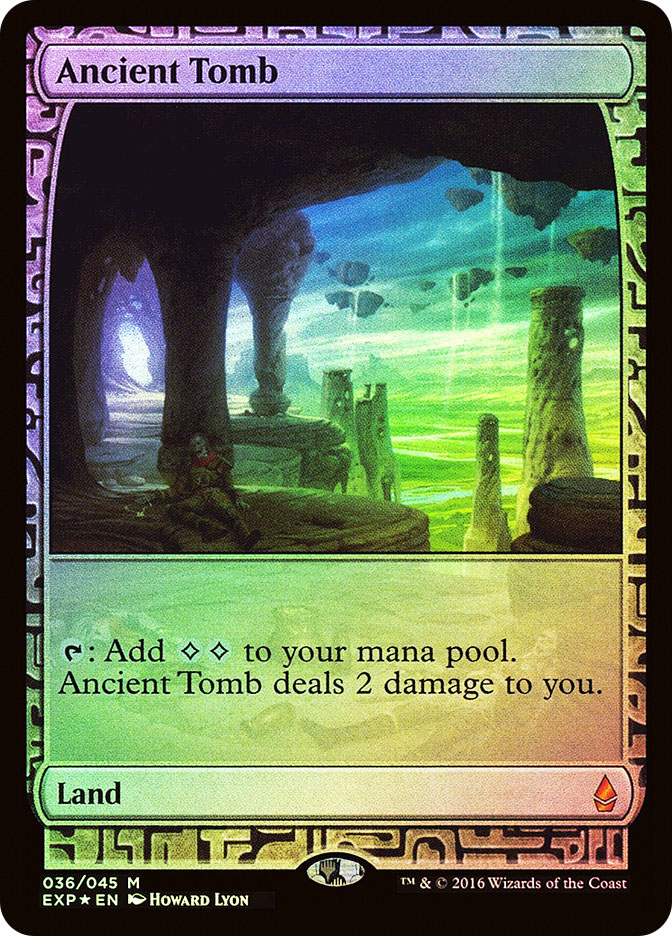
Magic’s look has changed a great deal over the years.
One of the longstanding constants, however, is the splitting of art and text into two separate boxes. Sure, there’s stuff around them, vital stuff like card names and types and mana costs. But for now, I want you to think of those two boxes and how many thousands upon thousands of Magic cards from the past 25 years have had a two-box look.
Now think of the cards that have broken that two-box rule.
They’re instantly different. Instantly memorable.
With the announcement of full-art Amonkhet basic lands appearing randomly in booster packs, it’s a good time to revisit the history of full-art cards in Magic: the good, the bad, and the Cryptic Command.
Someone didn’t think this through…
Doubleplus Unglued
Five years to the month after Limited Edition Alpha introduced Magic to the world, the game was sufficiently established (and sufficiently stabilized) to release a humorous non-tournament set, Unglued. While the set as a whole was not a massive commercial success, it did contain some smaller hits within it, most notably its unique basic lands.
The late Christopher Rush, who was not only an artist for Limited Edition Alpha but designed the original five symbols for the colors of mana among other contributions, also came up with the idea for full-art Magic cards, basic lands to be specific. As Mark Rosewater tells it in the link, an airplane conversation made him aware of Mr. Rush’s idea, and when Mr. Rosewater sought a way to differentiate Unglued’s basic lands from those of other sets, the full-art lands got their chance.
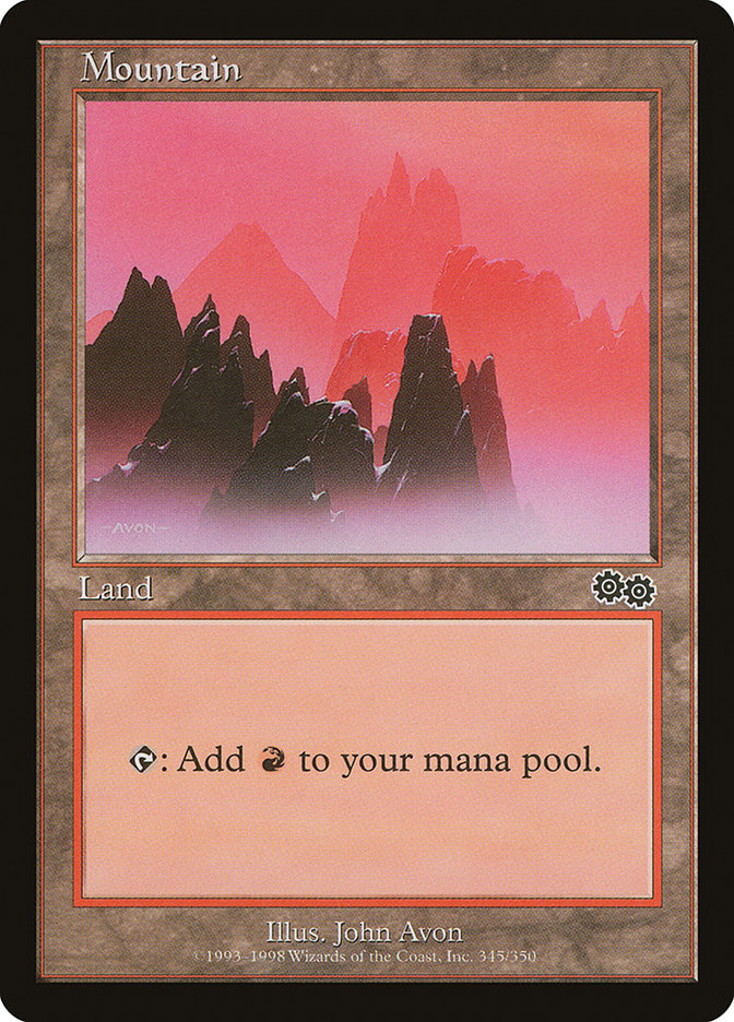
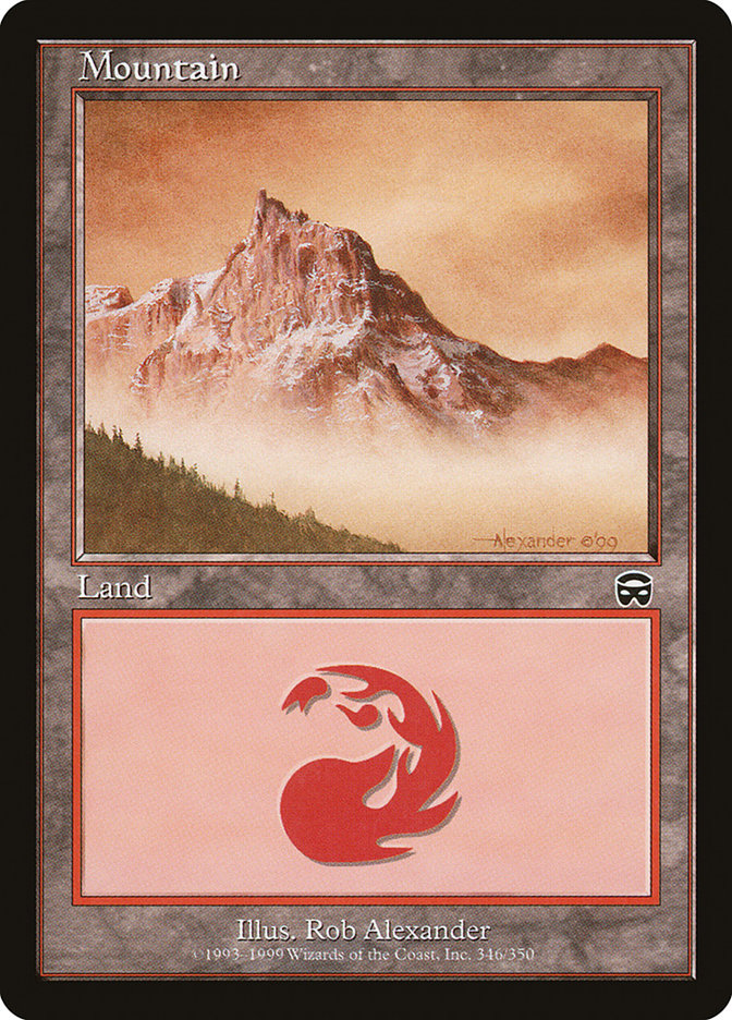
Crucially, the Unglued basic lands, while visually different from their predecessors, were not treated as jokes. They were made black-bordered, unlike the silver-bordered remainder of the set, so that they could be played in regular Magic decks; further, they contained all the printed information needed to understand them (according to the standards of the day) in a more compact form than the then-standard. It’s interesting to compare, for example, the Unglued Mountain (August 1998) with an Urza’s Saga Mountain (October 1998) and then one from Mercadian Masques (October 1999), when the “regular” basic land design flipped to simply having a giant mana symbol in the text box.
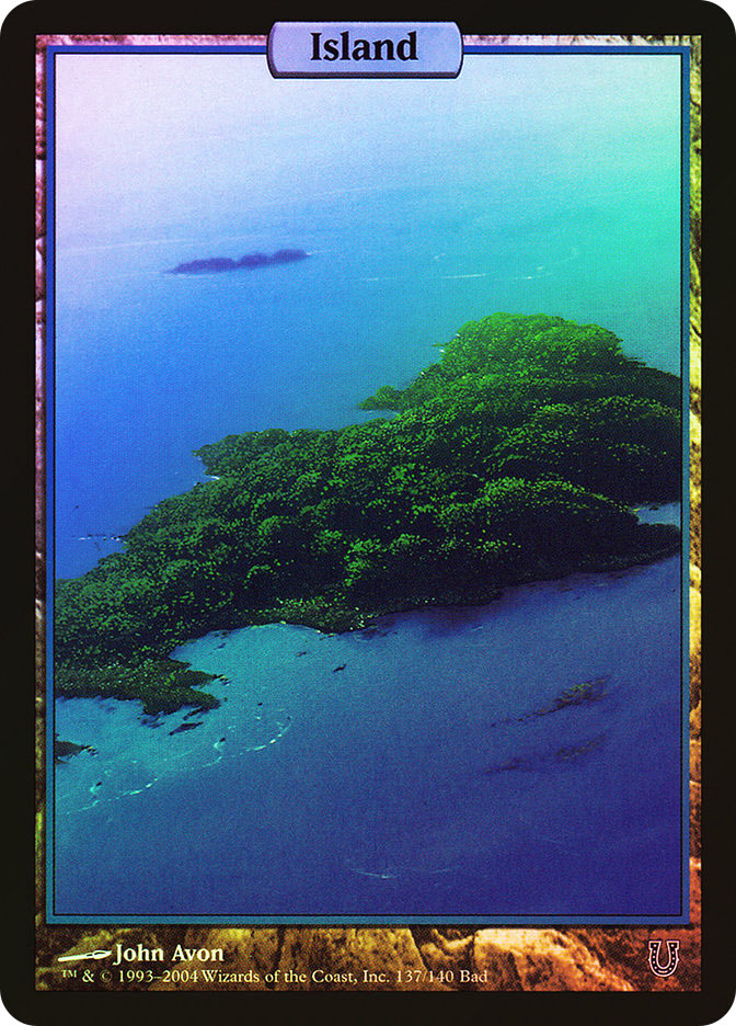
Fast-forward a few years. Unglued basic lands have enjoyed considerable popularity, in part due to their novelty but also in part because they made gameplay easier, showing which cards in a player’s hand or on the battlefield were basic lands at a glance. (In the past, I’ve disagreed frequently and sometimes volubly with Jesse Mason, but his blog post on the topic is one of the best I’ve seen.) When Unglued’s humorous follow-up Unhinged came out in 2004, full-art basic lands illustrated by John Avon, once more black-bordered to allow for regular Magic play, were part of the set; once more, the full-art lands, particularly the never-before-available premium foil versions, were among the best-received cards.
But before anyone had a chance to open a foil Unhinged Island in a booster pack, Wizards of the Coast announced new full-art cards, spells this time: the textless Magic Player Rewards series.
Rewards, No Words
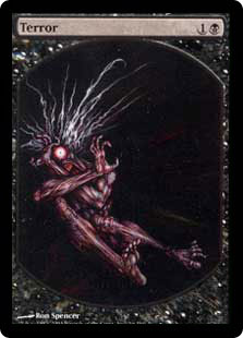
On 13 September 2004, Wizards of the Coast revealed the first-ever official textless spell, Terror, as the first Magic Player Rewards offering for 2005.
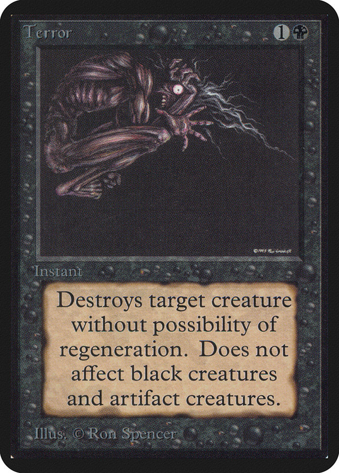
Interestingly enough, Ron Spencer’s original Alpha art for Terror was in portrait (longer than it was wider) layout rather than Magic’s default landscape layout; the art director just flipped the illustration around to make it work, which just made the illustration even more unsettling in card form. While Mr. Spencer is also the artist for the textless Terror, the illustration is new; note in particular the differences in the hair and the pose.
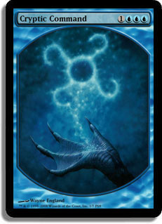
The Magic Player Rewards system, which ran from 2001 to 2010, automatically sent cards to players for every five official DCI tournaments they played in (originally then-novel token cards) and premium foil cards for every twenty tournaments; the premium cards took longer to switch to textless, but in 2007, the textless Wrath of God made its debut. Interestingly enough, both it and the next year’s follow-up, Damnation, had the exact same (missing) rules text: “Destroy all creatures. They can’t be regenerated.” The 2009 premium promo, Cryptic Command, was a bit more complicated and still gives the occasional judge (not to mention the frequent newer Modern player) a case of indigestion.
Soon after, the cost inefficiency of the Magic Player Rewards program led to its elimination. Wizards of the Coast hasn’t gone back to “textless spells” since, much to the relief of Standard players everywhere.
Champs and Game Day: Text Across Full Art
While textless iconic spells could safely be introduced into tournament halls and game stores in limited quantities (or so the thinking went for Magic Player Rewards), new cards were quite another story and required a different full-art solution. Enter the “borderless” full-art cards and their successors, first revealed on 16 February 2006.
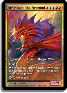
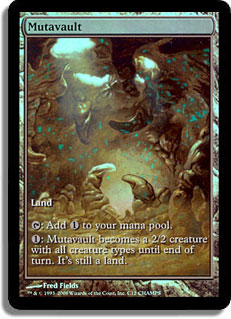
The “borderless” full-art cards originally came out for a Wizards of the Coast-organized program called “Champs,” run in the various U.S. states, Canadian provinces, and similar political subdivisions. The Champs series of full-art prize cards lasted for only three years, with the last of them, 2008, producing the geographically limited and thus notably rare full-art foil Mutavault.
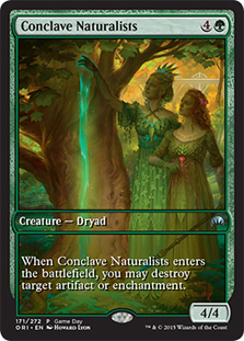
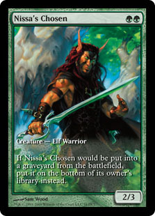
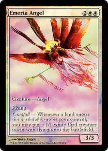
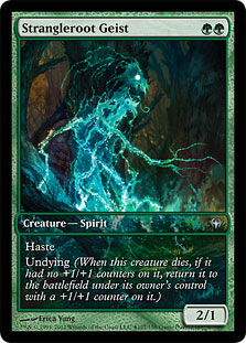
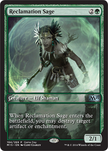
After the Champs program ceased, the store-based Game Day system took up the borderless full-art-with-text-on-top thread. The first Game Day, excluding the one-off 10th Edition celebration in 2007, was for Magic 2010 on 31 October 2009. While the participation prize Naya Sojourners card had the regular dimensions, the promo Mycoid Shepherd was full-art. And yes, both of those cards were from previous set Alara Reborn rather than Magic 2010 itself. The first in-set full-art Game Day promos were Nissa’s Chosen and Emeria Angel from Zendikar.
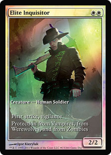
While the “borderless” look was a longstanding part of the Champs / Game Day promo design, it had a crucial flaw for use in promoting sets: it lacked an expansion symbol! A subsequent redesign added a “type line” border across the card art without otherwise interrupting it; this redesign took place between the original Innistrad and Dark Ascension. A further redesign took place with the Magic 2015 layout changes.
The Game Day promos are well-established enough that they seem almost familiar. That being said, while they represent Standard-legal spells, they cannot, barring some bizarre manufacturing error, be opened in Standard-legal booster packs. While planeswalker cards, first introduced in Lorwyn, are the most notable uses of full-art effects in Standard-legal booster packs (case in point: Jace Beleren and his legs), the first Standard-legal booster packs to contain full-art spells were from one of the strangest sets of all time, the one that hinted at but did not print the planeswalker card type: Future Sight.
Future Sight: Framing on a Curve
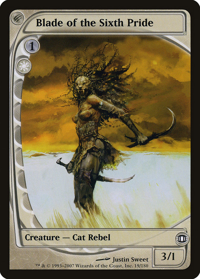
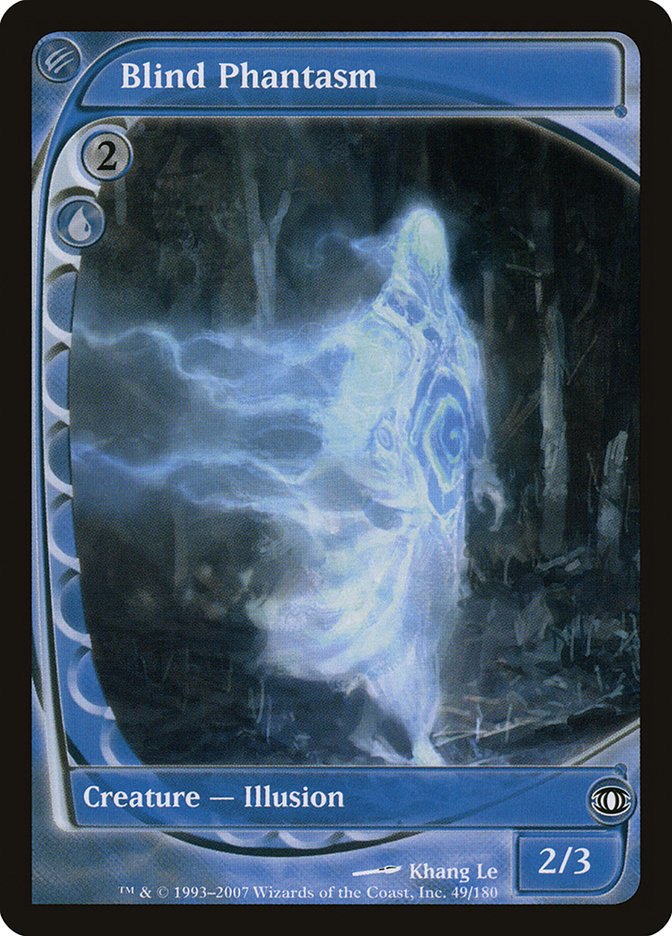
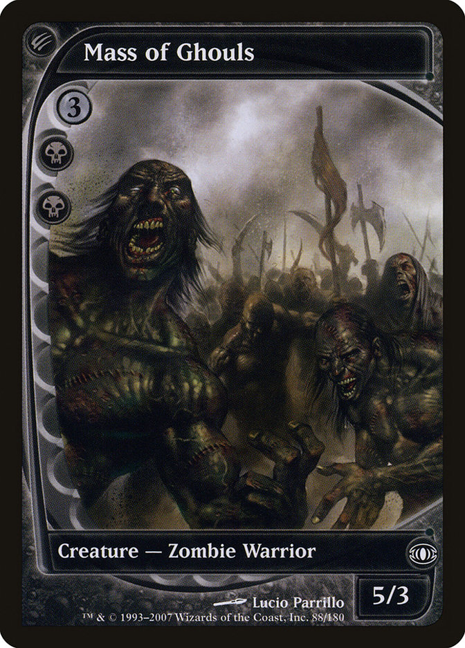
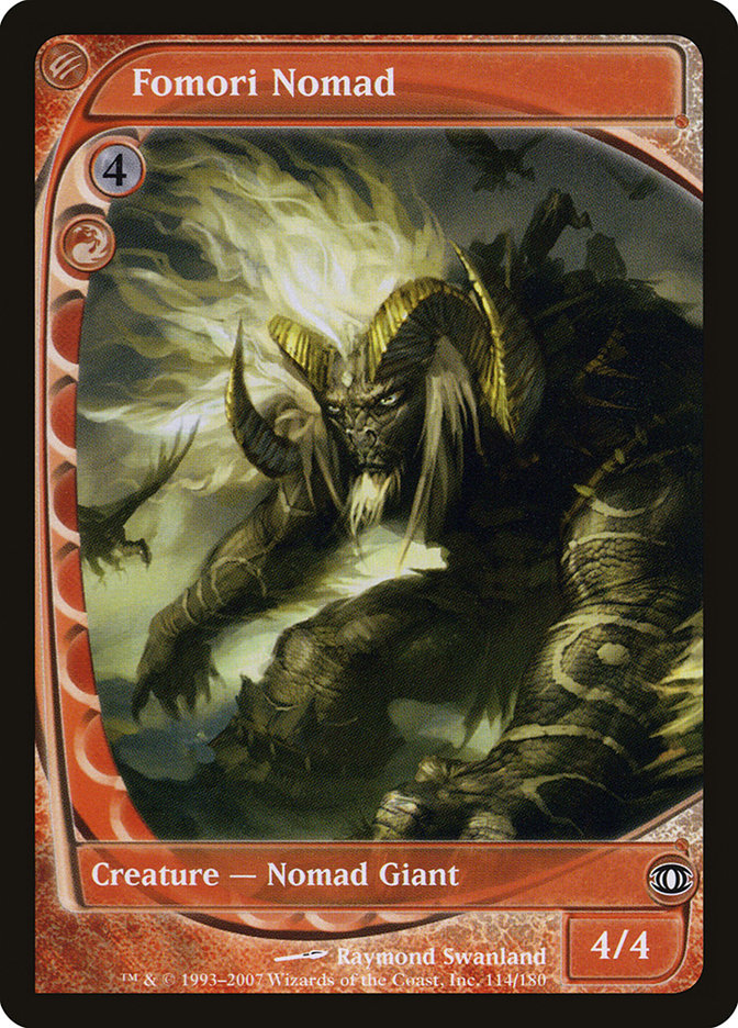
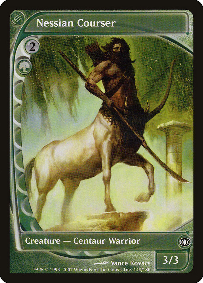
Among the most striking full-art cards Magic has ever printed are Future Sight’s cycle of five “vanilla” creatures.
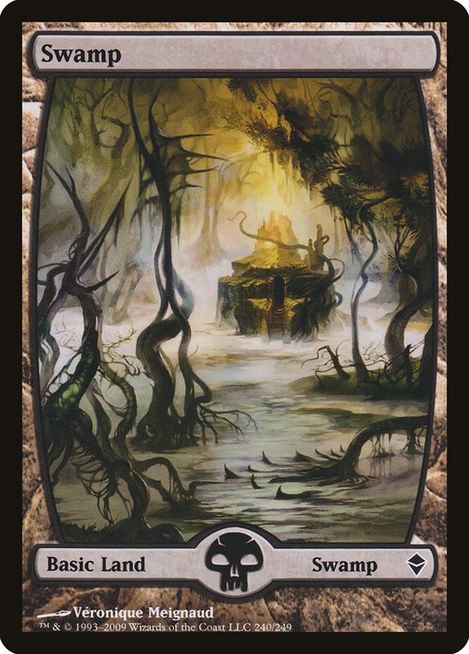
This cycle of five, one per color, showcases the full possibilities of the “future-shifted” frame that completed the “past-present-future” conceit of Time Spiral block. The future-shifted frame proved divisive, with the combined elements of the rearranged layout (checking the top left part of the card for the mana cost rather than the top right, and so on) proving too much for many players to stomach. The curved left side of the full-art frame, however, did find a second life in the curved left-right borders of the Zendikar full-art basic lands.
The State of the Full Art: Closing the Curve
Any curve, if lengthened enough, will eventually close back upon itself. A long arc of Magic graphical design, begun with the Unglued basics and drawing lessons from promo cards and Future Sight, comes at last to the Standard-legal Battle for Zendikar set and the upcoming Amonkhet.
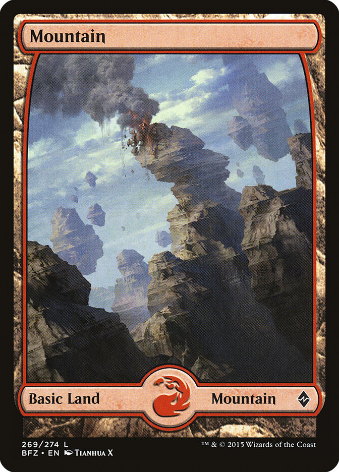
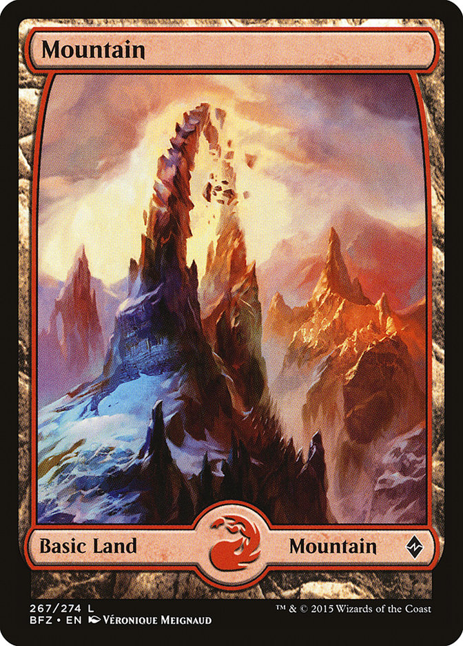
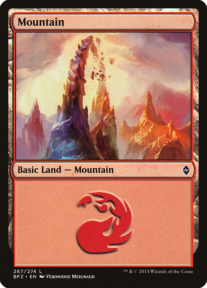
The most recent layout for full-art lands, as seen on Battle for Zendikar basic lands and the Zendikar Expeditions series, is a “top curved” layout, where the top of the art is curved while leaving the bottom corners squared, giving viewers that much more artwork to see. Looking back at the Amonkhet basic land announcement, this layout is still in effect.
The Amonkhet full-art lands’ innovation lies not in their layout but in their distribution. In Zendikar and Battle for Zendikar, the previous main-line sets with full-art basic lands, every booster pack contained one, with truncated “regular” versions appearing in other products such as the Battle for Zendikar Gift Box.
With Amonkhet, by contrast, the basic land slot in booster packs has itself been turned into a “premium-possible” slot, with roughly one in four Amonkhet booster packs containing a full-art basic land. While official versions of the “regular” Amonkhet basic lands have not been revealed as of this writing, one may get an idea of how they look by comparing cropped and regular versions of a Battle for Zendikar basic land, as below.
My best guess? The tighter crop of the “regular” Amonkhet basic lands will have “everything but the Nicol Bolas horns” on them. But maybe Wizards of the Coast has a curveball in store.
An Article in Full
From their tentative beginnings in Unglued and Unhinged to their regular appearances on planeswalkers and Game Day promos, full-art cards are now a well-established part of Magic. What’s your favorite?


