I’ve run through three food tasters in one week, so that can mean only one thing…a Conspiracy is
afoot!
Before I get into the individual cards, I’d like to say a few words about the overall setting of Conspiracy, the plane of Fiora, and specifically, the High
City of Paliano. While clearly a fantastic setting, in the sense of having such non-reality elements as goblins, ubiquitous constructs, and a
spirit who is also the king, the amount of magic in the sense of “cast a big splashy spell and make stuff go boom” is surprisingly small. Note that I’m not
talking about cards such as Rout, which is set on New Phyrexia, but those set on Fiora itself.
There are precedents for fantasy settings with dialed-back magic. The most obvious is A Song of Ice and Fire / Game of Thrones, where magic clearly exists but isn’t the focus of every scene and the
most shocking deaths aren’t magic-induced at all. (I won’t give any spoilers, and I’d appreciate it if they stayed out of the Facebook comments too. As Sir Noël Coward once quipped, “There are still a few old ladies in Worthing who don’t know.”)
Of course, “gritty” isn’t Fiora’s style; rather, it’s more a “fantasy of manners” setting
where intricacies of culture are the thing. Mervyn Peake’s Gormenghast series is arguably the
start of the subgenre, but my defining touchstone for the fantasy of manners is Ellen Kushner‘s Swordspoint, which has no magic whatsoever but plenty of
intrigue surrounding the young swordsman Richard St Vier and the highborn but broke university student Alec. Looking back at the Uncharted Realms stories
for Conspiracy, there’s something of a Swordspoint vibe to several tales, while “The Black Rose” brings to mind a certain scene from the cult classic The Princess Bride.
Big and flashy doesn’t go far on Fiora, and in any case, it’d damage the beautiful architecture. No, Fiora’s way is subtle, small; one person poisoned
here, another ruined there. If Fiora were forced to support a three-block set, it’d be a miserable fit, trying to jam too much into a tiny jewel of a
world. No, Conspiracy is just right for Fiora: big enough to give a good view of the world, small enough to avoid exhausting it.
As I go through cards, I’ll write about those that catch my eye; not every card makes an impression, for good or ill. In addition, I’ll restrict myself to
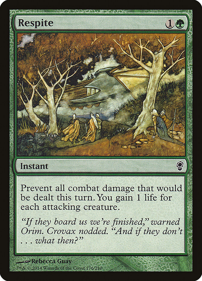
those items with something new: new cards, new art, or new flavor text. There’s no real reason to rehash something like Apex Hawks, except perhaps to note
how few people would recognize the characters of Orim and Crovax, as seen on Respite.
In any case…on to it!
White
Council Guardian
– Volkan Baga is one of my current Magic illustration favorites. His attention to detail really comes through on the intricacies of the giant’s shield.
Custodi Squire
– I get the feeling this illustration was created for something other than Conspiracy and was pulled from the slushpile of leftover art. That, or an
art-swap happened. Nothing about this image, which seems to show a very human woman rising into the air, screams “3/3 Spirit Cleric” to me.
Rout
– Elesh Norn rears her ugly and ridiculously large head, in case anyone forgot who won the Mirran-Phyrexian war. A far more accessible foil than the
Invasion version (and with different art for those who don’t care for Ron Spencer’s style), this puppy’s going to show up in a lot of Commander decks in
the future.
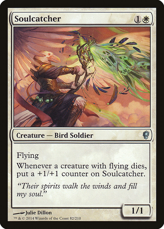
Soulcatcher
– Artist debut alert! This new reprint art (again, replacing a Ron Spencer illustration…coincidence?) is the first for Magic by Julie Dillon. Less than ten years removed from college, she’s snapped up quite a few awards and nominations
already and put together an impressive list of clients. Such fripperies aside, what she illustrates, I feel. I sincerely hope this isn’t a one-of
occurrence and that she has loads and loads of art in Magic 2015 and Khans of Tarkir.
Blue
Marchesa’s Emissary
– If Muzzio, Visionary Architect is the “ruin your life but let you live” school of Fiora, Marchesa’s Emissary shows the “kill it (or cover it up) with
fire” side. As for the flavor text, I get where it’s trying to go, but it feels a little forced.
Muzzio, Visionary Architect
– My art crush on Volkan Baga continues. Muzzio looks smart and accomplished…in short, it’s the perfect “court painting.”
Split Decision
– Is that a…hand guillotine? This is a good example of art that doesn’t show immediate violence but is extremely disconcerting.
Black
Bite of the Black Rose
– Franz Vohwinkel does an admirable job with this illustration, but if I had to pick one artist for this description, it would be Donato Giancola. Dude
paints hands like nobody’s business.
Drakestown Forgotten
– Drakestown is now a ghost town. It used to be Dack Fayden’s hometown until comic book death happened to the other inhabitants. It seems a few unfortunate
torture victims have come back to haunt some folks! Incidentally, a spelling note: the card calls the area “Drakestown,” but I’ve consistently seen
“Drakeston” without the “W” elsewhere. It’ll be interesting to see which spelling becomes official canon.
Grudge Keeper
– Delightfully ghoulish art, but it might be a little more Innistrad than Fiora. Well done, though! I also enjoyed the simple but effective flavor text.
Reign of the Pit
– Newer artist Evan Shipard knocks it out of the park here. Gorgeous, evocative, and marvelously evil.
Tyrant’s Choice
– One of the downsides of a low-magic setting is that the grim cards can seem too grim. In another set, Tyrant’s Choice might have had some grand abstract
illustration, or at least something to say “this is not real.” This card with its too-plausible sadism and the ghastly rules text “Starting with you, each
player votes for death or torture” is most disturbing.
Victimize
– New art and flavor text. Again, the “not-magical” nature of the spell art makes it veer off-course, this time toward a Jigsaw trap from Saw Whatever-Number-They’re-On.
Red
Grenzo’s Cutthroat
– In order to make it in Fiora, a goblin has to have at least some cunning. Grenzo follows in a tradition of “smart” goblins like Krenko, Mob Boss and
Slobad, Goblin Tinkerer.
Scourge of the Throne
– It wouldn’t be a Magic set without a dragon, and while the flame breath is a little narrow (does he have a propane torch in there?), the rest of this
illustration is suitably imposing.
Treasonous Ogre
– I’m willing to allow a certain latitude to smart goblins, but this flavor text with its two four-syllable words in a row would stretch human credulity.
Out of a goblin it’s just ridiculous.
Green
Exploration –
New art and a Magic illustrator debut! Florian de Gesincourt is a landscape specialist, and this version
of Exploration is pretty sharp. That said, a landscape-only illustrator is going to have a hard time making it while contending with the likes of Noah
Bradley, John Avon, Jonas de Ro, and many more. I hope I see more of his work, but he may not get as many opportunities as he would like.
Nature’s Claim
– I almost missed this new Raoul Vitale art, until I remembered he got his start after Worldwake. It’s such a natural fit, it feels as if it’d always been
there. Well done!
Selvala’s Charge
– I can’t help but think Selvala gets sued for damages a lot…and that she never pays.
Squirrel Nest
– New art, and heavy on the beautiful and adorable. Magic is populated with killer squirrels, and don’t you forget it!
Multicolored
Brago, King Eternal
– Karla Ortiz does it again. Brago floats just high enough off the ground to show that he can fly and he has a throne but doesn’t need it,
thankyouverymuch. The more I see of her work, the more I want.
Dack Fayden
– The greatest thief in the Multiverse, so awesome he has a hand permanently stained red (because he got caught red-handed, haha, get it?). I’ve
had way too much time with this character through the comics, so that prejudices my view of this art. I will note that the illustrator, Eric Deschamps,
also has been responsible for some comics illustration work.
Marchesa, the Black Rose
– I have a certain fondness for this portrait, though some of that must be credited toher short story. “Lovely meal. Butler, clean up that corpse?”
Marchesa’s Smuggler
– As with Nephalia Smuggler, there’s an open door, a heavily clothed guy, and an invitation to serious danger.
Selvala, Explorer Returned
– It took me a while to realize that the elf was carrying a sizable ax. She may be green-white, but she’s capable of anything.
Artifacts and Lands
Canal Dredger
– We have our John Avon sighting! The lighting effects are vintage Avon, though the background is curiously flat.
Cogwork Librarian
– It’s not enough for a preview card, especially the very first preview card for a set, to be good; it also must look good. Dan Scott’s
art for Cogwork Librarian was a great introduction to Fiora.
Lore Seeker
– The touch of the metal “robe” to make the construct more human (goblin?) is what sells this piece. Well done.
Paliano, the High City
– The only new land artwork. Ethereal beauty, but washed out in a way that doesn’t quite work.
Conspiracies
Backup Plan
– That look of shameless goblin glee is a winner. So silly! So devastating!
Iterative Analysis
– Winona Nelson sometimes uses unusual angles, as on Sharpened Pitchfork, but here it’s even more striking than the norm. The young man in the foreground
looks halfway Harry Potter, but I’ll take this one.
Sentinel Dispatch
– Sad to say, this flavor text is a clunker. Dack Fayden is a native of Fiora. Why would he make this observation on a home plane he knows well, and not
on, say, Ravnica, where he’s been and where the Orzhov have things like Cyclopean Snare?
Worldknit
– Now this is the cool landscape Conspiracy had been lacking. Gorgeous.
Next time you draft Conspiracy with your friends, take a little time out from backstabbing folks and give a card a good long look. Savor that flavor!


