Vorthos Service Announcement
In case you haven’t picked up The Secretist, Part Three, the final installment of Doug Beyer’s opus is available. Your two-dollar purchase can help secure the future of long-format storytelling in Magic’s Multiverse. This has been a Vorthos Service Announcement.
Shiny Happy Cardboard
Barring some freak accident involving me and a Powerball ticket, I’ll focus on singles rather than packs for Modern Masters. Simple price makes the thought of drafting the set come across as a "caviar Magic" experience: "Hey look, here’s an expensive box of cards! Draft it!" Granted, there’s no danger of any fish going extinct with Modern Masters, but at the same time if I had a choice between dropping close to $300 on a box of Modern Masters and buying a round-trip flight to visit my mother, she wins and it’s not close.
Some people love caviar; I had it once, didn’t care for it, and haven’t gone back. The reports of high preregistration rates for Grand Prix Las Vegas and its Modern Masters Sealed/Draft format suggests the demand is there. I’m simply not part of it, and I’m fine with that. Magic means different things to different people, and not every product has to cater to me.
As with any Magic release, my Vorthos eye zeroes in on the individual cards as well as the set on the whole. While all of the cards in Modern Masters are by definition reprints, that doesn’t mean there aren’t new twists to be seen on the Vorthos front: new art, new flavor text, new frames. At first I tried compiling a list of all the changes, but MTG Color Pie saved me a lot of effort. (And I thankee!)
Before I begin reviewing, a disclaimer: I have contributed names and flavor text to a Magic: The Gathering set (not Modern Masters) and am scheduled to contribute to another. For sets where I have advance knowledge of cards, I am ineligible to play in Prerelease events.
Now, on to the review! New art seems like a good place to start…
Old Guitars and New Strings
It’s worth noting that promotional illustrations get a lot of play in Modern Masters. These aren’t strictly new but will be new to many players who haven’t encountered the specific promo versions. (For example, I didn’t know about the Hydra-styled judge foil version of Doubling Season until I saw the Modern Masters version and started investigating.)
There is a selection of brand-spanking-new art created for Modern Masters. Last Friday’s Magic Arcana gives the full breakdown as well as side-by-side comparisons of old and new.
On a general level, there are two clear "strains" of new Magic art: instances where the illustrator was asked to take the old card as inspiration and others where something entirely new was wanted. The Mirrodin block cards in particular show the effects of several years of R&D Creative refinement of Mirrodin’s environment; Arcbound Ravager, for instance, looks less like a half-in, half-out Transformer and more like an arcbound creature with its own personality—and a tiny myr for a snack. There is a kinship between the two illustrations, however, and the same holds true for Blinkmoth Nexus and City of Brass early in the alphabetical run.
Bridge from Below, on the other hand, looks completely different. The original has direct reference to the Zombie tokens it creates, and now that Innistrad block has come and gone, doesn’t the foreground figure’s heavy clothing look vaguely Innistradian? Grinning Ignus also looks like a proto-Innistrad card with hindsight.
Back to Bridge from Below. The new art (in a new frame—more on that later) is visually dramatic with its small soldier figures dwarfed by the purple-magicked rocks. That said, what does Daarken’s awesome art have to do with the price of lapsang souchong* tea in North America? Admittedly the old art is a bit on the cheesy side, but at least it had a connection to the card’s concept and rules text. I just don’t see the link here.
*Lapsang souchong chosen because it was my late father’s favorite tea. He couldn’t find it easily in northern Indiana, but after I won a trip to the National Spelling Bee in Washington, D.C., my parents used this wacky new thing called the Internet to find a teashop in nearby Alexandria. (Ah 1997, when the Internet was novel and Magic still had interrupts.) We cleaned the place out, and later he ordered from the same shop by the case. Seeing a Father’s Day sale when I called up the Twinings site gave me a twinge…
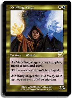
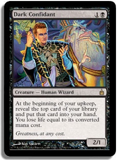
Countryside Crusher continues the trend of replacing Brian Snoddy artwork, this time with a Volkan Baga number that might or might not grow on me. Dark Confidant…blech. I didn’t like it when Chris Pikula was replaced on Meddling Mage, and I don’t like Bob Maher getting replaced here. I understand the need for new art to fit a different plane of the Multiverse, but how difficult would it be to send along a picture of Pikula or Maher and say "here’s your face," eh?
Don’t laugh, Finkel. You’re next.
The new Death Denied is curiously disconnected from its subject. Maybe the old Greg Hildebrandt illustration made it seem as if the figures were being killed rather than raised from the dead, but the new James Paick art is at odds both with the usual methods of depicting "Raise Dead" effects as well as the Kamigawa-based flavor text that remains on the card. Empty the Warrens marks the Magic debut of Jasper Sandner, an upstate New York artist. Since this is his only piece in Modern Masters, one might be inclined to think of it as "slush art," but from what I’m reading on his blog, he has at least one more painting in the pipeline. Based on the timing, I’m thinking Magic 2014.
Engineered Explosives and Grapeshot I don’t feel strongly about one way or another. They’re new, digital, different. Ivory Giant is more interesting to me because it, along with Reach of Branches and Tribal Flames, represents the debut of Zack Stella. I’d never heard of him before this, but one look at the paintings on his website and he strikes me as someone who can bring a distinct new artistic voice to Magic. I’m looking forward to what he does next.
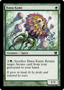
Manamorphose is a card I’m going to buy as a playset when I get the chance; I consider Adam Paquette’s artwork an upgrade from Jeff Miracola’s. Another flavor of "cola," Donato Giancola, replaces Dany Orizio’s Perilous Research artwork, again with an upgrade. (Based on the stylings, I’m guessing the Giancola painting originally was for a Kamigawa setting but was never used.) Reach of Branches, mentioned above, moves away from the Lorwyn-block tweeness and gets more mage-punk. While I don’t always defend that move, I will here. What I do find interesting is that with so many art replacements is that Rebecca Guay’s Hana Kami was not among them.
Modern Masters: mage-punk with a side of watercolor flower-spirits puking flowers.
Sword of Fire and Ice and Sword of Light and Shadow go from Mark Zug’s painterly approach to Chris Rahn’s harder edges. Rahn did the rest of the Sword cycle in Scars of Mirrodin block, so the choice makes sense overall, though I remain partial to the Zug pieces. New Tarmogoyf is a strict upgrade from old Tarmogoyf in that one can tell the artwork is supposed to be of a beastie, though I’m still a little cold on it.
Thallid and Thallid Germinator are both shifts to Magic’s dominant style; I’ll shed a tear for Ron Spencer’s art, though not Tom Wanerstrand’s. Tooth and Nail looks like a recycled artwork that’s somewhere between Ravnica and Innistrad. The Stella Tribal Flames is a solid upgrade for those who don’t like Phyrexia and Phyrexians, even when they’re getting roasted.
Trygon Predator and Vedalken Shackles follow their predecessors closely, and I consider each neutral to a slight upgrade. I do miss the Veteran Armorer from Ravnica, though. I’d talk to him, maybe buy him some bumbat. Kev Walker’s version is isolated from place and time concentrated on his work. I’m content to leave him alone.
Frames and Flavor Text
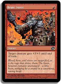
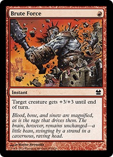
Many of the Modern cards in the set drawn from Time Spiral block make their debuts in the "regular Modern" frame. Thallid, a timeshifted card drawn from the past, switches from the old frame to the new. (I still say "new" out of force of habit, though by the end of July the "regular Modern" frame will have outlasted the old. It’s closing in on a decade.) "Present-shifted" cards such as Brute Force have their names printed in black for the first time. Then, of course, the "future-shifted" cards go from the funky curvaceous mana-symbols-on-the-left design to the regular Modern frame.
Rawr! Break Stuff!
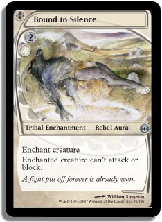
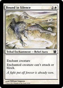
While I’m partial to the "present-shifted" frames in paper, they don’t seem to reproduce that well digitally, which I find curious (but I’m no graphic designer). The "future-shifted" cards are a mixed bag for me. On the one hand, cards such as Tarmogoyf and Bound in Silence benefit from my point of view because now in a typical hand-fan the player can look in the same place on every card to get the necessary information on mana costs.
On the other hand, Bridge from Below and Narcomoeba aren’t meant to be cast (usually). In this case, having the different frame helps differentiate them from the surrounding cards in the deck, making it easier to spot a Narcomoeba or Bridge flip in the Dredge deck, for instance. Of course, this convenience must be recognized as a historical accident, but the lack of any marker for the Dredge cards—not even an Odyssey block era tombstone as on Genesis—will let the cards blend in too easily for a number of players.
Not much has changed as far as flavor text goes. City of Brass has a new set of lines which have no reference to the story of the City of Brass, with the city beautiful and dead and the sun-mummified corpses surrounded by finery. Kokusho, the Evening Star reprint’s flavor text is from From the Vault: Dragons, which may be new to a substantial part of Magic’s audience (as it was to me). Similarly, Lightning Helix goes the Duel Decks route.
Manamorphose—I get where it’s going, but this serious replacement for mana-as-goblin-snack just doesn’t get there for me. Paradise Mantle is more confusing; I’d expect a mantle containing "the wisdom of generations" to make a creature draw you cards, not tap for one mana of any color.
Spell Snare isn’t new, but it did remind me of one of my all-time favorite flavor texts. Tarmogoyf is mechano-flavor—flavor that reflects and almost explains the mechanics—but there’s a certain poetry to it, so I’ll give it a pass. Not every card has to make history.
I hope you’ve enjoyed this brief review of the flavor of Modern Masters. For an all-reprint set, it has its share of quirky delights. Maybe you’re the only person in your draft that recognizes the flavor text on City of Brass as all new. If so, I Vorthos-salute you.
As always, thanks for reading.
— JDB
@jdbeety on Twitter

