Once we’d decided that Battleground was too good a product not to move forward, we knew that there were a lot of challenges facing us. Most of them had to do with the game itself. We needed to develop three launch armies that would play very differently from each other. We had to make sure that our point-cost system was balanced such that no unit was “too good” or “crappy”. We had to resolve dozens of issues that come up whenever you try to represent constant movement of individuals (albeit individuals in units) in a turn-based system in which the shape of a unit is fixed.
One of the biggest challenges, however, had nothing to do with game play. We had to get the art right.
Battleground is an attempt to create a new category in the wargame market – a miniatures game without miniatures. Putting aside the game system for a moment (and I do think we’ve got a fantastic game system), our basic value proposition is that by going down from three dimensions to two, the player gains a ton of advantages – while still keeping the look and feel of a battlefield.
There’s no way that a card-based wargame is going to look as good as a miniatures game with top-level painting. Trying to do that would not only set us up for disappointment, it’s the sort of unrealistic goal that can cause you to make poor decisions or to claim to the public that you’re doing something you aren’t.
We did feel, however, that we could achieve something pretty cool – making a Battleground game look like a battlefield, such that a wargamer would respect the result.
In essence, we’re recognizing the segment of the market that won’t be interested in Battleground – the dedicated modelist for whom the game is secondary or even irrelevant – and aiming at everyone else.
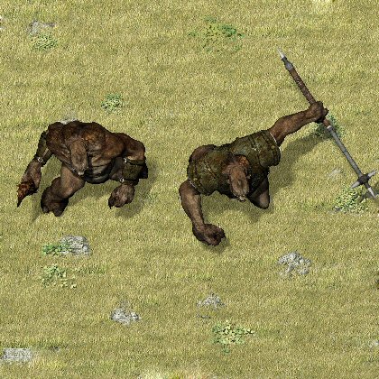
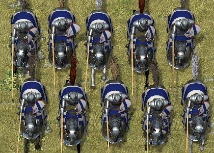
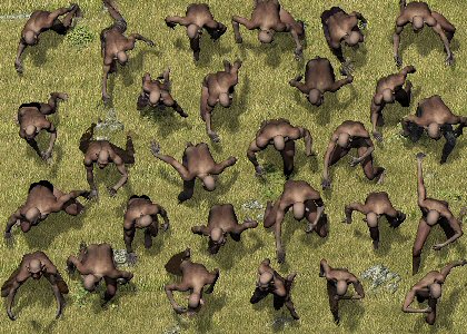
With that in mind, it’s clear that the basic “look” of the main art has to be an overhead view of the entire unit. Abstract art or frontal closeups are fine for other games, but when they’re laid out on the table they’ll look like cards, not a battlefield. From there, we decided that the reverse side would have a close-up frontal view of the unit (more or less one soldier with others behind), with the rest of that side containing rules text.
The problem with that approach is that overhead unit shots are pretty difficult for most artists to do. We spoke with several well-known artists, and most expressed skepticism over whether they could meet our requirements and a general dislike for the perspective. At the very least we would have to work with a large number of artists and face massive problems – even if we managed to keep all the units looking like they belonged in the same fantasy world, there was no way they would look like they were on the same battlefield.
I decided to look around www.renderosity.com (the website where I found the artists we used for Space Station Assault to see if anyone there could do the kind of art we were looking for. I was skeptical because CGI is much better-suited to space ships than to human and humanoid figures, particularly faces. Nevertheless, I soon found some very promising images:
I contacted “Flak” and explained the project to him. I also dug around further and found several other artists with the skills, time and interest we needed. Soon we had the units divided up and we were moving forward. Flak had created a “grassy field” background that randomly generated rocks and shrubs so each artist could use it without us worrying about it looking like a cut-and-paste.
Before all that could move forward, however, we had to decide on the perspective each of the artists would be using – otherwise, scale and perspective would be different from unit to unit. This became another balancing question. Each individual card looks better with a greater forward tilt and with a closer focus. The problem is that if a card-view is close and tilted, your brain interprets its own location as being in front of the card. When you have lots of cards facing in different directions, the end result doesn’t just look off, it can actually give a mild sense of vertigo.
We began by photographing actual miniatures from various distances and angles and printing out mockups of what they might look like as cards in play. Flak then put together some quick images of his own with different variations on our starting point. From there we were able to finalize the exact forward angle (a bit less than 15 degrees, if I recall correctly) and “camera” height.
We’re pretty happy with the final result. There are certainly drawbacks to the approach we took – a uniformity of the soldiers is hard to avoid, and individual human faces sometimes feel too obviously CGI – but the end result is that a game looks like a battlefield. Shadows are computer-perfect, scale and perspective are the same on all cards, and I think the artists did a tremendous job of bringing our unit concepts to life. I hope you feel the same.
Hugs ’til next time,
Chad