The Magic 2013 Prereleases are in the books, the Card Image Gallery is up on the official Wizards of the Coast site, and the singles are available for preorder. While the rest of the site nods sagely and proclaims Thragtusk a potent card of potent potency, I’m taking a look and thinking to myself, "’Always carry two spears.’ That has a nice ring to it."
Before I tackle the flavor of individual Magic 2013 cards, I’d like to make a few notes about the overall flavor of the set. I don’t mind the broader reach of this core set compared to others—I prefer a more kaleidoscopic look at the Multiverse—and there are enough common threads that Magic 2013 holds together, though structured like a collection of short stories instead of a novel.
While I’m glad to see legendary creatures back in the core set (with planeswalkers in the mix, it’s not much complexity to add), I’m not as sold on exalted as a returning mechanic as others have been. In practice (that is, the Prerelease I attended), exalted was a source of confusion in most rounds: "I deal five to you." "No, you deal six to me. You have Knight of Infamy out."
Maybe that confusion will fade as players get more experience with the set, but at least in my experience, exalted wasn’t such an easy "plug-in" for the core set as scry. Then again, there isn’t a Preordain in this set (I suspect Wizards reprinted Index, infamous source of card disadvantage, quite on purpose), so I expect my next fifteen months in Constructed will be glad for that.
As I talk about the cards that caught my eye, I’ll be focusing on the new for this review: new art, new flavor text, and above all new cards. Let’s get to those hits and misses!
New Cards
Ajani’s Sunstriker: Art miss. Usually I’m a fan of Matt Stewart’s art, but this one didn’t work for me. The composition is too confused; the forearm crossing the body doesn’t contrast well enough, and I can’t tell if the end of the foreshortened weapon is hollow (thus showing the Sunstriker’s fur pattern) or shows its own design.
Captain’s Call: Art hit, flavor text miss. Cool art from Greg Staples (including two rare left-handed soldiers), but the flavor text had me hoping the Firstblade heard crickets; as one of my coworkers says, "I learned three things in the army: never be first, never be last, and never volunteer." More to-the-point alternative flavor text: "Whatever the odds, they answer the call."
Faith’s Reward: Art hit, overall miss. Wicked art is wasted on the wrong card. Art and flavor text don’t have to work together flawlessly, but I don’t see the connection between the name "Faith’s Reward," the war priest’s story, and the heavily armored dude (who looks nothing like the War Priest of Thune) doing the double-handed sword-slam. The whole card just feels disjointed.
Healer of the Pride: Art miss. The Healer’s appearance makes little sense. Her gratuitously exposed stomach has no patterning (unlike other female Leonin) and the neck overlaps oddly with the shoulder placement. I like the background better, simple as it is, yet the background and figure don’t go together either.
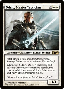
Odric, Master Tactician: Overall hit. And what a hit! Great art meets simply beautiful one-line flavor text: "Fear holds no place in faith’s battle plan." Mark Rosewater favorite quote, "Restrictions breed creativity," holds true for flavor text as well.
Rhox Faithmender: Flavor text miss. Decent flavor text is undone by contradiction; if the Faithmender is lending support by fixing combat injuries, that isn’t true retirement from "war." Substitute "fighting" for "war" and it’s a winner.
Show of Valor: Art miss, flavor text hit-and-miss. Cross-card language matters. Who is Ajani, the speaker? Is he the pithy, third-person-referencing voice of Glorious Charge or the longer-winded "you"-dropper on Show of Valor? And why did Anthony Palumbo paint a reasonably proportioned woman holding a Mannerist child? The contrast between the figures is jarring.
Touch of the Eternal: Art hit. Early frontrunner for "art of the set." From the full moon at left to the new moon at right (no other moon/sun reading makes much sense), this is an unexpectedly tender illustration from Christopher Moeller.
Archaeomancer: Name miss. File it under "names that sound impressive but don’t really mean anything." "Archaeo" is a Greek root meaning "ancient," and a "-mancer" is a diviner who tells the future through whatever the prefix is; thus, the Archaeomancer tells the future by…looking at the past. I do that too. If I eat Tex-Mex for lunch, I predict I’ll pay for it later. On an art side-note, this illustration is credited to Zoltan Boros alone with no co-credit to Gabor Szikszai.
Courtly Provocateur: Hit (?!). I’m not sure why this card holds together, yet it does. The name is great, the artwork strange, and the flavor text almost too fancy. I wouldn’t change a thing.
Downpour: Art hit, overall miss. The Eytan Zana artwork is gorgeous. There’s just one problem: the art shows a flood, not a rainstorm, so the text and art don’t match in flavor.
Hydrosurge: Flavor text miss. Short flavor text can be elegant, but this one-liner is cheesy. Jaya Ballard would take Drunvalus to school…if she didn’t just fry him first.
Omniscience: Overall hit (mostly). Suitably grand in both art (I see what you did there with the planeswalker symbol, Mr. Chan) and flavor text. The text could’ve been tightened up ("What" for "The things," losing an "only") but it’s ok as-is.
Switcheroo: Overall hit. With a name like Switcheroo, Wizards was going for cornball, and the flavor text fits. There’s a place for intentionally made cornball cards in the game.
Tricks of the Trade: Flavor text hit. The voice—a rogue with a mean streak—hits the spot.
Diabolic Revelation: Flavor text miss. It’s too long by a word, but which? My Twitter poll came back that "Interested?" was superfluous, but I’d rather take out "some." Anything to tighten it up a little would be welcome.
Harbor Bandit: Flavor text hit. Though a bit padded, this is a quality example of storytelling flavor text.
Knight of Infamy: Art hit, flavor text miss. With in-your-face art like that, it’s a pity the flavor text comes across as a WWE taunt. "He breaks laws and bones without a second thought." is better, but more suited to a red card than black.
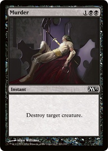
Murder: Overall hit. Dramatic and clean, a stab at a staple card that hit the heart. My only question is why there’s no blood on the sent-through side of the blade, but that’s a small nit.
Public Execution: Overall hit. This has the feel of a top-down card, and the slight play on words in the flavor text doesn’t undermine the seriousness of the well-composed illustration.
Vile Rebirth: Flavor text hit-and-miss. Almost every time I read that second sentence in the flavor text, I change my mind about whether I like it. As I type, the answer is yes.
Arms Dealer: Art hit. There’s no one aspect to the art I want to point out, but it made me chuckle when I opened it in a booster pack, so it did its job.
Craterize: Flavor text miss. Every time Chandra is quoted on a card, I wish Jaya Ballard were still around to show other red characters how it’s done.
Goblin Battle Jester: Art miss. I did not need to see this rejected goblin extra for LMFAO’s "Sexy and I Know It" music video. I really didn’t. Pants. Please.
Krenko, Mob Boss: Flavor text hit. An underused technique is the piece of flavor text that tells about the subject of a card but shows the character of the speaker or writer. "Civil sanctions?" Nice job, hussar. Maybe you’ll propose a few minutes in the time-out chair next.
Krenko’s Command: Art hit, flavor text miss. The card has a great Ravnica-set illustration, but the six acts in the flavor text aren’t in any discernible order by alphabet or severity. It suffers from the "arson, murder, and jaywalking" effect as a result.
Reckless Brute: Overall miss. The art does little for me and the over-explaining flavor text even less; worse yet, it’s a common, so I’ll be seeing it in Limited a lot.
Smelt: Flavor text hit. Oh, good. Koth of the Hammer took a couple of lessons in dry wit from Jaya Ballard. See, Chandra? That’s how it’s done.
Worldfire: Art hit. Devastation with an odd, shimmering beauty. I’ve seen less stylish apocalypses in Hollywood films with nine-figure CGI budgets.
Bond Beetle: Flavor text miss. Before Bond Beetle, there were 24 too many cards with the format "Quote1 – Culture1 Expression Meaning Quote2." Now there are 25 too many.
Elderscale Wurm: Overall hit. This new mythic is dripping with flavor, and it completes the symmetry of sevens we were denied with Griselbrand last set.
Fungal Sprouting: Flavor text miss. The Guru of Spores says that numbers will take care of "the rest," but what is that? This one gets kicked into the "sounds nice, means nothing" bin.
Mwonvuli Beast Tracker: Overall hit. She’s well kitted to track her deadly game, and she does indeed like it deadly. This card has made a fan of me, and not just for how I plan to use her in conjunction with Descendants’ Path, either…
Ranger’s Path: Overall miss. This barely-disguised riff on Explosive Vegetation feels superfluous on a mechanical level and the flavor is no better. The name sounds like an enchantment, the flavor text is empty while failing to synch up with the art, and the art…oy. Why is there nothing on the forest floor, why do half the leaves lack stems, and why is the ranger posed exactly so as to show some leg? Blech.
Sentinel Spider: Flavor text hit. I like the naturalist’s style, and I’m in a generous mood, so I’ll forgive the use of "very" just this once.
Chronomaton: Art hit, flavor text miss. I love the mood set by the illustration, but once again, the flavor text goes on too long. "After three nights of whirring gears and chiming metal, the villagers smashed their clocks." Done.
Gem of Becoming: Overall hit. Effective art (by newcomer Jack Wang—see below), if a bit abstracted in the background, and I like the card’s overall design.
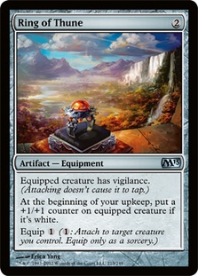
Ring of Evos Isle et al.: Overall hits. A flavorful cycle, far more useful than the old "lucky charms" like Iron Star or Wurm’s Tooth, and the settings are lovely. Ring of Thune in particular deserves praise for its background, which is total eye candy.
Trading Post: Name miss. On the plus side: Goat tokens! On the minus, how did the name "Trading Post" end up on an artifact instead of a land?
Cathedral of War: Art hit. The abstraction of this landscape may not be for everyone, but I enjoy the effect. I’m expecting this to be a polarizing choice.
Hellion Crucible: Hit and miss. The converse of Trading Post’s problem, "Hellion Crucible" sounds as if it should be an artifact instead of a land. "Hellion Crater," anyone? That said, I like the top-down "pressure counter" design, and I’ll stump for Trevor Claxton’s art.
New Flavor Text on Old Cards
Divine Verdict: Hit. One perfect word: "Guilty." Bravo.
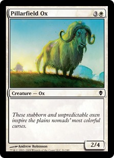
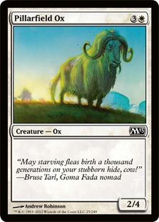
Pillarfield Ox: Hit. The most common piece of advice in modern creative writing courses is, "Show, don’t tell." The Zendikar version of Pillarfield Ox tells of nomads’ curses, while the Magic 2013 version shows one. It’s a clear improvement.
Clone: Hit. The last Clone flavor text was good. This four-word effort is even better.
Bloodthrone Vampire: Miss. The "What I need is…" construction is pointlessly long. "I need your blood. I don’t need your permission." That’s all I want.
Mutilate: Miss. This one just went on too long. "It’s only torture if you’re strong enough to survive." Done.
Ravenous Rats: Hit. I love how the first sentence sets up the second, which is both totally unexpected and totally right.
Wit’s End: Miss. Or maybe "msis" in honor of the typo "patheitc" for "pathetic" in the flavor text. As a meta-Vorthos exercise, how would Nicol Bolas fire a proofreader who made him look bad? More seriously, I hope nobody loses his or her job over this. I do editing myself and catch a lot of mistakes, but inevitably some get through. Even so, I’m surprised a slip that a simple spellcheck would’ve caught made it all the way through to the Card Image Gallery. I hope Wizards makes adjustments to decrease the likelihood of such an error in the future.
Fervor: Hit. Krenko, Mob Boss clearly is smarter than the average Goblin. His speech is one-third basketball coach, one-third Abraham Lincoln, and one-third Goblin leader, yet it doesn’t feel out-of-bounds for the little we’ve seen of his character. I approve.
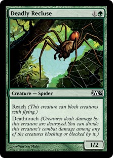
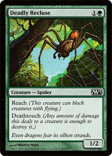
Deadly Recluse: Hit. Thanks to streamlined reminder text, Wizards found room for a line of flavor. Kudos to whoever came up with this one.
Rancor: Let me get back to this.*
New Artists (Six of Them)
Seb McKinnon (Attended Knight): Hit. Aside from the impractical armor design that puts the "breast" in "breastplate," this illustration a solid debut for new Magic artist Seb McKinnon, a young’un from Montreal. Given time, he’ll develop a stronger individual style, but for Attended Knight I noticed the new name, not a new style of art. Still, blending in with the pros is a good sign for a first-timer!
Ioan Dumitrescu (Prized Elephant): Hit. Another one-card debut, this time for a Romanian artist with architecture training, Ioan Dumitrescu. His online work has little fantasy in it (mostly robots and aliens), but I find the painting itself effective. Just one question: if the Elephant’s so prized, where are its guardians? The gold on its tusks must be worth a fortune…
Marco Nelor (Void Stalker): Hit. Oh. Heck. Yes. I don’t even know what that’s supposed to be, but I want to see more from the "Thurd Eye" guy.
Mathias Kollros (Watercourser): Miss. This one feels like a Lorwyn reject that was pulled out of the orphaned-art file. It’s too bad; this Austrian artist’s digital portfolio shows lots of promise.
Noah Bradley (Spelltwine, three basic lands): Hit and miss. This is the paper Magic debut for Noah Bradley, who contributed art to Magic Online before this. The good: this guy has talent and a signature style. If he has any art in Return to Ravnica, I’ll know it instantly. The bad: over four illustrations, he didn’t show me anything but atmosphere. Flex a bit! Also, this gent has chutzpah to spare; he’s barely paid off his student loans, yet he’s selling a five-hour lecture on how to make it in illustration freelancing. I don’t know how Mr. Bradley will do over the next few years, but he’ll be fascinating to watch.
Jack Wang (Gem of Becoming): Hit. I like it, but…who is this guy? I can’t find a reliable fix on Google, which makes me nervous about him; perhaps he uses a name other than "Jack Wang" in other contexts? Also making me nervous: he has exactly one illustration in Magic 2013 and it’s Nicol Bolas-themed, which gives me a worry about a largely unsuccessful tryout. I hope not.
Miscellanies
Reusing the 7th Edition artwork on Merfolk of the Pearl Trident: Miss. I’m pretty sure this is the only Merfolk in Magic 2013 to sport a tail, as the illustration was made in the "tailed Merfolk" era. Talrand doesn’t have a tail. Neither does Augur of Bolas. Sorry, Wizards, but y’all should’ve sprung for new art!
*Leaving off the original flavor text on Rancor: Miss. Bad miss. Horrible miss.
Begin Vorthos rant. This is not a drill.
Why, Wizards? What did my Vorthos heart ever do to you to make you want to rip it out by taking flavor text that’s a candidate for top ten all-time and leaving it off the card it made famous? This is just wrong. It was wrong in Planechase, and it’s wrong now. There are seven lines in a Magic text box. Use them. Canyon Minotaur and Omniscience sure did. Shrink the font if you must! Wizards, you made it work for Garruk’s Duel Deck and Archenemy. Just get that iconic flavor text in there for the next printing and never let this mistake happen again.

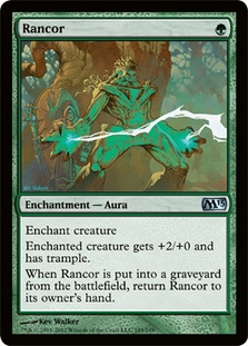
Vorthos done right, and Vorthos done wrong.
Seeing Rancor without flavor text deprives me of all rationality. When I saw a Magic 2013 Rancor bereft of its rightful flavor text, I held it in my hand and made it right.
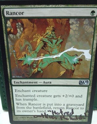
That’s better.
If you disagree with me on Rancor’s flavor text, I’m right and you’re wrong. If you insist on pressing the point, I’ll pull out one of my favorite lines from Ender’s Game: "If you want, I’ll pretend you won this argument. Then tomorrow you can tell me you changed your mind."
End Vorthos rant.
Whew, I feel better! Overall, I like Magic 2013. It has its hits and misses (still looking at you, flavor text-lacking Rancor…), but I enjoyed looking through the image gallery as a whole and playing with the set at the Prerelease. What are your Vorthosian thoughts? Are you ready to take a Sharpie to Rancor? Agree or disagree, I’d like to hear from you, and…
As always, thanks for reading.
— JDB
@jdbeety on Twitter