Welcome to Art Fight: Part Green, where I compare the available versions of the green cards in the cube. Here’s the
article
covering red, and
here
is white, blue, and black.

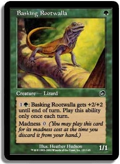
I think the foil emphasizes that there’s something to be basking in. There are actually a few green cards like this, where the foil makes the lighting look infinitely better.
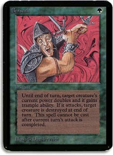
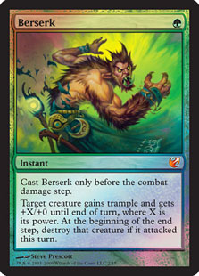
The alpha art definitely gets the point across — those are some crazy eyes. The From the Vault art depicts a guy who’s less insane and rather just does berserking as a general plan. He could also be turning into a werewolf. Toss up.
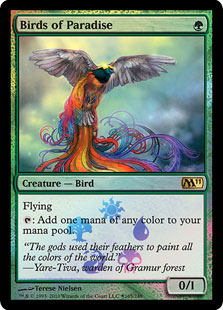
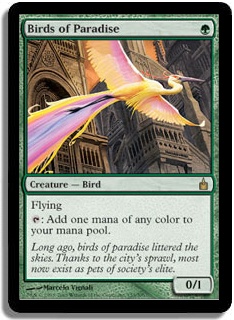
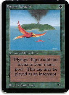
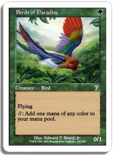
Summon mana birds! Adorable. I think it’s pretty hard to go wrong here. I like the Ravnica art a lot — I think it conveys the fragility really well. As in, this is a nice bird, but it doesn’t really belong in the city. That said, I’m running the Buy-a-Box promo, because the tail is cool, and I’m a sucker for things that are different.
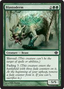
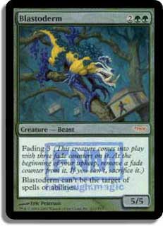
Blastoderm, you speckled weirdo. I think this one comes down to how highly you value realism, and whether or not you like foils. I like the bizarreness of the original, but I actually might be swayed if the Duel Deck version didn’t have reminder text for everything.
Borderland Ranger / Civic Wayfinder
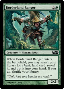
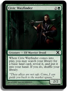
Okay, so they aren’t exactly functional reprints, but if you only have room for one, Civic Wayfinder is the choice (and not just for the creature type). The art is a bit dark for my taste, but I prefer it to the goofier Borderland Ranger. Land-fetching is serious business.
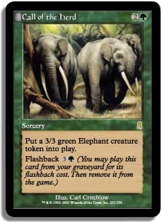
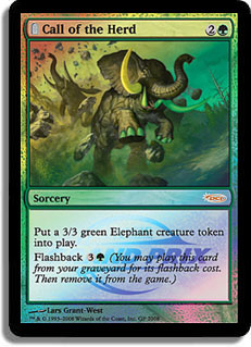
The Grand Prix version foiling makes it look like the elephant has painted toenails — they sparkle. I have a soft spot for sleepy animals, so I prefer the Odyssey version. Besides, I don’t really think the elephants would get rowdy the way the Grand Prix ones do — they probably just step on you by mistake.
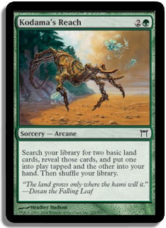
Kodama’s Reach, if you only have room for one. I don’t know what the little things around the hand are, but if they aren’t jellyfish, I don’t want to know.
This art’s so nice — I’m really glad they didn’t change it for the Judge promo. I think this is exactly the sweet spot on the spectrum of “Unimaginative” to “Nothing at all to do with the card.” In other words, it’s evocative of what the card does without being completely mindless — you gain some insight from the art. And yep, I like the Judge foil here.


When I first started playing, I read an
article
by Mark Rosewater where he talks about the fact that this card was really popular when it had the pretty girl art and then not so much in Ravnica. I remember thinking “Is this game only played by guys?” Oh, innocence.

The FNM art is clearly riffing on the original pretty hard, but I think the Fifth Dawn art wins out on every conceivable front. The pose is more athletic and purposeful, her face is prettier, the blank background makes for a gorgeous foil, and the flavor text is better albeit a little creepy. The pose is really the best thing about this piece though — it really conveys watchfulness, which is basically the point.
It’s pretty hard to understand how Terese Nielsen did such an amazing piece and then followed it up with one that’s a pale imitation.
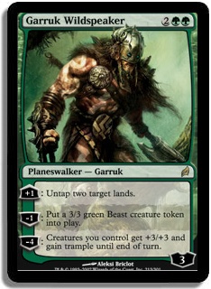


Ah, it’s so hard to get in a fight with Aleksi and win. I love that a cube staple like Garruk is so easy to get in foil, though. The Xbox promo and the Duel Deck versions are both reasonable, although personally I find the controller expansion symbol pretty troubling.

I’m not generally a fan of just sticking planeswalkers on any and every card, and is Garruk really the card-drawing type? Nonetheless, the background is really nice in the Duel Deck art, and the old art is a bit too dark for my taste.


I run the Zendikar version because it’s so crisp, and the glowing vines are pretty sweet, but the textless version is beautiful — the perspective is pretty unusual for Magic art, and I love the dust from the landslide.


Bam, that’s how you do it. I love the extended art frame, and it’s a great way to do promos that everyone can love, even people who hate foils. It doesn’t hurt to start with Scott Fischer art, either. The extended art really shows off how the leaves and sword frame the Perfect, which is my favorite thing about this piece.

Both of these are well done, but the FNM is hardly an upgrade. Also, the color scheme is a little abrasive.


Wow, that guy is ripped. I think the Alpha art is interesting, and handily it has been FNM foiled. I wish more creature art was like this — close-up, stylized, or from a different perspective.
Promo:

Despite the cat cleavage, I liked the old Nacatl art — it looks about as aggro as it should. I.e., very. The solid green and sun-through-the-leaves of the promo is really pretty though — I’m a big fan of lighting effects like this. My vote goes to the promo.


The Rise of the Eldrazi art is so weird — just swat that Hedron away. I like the 9th Edition art — the visible roots are visually interesting, but Shards is the winner. The blue background is striking, and it’s evocative without being heavy-handed.
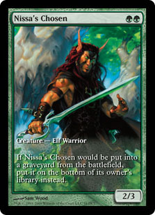

I mention this card because some people hack Nissa Revane into the cube by using a rule where if you draft Nissa, you get four Nissa’s Chosen for your deck. Anyway, Wizards has mostly done a great job of making the Game Day promos worthwhile, but this is such a flop. The original art is beautiful, but the promo looks garish and overly loose.

Wow, I hadn’t even seen the Tempest art before, but it’s amazing! Nothing better than the flat, painted background
and
a Pegasus. Bummer that Tempest doesn’t have foils — I think a reprint is in order.

Sleepy animals again! I like the Destiny version here for charm, but the 8th Edition art is a beautiful foil.


Same art, but I’m trying to cover promo versions here so you don’t even have to wonder if the art is different. I like this art too — it’s pretty literal but the jaguar looks stretchy and catlike, and the ferns are a nice touch.


Both versions are really pretty, but I prefer the Prerelease — I think it’s a more real-deal looking Baloth, and I like the perspective — even though the Zendikar art does a better job of indicating that there’s a herd of beasts.


What is happening in the Tempest art? My best guess is that an acorn is mutating while an Elf-voyeur watches in the creepiest possible way. I dare you to design a card to fit that piece of art.
The 10th edition art is pretty enough, but I’m partial to the Mirage antelope. It’s also pretty bizarre, since having your garden snacked on doesn’t fit the card either.
The background of the textless Rampant Growth is exactly the background of the Buy-a-Box Birds of Paradise promo, by the way. Terese Nielsen has a theme going.


Hmm. I don’t really interpret lightning out of the hands as “having trample,” but I guess it’s just a symptom of getting powered up. For all the printings that it’s had, it’s too bad that Rancor doesn’t offer any choices.


Foils don’t really benefit from dark art, but I do like how the shadows in the judge foil obscure how big the Baloth really is. It’s hard to say no to the dopey original, but I’d run the Judge foil if I had one.


It’s amazing what the god rays do for this piece. I think this is a pretty worthwhile judge foil, despite having the same art.


There’s nothing wrong with the Zendikar art (and actually I’m using that one since I have it in foil), but the Visions/FNM Boa does a way better job of actually being in a river.


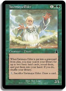
Sigh. This is an example of beautiful new art that totally misses the point. This isn’t a brawly snake badass; it’s an elder. The old art conveys this really well — he’s hunched over and using the walking stick. Also, isn’t it weird that they just used part of the original flavor text?
The JSS foil should be the auto-response whenever anyone complains about the From the Vault foiling process. “Well in
my
day…”
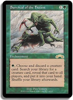
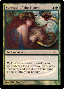
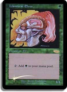
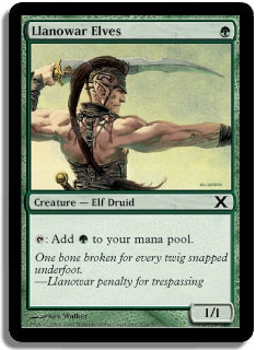
I’m a big sucker for promos and the new frame, but the judge foil Elf-nature-cuddle party is totally unrelated to the card. I like the brutal original art. It’s strange that such an iconic green card features Moggs, though.


This art is just so good, although I think that Tusker is trying to front that he has haste. I love his angry-looking eyes.


…and that’s why you run Viridian Shaman if you can only have the one.

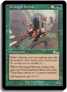
I find the Destiny version pretty charming, but the awesome headdress/branch/animals version is probably one of the best new arts that have been rolled out in a Duel Deck. Matt Cavotta, totally this week’s winner.
Green inspired me to add a new category—
Most in Need of New Art
The winner is obviously Tarmogoyf. For such an iconic card, it would be nice to be able to tell what was going on in the art. It would make a sweet Grand Prix promo, no?
What card do you think would benefit most from new art? I look forward to hearing what you think in the comments, or say hi on
Twitter.