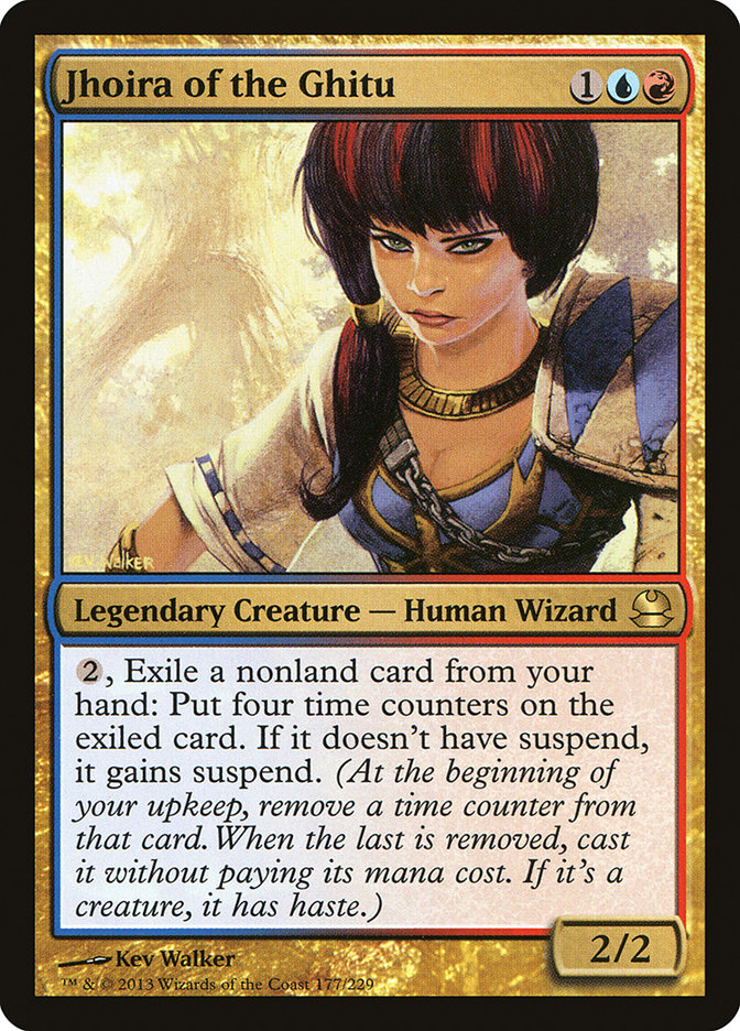
I have a mild like/mild dislike relationship with Commander. On one hand, it takes dueling Magic, which I enjoy, and adds politics, which I haven’t dealt with since the last election I contested (for Homecoming King of Logansport High School; I was the Latin Club nominee, I think by default). I’m not automatically bad at multiplayer political games; for instance, I’m fond of Settlers of Catan. On the other hand, I haven’t come up with the magic formula to win at Commander. It probably doesn’t help that when I borrow a deck, it’s usually an aggressive one like Jhoira of the Ghitu, which is prone to overplaying its hand.
Suspend a non Emrakul, the Aeons Torn Eldrazi . . . Hey, why am I dead?
I know when I’m outnumbered though. Even if I’m tag teaming with Jesse Snyder between Bennie Smith, Sheldon Menery, and the gents of Dear Azami, Team Commander thoroughly outnumbers Team Vorthos here on StarCityGames.com. I may like “joke” sets such as Unglued and Unhinged, if not their worst excesses, but with the release of the Commander 2013 product in November (how strange that “Commander 2013” comes out later than “Magic 2014”), it’s clear which one is seen as more commercially viable by Wizards. Commander products “translate” better than Un sets, which helps.
So for a column at least, I for one welcome our new Sliver Overlords and other commanders. It does help that in its original Elder Dragon Highlander incarnation Commander began as a format dripping with flavor, a mash up of Magic and another property called Highlander. (There can only be one . . . film. No, seriously, don’t watch the sequel under any circumstances.)
Elder Dragon Highlander as a living format emerged from Alaska and came into prominence through one Sheldon Menery. I don’t think anyone could’ve imagined that a single article from August 2004 would inspire a formal rules committee, a Wizards takeover and name change (see “another property” above for why Elder Dragon Highlander became “Commander”), and three specialty sets all in less than a decade.
As explained by Sam Stoddard in his October 18, 2013 article “Developing for Eternal Formats,” specialty sets such as Commander are the new go-to places to seed cards into Legacy and Vintage. While Commander maintains its own banned list (and that page could do with a bit of updating to clean up the “offline EDH rule set” language), in a format where Sol Ring is practically an auto-include in every deck, the power level can be a smidge higher than in Standard.
As has been the case in previous Commander product, the cards printed in Commander 2013 are a mix of reprints—I can’t be the only one enthused about an affordable English printing of Portal Three Kingdoms standby Strategic Planning, can I?—and brand-new cards. Leaving aside gameplay concerns except in the vaguest sense, here’s my color-by-color take on Commander 2013 and its flavor. Not every card, or even every new card, will get a line, but only the ones attracting my notice.
White
Act of Authority – The Veronique Meignaud artwork, though well done, fairly screams “slush” to me. It has nothing whatever to do with artifacts or enchantments and looks as if it would be far more at home on a reprint of Arrest.
Angel of Finality – Howard Lyon’s flame-haired angel is Innistradian through and through. I wonder if this card was made specifically for Commander or if it was a design made for Innistrad block but later pulled.
Archangel – Excellent choice to use the Quinton Hoover throwback artwork. It is startling, however, to see how far Magic illustration has evolved from the defining styles of its originators.
Curse of the Forsaken – Art by William Wu, who appears to be new to Magic. His LinkedIn page suggests there’s more in store, and his gallery on CGHub shows off some of the work he did for another project you might’ve heard of: Assassin’s Creed III.
Darksteel Mutation – The flavor text contains just two words but “says” a lot more. Well done!
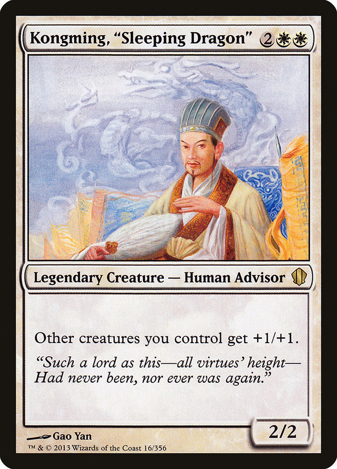
Kongming, “Sleeping Dragon” – The flavor text is from the Moss Roberts translation of Three Kingdoms: A Historical Novel (attributed to Luo Guanzhong). The lack of attribution was covered in Portal Three Kingdoms products—I took the information from a Starter Deck booklet I had lying around—but not here. The same thing happened in Eighth Edition with Peach Garden Oath. Dear Wizards: the next time you print a P3K card with Three Kingdoms flavor text, please attribute it. Luo Guanzhong doesn’t get nearly his due.
Serene Master – The art feels like a callback to the Seventh Edition printing of Venerable Monk. This card has flavor in spades and strikes me as all-around cool.
Unexpectedly Absent – The first time I saw this card, my mind instantly revised the name to “Unexpected Absence.” The adjective-noun pattern of card names (see “Serene Master” above) is well ingrained by now, so this combination of adverb and adjective immediately sounded “off” to me. The more I think about it, though, the more I like it. It breaks the norm.
Blue
Arcane Denial – I don’t recall seeing this Mark Zug artwork before. My guess is that Wizards didn’t want to pay royalties on either Alliance artwork and commissioned a new one instead. The delayed trigger is quintessentially Alliances, so the “retro” artwork makes sense to me.
Djinn of Infinite Deceits – The mechanics are the most exciting part of this card, at least for me. The art is more forgettable than what I saw out of Robbie Travino in Theros, and I can’t say I’m all that impressed with the flavor text either.
Illusionist’s Gambit – I’ll have to wait until the card’s in hand to say exactly what I think about the art. Similarly, I’ll have to wait until a Commander explains to me what this card does in simple English to say exactly what I think about the mechanics . . .
Order of Succession – So that’s what Magali Villeneuve was up to when she had only one artwork in the Theros set. I like the drama in this one.
Prosperity – Nic Klein is a flexible artist, which is why he received commissions from Scars of Mirrodin through Return to Ravnica, but I always look him up to see if he’s a new artist because I just can’t remember a visual signature for him. This new art for Prosperity is unobtrusively pleasing, but it’s not going to help me remember him.
Tempt with Reflections – Trying to parse this card makes my head hurt. It’s like Xzibit showed up on my doorstep and said, “Yo dawg, I heard you like copies, so I put a copy in your copy so you can copy while you copy.”
True-Name Nemesis – Huh, name magic—wait, why do I have a half-scribbled Legacy Fish decklist in front of me? Er, next color . . .
Black
Baleful Force – Liliana’s a lot more likable when she’s not trying to be funny.
Curse of Shallow Graves / Famine – Horror without gore. Magnificent. I thought Karla Ortiz was becoming one of the top illustrators for Magic, and these two pieces seal it. She is a treasure, and I hope she works with Magic for decades to come.
Ophiomancer – We get it, Sorin. You’ve seen a lot. Also, that pose? Hurts when you’re of my too-ample dimensions.
Reckless Spite – Easily the best of three flavor texts this card has received over the years. Past quotations from Volrath and Tsabo Tavoc didn’t do it for me.
Red
Blood Rites – I can’t decide whether I like the art or not. Either way it’s better than the Champions of Kamigawa original, which even then was too abstractly cartoonish for Magic’s dominant look.
From the Ashes – I’m surprised this card isn’t a reprint. I think I like the art, but I’ll have to see it in hand to be sure; the picture sizes I have now aren’t enough.
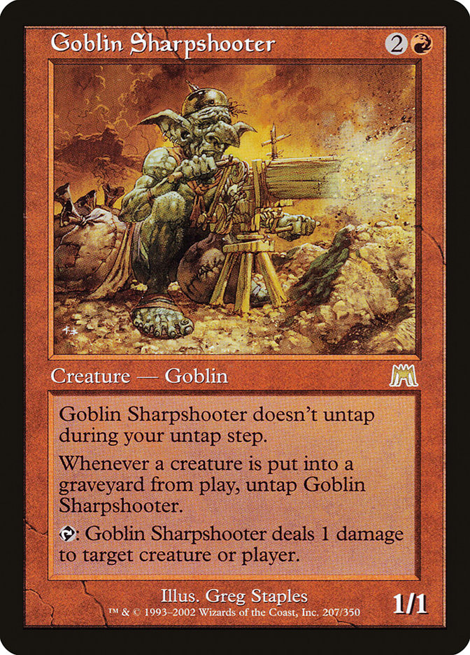
Goblin Sharpshooter – Now with the art it was meant to have all along. The Onslaught version just wasn’t funny enough.
Sudden Demise – Another I’m surprised isn’t a reprint. It’s a testament to how natural some of these designs feel.
Witch Hunt – This one definitely has the feel of a top-down design. Too obviously multiplayer to have found a good home in Innistrad block, but definitely at home on that plane.
Green
Bane of Progress – There’s something about the art that bugs me. Maybe it’s that a Bane of Progress, which shouldn’t like humanity, is appreciably anthropomorphic?
Reincarnation – Both this new art and the Edward P. Beard, Jr. original from Legends are trippy. This is more “cute trippy,” though, so I prefer it.
Restore – Though on a spell, this is clearly a landscape—and just as clearly by John Avon, God of Airbrush Technique.
Tempt with Discovery – Another by William Wu. I want to see this one up close.
Multicolored
Derevi, Empyrial Tactician – There haven’t been many aven (sentient bird) legends in the past, and they tend to be mono-white like Lieutenant Kirtar. The art is grand for a 2/3, almost too grand.
Gahiji, Honored One – Another debut illustration, this time from Brynn Metheney. Monster illustrations seem to be Brynn’s thing, and a legend is a nice start to be sure.
Jeleva, Nephalia’s Scourge – I like the way this art expresses Jeleva’s power and toughness. She’s not a hand-to-hand battler, though she could drop an Eager Cadet without much problem, yet she has a bit of endurance on her. Of course, physical appearance doesn’t mean much when there’s magic to level the playing field.
Marath, Will of the Wild – Now with errata stating “X can’t be zero” on the second ability. Step away from the Daru Spiritualist and Worthy Cause. Mmm, Daru Spiritualist. That’s a name I haven’t thought of in a while, and it was responsible for my first half-decent tournament result almost a decade ago.
Nekusar, the Mindrazer – Somebody give this guy a hug and tell him he doesn’t have to spend the rest of his unlife comparing himself to Arthas Menethil. He can just be himself.
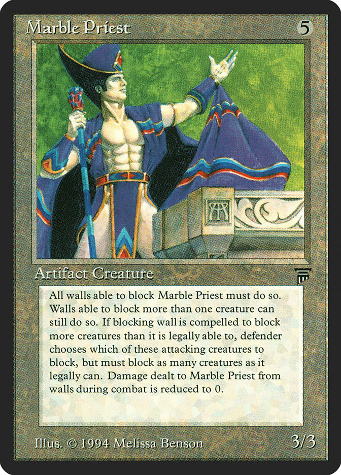
Oloro, Ageless Ascetic – This guy and Marble Priest must work out at the same gym. They even have the same little modesty cloth going. I’m curious how Oloro’s oversized card looks. Some of the small details that don’t show up at regular card size, such as the “decorations” on his bandolier and arm strap actually being human-size swords, axes, and similar weaponry, appear on the larger version posted by Eric Deschamps on his website. (Also, Oloro? You’re an ascetic. Stop slouching.)
Roon of the Hidden Realm – I keep getting distracted by the architectural feature on the left. There’s something of the Ypsilanti Water Tower to it.
Sydri, Galvanic Genius – I’ll take any excuse to get more Terese Nielsen artwork in Magic.
Artifact & Land
Command Tower – Does the angled shot work here? The Command Tower looks as if it’ll tip over any moment.
Crawlspace – A candidate for the best flavor text among new ones in the set. Good humorous setup.
Drifting Meadow – New art takes a cue from the Bob Eggleton original but looks highly “digital” in comparison. A curious art-director choice, though I mean no knock on Jonas De Ro.
Eye of Doom – Cue the Invader Zim alters in three, two, one . . .
Opal Palace – More colorful—dare I say psychedelic?—than Andreas Rocha’s usual palette, but as that gallery shows, Rocha has a knack for painting a city upon a hill.
Surveyor’s Scope – With different lines inside the Scope, this art would feel closer to Magic’s tech level, but as it is the illustration gives off an aura of steampunk.
I hope you enjoyed this brief flavorful look at Commander and its November 2013 commercial product. Join me in two weeks, when I’ll talk about the various UNESCO World Heritage Sites in the United States, the football team representing the island nation of Kiribati, or Magic. Probably Magic.
— JDB
@jdbeety on Twitter

