In 7th grade, I lived on the same street as my middle school. In fact, I lived right across the street. I could walk outside, count to thirty, and be
on campus. Having been dealt a hot hand in circumstances, like any budding kid, I used this opportunity to sleep until the last possible minute before
groggily showing up to class. Sometimes, breakfast at home was dull though, and I’d leave half an hour early to chow down on some travel-size Golden
Grahams and chocolate milk courtesy of the health patrol at our public schools.
Ah, the days before anyone cared.
It was during these twilight hours of bliss that I saw my first Magic game. Some kids from English would run regular three-on-three matches, armies
strewn about the bright cafeteria tables, tons of pointing and arguing and inefficiency and fun. Being an artist (or what qualified when you’re a
kid), I was immediately drawn to the depictions of this medieval world with knights, dragons, and that huge steamroller crushing a dude. Juggernaut was
the first Magic card I picked up and fawned at.
I was that kid who picked up your cards in the middle of a game and declared how awesome it looked and took perhaps just a little too long to
give it back when you needed to attack with it. My fascination with everything medieval hooked me and held on tight. It was all about the feeling, and Magic was gushing with it.
To me, the most important part of the feel of Magic is the art. It’s the first thing one sees on a card. It elicits an immediate
subconscious and emotional response. It’s the business card of the product. It’s also the first thing I remember when recalling a card from
days past. As a visual person and a right-brain dominant (if that wasn’t already a noun, I submit it for court approval), the art in Magic has played a
huge role in my affection for the game, and as the years have passed, I’ve noticed a trend.
Magic art has become streamlined in a way that stifles creativity.
There have been some magnificent works done in the last few years. When Baneslayer Angel debuted, I’m not sure anyone wasn’t blown
away by the sheer beauty of it. It feels like a rare occasion, though, as Magic enters new echelons of success and audience, and I believe I’ve
figured out why.
My initial contention was digital art. The gritty, hand-made feel of the visuals-of-old have made way to a new generation of computerized efficiency
and vision that smoothed over the irregularities of hand-painting. While this remains a large part of what I feel has changed (and I’ll get to
that in a bit), many artists still wield the brush (fewer, though) and sometimes combine it with digital art. This is an informative article detailing the concerns and
procedures of the digital age on our beloved masterpieces.
After researching it further, I’ve concluded that my major dispute is with Magic’s art direction. Over the years, continual and additional
restrictions have been placed upon the artists to the point that they have far less creative freedom in their work than they did fifteen years ago. If
you picked up Magic within the last five years, here’s a quiz for you:
MATCH THE PICTURE WITH ITS CARD NAME:
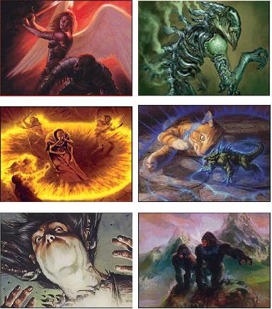
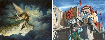
Silence, Grafted Exoskeleton, Summit Apes, Diminish, Act of Treason, Cerebral Eruption
Now try these:
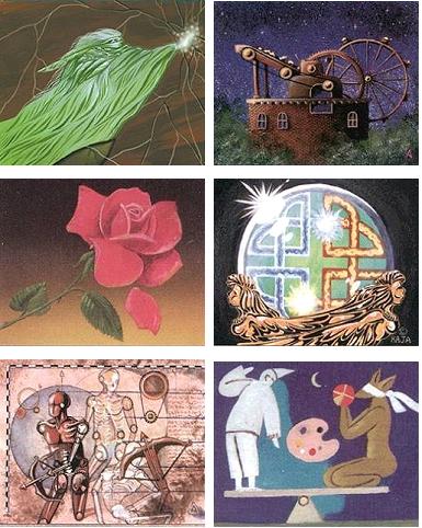
Stasis, Mana Short, Energy Flux, Urza’s Avenger, Diminishing Returns, Drafna’s Restoration
Magic had gobs of literal art fifteen years ago. It also had its interpretive pieces like the ones above, but in today’s Magic, they are becoming
scarcer. As laughable as Stasis’s art is (and possibly the silliest next to Word of Command), it’s forever recognizable and beloved by the Magic
community. Nowadays, if Stasis was assigned to an artist, it would undoubtedly show someone…holding still. Frozen, maybe. Unable to move. Sword
dropped at his side, mouth gaping.
Forcefield would have a picture of the Starship Enterprise. Time Walk would have Tim Curry and Susan Sarandon. Taste of Paradise would have a 4×4
animal style squarely centered and dripping with bliss. We wouldn’t have any of the classic art this game employed in its infancy. I found an article giving some detailed insight into the evolution of
WotC’s art direction. From the article:
Years ago, when we wrote art descriptions to give to Magic card illustrators, we used to specify palette in clear terms right in
the card’s art description. Here are two snippets from Mercadian Masques art descriptions, for example:
Palette: blacks, greys, purples
Palette: greens, nut browns, foliage colors
The idea was to keep the art of black cards looking black and the art of green cards looking green, and so on for the rest of the colors.
We don’t … we don’t do that anymore.
Mind you this was years ago. Here’s how they handle it today:
But the thing is, we already constrain our artists puh-lenty. These poor, courageous humans are drowning in constraints. In addition to the dense
block of instruction that constitutes the art description, they have to walk the line of Magic‘s tone and style. They have to
adhere to the style guide for the year (sometimes more than one). And they have to keep track of all the additional references we send along with
their assignment, such as reference for what a particular planeswalker needs to look like, or reference for a particular monster that we’ve taken
from another illustration. And sometimes the constraint is our difficult concept itself. Sometimes the artists have to navigate the stormy seas of
our harebrained ideas, as Izzy so admirably did for Deprive:
Color: Blue spell
Action: A human or elf nature mage has just had his/her spell foiled, and the spell’s remnants have exploded like a paint bomb. The nature mage
stands in front of a rock face, bracing from the blasted-apart spell, and the “spell-stuff” is splashed all over the mage and the rock face behind
him/her. The splashed stuff gives the impression of a radial splatter painting, and the splatter, through some kind of strange magic, forms a
rough, partial landscape “painting” from the splashes of spell goo.
Focus: The exploded spell and the ‘art’ it has created.
Doug goes on to describe exactly what artistic freedoms they allow:
So, the artists are already juggling many constraints, and we’ve found that color palette doesn’t have to be one of them. We’re
pretty picky about how the subject matter of the illustration comes out, but we tend to let the artist figure out how to “solve” the
piece in terms of its composition, lighting, “camera angle,” and palette. They’re the pros—we let them have most of the
tools in the toolbox so they can do their job. Restrictions breed creativity, but too many restrictions can eliminate beautiful solutions.
That last part again:
“Restrictions breed creativity, but too many restrictions can eliminate beautiful solutions.”
Ironic, no?
It’s obvious why they’re so restrictive. They work hard on characters, plot, style, and vision and want to communicate it quickly and
efficiently to their customers. It’s just that by doing so, over the years, they’ve slowly taken the art out of the artist.
Where’s the interpretation, the abstract, the vision?
Where’s the feel?
It seems most of it has fallen to the wayside for advantage of clarity and quick, logical recognition, and these aren’t bad things. Far from it.
They’re products of a game that’s grown wildly popular among a worldwide audience and developed from a need for efficiency and consistency.
It’s just that with every new line of direction from overhead, the artist loses another voice. There’s a cost for that efficiency, and
that’s what I want to bring light to.
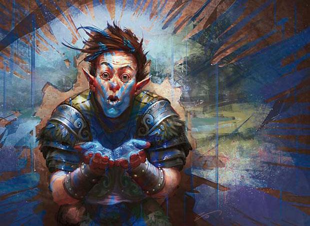
Take a look at this bad boy:
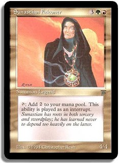
Art directors today would ask Christopher Rush why Sunastian Falconer has a glowing pendant and not a falconer’s glove and a masked falcon standing on
top of it. Why does Sunastian Falconer add two colorless mana to our mana pool? No one knows. How friggin’ awesome is that?
Now, I have no information on how much leeway Christopher Rush had in creating this art. This could have been made to a specific order or it could have
been his own whimsical imagination at work here, but it feels abstract and neither literal nor logical, and that brings a certain mystique to it. I
will always remember this card simply because it makes zero sense, and it’s wonderful.
On traditional techniques versus digital:
There are just some things that can’t be recreated with a computer. In my first link of this article, there were some fine examples of digital
art made to look traditional, but the styles are still noticeably modern. Oils, watercolors, and any unique type of material have their own distinct
mark, and these lend mood and style that we no longer see in Magic. The older sets in Magic are unmistakably hand-painted, and it shows.
WotC may disagree with me. There are definite tangible benefits to the structure and constraints of their current system, but I think if they allowed a
bit more freedom of expression and looked at hiring a few artists who work only with classical materials, we could achieve that timeless look that so
drew me to the cards in the first place. As Doug Beyer so aptly put, variety is good. Until then, I’ll be keeping my eye out for the
next Sunastian Falconers.
Thanks for reading,
Bo King