One of the most audacious titles of this millennium is A History of the World in 100 Objects. No mere listicle, it’s a 100-part BBC Radio series and accompanying book from 2010 that used artifacts from the British Museum to trace the course of human development. While of course no completeness is possible on such a project and Neil MacGregor‘s commitment to a broad view couldn’t eliminate all British bias (the section covering the 1800s and a bit on either side had three British artifacts out of five), still it gives a remarkable overview of human accomplishment in many times and places.
I won’t try anything so ambitious today. I’m focusing on Magic: The Gathering, and more narrowly the history of its flavor: art, story, and so on. If the history of the world merited a mere 100 objects, surely I, looking at just under 25 years of Magic’s flavorful history, could get by with just ten cards.
After several pages of notes taken and more rearranging than I care to think about, I’ve chosen my ten. Some items are representative of a time; others are individual masterpieces in one or more areas. All are valuable in their own ways. Not one is beyond debate.
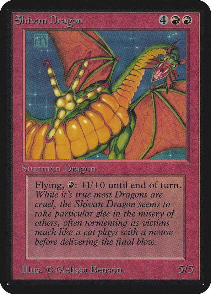
1. Shivan Dragon (Limited Edition Alpha), 1993
When Magic: The Gathering debuted in 1993, it was an immediate sensation. Originally brought to Wizards of the Coast by Richard Garfield after the company passed on his board game RoboRally, Magic had been envisioned as a game to be played during downtime for role-playing game sessions but swiftly outgrew that niche.
Before anyone could discover how fun Magic was, first they had to be drawn in by the game’s fantasy flavor. While other spells would prove more powerful in competitive play, the giant creatures of Limited Edition Alpha attracted many of the game’s early players and still capture the imaginations of the “Tammy/Timmy” player psychographic. Shivan Dragon was, and still is, the most iconic of them all.
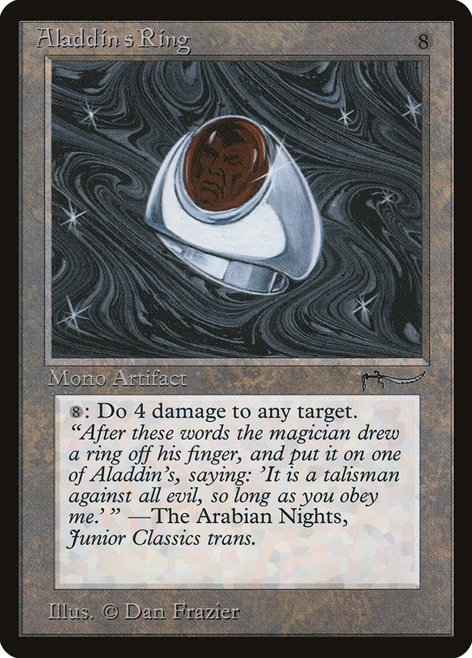
2. Aladdin’s Ring (Arabian Nights), 1993
After the initial success of Magic (which went through the two Limited Edition printings, Alpha and Beta, and was on to Unlimited before 1993 was out), already there was demand for a sequel. On a tight schedule, Richard Garfield designed Arabian Nights, drawing flavorful inspiration from One Thousand and One Nights and Issue #50 of The Sandman, “Ramadan,” first published in June 1993.
One of the most notable features of Arabian Nights cards might at first seem ordinary: they have the same backs as other Magic cards. Originally the plan was to have a purple-and-gold card back for Arabian Nights, but a last-minute change kept the cards playable unsleeved with those printed earlier.
The choice of Arabian Nights also created some issues for Wizards of the Coast. While nothing legally prevented them from printing cards with the theme, the public-domain source material was not their intellectual property, making it harder to protect. Further, as the game’s mythos of planes developed, Arabian Nights felt increasingly out of place; eventually, Wizards of the Coast settled on calling the expansion’s setting “Rabiah the Infinite.”
The use of flavor text from a real-world source, such as this card’s quote from the source collection of tales, was a frequent occurrence in the game’s early years. Sources of real-world flavor text were as diverse as Shakespeare, Sun Tzu, and Edgar Allan Poe. This tradition has also been discarded by Wizards of the Coast, though it persisted in core sets through Magic 2014.
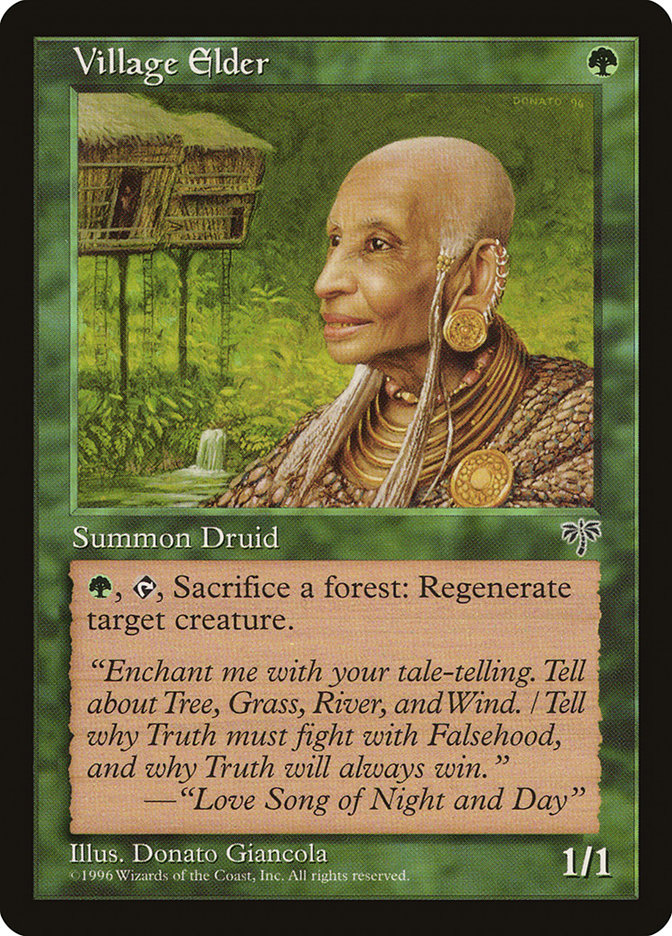
3. Village Elder (Mirage), 1996
Around 1996, two significant shake-ups changed the look of Magic’s art. Wizards of the Coast moved from a royalty-based contract system for artists, whereby they got paid in proportion to the quantity of cards printed with their illustrations, to a work-for-hire system with one-time payments. Naturally, this led some of the original cohort of artists to stop taking commissions.
At the same time, Magic’s art directors made an effort to reach beyond the small circle of illustrators concentrated around Seattle who had heretofore dominated the look of the game. (Seattle’s relatively obscure Cornish College of the Arts was the alma mater of at least three of the original 25 Magic artists, as Jesper Myrfors, the game’s original art director, recruited former classmates Anson Maddocks and Andi Rusu to provide illustrations.)
Among the four dozen or so artists to debut in Mirage block was Donato Giancola, who since has become one of the living masters of fantasy and science fiction art. Village Elder was one of his first pieces for the game, but already his remarkable talents are on display.
Of equal interest to the illustration is the flavor text, a passage from “The Love Song of Night and Day.” The poem, written by Jenny Scott during worldbuilding for Mirage block, was used for flavor text on seventeen cards and remains a singular achievement in Magic’s lore.
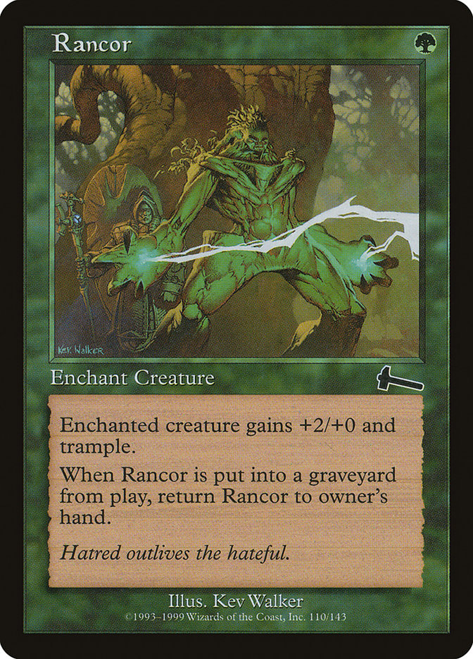
4. Rancor (Urza’s Legacy), 1999
Kev Walker, who started with Magic in roughly the same cohort as Donato Giancola, has become Magic’s most prolific illustrator. His art graces close to 400 unique card names, a figure that does not count repeat illustrations, such as for basic lands. Between his notable volume of work and a fan campaign to fill in certain gaps, it is now possible to build a Cube of 360 unique draftable cards and all five of the standard basic lands, all illustrated by Kev Walker.
Whereas Kev Walker’s art is (statistically) common, this card’s flavor text has a strong argument for being the best of all time. When Magic flavor text writers strive for universality and profundity, they fall short far more often than not, as with almost any creative endeavor. Yet the four simple, declarative words on Rancor, “Hatred outlives the hateful,” resonate and endure in their purity and truth. TheMagicManSam created a video meditation on Rancor and its flavor text that is well worth the time.
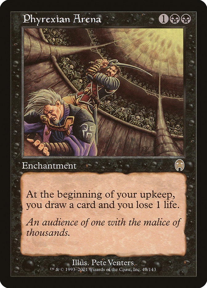
5. Phyrexian Arena (Apocalypse), 2001
For several years, beginning with the set Weatherlight in Mirage block, Magic made its first attempt at long-run storytelling. Specifically modeled on the Joseph Campbell-styled hero’s journey, it followed Gerrard Capashen, whose ancestors had been manipulated for generations by the godlike Urza Planeswalker in his Bloodline Project, and several other Bloodline Project results as they go from plane to plane, collecting the pieces of the Legacy Weapon that will defeat big bad Yawgmoth once and for all.
Of course, to get there, the protagonist Gerrard went through highs and lows. On Phyrexian Arena, Gerrard and Urza fight for the cruel amusement of Yawgmoth (the “audience of one with the malice of thousands” in the flavor text). The actions taken inside the Phyrexian Arena led to the Saga’s finale.
The artist of Phyrexian Arena’s first printing, Pete Venters, is also of considerable interest. While not among the first 25 illustrators for the game (he debuted the next year in Antiquities), he has contributed the second-most illustrations for Magic cards, behind only Kev Walker.
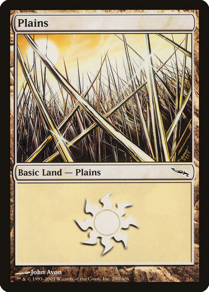
6. Plains #290 (Mirrodin), 2003
After Gerrard and crew saved the plane of Dominaria at the end of Apocalypse, Magic lingered on a remote continent called Otaria for six more sets before beginning a period where it visited a new plane each year. The first of these new planes was the metal-infused, artifact-heavy Mirrodin, and its namesake set was the second, after core set Eighth Edition, to feature 2003’s radically redesigned and vastly more legible card frame.
Basic lands are, as the name implies, the simplest and most iconic sources of mana, present in the game since Limited Edition Alpha. Each block’s new group of basic lands reflects the environments found in its setting. Artist John Avon re-imagined the Plains for Mirrodin; instead of a traditional wheat field or wide-open grassy expanse, his Plains depicts the Razorgrass Fields, where the metallic plants’ blades are sharp enough to kill, and depicts it up close, emphasizing its beautiful danger.
John Avon, from the same cohort as Donato Giancola and Kev Walker above, became the Magic equivalent of a household name with his remarkable landscape illustrations, achieved in the earlier years with airbrushed acrylic paint. During his work for Mirrodin block, John Avon completed his transition to digital work for the game, and while others have made their Magical reputations for their landscapes, John Avon’s body of work still towers above theirs.
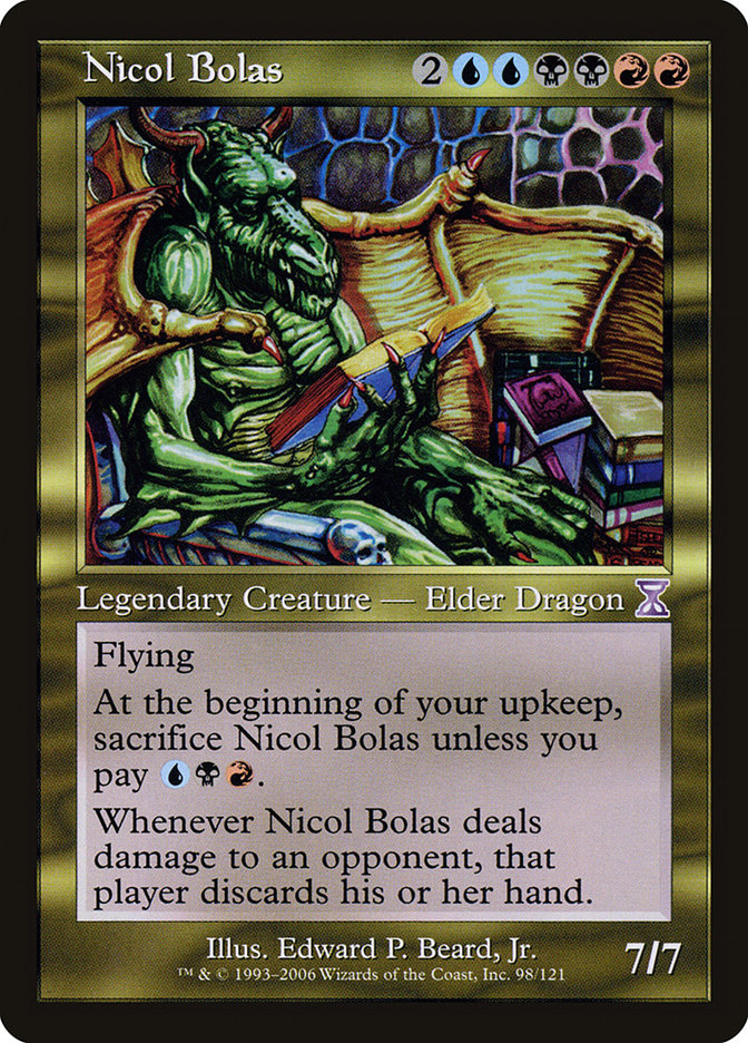
7. Nicol Bolas (Time Spiral Timeshifted), 2006
After three years of sampling the Multiverse, in 2006 Magic returned to Dominaria as its setting. The Time Spiral block’s premise was that “time rifts” had sprung up across Dominaria, disrupting time and the landscape, with all the Multiverse threatened by Dominaria’s imminent collapse.
The set Time Spiral is notable for the way it uses references to past cards, often “fixing” cards printed long ago and long since proved too powerful for most tournament play. The flavor of the cards relied heavily on knowledge of Magic’s past, using the game itself as source material. The overall effect was much like a musical theater production about auditioning for a musical theater production: endlessly fascinating to those with an affinity for the subject, self-indulgent to others.
In addition to nonstop references, 121 “Timeshifted” cards were reprinted with updated wordings but the original artwork and old-style frames at their own special rarity with purple expansion symbols. One such Timeshifted card, Nicol Bolas, originally saw print in 1994 in Legends and was one of the original Elder Dragons in a cycle of five; this cycle inspired the Elder Dragon Highlander format, later given official Wizards of the Coast support as Commander.
Nicol Bolas was the only Elder Dragon among the Timeshifted cards, and his presence was no accident: he proved to be a planeswalker, not merely a powerful Elder Dragon, and his schemes to regain the power he lost when the Mending repaired Dominaria’s time rifts and drastically weakened the planeswalker spark represent a grave threat to much of the Multiverse.
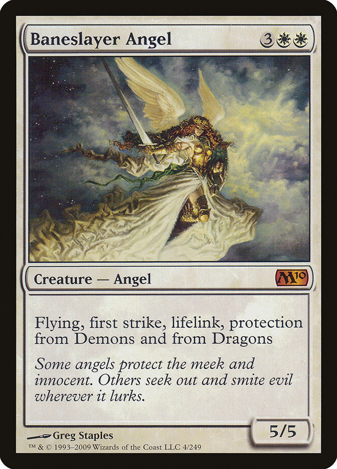
8. Baneslayer Angel (Magic 2010), 2009
Once Magic settled into its pattern of regularly releasing expansions, its core sets, replaced roughly every two years, became a hodgepodge of reprints from past sets. As a result, these sets, envisioned as the starting points for new players, lacked the cohesive identities or “hooks” that would get those players interested in the game.
For Magic 2010, the first in the Magic 201X sequence of yearly core sets, Wizards of the Coast sought to recapture the nonspecific “fantasy feel” that had infused Limited Edition Alpha and given Magic its start, updated with the understanding gained over fifteen years. Further, instead of merely stuffing Magic 2010 with reprints, Wizards of the Coast designed and commissioned art for more than 100 new cards.
Among the most memorable of those cards was Baneslayer Angel. Frequent Magic artist Greg Staples created an instantly recognizable illustration of an Angel whose elegance and beauty were matched only by her power. Its combination of abilities, including the never-before-seen “protection from Demons and Dragons,” reinforced the flavor text describing an assertive, perhaps even militaristic, Angel for the 21st century.
9. Descendants’ Path (Avacyn Restored), 2012
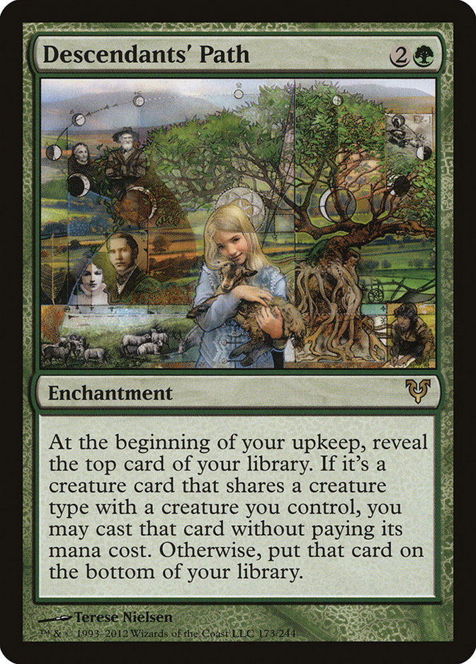
While digital art has become the medium of choice for many Magic illustrators, others still create physical pieces of art. Usually their choices of media are relatively simple, such as watercolor paint on Bristol board. Then there’s Terese Nielsen, whose mixed media for Descendants’ Path were “acrylic, oil, colored pencil, old etchings, skeleton leaves, gold and silver leaf.”
Terese Nielsen is yet another of the artists brought in for Magic at the same time as Donato Giancola, Kev Walker, and John Avon. By the time she began work on Descendants’ Path, she had been illustrating for Magic for more than fifteen years, evolving and refining her instantly recognizable style. Descendants’ Path showcases her recurring interests in diagrams as visual elements, history, and the natural world.
Further, while Terese Nielsen made Descendants’ Path for Magic and in response to a written art description, it became a deeply personal work that drew on her family and personal history in unexpected ways, a “journey of personal healing,” as she described it. Descendants’ Path shows the power of Magic’s flavor to affect not only players but the creators themselves.
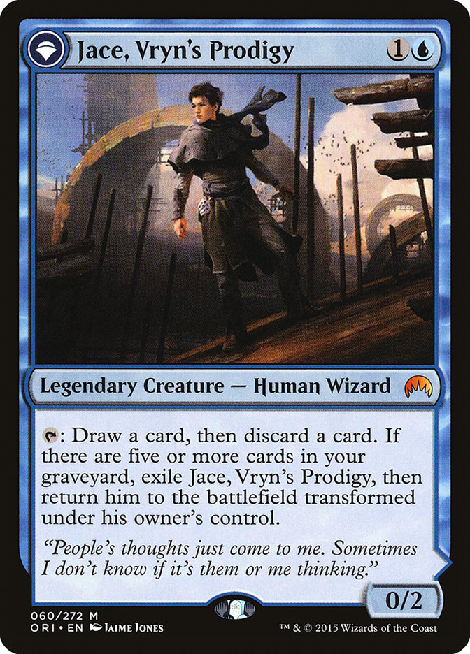
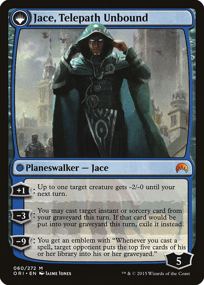
10. Jace, Vryn’s Prodigy | Jace, Telepath Unbound (Magic Origins), 2015
In January 2014, Wizards of the Coast and 20th Century Fox announced with much fanfare a deal for the film rights to Magic: The Gathering. A few months later, Mark Rosewater announced radical changes (since much revised) that included, at the time, the end of core sets. In February 2015, the “last” core set was announced as Magic Origins, focusing on five planeswalkers’ lives before and immediately after their planeswalker sparks ignited; these five planeswalkers would become the first five members of the Gatewatch, a superteam of intended as the new focus of Magic’s storytelling.
Flavorfully, the crown jewels of Magic Origins were five “flipwalkers,” double-faced cards that started as legendary creatures and transformed into planeswalkers (an in-game representation of their sparks igniting). Jace Beleren, one of the original five planeswalkers printed all the way back in Lorwyn and a character so central to Magic’s brand identity that Wizards of the Coast gave its proprietary typeface his last name, received the “flipwalker” treatment as the color blue’s representative.
The two sides of the card show him in two phases of life. At first he is a young telepath on the previously little-seen and still-mysterious plane of Vryn, trying to navigate adolescence and the intrusive thoughts of others. After a duel with the Sphinx mentor who abused him, Jace planeswalks away to the city-plane of Ravnica, bereft of his memory, where he rebuilds himself into a powerful mage who is still learning the limits of his conscience.
***
I hope you’ve enjoyed this survey of Magic’s flavorful history in ten objects. Of course, that history is still being created. Has the “eleventh card” of this list been printed yet? If so, what would you remove to make room for it?


