Every week I show you an alter that I’ve worked on and occasionally showcase other artists. While this does give you a glimpse into our altered
reality, I’ve never actually covered the breadth of what our community is capable of. My focus has been, and hopefully will continue to be,
extending the original artist’s work onto the borders of its cardboard prison, resulting in a recognizable and tournament playable bling version of
your favorite card. While this is my preferred method, I’d like to outline some of the other styles wielded by the best our community has to
offer.
Border Extension
A border extension is what you see me do week to week. The goal of this style is to keep the original picture intact and work from it outwards onto the
border. I’ve stuck to this style from the beginning, as it checks the most boxes for what people are looking for. The key requirements people
come to me with when commissioning an alter are that the card look significantly better than it did before (obviously), and that they’ll have a good
chance of being able to play it in their next tournament. As I’ve stated in the past, I’ve only ever had one card turned away come tourney
time. The central art has stayed the same, so there will seldom be an issue with your opponent mistaking the card for something it’s not. The
card name and casting cost as well as the text box and any accompanying power/toughness are kept intact in an extension, allowing both players to read
the card if need be. Here are a couple of examples from some colleagues:
Full Art
These are the bee’s knees of alterations. By completely covering over the rules text box, one can truly take the art to a new place. Leaving the title
bar and casting cost is optional in a full art, but I find most people still leave them there, so that there are no issues discerning what the card
actually is. As far as the legality is concerned with this style, the judges will usually permit a full-art card, as WotC produces legal, full-art
cards of their own. Again, it’s recommended that the title and casting cost be present, and it definitely helps if a creature has its power/toughness
still visible. The full-art style is definitely among the most effective when it comes to bling points, as shown here:
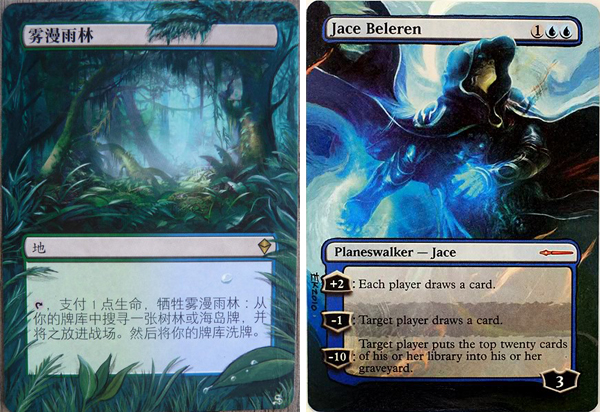
Elements Extension
As it sounds, the elements extension is simply taking some portion of the existing art and growing it beyond the boundaries of its original frame. The
border is left intact in every place except maybe where a sword or a wing breaks through. An in-print example of this would be with most planeswalkers.
They tend to have a small element, like Jace’s hood for example, slightly creeping outside of the art frame. Sometimes it can also be just adding
something small to the existing art or to the border for a little fun as well. These are fairly easy to complete and just add a nice little punch to
the card while flying under the legality radar. A couple examples of these are:
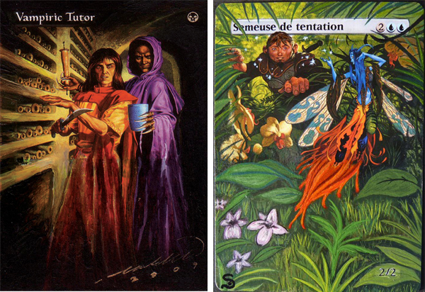
Original Artwork
Although I can’t create original works to save my life, many artists take to this form of alteration. Simply put, the stock artwork is completely
replaced by another artist’s work. Sometimes they tie in to the idea and backstory of the card name and text; other times it’s just something
completely unrelated that looks interesting. There are a whole host of people who do this to great effect, and although being more difficult to pass in
sanctioned tournaments, cards with original artwork are one of the most sought after alters for Commander decks globally. Here are a couple from some
community regulars:
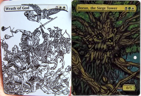
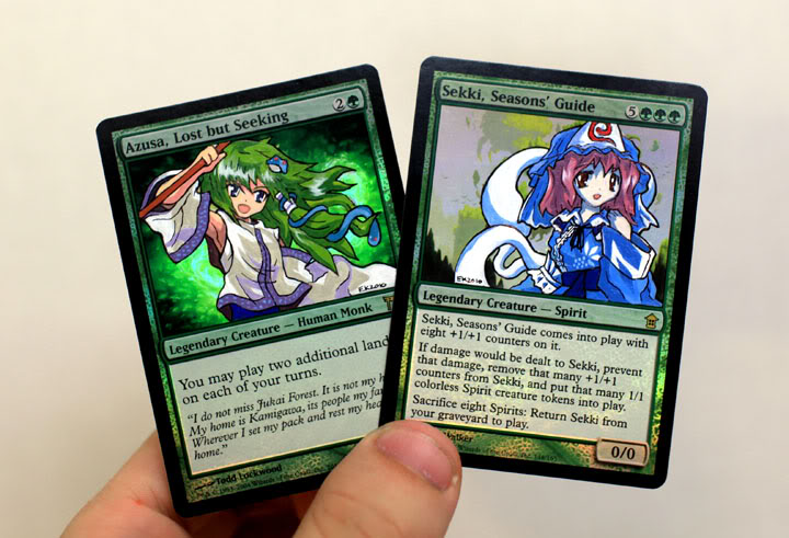
Anime
While falling under the original artwork banner, anime alters have been done to such an extent that they warrant their own heading. This style isn’t my
personal favorite, as it’s generally just used as an excuse to get uncensored teen bits onto a playing card. It seems the reason artists are
doing this style of alters is because they garner the most eBay profit, not surprising considering the sheer number of single Magic nerds out there.
It’s okay; I still love you guys, but seriously…get cool art done instead, and keep that other stuff at home. Although I just ragged on the
anime alters, there are a good number of awesome ones as well, as Klug shows us here:
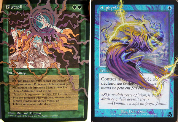
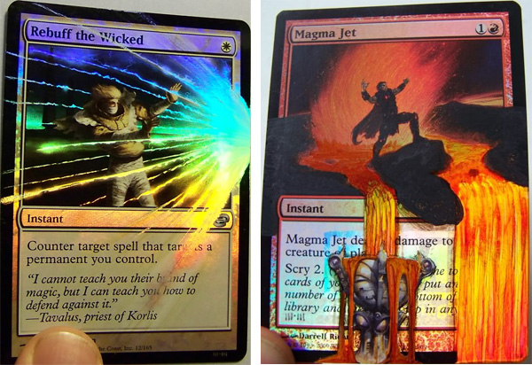
Foil Alter
I only know one person who can consistently pull off a foil alter. Sure, everyone can just paint on a foil card; that’s pretty straightforward.
To alter a foil and tie in the foiling is something rare however, and when done properly, this is probably one of the most amazing things to behold.
Here are a couple of BigUp’s foil jobs:
Of course, you can mix and match styles to your liking, and many people do this to great effect. In my alteration this week, I did my regular border
extension and added an element as well. Let’s dive in!
Azusa is a card that I always thought would look really cool altered and planned on painting the one in my Commander deck someday. Then Noah Whinston
contacted me about doing a couple alters for his EDH/Commander deck. I was sure I recognized the name, that I had read an article or two of his
somewhere before, so I delved into the intricate interwebs to jog my memory. As it turns out, Noah has quite the resume for someone lacking the ability
to grow facial hair. He actively writes for BlackBorder.com and QuietSpeculation.com, has previously written for TCGPlayer.com, and even had a
successful stint in the podcast biz on the MTGCast network!
I obviously took the commission, fully expecting to be enhancing breasts or painting away the subject’s clothing, with him being sixteen and all.
I was pleasantly surprised though. Noah, much like myself, prefers to keep the original art intact and have the borders expanded upon to maximum
effect. No Chandras in martini glasses for this guy!
The cards I received in the mail were Azusa, Lost but Seeking and a Primeval Titan, both in a foreign format. Apparently, Noah doesn’t mess
around when it comes to his Commander deck! The Titan isn’t quite finished yet, so I’ll go over the Azusa for this week’s alter. Based on
the simplicity of the original art’s perimeter, I figured I would be adding some sort of glow-y, flourish thing somewhere on the card to add a
little interest. Finishing the basic alter comes first though, as I’ll have an easier time deciding what extra things can be done afterwards.
Here are my first two steps:
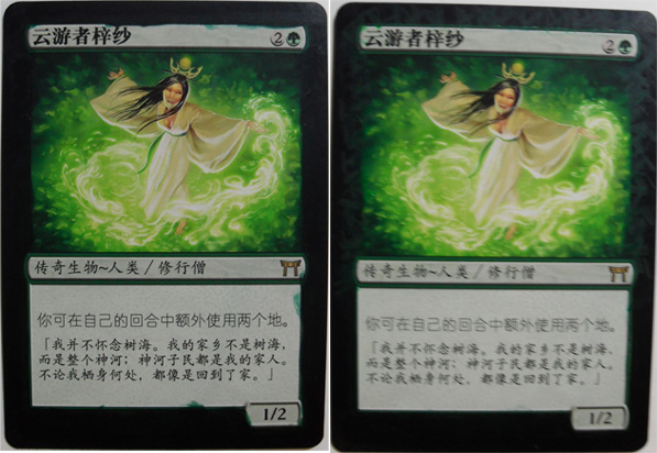
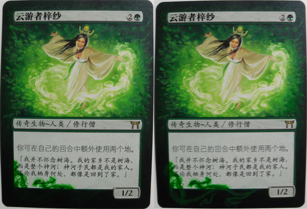
The outlying background color is really dark, but it still has a tinge of green to it, so I added one part black to about five parts of a deep forest
green and did the entire perimeter. This took several layers to get full coverage, as shown on the left. The second image shows some random strokes of
the dark green (without the black added) that I used to get a rough idea of where I was going. While this is a good way of templating your idea, it
will also add a level of depth that may be visible in a few spots at the end.
While I’m touching on this whole ‘depth’ thing, it’s worth noting again that working from the back forward when painting is
always the smartest way to go. It will add dimension to your work and keep the key subject of your picture the focus of the final piece. Think of it
like building a house…sure, you can build the house in a factory, then make a foundation and plop the house on top, but starting the foundation first
and working your way up until the house is complete will make for a much more sound structure. I’ve made mistakes in the past where I got so
caught up in working on the ‘subject’ of the art that I finished it first, then I found myself trying to work around it to get the
background done without affecting the subject in the process. On to the next step…
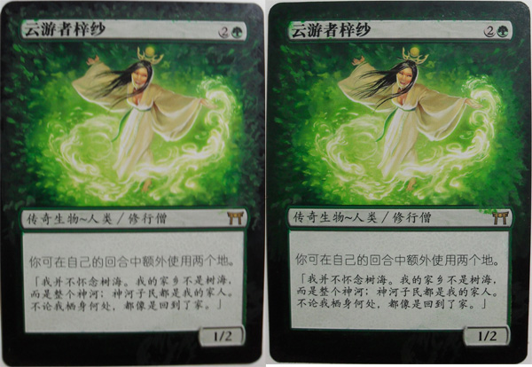
Shown on the left, you can see that I jumped too far ahead on the green scale and did some brights. The paint in the pot definitely didn’t look
quite so bright, but I figured I could mute them down with another green, so I kept going. The right-hand picture is where things started coming
together. I spent a good twenty minutes or so blending out the green all around the outside, so that it shaded from light to dark a little better. This
also made the borders look a little more interesting by not just simply fading to black.
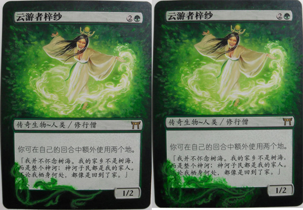
I felt fairly happy with the basic alter up top and decided it was time to start on my unique flourish piece at the bottom. Looking back at these
pictures makes me wish I spent more time on the right-hand side of the picture…it really is no comparison to the sharpness of the left side. Back to
what I’ll continue calling the ‘flourish’; a layer of dark green was laid down just like was done in the beginning. This gives me a
good idea of the direction I’m going and makes it simple to change because it’s barely noticeable other than in the text box. The second
picture shows me taking that green to the next level on the background and somewhat committing to the layout of the flourish.
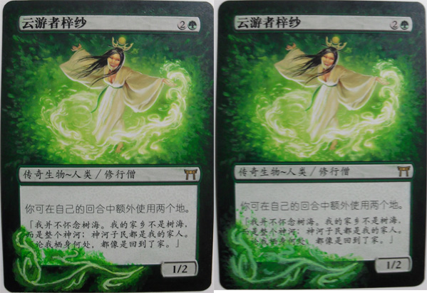
In these two steps, I tried building a glow effect outward like in the original, keeping the lighter color in the middle. There’s not much going
on in these few sets of pictures, as I kept changing the colors again and again trying to get the right look. I wanted to show the process, as
it’s important for growth – both yours and mine. Being analytical about my work, days after it’s complete, really helps me develop,
and hopefully those of you altering can learn from my mistakes!
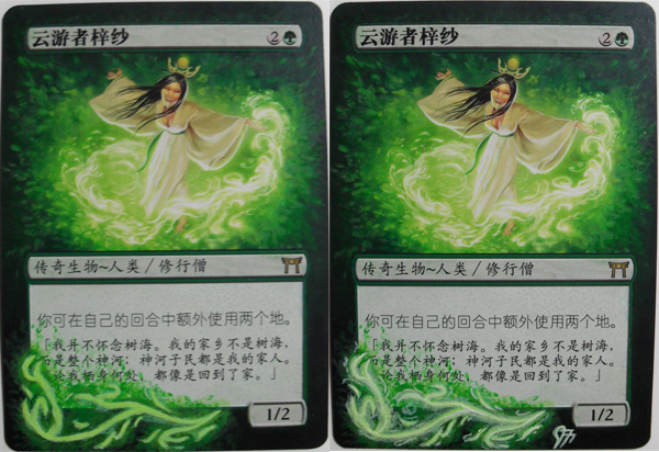
Yikes! This is where I took a page out of Ke$ha’s book and turned it into a hot mess. Todd Lockwood (the original artist) did such an excellent
job making this wispy green glow that I was struggling to try to make work. The picture on the left was experimentation really. I wanted to try to make
a fine spell effect, trying to finish it off soon after. When I took a step back, however, it was clear that I needed to try something thicker like
Todd’s or it just wouldn’t look like it fit together on the same card. The picture on the right was my attempt at expanding that wisp out
some. I wanted to get a similar glow thickness, so I just started pulling green in every direction.
The left picture is where I introduce some yellow and try to get that thicker glow feeling to work, but with the fine lines I was trying to work with,
I was having a really hard time. I’m sure it’s easier to do this on a canvas fifteen times the size or digitally…I may need a smaller
brush.
The right side shows my finished product. I spent a great deal of time trying to get the yellowish glow from the original but just couldn’t get
the color down pat. I stuck with the closest one I had, which ended up being whiter and put a signature on it.
Again, I was definitely happier with it when I put the brush down, but now I’m wishing I could tear through that Krylon spray and fix so many
things. Artists are always the most critical about their own work I hear; I just hope Noah likes what I’ve done more than I do!
Thanks again for taking the time to read my work and for keeping me around this long; the end is in sight, and I’m eagerly anticipating writing
for you guys going forward!
As always, I can be found all over:
Twitter: @Jerfroggatt
E-mail: jfroggatt at persona dot ca
MTGS: Kyrian
Facebook: Jeremy Froggatt
Don’t be a stranger, if you have ideas, questions, comments…anything at all, let me know!
Cheers,
Jeremy

