Where dreams come true indeed. The first actual holiday I’ve taken in, well… as long as I can remember—discounting the week taken off to renovate the
bathroom—went down pretty well. It was my first time to Disney World since the early 90’s when I was a wee sprog just entering the double digits. So
many new things to look at, yet so many memories to relive with my own children. I was honestly a little surprised that such things as the haunted
house, the Swiss Family Robinson tree, and the It’s a Small World ride had withstood the test of time, seemingly unchanged. The experience was
refreshing, when line-ups and prices were taken out of the equation.
I stood in a line for three hours one morning, while Tiffany and the kids scratched items off of the to-do list, holding the family’s place in line to
meet Rapunzel. Yup, three hours, and we arrived at the park at 9:00 am when it opened. Apparently being the newest Disney princess is a pretty big
deal. Some families waited in that line together, in the scorching sun, which was baffling to me. I can’t get my kids to stand still for longer than
the time it takes me to tie their shoes, yet there was a line full of little girls determined, despite the sun and boredom, to meet their princess.
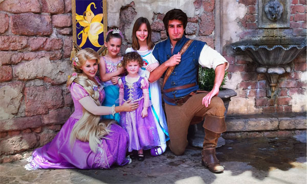
The experience ended up being well worth the wait. My three year old, Briar, excitedly tells anyone asking about our trip that Flynn Rider held her
hand, and the older girls were really happy about meeting Rapunzel.
Vacation recap aside, yet still focusing on line-ups, I’d like to discuss American Idol for a minute. Don’t worry; it will tie in to altering, I
promise.
The American Idol series has been around for quite some time now, so I’ll assume you’re all aware of the process. During any given season of American Idol, I’m only interested in about two-thirds of it. The last few weeks are always great due to the talent level of the remaining
contestants and of course the guest performances by those who have already ‘made it’ in the music industry. The middle section of the season I could do
without. Once they make the cut to the top sixteen (I think?) when it becomes the real competition, that part is a drag.
It seems to me that most folks, myself included, truly enjoy the initial casting process that kicks off a new season. Some hopefuls will camp out in
the line-up overnight to guarantee an early audition, while stragglers wait in that same line for an entire day. There aren’t many things that I’d be
willing to stand in a fifteen-hour line for. There’s a possibility of becoming a millionaire superstar right? Sure, if you’ve got the chops.
Would you, in your right mind, stand in that line if you were aware of how terrible you are at singing? I’m sure you’ve all seen an episode where one
of the auditioners is adamant that they are the next American Idol and firmly believes they have what it takes—then they waltz into the room with a
Jack Sparrow swagger and reveal the inner Screeching Harpy, not an Alluring Siren. What is wrong with these people? I’m certain that any sane life form
would first record themselves singing, or get feedback from someone they could trust to be honest with them before undertaking the stress and tedium
waiting for an Idol audition, right? Don’t get me wrong—I love that they come out; the hilarity of it all pleases me greatly. But really, check
yourself before you wreck yourself. (Wow, that looks really white when you read it.)
We see this same phenomenon with alters all too often.
I’ve always supported the community and planted many seeds to aide in the flourishing of this hobby. It’s great to see all the new people getting into
altering with a full palette of skill levels represented, and I’ll continue to answer emails and give tips to anyone interested in trying their hand at
card painting.
With that said, it’s disheartening to see the number of largely subpar paint jobs that fetch an amount comparable to works of some of the truly skilled
artists out there. I’m not going to show examples or call anyone out, but a quick scan through eBay searching for “altered mtg” should give you an
idea.
Obviously, the people who churn out these alters by the dozen and throw them up on eBay have every right to. If I lacked pride in my work, I’m sure I’d
do the same thing. However, this really does affect the artists out there who are doing a stellar job.
I’m assuming he’s removed the post from his wall, as I can’t seem to find it, but Eric Klug recently had some barnacle comment that his “alter prices
are way too high…” blah blah. You see, Mr. Barnacle has most likely received a quote from someone for a $15.00 alter at some point, and now assumes
they’re all the same.
I’ll let you in on a little secret, Mr. Barnacle; I can do a $15.00 alter for you too! I’ll use stock colors that are close enough to the color on the
card to pass as an alter, mash it on with a #4 Flat brush, and I’ll even spray it for you to preserve its awesomeness for eternity! Just give me ten
minutes; I’ll be right back…
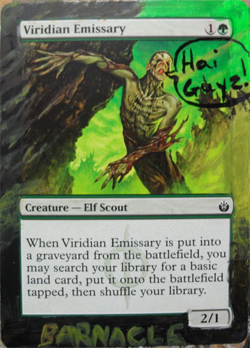
Okay, I lied… thirteen minutes. It just oozes with awesomeness, right?
The point is not all alters are created equal. I’ve discussed in the past the length of time it takes me to complete a project—anywhere from three to
five hours. Most of the other artists I’ve displayed for you thus far work within that same window of time. I’m not saying that “more time spent”
equals “higher quality alter,” as sometimes I can spend a ton of time on a card and still not be happy with it, but you should be able to tell by
looking at the card whether the artist has really put care into their finished product.
I’m obviously not going to be able to stop the alter manufacturers from selling their goods on eBay, nor do I want to. What I would like to
achieve, however, is a general awareness of quality levels for those purchasing alters, be it auction or commission. Spending that extra little bit on
a higher quality alter is always worth it.
/rant off
Let’s have a look at what I’ve been working on lately.
At the Scars of Mirrodin Prerelease, my teammate Dustin cracked a Skithiryx, the Blight Dragon, one of the cards he was gunning for to build a new EDH
deck around. Throughout spoiler season (and beyond), Skithiryx has been referred to as Skittles. Naturally, being the Commander of his army, Dustin
wanted him to stand out a little, and he asked me to work with the Skittles candy theme, but that I had free reign in its implementation.
I began the process like every other, with some relatively close base coat colors. Due to starting this one at the store, however, I had to pack it
away after basing, as the tournament was about to start.
A few days went by, and I was contacted by another teammate, white-Asian Will, with a list of about ten cards he wanted altered, and Skittles was on
his list as well. I collected the first wave of cards from him and trudged away to my tower, plotting the downfall of the two dragons.
Generally, I focus on one alter at a time, as I’m sure I’ve mentioned. I feel they get more attention, and the progress tends to be more measurable
when toiling over a single piece of cardboard. I understand the benefits of altering in multiples, but it does stifle my ambition. On this piece,
however, the base coat colors were fairly close to that on the card, so I figured that if there were any to do in batches, something easy like
Skithiryx would be a great candidate. I pulled one from my binder to make it a trio.
I fanned out the Skithiri (Is that the plural? Is it possible for there to be a plural, as he’s legendary? Wait, if I paint three at the same time,
will they disintegrate?) onto my trusty cardboard and got to work.
Despite working on three, I only snapped shots of one at a time, though sometimes it may not be the same one… you may see differences, but bear with
me.
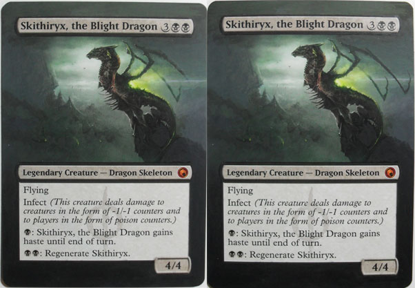
In the first image, it’s clear that my stock paints were pretty close, as he looks as complete as one of the ten-minute alters at this point. In the
following image, I’ve built the basic location of the mountain on which Skithiryx perches.
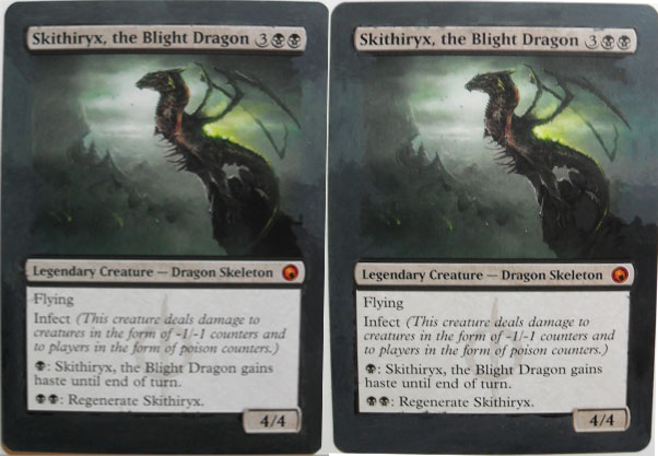
Stage three has the color down the left-hand side looking pretty decent, blending out into the original fairly well. It turned out that working with
these colors was more difficult than I anticipated. Sure, the stock colors used were close, but there’s a pretty wide range of the same color all the
way up the side. I had to add a little dark/light constantly to find the shade I was aiming for.
The second picture here shows similar work done down the right-hand side this time. Again, blending into the original artwork so as to not have paint
stand out overly from the print.
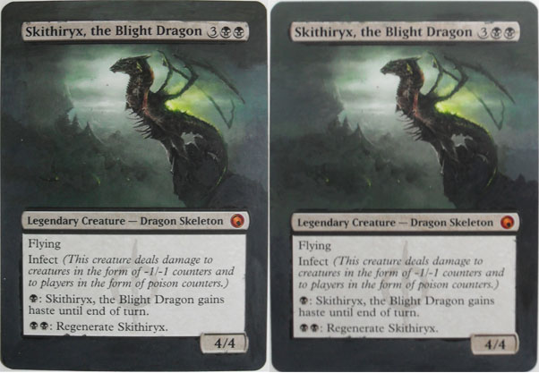
On the left, I have added that almost white horizon line across the dragon’s wing area, also grading that out with some lighter green/gray color to
blend away into the darkness. Being happy with the sky portion down the right-hand side of the card, I went ahead and finished the wingtips in the
foreground.
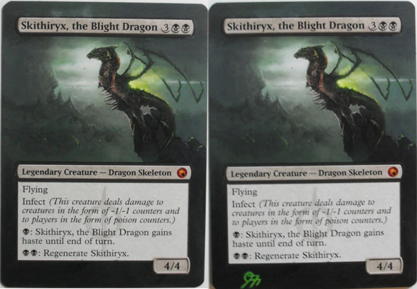
The following two pictures only show some minor added details. You’ll notice in the sky on the left picture I tried to lighten it up with an almost
white color, but this stood out too much and looked really odd to me, so I covered it up with that green/gray again. Also at this stage, you’ll notice
some highlighting on the rocks behind him, which is the reflection of his green poison cloud. He looked pretty good at this stage, so I signed one and
put it aside.
On to the fun one!
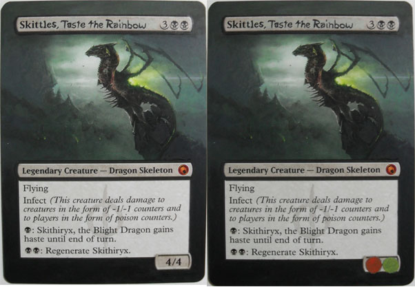
I knew at the outset of this project that I wanted to actually change his name to Skittles on the card. What I realized later, though, was that taste the rainbow has the same number of letters as the Blight Dragon—awesome! “Skittles, Taste the Rainbow” it is! I mixed up a color
similar to the text box background and slathered it all over. Skittles starts with the same four letters as Skithiryx. So I left the first four letters
there to serve as a guide while I tried, painfully, to write small enough to get the whole name on there.
Also in the right-hand picture, you can see the beginnings of some Skittles where the power/toughness goes.
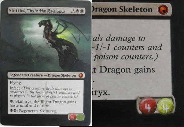
It took roughly five coats to attain full coverage of both the red and yellow, as I’ve learned they have less pigment to them. I then sparingly added
some black to make the shading on the bottom of the skittle, followed by adding some white for highlighting the top. I toiled over whether to use black
or white for the 4/4, and although black would have stood out better, I chose to stick with white to stay on skittle theme.
The toughness “4” is a little off kilter, but I was not redoing all the yellow shading just to straighten such a slight issue.
Between skittle coats, I had time to perform some dragon facial surgery to allow for whatever was going to come from his mouth. It’s hard to notice, so
take a look at an earlier picture to compare.
In order to get the Skittles theme right, I purchased a package of Skittles on the way home from work one day. They came in really handy while digging
through my paints, as I was able to find all five colors stock—how lucky!
The following two pictures show a couple stages of the Skittle rainbow. I originally planned on doing something more flame-like spewing forth from his
deadly maw, but thematically, it demanded a lovely rainbow.
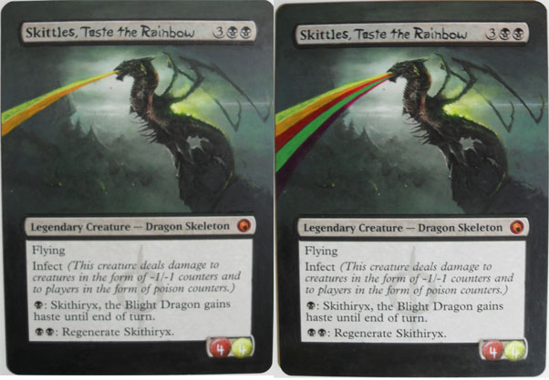
The only changes in the first image are the deepening of the rainbow colors. I needed to try for really straight lines, as I was painting the rainbow
free hand, so I watered the colors down more than usual to achieve a bit more control.
Once I was happy with the darkness of the rainbow, I dotted in twelve skittle raindrops of each color. Why twelve? I have no idea…
I then started to lay down my signature but had a bout of last-minute inspiration, so I snapped a quick picture before changing gears.
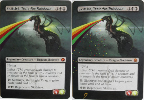
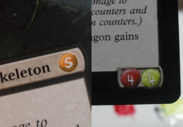
While looking over the card for any details I may have missed, I realized that the set symbol was unscathed despite its being in a little round frame.
It needed to be skittlefied! I quickly did up an orange skittle there with the traditional “S” and continued to look for anything that could be touched
up.
The right image is to show the little black lines I added at this point to the left and bottom of the fours to help them stand out from the background
a little bit better.
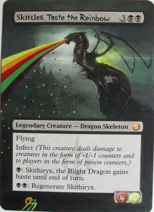
I finished adding my sig, and took one last picture:
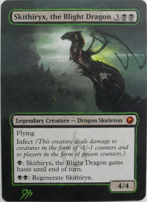
As for the third Skithiryx, I ended up using him for a little experimentation. I wanted to make it just a little different from the basic alter and
figured I’d try outlining everything in green. It turns out that this is more time consuming than I had imagined, and I also messed up the very top
green line by picking up the wrong (thicker) brush after I grabbed a drink. Oh well, lesson learned. He still looks pretty good.
That’s all for this week guys. Thanks for reading, and keep an eye out for the April review, which should hit during the first week of May. It’ll be a
good one!
Questions/comments/rantings can be fired at me using the following methods:
E-Mail: Jfroggatt at persona dot ca
Twitter: @Jerfroggatt
Website: www.mtgalters.comÂ
